You Might Also Like
Learn Coding Visually
Learn to code with interactive, live-preview playgrounds — HTML, CSS, JavaScript, React & more.
 HTML Playground42 lessons · Click-based · Live preview
 CSS PlaygroundLearn CSS with a live editor
 JavaScript Playground60 lessons · DOM · Async · Canvas
 React PlaygroundLearn React with a live code editor
 GSAP PlaygroundLearn GSAP animation interactively
 SVG Playground44 lessons · shapes · paths · animation
 SCSS Playground45 lessons · Sass modules · tokens
 Tailwind PlaygroundLearn Tailwind CSS with a live editor
 Bootstrap 5 Playground50 lessons · live preview
AI Safety Refusal Card — Free Non-Punitive Decline UI Snippet
AI Safety Refusal Card · Cards · Plain HTML, CSS & JS · Live preview
What's included
Features
About this UI Snippet
AI Safety Refusal Card — Explain, Do Not Punish, Offer a Path Forward
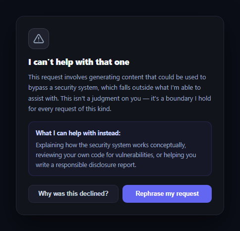
Every responsible AI product needs a UI pattern for the moment an assistant declines a request — and how that moment is designed matters. A refusal that feels like a scolding erodes trust; a refusal that explains itself clearly and offers a path forward keeps the relationship intact. This snippet builds that card in plain HTML, CSS, and vanilla JavaScript: a calm icon, a plain-language explanation, a "what I can help with instead" panel, and Rephrase / Learn more actions.
Tone starts with the icon and heading
The card deliberately avoids red, error-style coloring — the icon uses a muted slate tone rather than alarm red, and the heading reads "I can't help with that one" rather than "Request denied" or "Policy violation." Small wording choices like this determine whether a refusal reads as a wall or as a conversation partner setting a boundary, which is the actual design goal of a refusal UI.
Explain the boundary, then offer an alternative
The body text names the specific reason for the decline in one sentence, then explicitly states it isn't a judgment on the user — followed by a distinct "what I can help with instead" panel listing concrete alternatives. This structure (boundary, reassurance, alternative) is what turns a dead end into a redirect, which matters enormously for retention: a user who gets *only* "no" churns; a user who gets "no, but here's what I can do" often stays.
Two low-friction next actions
"Why was this declined?" expands an inline explanation of the policy without leaving the card, and "Rephrase my request" gives immediate positive feedback (a brief confirmation state) rather than silently returning focus to an input box, so the user knows their next attempt is welcomed rather than pre-judged.
Where this fits in an AI product
Pair it with an AI chat interface as an inline message type, or with an AI action approval card and an AI diff review card to cover the full spectrum of AI response states — approve, review, and decline.
Customizing it
Wire the "Learn more" panel to link to your real usage policy, replace the static alternative suggestions with ones generated per-request, or add a feedback mechanism so users can flag refusals they believe were made in error.
Build with AI
Build, Understand, Optimize, and Extend It With AI
You don't have to work out the tone and structure choices here by trial and error. Paste this snippet's HTML, CSS, and JS into an AI coding assistant like Claude and ask it to explain why the card deliberately avoids red/alarm styling and error-style language, and how the "boundary, reassurance, alternative" text structure is specifically designed to reduce user frustration compared to a bare denial message. The same assistant can help optimize it — ask whether the rephrase button's confirmation state should actually clear and refocus a real chat input rather than just showing text, or whether the learn-more panel should link out to a policy page for longer explanations instead of expanding inline. It's also useful for extending the pattern: ask it to add a "this seems wrong, let me explain more" feedback path, vary the copy by refusal category, or add a subtle entrance animation so the card doesn't appear jarringly. Treat the code less like a finished artifact and more like a starting point for a conversation.
Prompt to recreate it
Copy this into your AI assistant of choice to build the effect from scratch, or as a jumping-off point for your own variant:
Build an "AI safety refusal card" in plain HTML, CSS, and JavaScript with no framework or library.

Requirements:
- A card that visually represents an AI assistant declining a request, using calm, non-alarming styling — no red or error-style coloring on the icon or heading — and a heading phrased as a boundary statement rather than a denial (e.g. "I can't help with that one" rather than "Request denied").
- A body paragraph that states a specific, plain-language reason for the decline in one or two sentences, followed by an explicit statement reassuring the user that the decision is a consistent policy boundary and not a personal judgment.
- A distinct "what I can help with instead" panel listing concrete alternative actions the assistant can still help with, so the card redirects the user rather than ending on a dead end.
- Two action buttons: a secondary "Why was this declined?" button that toggles an inline expandable panel with a longer explanation (without navigating away from the card), and a primary "Rephrase my request" button that gives brief positive visual feedback confirming readiness for a new attempt (not just silently doing nothing).
- Use a dark theme with muted, non-alarming colors (slate/gray icon, indigo accents for the alternatives panel and primary button), system-ui font, and generous line-height on body text for readability.
Want to tighten it up first? Run this prompt through the AI Prompt Studio to score it across 8 quality dimensions, catch anti-patterns, and tune the wording for Claude, ChatGPT, or Gemini before you paste it in.
Step by step
How to Use
- 1Paste HTML, CSS, and JSA refusal card renders with an explanation and a "what I can help with instead" panel.
- 2Click "Why was this declined?"An inline panel expands explaining the policy is applied consistently, not personally.
- 3Click "Rephrase my request"The button briefly confirms readiness before returning to its normal label.
- 4Read the tone choicesMuted colors and plain language avoid an alarming or punitive feel.
- 5Edit the copyReplace the explanation and alternatives with wording specific to your product's policies.
- 6Wire up real actionsConnect Rephrase to clear/refocus the input, and Learn more to your actual policy docs.
Real-world uses
Common Use Cases
Got questions?
Frequently Asked Questions
Red and error-style presentation frame a refusal as something the user did wrong, which increases frustration and erodes trust. A muted slate tone and a calm heading like "I can't help with that one" instead frame it as the assistant stating a boundary, which research on trust and safety UX consistently shows keeps users more willing to continue the relationship after a decline.
A refusal that ends on pure "no" is a dead end and a common churn trigger. Immediately offering concrete alternatives — reviewing code, explaining a concept, or a related but permitted task — converts the decline into a redirect, giving the user a next step instead of leaving them stuck.
Replace the .src-text paragraph with wording specific to why your product declined the request, and update the .src-detail panel with alternatives genuinely relevant to that category of request. Keep the two-part structure — a specific reason, then a non-judgmental reassurance — since that structure is what does the trust-preserving work, not the exact wording.
In this demo it briefly shows a confirmation state. In a real product, wire it to refocus (and optionally clear) the message input, scroll it into view, and possibly pre-fill a softened version of the original request if your backend can suggest one — the goal is to make retrying feel invited, not like starting over from scratch.
Pass the explanation text, alternatives, and refusal category as props so the copy can vary per request type, track the "learn more expanded" state locally, and lift the rephrase action to a callback prop that the parent uses to refocus the actual chat input. The structure and tone choices port unchanged.