You Might Also Like
Learn Coding Visually
Learn to code with interactive, live-preview playgrounds — HTML, CSS, JavaScript, React & more.
 HTML Playground42 lessons · Click-based · Live preview
 CSS PlaygroundLearn CSS with a live editor
 JavaScript Playground60 lessons · DOM · Async · Canvas
 React PlaygroundLearn React with a live code editor
 GSAP PlaygroundLearn GSAP animation interactively
 SVG Playground44 lessons · shapes · paths · animation
 SCSS Playground45 lessons · Sass modules · tokens
 Tailwind PlaygroundLearn Tailwind CSS with a live editor
 Bootstrap 5 Playground50 lessons · live preview
Job Listing Card — Job Board UI HTML CSS JS Snippet
Job Listing Card · Cards · Plain HTML, CSS & JS · Live preview
What's included
Features
.remote (green), .onsite (blue), .contract (amber) — colour-coded work arrangement badges that candidates scan first when filtering listings.data-type on each card with space-separated tokens. Filter function shows/hides with dataset.type.includes(type) — scales to any number of filter values.saved class fills the SVG bookmark icon with indigo. Toggle is instant — no server call needed for the visual state..detail.salary uses green #059669 — the highest-contrast detail to make compensation immediately visible when scanning listings..featured with amber border, warm background, and 🔥 Featured badge — the promoted listing pattern used by LinkedIn, Indeed, and Glassdoor.--bg and --fg on each .company-logo — one inline style attribute per card sets the entire logo colour scheme..tags with wrapping chip elements show required technologies per role — first-pass filter for candidates checking technical stack fit..apply-btn is an <a> tag (not a button) so it navigates directly to the application URL without JavaScript.About this UI Snippet
Job Listing Card — Job Board UI, Filter Bar, Save Toggle & Featured Card Pattern
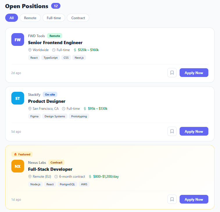
Job listing cards are the core UI unit of job boards, career pages, and recruitment platforms. Every listing card must communicate role identity (title, company, location), compensation (salary range), work arrangement (remote/on-site/contract), required skills (tag chips), and actions (apply, save) — all within a compact scannable card that works at mobile widths. This snippet builds a complete job listings page with filter bar, four listing cards, featured card variant, save-to-bookmarks toggle, and job-type colour-coded badges.
Job board UI appears across dedicated job platforms (LinkedIn Jobs, Indeed, Greenhouse), company career pages, aggregator sites, and freelance marketplaces. The UX challenge is giving candidates enough information to qualify the role without overwhelming the card — salary and work arrangement are the first filters candidates apply, so they must be prominent.
Company logo with CSS custom property colour
Each listing's company logo uses initials with --bg and --fg CSS custom properties for background and text colour. This gives each company a distinct colour identity without loading images. In a real application, you'd use an <img> with a fallback to the initials <div> via an onerror handler. The same CSS custom property colour pattern appears in team cards and review cards.
Job type badge colour system
Three badge variants handle the most common work arrangements: .remote (green — positive signal for remote workers), .onsite (blue — neutral office work), and .contract (amber — time-limited engagement). Each uses a light tinted background with a dark matching text colour — the same tonal badge pattern as status indicators in activity feeds.
Filter bar with data attribute matching
The filter buttons use data-type attributes on each card containing space-separated type tokens (e.g. "remote full-time"). The setFilter function checks card.dataset.type.includes(type) and shows/hides cards accordingly. This approach scales to any number of filter values and any number of types per card — a job can be both remote and full-time and appear under either filter.
Save/bookmark toggle
The bookmark button uses a saved class toggle with CSS fill state — fill: #6366f1 on the SVG path fills the bookmark icon when saved. No JavaScript state persistence is shown here (you'd use localStorage or a backend), but the visual affordance is clear. The same bookmark save pattern appears in product cards.
Featured card variant
The .featured card uses an amber border and warm background tint — the standard "promoted listing" pattern on job boards. A 🔥 Featured badge appears above the job main content using a dedicated .featured-badge element. In a real implementation, featured cards come from paid job promotions.
Build with AI
Build, Understand, Optimize, and Extend It With AI
You do not have to reverse-engineer the filter matching by hand. Paste this snippet's HTML, CSS, and JS into an AI coding assistant like Claude and ask it to walk through exactly why setFilter checks card.dataset.type.includes(type) against a space-separated string instead of an array, and what edge case that string-includes check could silently break on (think a type value that is a substring of another, like "remote" matching inside a longer token). The same assistant can help optimize it, for instance suggesting how the approach should change once the four hardcoded cards become fifty or a hundred fetched from an API, or whether re-querying all .job-card elements on every filter click is worth caching. It is just as useful for extending the pattern, such as adding a combined AND-filter for both location and job type at once, persisting the save toggle to localStorage, or turning the amber featured-card styling into a data-driven flag from a real listings API. Treat the code less like a finished artifact and more like a starting point for a conversation.
Prompt to recreate it
Copy this into your AI assistant of choice to build the effect from scratch, or as a jumping-off point for your own variant:
Build a "job listing card" board in plain HTML, CSS, and JavaScript using only DOM APIs and CSS custom properties for per-company colors — no framework, no icon library beyond inline SVG.

Requirements:
- A filter bar of pill buttons (All, Remote, Full-time, Contract) where clicking one marks it active and shows or hides job cards based on a data-type attribute on each card containing space-separated tokens (e.g. "remote full-time"). The filter must work by checking whether the clicked filter's token is included in that space-separated string, so a card can match multiple filters.
- Each job card must show a company logo rendered as initials inside a div whose background and text colors come from CSS custom properties (--bg and --fg) set inline per card, a company name, a color-coded job-type badge (distinct colors for remote, on-site, and contract), a job title, a row of detail items with inline SVG icons (location, employment duration, salary), a wrapping row of skill tag chips, a relative "posted X ago" timestamp, a bookmark/save icon button, and an Apply Now link styled as a button.
- The save button must toggle a "saved" class on click that changes its border color and fills the bookmark SVG icon, with no page reload or navigation.
- Include at least one "featured" card variant with a distinct border color, a tinted gradient background, and a small badge element above its content to mark it as a promoted listing.
- Keep the Apply action as a real anchor tag (not a JavaScript button) so it works without any script running, and keep the save toggle and filter logic as small, independent functions attached via plain addEventListener or inline handlers.
Want to tighten it up first? Run this prompt through the AI Prompt Studio to score it across 8 quality dimensions, catch anti-patterns, and tune the wording for Claude, ChatGPT, or Gemini before you paste it in.
Step by step
How to Use
- 1Paste HTML, CSS, and JSFour job cards appear in a vertical list below a filter bar. Cards show company logo, job title, location, salary, job type badge, tags, save button, and Apply Now CTA.
- 2Click filter buttons"Remote" shows only remote listings. "Full-time" shows full-time roles. "Contract" shows the featured Nexus Labs listing. "All" restores all cards.
- 3Click the bookmark iconThe bookmark SVG fills with indigo and the button gets an indigo border — indicates the job is saved. Click again to un-save.
- 4Identify the featured cardThe Nexus Labs card has an amber border, warm background, and a "🔥 Featured" badge — the promoted listing pattern used by job boards.
- 5Update job detailsChange the company initials,
--bgcolour, job title, location, salary, and skill tags. Updatedata-typeon each card to include the correct filter tokens. - 6Add more jobsDuplicate any
.job-cardarticle. Setdata-typeto space-separated values from:remote,full-time,contract. The filter function matches these automatically.
Real-world uses
Common Use Cases
.remote badge is the most important filter.Got questions?
Frequently Asked Questions
Store active filters in a Set: const active = new Set(). Toggle filters in/out of the set on button click. Show a card only if all active filters are present in card.dataset.type. This gives AND-logic filtering (Remote AND Full-time).
On save toggle, read/write to localStorage: const saved = JSON.parse(localStorage.getItem('savedJobs') || '[]'). Add/remove the job ID. On page load, restore saved state by checking each card's ID against the saved array and applying .saved class.
Create a JobCard component with props: {company, logoColor, title, type, location, salary, tags, featured, posted}. The filter bar is a parent component with const [filter, setFilter] = useState('all'). Filter the jobs array before mapping to JobCard components: jobs.filter(j => filter === 'all' || j.type.includes(filter)).