You Might Also Like
Learn Coding Visually
Learn to code with interactive, live-preview playgrounds — HTML, CSS, JavaScript, React & more.
 HTML Playground42 lessons · Click-based · Live preview
 CSS PlaygroundLearn CSS with a live editor
 JavaScript Playground60 lessons · DOM · Async · Canvas
 React PlaygroundLearn React with a live code editor
 GSAP PlaygroundLearn GSAP animation interactively
 SVG Playground44 lessons · shapes · paths · animation
 SCSS Playground45 lessons · Sass modules · tokens
 Tailwind PlaygroundLearn Tailwind CSS with a live editor
 Bootstrap 5 Playground50 lessons · live preview
Table Row Detail Panel — Master-Detail List with Instant Inspector (JS)
Table Row Detail Panel (Master-Detail) · Tables · Plain HTML, CSS & JS · Live preview
What's included
Features
About this UI Snippet
Table Row Detail Panel — A Master List with an Always-Visible Inspector
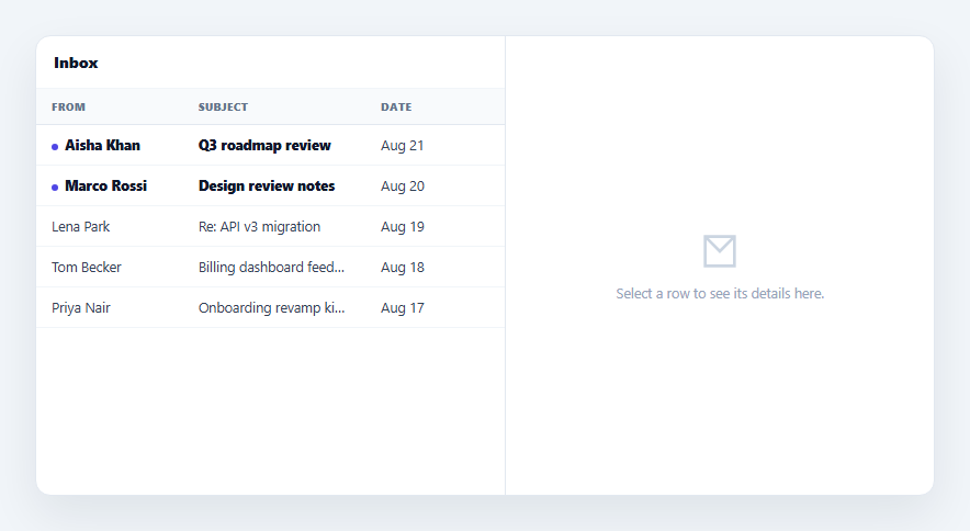
An email client's message list and reading pane is a specific, well-understood pattern: a compact list on one side, and a detail panel that updates instantly as you click different rows on the other — never expanding inline, never navigating away. This snippet builds that master-detail layout for a table in plain HTML, CSS, and vanilla JavaScript, distinct from an accordion-style expandable row that pushes content into the row itself.
Master-detail, not expand-in-place
An expandable table grows the clicked row taller to reveal its detail inline, pushing every row below it down the page. This pattern does the opposite: the list stays a fixed, compact grid, and a *separate* panel beside it shows the selected row's extended information. Clicking a different row doesn't grow anything — it swaps the panel's content instantly, exactly like clicking between emails in an inbox never resizes the message list.
One click, one source of truth
showDetail(id) looks up the clicked message by id, sets it as selectedId, and rebuilds both the list (to show the selection highlight and clear the unread dot) and the detail panel's content from that single message object. Because both halves of the UI render from the same lookup, the highlighted row in the list and the content in the panel can never disagree about which item is "current."
A real empty state before any selection
Before anything is clicked, the detail panel shows a dedicated empty state — an icon and "Select a row to see its details here" — rather than either a blank panel or a default-selected first row. This matches how a reading pane actually behaves the first time you open a mail client: there's a genuine prompt, not an implicit selection the user didn't make.
Read-state side effect, like a real inbox
Opening a message clears its unread flag and removes its bold styling and dot indicator on the very next render — a small but realistic detail that shows the detail panel isn't just a display surface, it's wired to actually mutate the underlying data the way clicking into an email marks it read.
Compact list columns, expanded detail content
The list intentionally shows only three columns (From, Subject, Date) with text-overflow: ellipsis truncation, while the detail panel shows the full sender email, full body text, and tags — information that would be far too dense to fit in the table itself. This division of "just enough to scan" versus "everything once selected" is the actual reason the master-detail pattern exists, as opposed to just making the table wider. Pair it with a selectable table if you also need multi-row bulk actions alongside single-row inspection, or a table row context menu for right-click actions on the same list.
Build with AI
Build, Understand, Optimize, and Extend It With AI
Rather than reverse-engineering a mail-client-style layout, paste this snippet's HTML, CSS, and JS into an AI coding assistant like Claude and ask it to explain exactly why the list and the detail panel are both driven from the same selectedId lookup instead of tracking separate "highlighted row" and "shown detail" state, and why the unread flag is mutated on the real MESSAGES array rather than just toggled visually with a CSS class. The same assistant can help extend it — ask it to add keyboard navigation (up/down arrows to move the selection, Enter to open), support marking a message unread again from the detail panel, or add a responsive mode where the detail panel becomes a full-screen overlay on narrow viewports instead of a side-by-side column. Treat the code less like a finished artifact and more like a starting point for a conversation.
Prompt to recreate it
Copy this into your AI assistant of choice to build the effect from scratch, or as a jumping-off point for your own variant:
Build a master-detail list-with-inspector layout in plain HTML, CSS, and JavaScript, modeled on an email client's message list and reading pane — no libraries.

Requirements:
- A two-column layout: a compact list/table on one side (showing only a few essential columns, truncated with ellipsis if needed) and a separate detail panel on the other side, laid out side by side (not one expanding into the other, and not navigating to a different page).
- Clicking any row in the list must instantly update the detail panel's content to show that row's extended information (fields not visible in the compact list view), without resizing, reordering, or reflowing the list itself.
- Both the list's "currently selected" visual highlight and the detail panel's displayed content must be derived from the same single piece of state (e.g. a selected id) and the same lookup into the underlying data array, so they can never disagree about which record is currently shown.
- Before any row has been clicked, the detail panel must show a distinct, deliberate empty state (an icon plus a prompt like "Select a row to see its details") — not a blank panel and not a row selected by default.
- Include at least one example of the detail panel's selection causing a genuine mutation of the underlying data (for instance, marking a message as read when opened, clearing an unread indicator in the real data array, not just a CSS toggle), demonstrating the panel is wired to real state rather than being a static display-only surface.
- Visually distinguish unread/flagged rows in the list (e.g. bold text and a dot indicator) and confirm that indicator clears correctly, driven by the real data change, when that row is opened.
Want to tighten it up first? Run this prompt through the AI Prompt Studio to score it across 8 quality dimensions, catch anti-patterns, and tune the wording for Claude, ChatGPT, or Gemini before you paste it in.
Step by step
How to Use
- 1Paste HTML, CSS, and JSAn inbox-style list renders on the left with an empty detail panel on the right.
- 2Click a rowThe detail panel instantly fills with that message's full sender, body, and tags.
- 3Click a different rowThe panel content swaps immediately — the list itself never grows or shifts.
- 4Note the unread dotUnread rows are bold with a dot; opening one clears both, mirroring a real inbox.
- 5Check the selection highlightThe currently open row stays visually marked in the list.
- 6Swap in your dataReplace MESSAGES with your own records; showDetail() is generic over any object shape.
Real-world uses
Common Use Cases
Got questions?
Frequently Asked Questions
An expandable row grows taller in place to reveal its detail, pushing every row beneath it down the page — the list's layout changes with every click. This pattern keeps the list a fixed grid and shows detail in a completely separate panel beside it, so clicking different rows never resizes or reflows the list itself — exactly like an email client's message list and reading pane.
Both. showDetail() looks up the clicked message by id and both re-renders the panel from it and sets that message's real unread property to false in the underlying MESSAGES array — so the bold styling and dot indicator that reflect "unread" are driven by an actual data mutation, the same way opening an email in a real inbox marks it read in the underlying mail store, not just visually.
The detail panel shows a dedicated empty state with an icon and a "Select a row to see its details here" message — there's no default-selected first row and no blank panel. This matches the real first-load behavior of a mail client's reading pane, which prompts for a selection rather than guessing one.
No — both are rendered from the same selectedId and the same MESSAGES.find() lookup inside showDetail(), so the highlighted row in the list and the content in the panel always refer to the same record. There's no separate state for "what's highlighted" versus "what's displayed."
Keep selectedId in component state, derive the selected record with a find() over your data array, and render the list (with a selected class check) and the detail panel (or its empty state) both from that same state and derived value — the click handler just needs to set the id, and both halves re-render consistently.