Source Code
<div class="wrap">
  <div class="table-head-row">
    <h2 class="table-title">Orders</h2>
    <span class="sub-label">Click any row to expand line items</span>
  </div>
  <div class="table-scroll">
    <table class="table" id="orders-table">
      <thead>
        <tr>
          <th class="exp-col"></th>
          <th>Order ID</th>
          <th>Customer</th>
          <th>Date</th>
          <th>Items</th>
          <th>Total</th>
          <th>Status</th>
        </tr>
      </thead>
      <tbody>
        <!-- Row 1 -->
        <tr class="main-row" onclick="toggle(this)" data-id="1">
          <td class="exp-col"><span class="chevron">›</span></td>
          <td class="order-id">#10041</td>
          <td><div class="customer"><div class="cav" style="background:linear-gradient(135deg,#6366f1,#a78bfa)">AJ</div>Alex Johnson</div></td>
          <td>May 28, 2026</td>
          <td>3 items</td>
          <td class="amount">$184.50</td>
          <td><span class="badge green">Shipped</span></td>
        </tr>
        <tr class="detail-row" id="detail-1">
          <td colspan="7">
            <div class="detail-wrap">
              <table class="inner-table">
                <thead><tr><th>Product</th><th>SKU</th><th>Qty</th><th>Price</th><th>Subtotal</th></tr></thead>
                <tbody>
                  <tr><td>Wireless Headphones</td><td>SKU-WH-001</td><td>1</td><td>$89.00</td><td>$89.00</td></tr>
                  <tr><td>USB-C Cable 2m</td><td>SKU-CB-002</td><td>2</td><td>$12.00</td><td>$24.00</td></tr>
                  <tr><td>Phone Stand</td><td>SKU-PS-003</td><td>1</td><td>$71.50</td><td>$71.50</td></tr>
                </tbody>
              </table>
            </div>
          </td>
        </tr>

        <!-- Row 2 -->
        <tr class="main-row" onclick="toggle(this)" data-id="2">
          <td class="exp-col"><span class="chevron">›</span></td>
          <td class="order-id">#10042</td>
          <td><div class="customer"><div class="cav" style="background:linear-gradient(135deg,#ec4899,#f97316)">SM</div>Sara Miller</div></td>
          <td>May 27, 2026</td>
          <td>1 item</td>
          <td class="amount">$49.99</td>
          <td><span class="badge yellow">Processing</span></td>
        </tr>
        <tr class="detail-row" id="detail-2">
          <td colspan="7">
            <div class="detail-wrap">
              <table class="inner-table">
                <thead><tr><th>Product</th><th>SKU</th><th>Qty</th><th>Price</th><th>Subtotal</th></tr></thead>
                <tbody>
                  <tr><td>Mechanical Keyboard</td><td>SKU-KB-007</td><td>1</td><td>$49.99</td><td>$49.99</td></tr>
                </tbody>
              </table>
            </div>
          </td>
        </tr>

        <!-- Row 3 -->
        <tr class="main-row" onclick="toggle(this)" data-id="3">
          <td class="exp-col"><span class="chevron">›</span></td>
          <td class="order-id">#10043</td>
          <td><div class="customer"><div class="cav" style="background:linear-gradient(135deg,#10b981,#0ea5e9)">RP</div>Raj Patel</div></td>
          <td>May 26, 2026</td>
          <td>4 items</td>
          <td class="amount">$312.00</td>
          <td><span class="badge blue">Delivered</span></td>
        </tr>
        <tr class="detail-row" id="detail-3">
          <td colspan="7">
            <div class="detail-wrap">
              <table class="inner-table">
                <thead><tr><th>Product</th><th>SKU</th><th>Qty</th><th>Price</th><th>Subtotal</th></tr></thead>
                <tbody>
                  <tr><td>Monitor 27"</td><td>SKU-MN-010</td><td>1</td><td>$220.00</td><td>$220.00</td></tr>
                  <tr><td>HDMI Cable</td><td>SKU-HD-011</td><td>2</td><td>$14.00</td><td>$28.00</td></tr>
                  <tr><td>Desk Lamp</td><td>SKU-DL-012</td><td>2</td><td>$32.00</td><td>$64.00</td></tr>
                </tbody>
              </table>
            </div>
          </td>
        </tr>
      </tbody>
    </table>
  </div>
</div>
* { box-sizing: border-box; margin: 0; padding: 0; }
body { font-family: system-ui, sans-serif; background: #f8fafc; min-height: 100vh; padding: 32px 20px; }
.wrap { max-width: 860px; margin: 0 auto; }
.table-head-row { display: flex; justify-content: space-between; align-items: center; margin-bottom: 16px; flex-wrap: wrap; gap: 8px; }
.table-title { font-size: 18px; font-weight: 800; color: #0f172a; }
.sub-label { font-size: 12px; color: #94a3b8; }
.table-scroll { overflow-x: auto; border-radius: 14px; box-shadow: 0 1px 8px rgba(0,0,0,0.06); }
.table { width: 100%; border-collapse: collapse; background: #fff; }
.table thead tr { background: #f8fafc; }
.table th { padding: 11px 14px; text-align: left; font-size: 11px; font-weight: 700; letter-spacing: 0.6px; text-transform: uppercase; color: #64748b; border-bottom: 1px solid #e2e8f0; white-space: nowrap; }
.table td { padding: 13px 14px; font-size: 13px; color: #374151; border-bottom: 1px solid #f1f5f9; vertical-align: middle; }
.exp-col { width: 40px; }
.chevron { display: inline-block; font-size: 16px; color: #94a3b8; transition: transform 0.2s; user-select: none; }
.main-row { cursor: pointer; transition: background 0.12s; }
.main-row:hover { background: #fafafa; }
.main-row.open .chevron { transform: rotate(90deg); color: #6366f1; }
.main-row.open { background: #fafafa; }
.order-id { font-weight: 700; color: #6366f1; font-family: monospace; font-size: 12px; }
.customer { display: flex; align-items: center; gap: 8px; }
.cav { width: 26px; height: 26px; border-radius: 50%; color: #fff; font-size: 9px; font-weight: 800; display: flex; align-items: center; justify-content: center; flex-shrink: 0; }
.amount { font-weight: 700; color: #0f172a; }
.badge { font-size: 11px; font-weight: 700; padding: 3px 10px; border-radius: 20px; }
.badge.green { background: rgba(34,197,94,0.1); color: #16a34a; }
.badge.yellow { background: rgba(245,158,11,0.1); color: #b45309; }
.badge.blue { background: rgba(14,165,233,0.1); color: #0369a1; }
.badge.red { background: rgba(239,68,68,0.1); color: #dc2626; }
/* Detail rows */
.detail-row { display: none; }
.detail-row.open { display: table-row; }
.detail-row td { padding: 0; background: #f8fafc; }
.detail-wrap { padding: 12px 16px 16px; border-left: 3px solid #6366f1; margin: 0 14px 0 52px; }
.inner-table { width: 100%; border-collapse: collapse; }
.inner-table th { font-size: 10px; font-weight: 700; text-transform: uppercase; letter-spacing: 0.5px; color: #94a3b8; padding: 4px 10px; text-align: left; }
.inner-table td { font-size: 12px; color: #475569; padding: 6px 10px; border-bottom: 1px solid #e2e8f0; }
.inner-table tr:last-child td { border-bottom: none; }function toggle(row) {
const id = row.dataset.id;
const detail = document.getElementById('detail-' + id);
const isOpen = row.classList.contains('open');
// Close all others
document.querySelectorAll('.main-row.open').forEach(r => {
r.classList.remove('open');
document.getElementById('detail-' + r.dataset.id).classList.remove('open');
});
// Toggle current
if (!isOpen) {
row.classList.add('open');
detail.classList.add('open');
}
}Learn Coding Visually
Learn to code with interactive, live-preview playgrounds — HTML, CSS, JavaScript, React & more.
 HTML Playground42 lessons · Click-based · Live preview
 CSS PlaygroundLearn CSS with a live editor
 JavaScript Playground60 lessons · DOM · Async · Canvas
 React PlaygroundLearn React with a live code editor
 GSAP PlaygroundLearn GSAP animation interactively
 SVG Playground44 lessons · shapes · paths · animation
 SCSS Playground45 lessons · Sass modules · tokens
 Tailwind PlaygroundLearn Tailwind CSS with a live editor
 Bootstrap 5 Playground50 lessons · live preview
Expandable Table — Free HTML CSS JS Snippet
Expandable Rows Table · Tables · Plain HTML, CSS & JS · Live preview
What's included
Features
About this UI Snippet
Expandable Rows Table — Parent Rows with Nested Detail Tables, Chevron Toggle & Accordion Behaviour
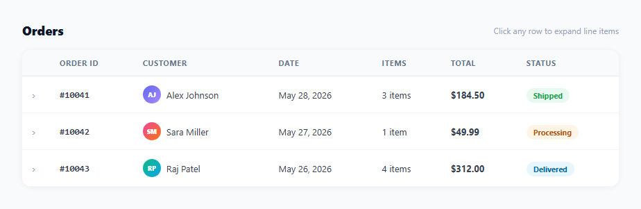
An expandable rows table shows summary data in each row and reveals detailed sub-data when the row is clicked — without navigating to a new page. This pattern is used in order management tables (click an order to see line items), expense reports (click a category to see individual transactions), file managers (click a folder to see files), and any data set with a parent-child hierarchy. This snippet provides a complete implementation with chevron rotation, accordion single-open behaviour, an inner detail table, status badges, and customer avatar initials.
How the expand/collapse works
Each main row has a data-id attribute. The detail row below it has id="detail-N" matching the data-id. When a row is clicked, toggle(row) reads the data-id, finds the detail row, and adds/removes the .open class on both. The detail row defaults to display: none via CSS and switches to display: table-row when .open is applied.
Accordion behaviour
Before opening a new row, toggle() closes all currently open rows: document.querySelectorAll(".main-row.open").forEach(r => { r.classList.remove("open"); detail.classList.remove("open"); }). This ensures only one row is expanded at a time — the accordion pattern — which keeps the table scannable. Remove the "close all others" block to allow multiple rows to be open simultaneously.
The chevron indicator
A › character in the first column rotates 90 degrees via transform: rotate(90deg) when .open is applied to the parent row. The CSS transition: transform 0.2s animates the rotation smoothly. The colour changes from grey to indigo to signal the active state.
The inner detail table
The detail row contains a full colspan="7" cell (spanning all columns). Inside it, a .detail-wrap div with a left border accent (border-left: 3px solid #6366f1) and indentation creates visual hierarchy. Inside .detail-wrap, a nested .inner-table shows line-item data (product name, SKU, quantity, price, subtotal). The inner table uses the same border-collapse collapse style as the outer table for visual consistency.
Customising the table
Update the outer table columns (Order ID, Customer, Date, Items, Total, Status) to match your data model. Change the inner table columns to match your detail data. Update the colspan value on the detail td to match your column count. Add or remove badge colour classes as needed. For a flat list instead, use the Data Table snippet; for true hierarchical nesting, see the tree table.
Build with AI
Build, Understand, Optimize, and Extend It With AI
You don't have to trace the row-to-detail wiring by eye. Paste this snippet's HTML, CSS, and JS into an AI coding assistant like Claude and ask it to explain exactly how the data-id attribute on each main row is used to find and toggle its matching detail row by constructed id, and why the toggle function closes every other open row before opening the clicked one. The same assistant can help optimize it — ask whether hardcoding every order's line items directly in the HTML will scale once there are hundreds of orders, and what a lazy-fetch-on-first-expand approach would need to change in the toggle function. It's also useful for extending the table: ask it to add a smooth height animation instead of the instant display toggle, support expanding multiple rows at once as an option, or add a small loading spinner inside the detail row while its data is being fetched for the first time. Treat the code less like a finished artifact and more like a starting point for a conversation.
Prompt to recreate it
Copy this into your AI assistant of choice to build the effect from scratch, or as a jumping-off point for your own variant:
Build a table with expandable master-detail rows in plain HTML, CSS, and JavaScript — no library.

Requirements:
- Each summary row must carry a data-id attribute, and immediately following it in the same tbody, a matching detail row whose id is derived from that same identifier (for example "detail-" plus the id), so the two rows can be found and linked programmatically without any external mapping.
- The detail row must be a single td with a colspan equal to the total number of columns in the outer table, containing a nested, completely independent inner table with its own columns and widths for the line-item detail.
- The detail row must be hidden by default via CSS (display: none) and switched to display: table-row only when an "open" class is applied — never removed from the DOM, so the same markup can be toggled back and forth cheaply.
- Clicking a summary row must first find and close every other row that is currently open (removing the open class from both its summary and detail row), then toggle open state on the clicked row and its detail row — enforcing that only one row's detail is visible at a time.
- A chevron indicator in the first column of each summary row must rotate 90 degrees via a CSS transform transition when its row is open, and change color to signal the active state.
- Give the detail panel a visually distinct left border accent and indentation relative to the outer table so it reads clearly as a nested, subordinate data view rather than another top-level row.
- Style at least three status badge variants with tinted backgrounds for the summary row's status column.
Want to tighten it up first? Run this prompt through the AI Prompt Studio to score it across 8 quality dimensions, catch anti-patterns, and tune the wording for Claude, ChatGPT, or Gemini before you paste it in.
Step by step
How to Use
- 1Click any row to expand its detailClicking a row reveals the nested detail table with line items. The chevron rotates 90 degrees and the row gets a background tint. Clicking another row closes the open one (accordion behaviour).
- 2Update the outer table dataIn the HTML, edit each main-row tr: change order ID, customer initials and gradient, date, item count, total amount, and badge class/text. Update the data-id attribute and matching detail row id accordingly.
- 3Update the inner detail tableInside each detail-row, edit the inner-table tbody rows with your actual line-item data. Adjust the number of columns in the inner thead and tbody to match your data structure.
- 4Allow multiple rows open simultaneouslyRemove the "Close all others" block in the toggle() function: delete the document.querySelectorAll(".main-row.open").forEach(...) lines. The function will then only toggle the clicked row without affecting others.
- 5Add more columns or rowsAdd th headers to the outer table thead and matching td cells to each main-row tr. Update the colspan="7" on each detail-row td to match the new total column count. Duplicate the main-row + detail-row pair for each new data record.
- 6Export in your formatClick "HTML" for a standalone file, "JSX" for a React component managing open state in useState, or "Tailwind" for a React + Tailwind CSS version.
Real-world uses
Common Use Cases
Got questions?
Frequently Asked Questions
The detail row has a single td element with colspan="7" — or whatever number matches the total column count in the outer table. This single cell spans the full row width. Inside it, a div with padding and a left border creates the indented detail panel. The inner-table inside this div is a completely separate table, not constrained by the outer column widths, so it can have different columns and widths.
Track which rows have been loaded: const loaded = new Set(). In toggle(), before opening a new row, check if loaded.has(id). If not: show a loading spinner in the detail row, fetch("/api/orders/"+id+"/items").then(data => { renderDetail(id, data); loaded.add(id); row.classList.add("open"); detail.classList.add("open"); }). The detail row content is rendered from the API response on first expand and cached for subsequent expands.
CSS cannot animate from height: 0 to height: auto directly. Instead: set the detail row to display: table-row always (remove display:none), and use max-height animation: max-height: 0; overflow: hidden on the detail div, transitioning to max-height: 500px on .open. Or use the Web Animations API: detail.animate([{height: "0"},{height: detail.scrollHeight+"px"}], {duration: 250, easing: "ease"}).
Click "JSX" to download. Manage open row state with useState<string|null>(null) for accordion mode (one open at a time) or useState<Set<string>>(new Set()) for multi-open mode. Render the detail tr conditionally: {openId === row.id && <tr><td colSpan={7}><DetailContent data={row.items} /></td></tr>}. For lazy data loading, use useState to track per-row data and fetch on first expand inside a click handler.