Source Code
<div class="faq">
  <h2>Frequently Asked Questions</h2>

  <div class="item">
    <button class="q" onclick="toggle(this)">
      What is your refund policy?
      <svg class="chevron" width="16" height="16" viewBox="0 0 24 24" fill="none" stroke="currentColor" stroke-width="2.5"><polyline points="6 9 12 15 18 9"/></svg>
    </button>
    <div class="a"><p>We offer a full refund within 30 days of purchase. No questions asked. Simply contact our support team and we'll process the refund within 2–3 business days.</p></div>
  </div>

  <div class="item">
    <button class="q" onclick="toggle(this)">
      How do I cancel my subscription?
      <svg class="chevron" width="16" height="16" viewBox="0 0 24 24" fill="none" stroke="currentColor" stroke-width="2.5"><polyline points="6 9 12 15 18 9"/></svg>
    </button>
    <div class="a"><p>You can cancel anytime from your account settings under Billing → Cancel subscription. Your access continues until the end of the billing period.</p></div>
  </div>

  <div class="item open">
    <button class="q" onclick="toggle(this)">
      Do you offer a free trial?
      <svg class="chevron" width="16" height="16" viewBox="0 0 24 24" fill="none" stroke="currentColor" stroke-width="2.5"><polyline points="6 9 12 15 18 9"/></svg>
    </button>
    <div class="a"><p>Yes! Every plan includes a 14-day free trial with full access. No credit card required. If you decide not to continue, your account automatically downgrades to the free tier.</p></div>
  </div>

  <div class="item">
    <button class="q" onclick="toggle(this)">
      Can I switch plans later?
      <svg class="chevron" width="16" height="16" viewBox="0 0 24 24" fill="none" stroke="currentColor" stroke-width="2.5"><polyline points="6 9 12 15 18 9"/></svg>
    </button>
    <div class="a"><p>Absolutely. You can upgrade or downgrade at any time. Upgrades take effect immediately and are prorated. Downgrades take effect at the next billing cycle.</p></div>
  </div>

  <div class="item">
    <button class="q" onclick="toggle(this)">
      Is my data secure?
      <svg class="chevron" width="16" height="16" viewBox="0 0 24 24" fill="none" stroke="currentColor" stroke-width="2.5"><polyline points="6 9 12 15 18 9"/></svg>
    </button>
    <div class="a"><p>All data is encrypted in transit (TLS 1.3) and at rest (AES-256). We are SOC 2 Type II certified and GDPR compliant. We never sell your data to third parties.</p></div>
  </div>
</div>
* { box-sizing: border-box; margin: 0; padding: 0; }
body { font-family: system-ui, sans-serif; background: #f8fafc; display: flex; justify-content: center; padding: 40px 20px; }
.faq { width: 100%; max-width: 580px; }
h2 { font-size: 20px; font-weight: 800; color: #1e293b; margin-bottom: 20px; }
.item { border: 1px solid #e2e8f0; border-radius: 12px; overflow: hidden; margin-bottom: 8px; background: #fff; transition: box-shadow 0.15s; }
.item.open { box-shadow: 0 4px 16px rgba(0,0,0,0.07); }
.q {
width: 100%; display: flex; align-items: center; justify-content: space-between;
padding: 16px 18px; font-size: 14px; font-weight: 600; color: #1e293b;
background: none; border: none; cursor: pointer; text-align: left;
gap: 12px; font-family: inherit; transition: background 0.1s;
}
.q:hover { background: #f8fafc; }
.item.open .q { color: #6366f1; }
.chevron { flex-shrink: 0; transition: transform 0.25s cubic-bezier(0.4,0,0.2,1); color: #94a3b8; }
.item.open .chevron { transform: rotate(180deg); color: #6366f1; }
.a {
max-height: 0; overflow: hidden;
transition: max-height 0.3s cubic-bezier(0.4,0,0.2,1), padding 0.3s;
}
.item.open .a { max-height: 200px; }
.a p {
padding: 0 18px 16px;
font-size: 13.5px; color: #475569; line-height: 1.7;
border-top: 1px solid #f1f5f9;
padding-top: 12px;
}function toggle(btn) {
const item = btn.closest('.item');
const isOpen = item.classList.contains('open');
document.querySelectorAll('.item.open').forEach(i => i.classList.remove('open'));
if (!isOpen) item.classList.add('open');
}
document.querySelector('.item.open .q')?.dispatchEvent(new MouseEvent('click'));Learn Coding Visually
Learn to code with interactive, live-preview playgrounds — HTML, CSS, JavaScript, React & more.
 HTML Playground42 lessons · Click-based · Live preview
 CSS PlaygroundLearn CSS with a live editor
 JavaScript Playground60 lessons · DOM · Async · Canvas
 React PlaygroundLearn React with a live code editor
 GSAP PlaygroundLearn GSAP animation interactively
 SVG Playground44 lessons · shapes · paths · animation
 SCSS Playground45 lessons · Sass modules · tokens
 Tailwind PlaygroundLearn Tailwind CSS with a live editor
 Bootstrap 5 Playground50 lessons · live preview
Accordion FAQ — Free HTML CSS JS Snippet
Accordion / FAQ · Navigation · Plain HTML, CSS & JS · Live preview
What's included
Features
About this UI Snippet
Accordion FAQ — Single-Open Toggle, max-height Transition & Chevron Rotation
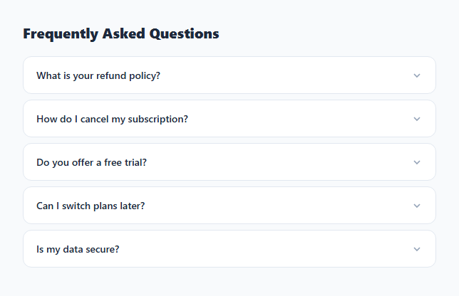
An accordion FAQ lets users expand one question at a time to read the answer, keeping the page compact while making all questions visible. The single-open pattern — collapsing the previous item when a new one opens — is the standard for FAQs, settings panels, and any list of collapsible content.
The toggle function
toggle(btn) finds the .item via btn.closest('.item'), checks if it has .open, then closes ALL open items with querySelectorAll('.item.open').forEach(i => i.classList.remove('open')). If the clicked item was not already open, it adds .open. This single-open-at-a-time pattern prevents the FAQ from becoming an incomprehensible wall of open answers.
The max-height CSS transition
The .answer div has max-height: 0; overflow: hidden; transition: max-height 0.3s by default. When .open is added, max-height: 500px applies. CSS animates between these values. Using max-height instead of height works because height: auto cannot be transitioned — max-height on a value large enough to never clip the content effectively animates the reveal.
The chevron rotation
The question row contains an SVG chevron. .item.open .q svg { transform: rotate(180deg) } with transition: transform 0.3s rotates the chevron when the item opens. This communicates the expand/collapse state at a glance.
Initial open state
The last dispatchEvent(new MouseEvent('click')) call in the JS opens the first item on page load. Remove this line to start with all items closed.
The max-height animation technique
CSS cannot animate from height: auto to height: 0 directly. The accordion uses max-height instead: the closed state has max-height: 0; overflow: hidden. The open state applies max-height: 500px (larger than any possible content). CSS transition: max-height 0.3s ease animates between these values. The transition feels natural even though max-height: 500px is much larger than the actual content height — the ease-out timing makes it decelerate near the end, which coincidentally matches when the content is near its natural height.
Chevron rotation
The chevron uses transform: rotate(180deg) when .open is applied to the parent item. CSS transition: transform 0.25s eases the rotation. This provides visual feedback that the item is a toggle without requiring a separate open/close icon pair.
Single-open accordion behaviour
The toggle() function closes all items before opening the clicked one: document.querySelectorAll('.faq-item').forEach(el => el.classList.remove('open')). This ensures only one answer is visible at a time — the accordion pattern. Remove this close-all block to allow multiple items open simultaneously if your FAQ content benefits from side-by-side comparison.
Build with AI
Build, Understand, Optimize, and Extend It With AI
You don't have to puzzle out the timing tricks alone — paste this snippet's HTML, CSS, and JS into an AI coding assistant like Claude and ask it to explain exactly why max-height is used instead of height for the answer transition, and why the value is set to a fixed number like 200px rather than something dynamic. The same assistant can help optimize it — for instance asking whether a ResizeObserver-based measurement would be more robust than a hardcoded max-height for answers of very different lengths. It's just as useful for extending the component: ask it to add aria-expanded and aria-controls for full accessibility, animate multiple items open at once by removing the close-all loop, or wire it up to FAQ schema JSON-LD automatically from the same data. Treat the code less like a finished artifact and more like a starting point for a conversation.
Prompt to recreate it
Copy this into your AI assistant of choice to build the effect from scratch, or as a jumping-off point for your own variant:
Build a single-open accordion FAQ in plain HTML, CSS, and JavaScript — no libraries, using only class toggling and a max-height transition for the expand/collapse animation.

Requirements:
- A list of question/answer items, each with a button header (containing the question text and a chevron SVG icon) and a hidden answer panel below it.
- Clicking a question's button must first remove an "open" class from every other item, then toggle it onto the clicked item only if it wasn't already open — so at most one answer is expanded at any time, and clicking an already-open item closes it.
- The answer panel must start with max-height: 0 and overflow: hidden, and transition to a max-height value large enough to never clip the tallest expected answer when the "open" class is present — explain in a comment why height: auto cannot be transitioned and max-height is the workaround.
- The chevron icon must rotate 180 degrees with its own CSS transition when its parent item gains the "open" class, so it visually points the opposite direction when expanded.
- One item should be open by default when the page loads (not all closed).
- Do not use any animation or accordion library — the entire interaction should be driven by one small toggle function that manipulates classList.
Want to tighten it up first? Run this prompt through the AI Prompt Studio to score it across 8 quality dimensions, catch anti-patterns, and tune the wording for Claude, ChatGPT, or Gemini before you paste it in.
Step by step
How to Use
- 1Click each questionClick question headers to expand answers. Clicking a new question collapses the current open item — single-open pattern.
- 2Update questions and answersIn the HTML panel, change the .q button text and .a div content for each .item.
- 3Add more itemsCopy an .item div and paste it inside .faq. The toggle function picks up any .item with a .q button.
- 4Change animation speedUpdate 0.3s on transition: max-height in the CSS panel.
- 5Allow multiple open itemsIn the JS panel, remove the querySelectorAll close-all loop to allow multiple items to be open simultaneously.
- 6Export in your formatClick "HTML" for a standalone file, "JSX" for a React component, or "Tailwind" for a React + Tailwind version.
Real-world uses
Common Use Cases
Got questions?
Frequently Asked Questions
toggle() first closes all elements with .open via querySelectorAll(".item.open").forEach(i => i.classList.remove("open")). Then if the clicked item was not already open, it adds .open. Clicking an already-open item closes it without reopening.
height: auto cannot be CSS-transitioned. max-height on a value larger than the content (500px) acts as height: auto — the element shows its full height. Setting max-height: 0 with overflow: hidden collapses it. CSS transitions can animate between these two max-height values.
Remove the querySelectorAll(".item.open").forEach(i => i.classList.remove("open")) loop from toggle(). Only the final if (!isOpen) item.classList.add("open") needs to remain.
Add a <script type="application/ld+json"> with @type: FAQPage and mainEntity array. Each item in the array has @type: Question, name (the question text), and acceptedAnswer.text (the answer). Google uses this for rich results in search.
Add aria-expanded="false" to the .q button and toggle it to "true" when .open is added. Add aria-controls="answer-id" pointing to the .answer div id. Add role="region" and aria-labelledby to the answer container.
Yes. Click "JSX" for a React component. In React, manage an openIndex state. Compare each item index to openIndex to determine the .open class and chevron rotation. Set openIndex to null or to the clicked index.