You Might Also Like
Learn Coding Visually
Learn to code with interactive, live-preview playgrounds — HTML, CSS, JavaScript, React & more.
 HTML Playground42 lessons · Click-based · Live preview
 CSS PlaygroundLearn CSS with a live editor
 JavaScript Playground60 lessons · DOM · Async · Canvas
 React PlaygroundLearn React with a live code editor
 GSAP PlaygroundLearn GSAP animation interactively
 SVG Playground44 lessons · shapes · paths · animation
 SCSS Playground45 lessons · Sass modules · tokens
 Tailwind PlaygroundLearn Tailwind CSS with a live editor
 Bootstrap 5 Playground50 lessons · live preview
Account Switcher — Free HTML CSS JS Workspace Menu
Account Switcher · Navigation · Plain HTML, CSS & JS · Live preview
What's included
Features
About this UI Snippet
Account Switcher — Workspace Dropdown with Active Checkmark and Outside-Click Close
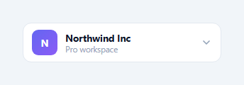
Any app that supports multiple workspaces, organisations, or accounts — Slack, Notion, Vercel, Linear, GitHub — needs a switcher: a trigger showing the current account, and a dropdown to jump between the others. This component is exactly that, built in HTML, CSS, and vanilla JavaScript: a trigger button with the active workspace's avatar, name, and plan; a dropdown listing all workspaces with a checkmark on the current one; and create-workspace and sign-out actions below a divider. It handles the disclosure animation, switching, click-outside and Escape close, and ARIA wiring.
The trigger that mirrors the selection
The trigger button shows the active workspace: a gradient avatar with its initial, the workspace name (truncated with ellipsis so a long name never breaks the layout), the plan label beneath it, and a chevron that rotates 180 degrees when the menu opens. When you switch workspaces, switchTo() updates all of these in place — the avatar's letter and gradient, the name, and the plan — so the trigger always reflects the current context at a glance, the way the top-left switcher does in the apps users already know.
Data-driven workspace list
The dropdown is generated from a WORKSPACES array of { name, plan, initial, color } objects. buildList() renders each as a menu item with its gradient avatar, name, plan, and a checkmark that is visible only on the active workspace (toggled by an .active class with opacity). Rebuilding the list on every switch keeps the checkmark in sync with the selection with no per-item bookkeeping. Adding a workspace is one array entry.
The disclosure animation
The menu starts hidden with opacity: 0, transform: translateY(-8px) scale(0.98), and pointer-events: none. Adding the open class transitions it to full opacity and scale(1) with the transform origin at the top, so it grows downward out of the trigger — the standard dropdown reveal. Because pointer-events are disabled while closed, the invisible menu never intercepts clicks meant for the page behind it.
Robust close behaviour
A dropdown must close when you click elsewhere or press Escape. The outside-click handler uses e.composedPath().includes(...) rather than e.target.closest(), checking whether the click landed inside the menu or the trigger. composedPath() captures the full event path at dispatch time, which is more reliable than closest() when list items are re-rendered (the active item's DOM node is replaced on switch, which can break closest()-based checks). The trigger's own click uses stopPropagation() so it toggles the menu without immediately triggering the document handler that would close it. Escape closes it from anywhere.
Accessible menu semantics
The trigger carries aria-haspopup="true" and aria-expanded that flips with the open state, the dropdown has role="menu", and each workspace and action has role="menuitem". Every interactive element is a real <button>, so the whole switcher is keyboard-focusable and operable out of the box, and screen readers announce it as a menu with the correct expanded state.
Customisation
Replace the WORKSPACES array with your real accounts, use <img> avatars in place of the gradient initials if you have logos, and wire switchTo() to actually change the active workspace in your app (navigate, set a cookie, or call an API). Point the "Create workspace" and "Sign out" actions at your routes. Swap the #6366f1 accent used by the checkmark and hover states for your brand. The whole component is 280px wide by default and sits in a relatively positioned wrapper, so it drops neatly into a sidebar or top bar.
Build with AI
Build, Understand, Optimize, and Extend It With AI
You don't have to trace the outside-click logic by hand — paste this snippet's HTML, CSS, and JS into an AI coding assistant like Claude and ask it to explain exactly why e.composedPath() is used instead of e.target.closest() to detect clicks outside the menu, and what specific scenario (the list being rebuilt on every switch) makes closest() unreliable here. The same assistant is useful for optimizing it — asking whether rebuilding the entire workspace list with innerHTML on every switch is wasteful compared to just toggling the active class and checkmark on existing nodes. It's just as good for extending the switcher: ask it to add keyboard arrow-key navigation between menu items, persist the last-selected workspace to localStorage, or support workspace logo images with a graceful fallback to the gradient initial. Treat the code less like a finished artifact and more like a starting point for a conversation.
Prompt to recreate it
Copy this into your AI assistant of choice to build the effect from scratch, or as a jumping-off point for your own variant:
Build an account/workspace switcher dropdown in plain HTML, CSS, and JavaScript — no libraries, driven by a plain data array.

Requirements:
- A trigger button showing the currently active workspace: a gradient-colored avatar with an initial letter, the workspace name (truncated with an ellipsis if too long), a secondary plan label beneath it, and a chevron icon that rotates 180 degrees when the menu is open.
- A dropdown menu, initially hidden via opacity 0, a translateY/scale transform, and pointer-events none (not display: none), that reveals with a transition to opacity 1 and scale 1 anchored from its top edge when an "open" class is added.
- The dropdown's list of workspaces must be generated entirely from a JavaScript array of objects (name, plan, initial, color), rebuilt into DOM elements every time the active workspace changes, with a checkmark icon visible only on the currently active item.
- Clicking a workspace in the list must update the trigger's avatar, name, and plan to match the selection and close the menu.
- Implement outside-click-to-close using event.composedPath() (not closest() or contains()) to check whether the click landed inside the menu or trigger, specifically because the list DOM nodes get replaced on every selection and a stale reference could otherwise cause incorrect behavior. Also close the menu on the Escape key.
- Give the trigger aria-haspopup and aria-expanded attributes that reflect state, mark the dropdown with role="menu" and each item with role="menuitem", and use real button elements throughout so the whole thing is keyboard operable.
- Include a divider and two extra actions below the workspace list (e.g. "Create workspace" and "Sign out").
Want to tighten it up first? Run this prompt through the AI Prompt Studio to score it across 8 quality dimensions, catch anti-patterns, and tune the wording for Claude, ChatGPT, or Gemini before you paste it in.
Step by step
How to Use
- 1Paste the HTML, CSS, and JSA trigger button shows the current workspace's avatar, name, and plan, with a chevron.
- 2Click the triggerThe dropdown grows downward listing all workspaces, with a checkmark on the active one, plus Create and Sign out actions.
- 3Pick a workspaceThe trigger's avatar, name, and plan update to the chosen workspace, the checkmark moves, and the menu closes.
- 4Click outside or press EscapeThe menu closes reliably whether you click elsewhere on the page or hit Escape.
- 5Add your workspacesEdit the WORKSPACES array; the list, avatars, and active checkmark all update automatically.
- 6Wire up actionsMake switchTo() change the active workspace in your app and point Create/Sign out at your routes; swap the accent colour.
Real-world uses
Common Use Cases
Got questions?
Frequently Asked Questions
Because the menu rebuilds its list on every switch, the DOM node you clicked may be replaced before the document handler runs, which can make target.closest('.acs-menu') return null and close the menu unexpectedly. e.composedPath() captures the full event path at dispatch time — before any re-render — so checking whether it includes the menu or trigger is reliable even right after a list rebuild.
In switchTo(), after updating the UI, perform your real switch: navigate to the workspace route (location.href or your router), set a workspace cookie/header, or call an API to change the active org, then reload the relevant data. The UI update and the real switch are separate concerns — the snippet handles the former so you can drop your logic into the latter.
Add an img field to each WORKSPACES entry and render <img class="acs-item-av" src={w.img}> (with object-fit: cover) instead of the initial span, doing the same for the trigger's .acs-avatar. Keep the gradient-initial version as a fallback for workspaces without a logo so the list always looks complete.
Yes to both. A document keydown handler closes it on Escape from anywhere, and a document click handler closes it whenever the click is outside the menu and trigger. The trigger's own click uses stopPropagation so toggling open does not instantly hit the document handler and close again. This matches the close behaviour users expect from any dropdown.
Hold open and activeIndex in state. Render WORKSPACES with .map/v-for/*ngFor, binding each item's .active class to its index. The trigger toggles open; bind aria-expanded and the chevron rotation to it. For outside-click, add a document listener in an effect that closes on clicks outside a ref to the wrapper, and remove it on cleanup; add an Escape key handler too. switchTo sets activeIndex and runs your real switch. All the CSS ports unchanged.