You Might Also Like
Learn Coding Visually
Learn to code with interactive, live-preview playgrounds — HTML, CSS, JavaScript, React & more.
 HTML Playground42 lessons · Click-based · Live preview
 CSS PlaygroundLearn CSS with a live editor
 JavaScript Playground60 lessons · DOM · Async · Canvas
 React PlaygroundLearn React with a live code editor
 GSAP PlaygroundLearn GSAP animation interactively
 SVG Playground44 lessons · shapes · paths · animation
 SCSS Playground45 lessons · Sass modules · tokens
 Tailwind PlaygroundLearn Tailwind CSS with a live editor
 Bootstrap 5 Playground50 lessons · live preview
Responsive Table to Cards — Free HTML CSS Mobile Table Snippet
Responsive Table to Cards · Tables · Plain HTML, CSS & JS · Live preview
What's included
Features
About this UI Snippet
Responsive Table to Cards — CSS-Only Mobile Table Snippet
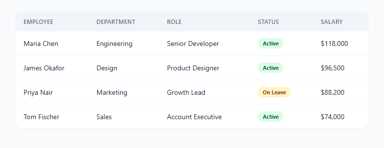
HTML tables are the right structure for tabular data, but they're notoriously bad on narrow screens — either they overflow horizontally or every column gets crushed unreadably thin. A common, elegant fix is to keep the semantic <table> markup for desktop and re-render each row as a self-contained "card" on mobile, with each cell's value paired with its own label.
This snippet does exactly that using pure CSS — no JavaScript at all.
How the desktop table works
On wider screens, this is a completely ordinary HTML table: <thead> with column headers, <tbody> with data rows, striped hover states, and a status badge. Nothing unusual.
How the mobile collapse works
Inside a @media (max-width: 640px) block, every table-related element is forced to display: block: the table, its body, each row, and each cell. This breaks the table out of its grid layout entirely — <thead> is hidden outright since column headers make no sense once there's no grid to label — and each <tr> becomes its own bordered, rounded "card" stacked vertically.
How the pseudo-header labels work
The clever part is what replaces the missing column headers. Every <td> in the HTML already carries a data-label attribute matching its column name, e.g. <td data-label="Department">Engineering</td>. Inside the mobile media query, a ::before pseudo-element on every td uses content: attr(data-label) to pull that attribute's value and render it as text — no duplicate label markup, no JavaScript to inject text nodes. Each cell is then laid out with display: flex; justify-content: space-between, so the generated label sits on the left and the actual cell value sits on the right, like a mobile settings row.
Why data-label instead of a JS-based transform
Because the label text lives in an HTML attribute rather than being computed by JavaScript, this technique keeps working even if scripts are disabled, degrades gracefully, and requires zero runtime cost — the browser's own CSS engine does the entire transformation via a single media query breakpoint.
Choosing the breakpoint
640px is used here because it comfortably fits five columns' worth of stacked rows on a typical phone screen. Adjust the breakpoint to match wherever your specific table's columns actually start feeling cramped in your own layout.
Build with AI
Build, Understand, Optimize, and Extend It With AI
Paste this snippet's HTML and CSS into an AI coding assistant like Claude and ask it to explain exactly how the CSS attr() function reads the data-label attribute inside the ::before pseudo-element, and why this specific transformation needs every table-related element forced to display: block rather than just changing the table's own display property. It's also worth asking the assistant to help apply this exact pattern to a different table you already have in your codebase — describe your table's columns and ask it to generate the matching data-label attributes and confirm the media query breakpoint makes sense for your content's actual character lengths.
Prompt to recreate it
Copy this into your AI assistant of choice to build the effect from scratch, or as a jumping-off point for your own variant:
Build a responsive HTML table that renders as a normal table on desktop and collapses into stacked "cards" on mobile — pure CSS only, no JavaScript.

Requirements:
- A standard semantic <table> with <thead>, <tbody>, multiple columns, and at least one cell per row containing rich content (such as a colored status badge), not just plain text.
- Every <td> must carry a data-label attribute exactly matching its column's header text.
- Inside a single @media (max-width: ...) query, force the table, tbody, tr, and td elements all to display: block, and hide the thead entirely, so the table breaks out of its grid layout and each row becomes an independently stacked block.
- Inside that same media query, give each td a ::before pseudo-element with content: attr(data-label) to render the column name as a label pulled directly from the data-label attribute — do not duplicate the label text anywhere else in the markup or in JavaScript.
- Lay out each mobile td as a flex row with the generated label on the left and the actual cell value right-aligned on the right, and wrap each tr in a bordered, rounded card style with spacing between cards.
- The solution must scale to any number of columns or rows without any JavaScript and without duplicating label text outside the data-label attributes.
Want to tighten it up first? Run this prompt through the AI Prompt Studio to score it across 8 quality dimensions, catch anti-patterns, and tune the wording for Claude, ChatGPT, or Gemini before you paste it in.
Step by step
How to Use
- 1Load the snippetClick "Responsive Table to Cards" in the sidebar Library tab. The preview shows a normal employee table.
- 2Switch to the Mobile device previewClick the Mobile (375px) device button above the preview to see the table collapse into stacked cards with visible field labels.
- 3Check the data-label attributesIn the HTML panel, confirm every <td> has a data-label matching its column header — this is what powers the mobile labels.
- 4Add a new columnAdd a new <th> in the header row and a matching <td data-label="..."> in every row — the mobile card layout picks it up automatically.
- 5Adjust the breakpointIn the CSS panel, change the max-width value in the @media query to match where your own table starts feeling cramped.
- 6Export in your formatClick "HTML" for a standalone file, "JSX" for React, or "Tailwind" for React + Tailwind CSS.
Real-world uses
Common Use Cases
Got questions?
Frequently Asked Questions
No. The entire table-to-card transformation happens with a single CSS media query and the attr() function — there is no JavaScript in this snippet at all.
Every <td> has a data-label attribute matching its column, such as data-label="Department". A ::before pseudo-element inside the mobile media query uses content: attr(data-label) to render that attribute's value as visible text, positioned to the left of the actual cell value.
Once every table element is forced to display: block, there is no longer a tabular grid for the column headers to label — the headers would just appear as an orphaned row above the stacked cards, so thead is hidden entirely and each cell gets its own inline label instead.
Yes. Add a new <th> to the header row and a matching <td data-label="Your Column"> to every row in the body — the CSS reads the data-label dynamically, so no additional CSS or JavaScript changes are needed to support the new column.
Edit the max-width value in the @media (max-width: 640px) rule in the CSS panel to whatever pixel width matches when your specific table starts feeling too cramped for its column count.
Yes, largely — the underlying markup remains a real <table> with <th> and <td> elements, so screen readers still understand the row and column relationships even though the visual presentation changes with CSS alone.
Yes. Any HTML inside a <td> — badges, icons, links, buttons — renders exactly as normal on the right side of its flex row; only the layout direction changes, not the cell content itself.
It depends on the use case. Horizontal scroll preserves the exact table shape but requires users to scroll sideways to read later columns; the card collapse shown here reads top-to-bottom naturally on a phone but takes more vertical space per row. For wide tables with many columns, cards are usually the more mobile-friendly choice.