Learn Coding Visually
Learn to code with interactive, live-preview playgrounds — HTML, CSS, JavaScript, React & more.
 HTML Playground42 lessons · Click-based · Live preview
 CSS PlaygroundLearn CSS with a live editor
 JavaScript Playground60 lessons · DOM · Async · Canvas
 React PlaygroundLearn React with a live code editor
 GSAP PlaygroundLearn GSAP animation interactively
 SVG Playground44 lessons · shapes · paths · animation
 SCSS Playground45 lessons · Sass modules · tokens
 Tailwind PlaygroundLearn Tailwind CSS with a live editor
 Bootstrap 5 Playground50 lessons · live preview
Sticky Table Header — Free HTML CSS Scrollable Table Snippet
Sticky Table Header · Tables · Plain HTML, CSS & JS · Live preview
What's included
Features
About this UI Snippet
Sticky Table Header — CSS position: sticky Scrollable Table
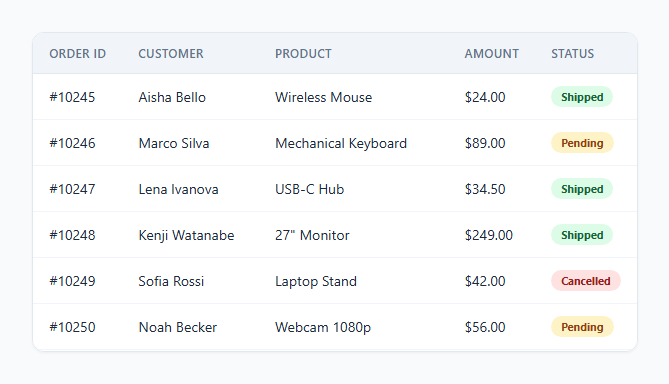
Long data tables — order lists, transaction histories, leaderboards — become hard to read once you scroll past the header row and lose track of which column is which. The fix is a table header that stays pinned in place while the rows beneath it keep scrolling, and modern CSS can do this with a single property: position: sticky.
This snippet builds a scrollable table with a pinned header using pure CSS — no JavaScript, no scroll event listeners.
How the sticky header works
The table lives inside a .table-scroll container with a fixed max-height and overflow-y: auto, which makes it the scrolling context for everything inside it. Every <th> in the <thead> gets position: sticky; top: 0. Sticky positioning behaves like relative until the element would scroll past the specified offset (top: 0 here), at which point it "sticks" and behaves like position: fixed *relative to its scrolling ancestor* — in this case, .table-scroll rather than the whole page. As the <tbody> rows scroll upward inside the container, the header row simply never leaves the top of the visible area.
Why the header needs its own background
Sticky elements don't automatically get an opaque backdrop — without one, the scrolling body rows would visually show through and overlap the header text as they pass beneath it. Setting background: #f1f5f9 on every sticky <th> (not just the <thead> as a whole, since some browsers don't propagate background through to sticky children reliably) keeps the header fully opaque against the scrolling content behind it.
Why z-index is set
A small z-index: 1 ensures the sticky header renders above the table body's rows in the stacking order, which matters if any body content (like a border or hover background) would otherwise visually compete with the header at the boundary where they meet.
Sticky vs. fixed vs. JavaScript scroll listeners
Before position: sticky had solid browser support, this effect required either a duplicated header element repositioned with JavaScript on scroll, or a fixed-position header requiring careful width syncing with the underlying table. position: sticky avoids both — it's declarative, has no JavaScript scroll listener overhead, and the browser handles all position calculations natively and efficiently.
Build with AI
Build, Understand, Optimize, and Extend It With AI
Give this snippet's HTML and CSS to an AI coding assistant like Claude and ask it to explain precisely why position: sticky resolves against .table-scroll rather than the browser viewport, and why the opaque background has to live on the individual th elements rather than on thead itself for the pinned effect to look correct while rows scroll underneath. It's also a good snippet to extend with the assistant's help — ask it to add a sticky first column for pinning both an identifying row and the header simultaneously, or to add a subtle box-shadow beneath the sticky header that only appears once the table has actually been scrolled, giving users a clearer visual cue that content is hidden above.
Prompt to recreate it
Copy this into your AI assistant of choice to build the effect from scratch, or as a jumping-off point for your own variant:
Build a scrollable data table with a header row that stays pinned to the top while the body scrolls beneath it, using plain HTML and CSS only — no JavaScript, no scroll event listeners.

Requirements:
- A table wrapped in a container with a fixed max-height and overflow-y: auto, so the container itself becomes the scrolling context for the table.
- Apply position: sticky and top: 0 to every header cell (not the thead element as a whole) so the header row remains visible at the top of the scrolling container regardless of how far the body has scrolled.
- Give the sticky header cells their own opaque background color so that scrolling body rows never visually show through or overlap the header text as they pass beneath it.
- Set an appropriate z-index on the sticky header cells so they render above the table body content at the boundary where they meet.
- The table body should contain at least ten rows of realistic tabular data with a status badge or similarly styled inline element in at least one column, to verify the sticky effect works correctly with rich cell content.
- The solution must not use any JavaScript at all — the entire sticky behavior must come from CSS position: sticky.
Want to tighten it up first? Run this prompt through the AI Prompt Studio to score it across 8 quality dimensions, catch anti-patterns, and tune the wording for Claude, ChatGPT, or Gemini before you paste it in.
Step by step
How to Use
- 1Load the snippetClick "Sticky Table Header" in the sidebar Library tab. The preview shows a scrollable order table inside a fixed-height container.
- 2Scroll inside the tableScroll down within the table area in the preview and watch the header row stay pinned at the top while the order rows scroll beneath it.
- 3Adjust the scroll container heightIn the CSS panel, change max-height on .table-scroll to control how many rows are visible before scrolling kicks in.
- 4Add more rowsIn the HTML panel, add more <tr> rows to the tbody — the sticky header behavior applies automatically with no other changes.
- 5Restyle the headerIn the CSS panel, update the background and text color on .sticky-table thead th to match your brand, keeping it opaque.
- 6Export in your formatClick "HTML" for a standalone file, "JSX" for React, or "Tailwind" for React + Tailwind CSS.
Real-world uses
Common Use Cases
Got questions?
Frequently Asked Questions
No. position: sticky is a native CSS layout mode. The browser automatically keeps the header pinned to the top of its scrolling container as the user scrolls — there is no JavaScript involved anywhere in this snippet.
Sticky elements don't automatically render an opaque backdrop. Without a background set directly on the sticky th elements, the scrolling body rows underneath would visually bleed through the header text as they pass beneath it.
position: sticky resolves relative to the nearest ancestor with a scrolling overflow context. Because .table-scroll has overflow-y: auto and a fixed max-height, it becomes that scrolling context, and the header sticks within its bounds rather than sticking to the browser viewport.
Yes. Remove the max-height and overflow-y: auto from .table-scroll so the table scrolls with the page itself — the sticky header will then pin to the top of the browser viewport instead of a boxed container.
Yes. Apply position: sticky; left: 0 to the first column's th and td elements (with their own background color), and it will remain pinned to the left edge while the table scrolls horizontally, independent of the vertical header stickiness.
Yes, it has solid support in all current major browsers. In very old browsers without support, the header simply behaves like a normal static row and scrolls away with the rest of the table — a safe, non-breaking fallback.
Adjust the max-height value on .table-scroll in the CSS panel — a larger value shows more rows before the container starts scrolling, a smaller value shows fewer.
Yes, as long as overflow-x and overflow-y are both handled on the same scrolling container — the sticky top offset continues to apply independently of horizontal scroll position.