You Might Also Like
Learn Coding Visually
Learn to code with interactive, live-preview playgrounds — HTML, CSS, JavaScript, React & more.
 HTML Playground42 lessons · Click-based · Live preview
 CSS PlaygroundLearn CSS with a live editor
 JavaScript Playground60 lessons · DOM · Async · Canvas
 React PlaygroundLearn React with a live code editor
 GSAP PlaygroundLearn GSAP animation interactively
 SVG Playground44 lessons · shapes · paths · animation
 SCSS Playground45 lessons · Sass modules · tokens
 Tailwind PlaygroundLearn Tailwind CSS with a live editor
 Bootstrap 5 Playground50 lessons · live preview
Rental Car Comparison Cards — Free Class Comparison Snippet
Rental Car Comparison Cards · Cards · Plain HTML, CSS & JS · Live preview
What's included
Features
About this UI Snippet
Rental Car Comparison Cards — Silhouettes, Capacity, and a Chosen State
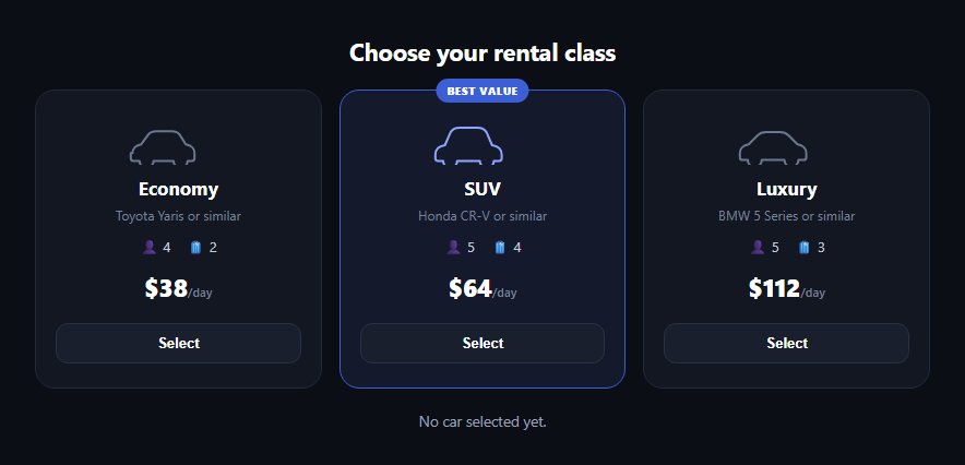
The rental car comparison card is the row of class options rental sites show before checkout — Economy, SUV, Luxury — each with a car silhouette, seat and bag capacity, a price per day, and a select button that visibly marks the chosen class. This snippet builds it in plain HTML, CSS, and JavaScript, no dependencies.
One inline SVG silhouette per class
Each card's icon is a hand-drawn inline SVG path rather than a photo, so it recolors with currentColor and scales crisply at any size. The three paths are deliberately similar but not identical — the SUV's is taller and boxier, the luxury car's roofline is longer — so the silhouettes alone hint at the class difference before you read a single label.
Capacity as glanceable icon pairs
Seats and bags render as small emoji-plus-number pairs (👤 5, 🧳 4) rather than a sentence, matching how comparison tables on real rental sites present capacity — fast to scan across three cards side by side.
A featured card, set apart in markup
The SUV card carries an extra .rcc-featured class and a "Best value" badge — a common rental-site nudge toward the middle option. It's a static markup difference, not JS-driven, so promoting a different class to "featured" is a one-line HTML change.
Selection state lives on the card, not just the button
Clicking any "Select" button sets data-selected="true" on its parent card and "false" on the other two, and every visual change — border color, background tint, lift, silhouette recolor, button relabeling to "Selected ✓" — is driven by that one attribute per card. A summary line below the cards confirms the chosen class in plain language.
Single-selection logic in one loop
The click handler loops over every card to reset its data-selected attribute before applying the new selection, so there's never a state where two cards claim to be selected — the same pattern you'd use for a mutually exclusive card group backed by radios, but written as plain buttons here since the UI reads more like a comparison than a form.
Customizing it
Add a fourth class, wire the price to real per-day rates from a rental API, or turn the buttons into real radio inputs if the cards live inside a booking form. Pair it with a flight search form, property listing card, or radio card group elsewhere in a trip-planning flow.
Build with AI
Build, Understand, Optimize, and Extend It With AI
Rather than redrawing the car silhouettes or working out the selection logic yourself, paste this snippet's HTML, CSS, and JS into an AI coding assistant like Claude and ask it to explain how a data-selected attribute set per card, reset in a loop on every click, guarantees exactly one card is ever marked as selected, and how the inline SVG silhouettes use currentColor so the same path recolors automatically when a card becomes selected. It's also useful for extending the cards — ask it to add a fourth rental class, convert the Select buttons into real radio inputs so the choice can submit as part of a larger booking form, or wire the prices to live per-day rates from a rental API. Use it to adapt the comparison pattern to your data rather than shipping the static demo prices.
Prompt to recreate it
Copy this into your AI assistant of choice to build the effect from scratch, or as a jumping-off point for your own variant:
Build a "rental car comparison cards" row in plain HTML, CSS, and JavaScript with no external dependencies.

Requirements:
- Three cards for rental classes (Economy, SUV, Luxury) laid out side by side in a responsive grid that wraps to one column on narrow screens.
- Each card includes an inline SVG car-silhouette icon (not an image), drawn simply enough to differ visibly between classes (e.g. the SUV taller/boxier, the luxury car with a longer roofline), styled to use currentColor so it can recolor via CSS.
- Each card shows a class name, an example model, small seat and bag capacity indicators (icon plus number, e.g. "seats 5" and "bags 4"), a price per day, and a Select button.
- Mark one card as "featured" with a small badge (e.g. "Best value") using a static CSS class in the markup, not JavaScript.
- Clicking a card's Select button should mark that card as selected via a data-selected="true" attribute (resetting the other cards' attributes to "false" in the same click), and every selected-state visual change — border color, background tint, slight lift on hover/selection, silhouette recolor, and the button relabeling to "Selected ✓" — should be driven by that single attribute.
- A summary line below the cards that updates to name which class is currently selected in plain language, and reads something neutral like "No car selected yet" before any selection is made.
Want to tighten it up first? Run this prompt through the AI Prompt Studio to score it across 8 quality dimensions, catch anti-patterns, and tune the wording for Claude, ChatGPT, or Gemini before you paste it in.
Step by step
How to Use
- 1Paste HTML, CSS, and JSThree rental class cards render side by side.
- 2Click Select on a cardThat card lifts, recolors, and its button confirms.
- 3Note the featured badgeThe SUV card is marked "Best value" in markup.
- 4Read the summary lineConfirms which class is currently chosen.
- 5Add a fourth classCopy a card, adjust its silhouette path and data.
- 6Wire real pricingReplace the static price with rental API data.
Real-world uses
Common Use Cases
Got questions?
Frequently Asked Questions
Clicking a Select button sets data-selected="true" on its own card and "false" on the other two. Every visual change tied to selection — border color, background tint, a slight lift, the silhouette's recolor, and the button's relabel to "Selected ✓" — is a CSS or JS rule keyed off that one attribute per card.
No, each is an inline SVG path drawn to resemble a car silhouette, so it inherits color via currentColor and stays crisp at any size. The three paths differ slightly in proportion (economy is compact, SUV is boxier and taller, luxury has a longer roofline) to hint at the class visually.
The click handler loops over every card on each click, first resetting all three data-selected attributes to false, then setting true only on the card matching the clicked button's data-class. This guarantees exactly one card is marked selected after every click.
Move the rcc-featured class and the .rcc-badge markup from the SUV article to whichever card should be highlighted — it's a static structural change, not something driven by JavaScript, so no script changes are needed.
Yes — if these cards live inside a larger booking form, swap each Select button for a visually hidden radio input sharing a name, using the input:checked + selector pattern (as in the hotel room picker snippet) to drive the same selected styling, which also gives you native form submission of the chosen class.