You Might Also Like
Learn Coding Visually
Learn to code with interactive, live-preview playgrounds — HTML, CSS, JavaScript, React & more.
 HTML Playground42 lessons · Click-based · Live preview
 CSS PlaygroundLearn CSS with a live editor
 JavaScript Playground60 lessons · DOM · Async · Canvas
 React PlaygroundLearn React with a live code editor
 GSAP PlaygroundLearn GSAP animation interactively
 SVG Playground44 lessons · shapes · paths · animation
 SCSS Playground45 lessons · Sass modules · tokens
 Tailwind PlaygroundLearn Tailwind CSS with a live editor
 Bootstrap 5 Playground50 lessons · live preview
Restaurant Menu Item Customizer — Free Live-Total Order Card
Restaurant Menu Item Customizer · Cards · Plain HTML, CSS & JS · Live preview
What's included
Features
About this UI Snippet
Restaurant Menu Item Customizer — Sizes, Add-ons, and a Live Total
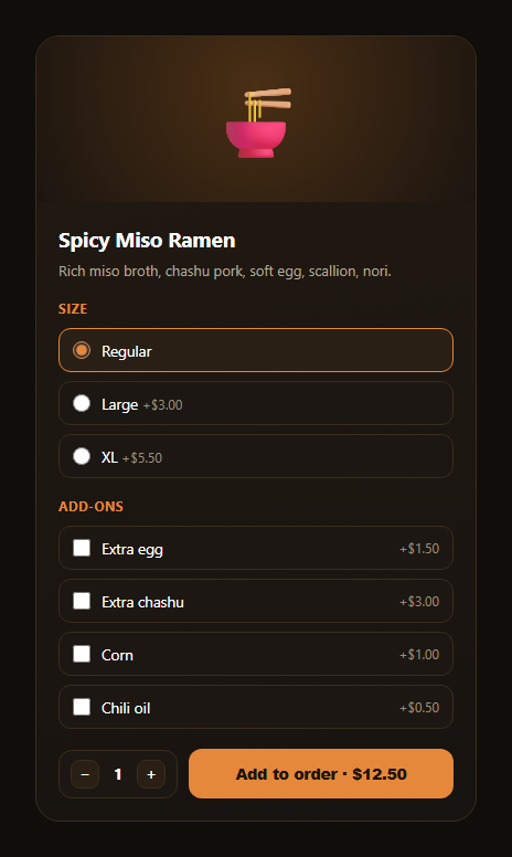
The menu item customizer is the detail card food ordering apps show when you tap a dish — a base item you can size up, load with add-ons, and multiply by quantity, watching the total price update after every choice. This snippet builds it in plain HTML, CSS, and JavaScript, no dependencies.
Three price contributors, one calculation
The unit price is built from three sources: a fixed basePrice constant in JS, the checked size radio's data-delta (a price difference, which can be 0), and the sum of every checked add-on's data-price. calcUnitPrice() reduces all three into one number, then updateTotal() multiplies by quantity — so every possible combination of size, add-ons, and quantity resolves through the same two small functions.
Radios for size, checkboxes for add-ons — on purpose
Size is mutually exclusive (you can't order Regular and Large at once), so it's a radio group; add-ons are independent toggles, so they're checkboxes. Each price-affecting input carries its own data-delta or data-price, so the calculation logic never hardcodes an option's price — it just reads whatever's on the checked/selected inputs.
A visible selected state without extra JS
Both the radio and checkbox rows use the :has() selector — .mic-radio:has(input:checked) — to recolor the row's border and background when its input is checked, so the "selected" look is pure CSS reacting to native form state, not a class the JavaScript has to add and remove.
Quantity stepper feeding the same total
The quantity stepper works exactly like the reservation and room-picker patterns elsewhere in this library: clamped between 1 and 9, disabling at each bound, and calling the same updateTotal() every size, add-on, or quantity change touches.
A satisfying add-to-order moment
Clicking "Add to order" briefly swaps its label to "Added ✓" before reverting, a lightweight bit of feedback that doesn't require a toast library — just a setTimeout restoring the button's original markup.
Customizing it
Add a "spice level" radio group, a max-add-ons limit, or an out-of-stock disabled state for an add-on. Pair it with a quantity stepper, variant selector, or order summary further down the ordering flow.
Build with AI
Build, Understand, Optimize, and Extend It With AI
Instead of working out the price-calculation logic from scratch, paste this snippet's HTML, CSS, and JS into an AI coding assistant like Claude and ask it to explain how calcUnitPrice() combines a fixed base price, a size radio's data-delta, and the sum of checked add-on data-price values into one number, and why the selected-row highlight uses the CSS :has() selector instead of JavaScript class toggling. It's also a strong assistant for extending the card — ask it to add a "spice level" radio group, cap the number of selectable add-ons, disable an add-on that's out of stock, or wire the Add to order button into a real cart array with line items. Use the conversation to adapt the calculation and cart logic to your app instead of treating this as a finished checkout system.
Prompt to recreate it
Copy this into your AI assistant of choice to build the effect from scratch, or as a jumping-off point for your own variant:
Build a "restaurant menu item customizer" card in plain HTML, CSS, and JavaScript with no external dependencies.

Requirements:
- A dish card with an image/emoji area, a title, and a short description.
- A size section using a radio group (Regular / Large / XL), where each radio input carries a data-delta price attribute (Regular is 0) and only one size can be selected.
- An add-ons section using checkboxes (e.g. extra egg, extra protein, a topping, a sauce), each carrying its own data-price attribute, where any combination can be checked independently of the others.
- A visual "selected" highlight (border color + background tint) on whichever radio or checkbox row is currently checked, implemented using the CSS :has() selector rather than JavaScript adding/removing a class.
- A quantity stepper (decrement/increment buttons around a live count) clamped between 1 and 9, disabling each button at its bound.
- A single calcUnitPrice() function that sums a fixed base price, the checked size's data-delta, and every checked add-on's data-price, and a single updateTotal() function that multiplies that by the quantity and updates a total display on the "Add to order" button — call updateTotal() from the size radios' change event, the add-on checkboxes' change event, and the stepper buttons.
- Clicking "Add to order" should briefly show a confirmation state (e.g. change the label to "Added ✓" for about a second) before reverting to show the button with the current total again.
Want to tighten it up first? Run this prompt through the AI Prompt Studio to score it across 8 quality dimensions, catch anti-patterns, and tune the wording for Claude, ChatGPT, or Gemini before you paste it in.
Step by step
How to Use
- 1Paste HTML, CSS, and JSA dish card with size, add-ons, and stepper renders.
- 2Pick a sizeThe radio row highlights and price deltas apply.
- 3Toggle add-onsEach checked add-on adds its price to the total.
- 4Adjust quantityThe stepper multiplies the unit price live.
- 5Click Add to orderA brief "Added ✓" confirms the action.
- 6Wire it to a cartRead calcUnitPrice() and qty on add-to-order.
Real-world uses
Common Use Cases
Got questions?
Frequently Asked Questions
calcUnitPrice() adds a fixed basePrice, the currently checked size radio's data-delta, and the sum of every checked add-on checkbox's data-price. updateTotal() then multiplies that unit price by the quantity and writes the formatted result, so every input change routes through the same two functions.
Size options are mutually exclusive — a dish can only be one size at a time — which is exactly what a radio group enforces natively. Add-ons are independent; any combination can be selected, which is what checkboxes are for. Using the right native input type also gets correct keyboard and screen reader behavior for free.
Both .mic-radio and .mic-checkbox rows use a :has() CSS selector — e.g. .mic-radio:has(input:checked) — to change their border and background the moment the input inside them becomes checked. No JavaScript needs to add or remove a "selected" class; the highlight is pure CSS reacting to native form state.
The button's text briefly changes to "Added ✓" and then, after about a second, reverts to "Add to order" followed by the current total — a lightweight confirmation. In a real app you'd also push the configured item (size, add-ons, quantity, unit price) into your cart state at that point.
On the add-to-order click, call calcUnitPrice() and read qty to build a line item object, then push it into your cart state or send it to your backend. The DOM structure already exposes everything needed: the checked size input's value, the checked add-on values, and the quantity.