You Might Also Like
Learn Coding Visually
Learn to code with interactive, live-preview playgrounds — HTML, CSS, JavaScript, React & more.
 HTML Playground42 lessons · Click-based · Live preview
 CSS PlaygroundLearn CSS with a live editor
 JavaScript Playground60 lessons · DOM · Async · Canvas
 React PlaygroundLearn React with a live code editor
 GSAP PlaygroundLearn GSAP animation interactively
 SVG Playground44 lessons · shapes · paths · animation
 SCSS Playground45 lessons · Sass modules · tokens
 Tailwind PlaygroundLearn Tailwind CSS with a live editor
 Bootstrap 5 Playground50 lessons · live preview
Live Region Announcer Demo — Free ARIA aria-live Toast Pattern
Live Region Announcer Demo · Forms · Plain HTML, CSS & JS · Live preview
What's included
Features
About this UI Snippet
Live Region Announcer Demo — Toasts That Are Actually Announced
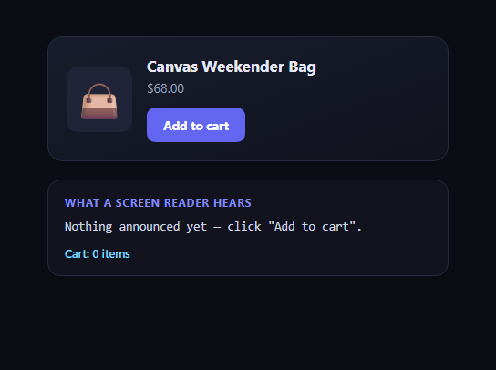
A visual toast that pops up, sits for two seconds, and fades away is a completely normal UI pattern — and completely invisible to a screen reader user unless the underlying element is wired up correctly. This snippet shows the two-part pattern that makes a confirmation message actually accessible: a visible toast for sighted users, plus a separate, visually-hidden aria-live="polite" region that receives the exact same message and gets announced automatically by assistive technology, with no focus change and nothing appearing on screen.
Why the toast alone isn't enough
Screen readers only announce dynamic content automatically when it lives inside a region the browser has marked as "live." A plain <div> that gets new textContent — even if it's visually obvious, colorful, and animated — is invisible to assistive technology unless it (or an ancestor) carries aria-live, role="status", or role="alert". This is one of the most common accessibility gaps in production apps: the toast looks done, ships, and passes every visual QA pass, while screen reader users never learn their action succeeded.
The sr-only pattern, done correctly
The hidden region uses position: absolute, a 1px×1px box, overflow: hidden, and clip: rect(0,0,0,0) — never display: none or visibility: hidden. Those two properties remove an element from the accessibility tree entirely, which means a live region hidden that way would never be announced at all, defeating its entire purpose. The sr-only technique keeps the element rendered (just clipped to nothing visually), so it stays fully present for assistive technology while being completely invisible on screen — the same off-screen principle used by the accessible skip-to-content link.
Forcing re-announcement of identical messages
A live region only announces when its content actually changes. Clicking "Add to cart" twice in a row would produce the exact same message string, and some screen readers won't re-announce unchanged text. The JS clears liveRegion.textContent first, then sets the new message on the next animation frame — a small but necessary trick that guarantees a fresh mutation the accessibility tree can detect, even when the words are identical to last time.
polite vs assertive
This demo intentionally uses aria-live="polite", which waits for the screen reader to finish whatever it's currently saying before announcing the new message — appropriate for a routine confirmation like a cart update. Time-critical or error messages instead want aria-live="assertive", which interrupts immediately; see the ARIA live status badge for a side-by-side comparison of the two politeness levels.
Where this pattern belongs
Any UI that confirms an action visually — form submissions, cart updates, saved-settings toasts, filter-applied banners — needs this same two-part treatment if it wants to be usable with a screen reader. Pair it with the toast notification component for the visual half, or the notification center for a persistent log of the same announcements.
Build with AI
Build, Understand, Optimize, and Extend It With AI
Paste this snippet's HTML, CSS, and JS into an AI coding assistant like Claude and ask it to walk through exactly why a visible toast alone fails screen reader users, and how the sr-only CSS pattern differs from display:none in terms of what stays in the accessibility tree. It's also a good prompt for auditing your own toast or notification component — ask the assistant to check whether your existing implementation has a paired live region, and if not, to add one using this same clear-then-set trick for forcing re-announcement of repeated messages. You can also ask it to extend the pattern to a queue, so multiple rapid actions get announced in sequence rather than one message clobbering the next before it's spoken. Treat this less as a finished widget and more as the reference case for making any toast, banner, or inline confirmation genuinely accessible.
Prompt to recreate it
Copy this into your AI assistant of choice to build the effect from scratch, or as a jumping-off point for your own variant:
Build an "Add to cart" button in plain HTML, CSS, and JavaScript that is accessible to screen reader users, not just sighted users.

Requirements:
- A visible toast notification that appears briefly (around 2 seconds) when the button is clicked, confirming the action with a message and an incrementing cart count.
- A separate, always-present element marked aria-live="polite" and aria-atomic="true" that receives the exact same confirmation message as the toast, so screen readers announce it automatically with no extra JavaScript speech API required.
- The live region must be visually hidden using the correct "screen-reader only" CSS technique: position:absolute, a 1px by 1px box, overflow:hidden, and clip:rect(0,0,0,0) — explicitly do NOT use display:none or visibility:hidden, since both remove an element from the accessibility tree and would make the live region silently unannounceable.
- Handle the case where the button is clicked multiple times in a row with a nearly identical message: clear the live region's text content first, then set the new message on the next animation frame, so a screen reader treats it as a fresh change and re-announces it even when the text is the same or very similar to what was just announced.
- The announcement must not move keyboard focus away from the button.
- Add a small on-page panel that displays exactly what text was just written into the hidden live region, purely so a sighted developer can verify what a screen reader would hear without needing one running.
Want to tighten it up first? Run this prompt through the AI Prompt Studio to score it across 8 quality dimensions, catch anti-patterns, and tune the wording for Claude, ChatGPT, or Gemini before you paste it in.
Step by step
How to Use
- 1Click "Add to cart"A green toast slides up from the bottom for about two seconds.
- 2Check the live region textThe panel below shows exactly what was written into the hidden aria-live region — the same message a screen reader would speak.
- 3Click it againThe cart count increments and a fresh announcement fires even though the message text is nearly identical.
- 4Turn on a screen readerWith VoiceOver, NVDA, or JAWS running, click the button — you'll hear the confirmation spoken with no visual toast required.
- 5Inspect the sr-only CSSNote it uses clip/position, never display:none, so the region stays in the accessibility tree.
- 6Swap in your own actionReplace the button and message with any confirmation your UI needs to announce.
Real-world uses
Common Use Cases
Got questions?
Frequently Asked Questions
Screen readers only automatically announce dynamic content inside an element marked as "live" (aria-live, role="status", or role="alert"). A plain div that gets new text, no matter how visually obvious, is silent to assistive technology unless it or an ancestor carries one of those attributes — so the toast can look completely finished while never being announced.
display:none and visibility:hidden both remove an element from the accessibility tree entirely, which means a live region hidden that way could never be announced — the exact opposite of what you want. The sr-only pattern keeps the element in the layout and accessibility tree while clipping it to a 1px box, so it is invisible on screen but still fully readable by assistive technology.
A live region only announces when its content changes. If you click "Add to cart" twice and the message string is identical both times, some screen readers won't detect a change and stay silent. Clearing textContent first, then setting the new message on the next frame, guarantees a real mutation the accessibility tree can pick up, even for repeated identical messages.
Routine, non-urgent confirmations like a cart update should use polite, which waits for any current speech to finish so it never interrupts the user mid-sentence. Reserve assertive for urgent or error conditions that truly need to interrupt immediately — see the ARIA live status badge snippet for a direct comparison of the two.
Yes — role="status" is implicitly aria-live="polite" and aria-atomic="true" in most browsers, so it is a reasonable shorthand for exactly this pattern. Explicitly setting aria-live="polite" alongside aria-atomic="true" as this snippet does is more verbose but leaves no ambiguity about the intended behavior across browser/AT combinations.