You Might Also Like
Learn Coding Visually
Learn to code with interactive, live-preview playgrounds — HTML, CSS, JavaScript, React & more.
 HTML Playground42 lessons · Click-based · Live preview
 CSS PlaygroundLearn CSS with a live editor
 JavaScript Playground60 lessons · DOM · Async · Canvas
 React PlaygroundLearn React with a live code editor
 GSAP PlaygroundLearn GSAP animation interactively
 SVG Playground44 lessons · shapes · paths · animation
 SCSS Playground45 lessons · Sass modules · tokens
 Tailwind PlaygroundLearn Tailwind CSS with a live editor
 Bootstrap 5 Playground50 lessons · live preview
ARIA Live Status Badge — Free polite vs assertive Live Region Demo
ARIA Live Status Badge · Dashboards · Plain HTML, CSS & JS · Live preview
What's included
Features
About this UI Snippet
ARIA Live Status Badge — polite vs assertive, Demonstrated Side by Side
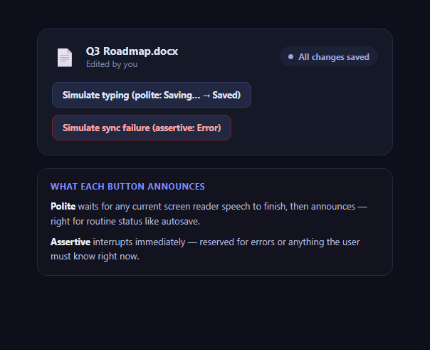
aria-live has exactly two commonly used politeness levels, and picking the wrong one is a frequent, subtle accessibility bug: routine status announced as assertive interrupts a screen reader user constantly and becomes noise they learn to tune out, while genuine errors announced as polite can queue behind other speech and go unnoticed at the worst possible moment. This snippet builds a small "Saving… → Saved" status badge, wired to two separate live regions, so you can trigger both politeness levels and feel the difference directly rather than just reading about it.
Two regions, not one, on purpose
The markup includes #politeRegion (aria-live="polite") and #assertiveRegion (aria-live="assertive") as two distinct, always-present, visually-hidden elements, rather than one region whose aria-live attribute gets toggled at runtime. Some browser/screen-reader combinations handle a dynamically-changed aria-live value inconsistently, so keeping the politeness level fixed per-region and simply choosing which region to write into is the more reliable pattern in production.
polite: waits its turn
Clicking "Simulate typing" sets the badge to "Saving…" and writes into the polite region. A screen reader honors polite by finishing whatever it is currently saying — including the user's own typing being echoed back, or another announcement in flight — before speaking this one. That's exactly right for autosave status: useful information, but never urgent enough to justify cutting the user off mid-sentence.
assertive: cuts the line
Clicking "Simulate sync failure" writes into the assertive region instead, and a screen reader interrupts its current speech to announce it immediately. That's the correct behavior for a failed save the user genuinely needs to know about right now — silently losing work is worse than a brief interruption. Reserve assertive for exactly this class of event; overusing it for routine updates trains users to distrust or disable it.
The same clear-then-set trick, twice
Both announcePolite and announceAssertive clear the target region's textContent and set the new message on the next animation frame, guaranteeing a real DOM mutation fires even if the message text repeats — the identical technique used in the live region announcer demo, which this snippet extends from a single-region toast pattern into a two-region politeness comparison.
Where this belongs
Any UI with an autosave indicator, a sync status, a form-validation summary, or a connection-status chip needs exactly this polite/assertive split. Pair it with a toast notification for the visual half and a notification center for a persistent history of the same events.
Build with AI
Build, Understand, Optimize, and Extend It With AI
Paste this snippet's HTML, CSS, and JS into an AI coding assistant like Claude and ask it to explain, using this exact code, why two separate fixed-politeness live regions are more reliable than one region whose aria-live attribute changes at runtime — that's a subtlety worth understanding deeply before you build your own status system. It's also a good prompt for auditing an existing autosave or sync indicator in your codebase: ask the assistant to trace whether your current implementation routes errors and routine status through the correct politeness level, or whether everything funnels through one region regardless of urgency. You can ask it to extend the sequence-counter guard into a more general debounce utility, or to add a third "warning" state and reason about which politeness level that deserves. Treat the demo as a reference case for a distinction that recurs across notification systems, not a one-off widget.
Prompt to recreate it
Copy this into your AI assistant of choice to build the effect from scratch, or as a jumping-off point for your own variant:
Build a status badge component in plain HTML, CSS, and JavaScript that demonstrates the difference between aria-live="polite" and aria-live="assertive".

Requirements:
- A visible status badge showing states like "Saving...", "All changes saved", and "Sync failed", each with a distinct color and a small animated indicator dot.
- Two separate, always-present, visually-hidden live region elements: one with aria-live="polite" and aria-atomic="true", and a second, different element with aria-live="assertive" and aria-atomic="true" — do not use a single region whose aria-live attribute is changed dynamically at runtime.
- A button that simulates a routine autosave flow: set the badge to "Saving..." and announce it via the polite region, then after a short delay transition to "All changes saved" and announce that via the polite region too.
- A separate button that simulates an error: set the badge to an error state and announce a clear error message via the assertive region, since an error is the kind of urgent information that should interrupt current screen reader speech.
- A guard against stale delayed callbacks: if the "Saving..." button is clicked again before the delayed "Saved" transition fires, only the most recent click's transition should ever take effect (e.g. using a sequence/generation counter).
- Force a fresh screen reader announcement even when the message text is identical to the previous one, by clearing each live region's content and setting the new message on the next animation frame rather than setting it directly.
- Visually hide both live regions using the correct sr-only CSS technique (absolute positioning, 1px clipped box) — never display:none or visibility:hidden, since both would remove the regions from the accessibility tree.
Want to tighten it up first? Run this prompt through the AI Prompt Studio to score it across 8 quality dimensions, catch anti-patterns, and tune the wording for Claude, ChatGPT, or Gemini before you paste it in.
Step by step
How to Use
- 1Click "Simulate typing"The badge shows "Saving…" then "All changes saved" about 1.4s later — announced politely both times.
- 2Click "Simulate sync failure"The badge turns red and announces immediately via the assertive region.
- 3Turn on a screen readerNotice the polite announcement waits its turn; the assertive one interrupts instantly.
- 4Click "Simulate typing" repeatedly, fastOnly the latest click's "Saved" message lands — a sequence counter discards stale timers.
- 5Inspect the two live regions#politeRegion and #assertiveRegion are separate, always-present, visually-hidden elements.
- 6Reuse the patternRoute routine status through the polite region and errors through the assertive one in your own app.
Real-world uses
Common Use Cases
Got questions?
Frequently Asked Questions
aria-live="polite" tells the screen reader to wait until it finishes whatever it is currently saying before announcing the new content, so it never interrupts. aria-live="assertive" tells it to interrupt immediately and announce right away, even mid-sentence. Polite is right for routine, non-urgent updates; assertive is right for something the user needs to know about immediately, like an error.
Some browser and screen-reader combinations handle a dynamically changed aria-live attribute inconsistently — the new politeness level may not reliably take effect on the next announcement. Keeping two fixed-politeness elements always present in the DOM and simply choosing which one to write into is the more broadly reliable pattern.
Each click increments a sequence counter and captures its own value. When the delayed "Saved" callback fires, it checks whether its captured sequence still matches the current one; if a newer click has happened in the meantime, the stale callback exits without touching the badge or announcing anything, so only the latest state ever lands.
Errors that genuinely need immediate attention — a failed save that could lose the user's work, a broken connection — are a good fit for assertive. But not every error needs to interrupt; a minor, recoverable validation hint on a single field is often better as polite so it doesn't constantly cut off the user while they're still typing elsewhere on the page.
Screen reader users experience constant interruptions to their current speech, which is jarring and, over time, trains them to distrust, mute, or tune out live announcements entirely — the same fatigue effect as an app that pushes too many push notifications. Reserve assertive specifically for events that truly warrant breaking in.