You Might Also Like
Learn Coding Visually
Learn to code with interactive, live-preview playgrounds — HTML, CSS, JavaScript, React & more.
 HTML Playground42 lessons · Click-based · Live preview
 CSS PlaygroundLearn CSS with a live editor
 JavaScript Playground60 lessons · DOM · Async · Canvas
 React PlaygroundLearn React with a live code editor
 GSAP PlaygroundLearn GSAP animation interactively
 SVG Playground44 lessons · shapes · paths · animation
 SCSS Playground45 lessons · Sass modules · tokens
 Tailwind PlaygroundLearn Tailwind CSS with a live editor
 Bootstrap 5 Playground50 lessons · live preview
Feature Flag Toggle Panel — Free Admin Flags UI with Rollout Slider
Feature Flag Toggle Panel · Dashboards · Plain HTML, CSS & JS · Live preview
What's included
Features
About this UI Snippet
Feature Flag Toggle Panel — Per-Environment Switches Plus a Rollout Slider
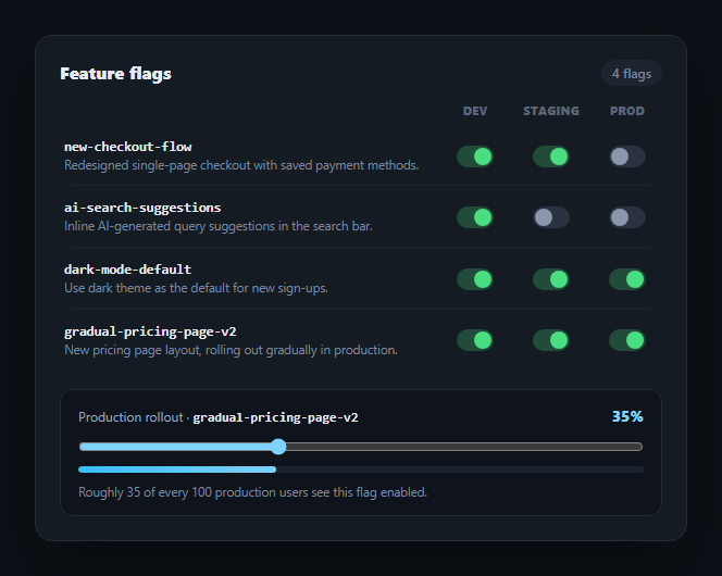
Feature flag admin panels share one recurring shape: a list of flags, each with independent on/off state per environment, and occasionally a percentage-based gradual rollout for production. This snippet builds that panel — dev/staging/prod toggle columns per flag row, plus a rollout slider with a live percentage readout — with no dependency, a natural companion to a permission matrix or settings panel in an internal admin tool.
A grid, not a table, for alignment
Each flag row and the header labels above them share the exact same CSS Grid column template (1fr 56px 64px 56px), so the Dev/Staging/Prod switches always line up vertically under their labels regardless of how long a flag's name or description runs. This is a simpler and more robust alternative to an actual <table> when the content in each "column" is a fixed-width control rather than variable-width text.
Real checkboxes under every switch
Each toggle is a native <input type="checkbox"> visually hidden and paired with a styled sibling track and thumb — the same accessible-switch technique as this library's radio card group, applied to checkboxes instead of radios. :checked-driven CSS handles all the visual state, and :focus-visible adds a keyboard focus ring, so every switch is fully operable and announced correctly without any custom ARIA role juggling.
Independent per-environment state
Each <input> carries data-flag and data-env attributes identifying which flag and which environment it controls — so flipping the Dev switch for one flag never touches its Staging or Prod state. This mirrors how real flag services (LaunchDarkly, Split, a homegrown flag table) key state by the (flag, environment) pair rather than one boolean per flag.
The rollout slider models a real gradual release
One flag ("gradual-pricing-page-v2") is already fully enabled in every environment, but production also carries a percentage rollout — the slider, its live percentage label, its progress bar fill, and its explanatory note all update from a single input event handler, so they can never show conflicting numbers. This models the common pattern where "enabled in prod" and "what percent of prod traffic sees it" are two separate, composable dimensions of a flag's state.
Connecting to a real flag service
Each switch's change handler is where you'd PATCH your flag service with { flag, env, enabled } — the comment in the JS shows the shape. For the rollout slider, debounce the input handler before firing the network request (dragging fires many events per second), and only persist on release (a change event) if you want to avoid spamming your API during the drag itself.
Build with AI
Build, Understand, Optimize, and Extend It With AI
You don't have to work out the accessible-switch pattern or the per-environment state modeling on your own. Paste this snippet's HTML, CSS, and JS into an AI coding assistant like Claude and ask it to explain exactly how the visually-hidden checkbox plus styled sibling technique gives each toggle full keyboard and screen-reader support without any custom ARIA, and why keying state by both data-flag and data-env (rather than one boolean per flag) matches how real flag services model per-environment overrides. The same assistant can help optimize it — asking whether the rollout slider's input handler should be debounced before it fires a real network request, or whether the row-highlight-on-change feedback would benefit from being tied to the actual PATCH response instead of firing optimistically. It's also useful for extending the panel: ask it to add a flag-level "kill switch" that force-disables all environments at once, add an audit-log column showing who last changed each toggle, or add search/filter across a much longer flag list. Treat the code less like a finished artifact and more like a starting point for a conversation.
Prompt to recreate it
Copy this into your AI assistant of choice to build the effect from scratch, or as a jumping-off point for your own variant:
Build a "feature flag toggle panel" in plain HTML, CSS, and JavaScript with no library or CDN dependency.

Requirements:
- A list of feature flags, each row showing the flag's name (in a monospace font), a short description, and three independent toggle switches for Dev, Staging, and Prod environments — the header and every row must share one identical CSS Grid column template so the three environment columns stay vertically aligned regardless of description text length.
- Every toggle switch must be built on a real, visually-hidden native checkbox input (not a div with a click handler) paired with a styled sibling track-and-thumb element whose appearance is driven entirely by the :checked CSS pseudo-class, plus a distinct :focus-visible style for keyboard focus — so switches remain fully keyboard-operable and correctly announced by screen readers.
- Each checkbox input must carry data attributes identifying both which flag and which environment it controls, and toggling one environment's switch for a flag must never affect that same flag's state in a different environment — state must be addressed by the (flag, environment) pair, not a single shared boolean per flag.
- One flag must additionally show a "gradual rollout" control for its production environment: a range slider from 0 to 100 whose live percentage value simultaneously updates a percentage label, a progress-bar-style fill, and an explanatory sentence (e.g. "Roughly N of every 100 production users see this flag enabled") — all three must derive from the exact same slider value in one input event handler so they can never disagree with each other.
- Add a brief visual confirmation (e.g. a momentary background highlight) on a row when one of its switches changes, and leave an inline comment showing the shape of a real PATCH request (flag id, environment, enabled boolean) that a production implementation would send to persist the change.
Want to tighten it up first? Run this prompt through the AI Prompt Studio to score it across 8 quality dimensions, catch anti-patterns, and tune the wording for Claude, ChatGPT, or Gemini before you paste it in.
Step by step
How to Use
- 1Paste HTML, CSS, and JSFour flag rows render with independent Dev/Staging/Prod toggle switches.
- 2Flip a switchEach toggle only affects its own flag and environment — others are unaffected.
- 3Drag the rollout sliderThe percentage label, bar fill, and explanatory note update together for the featured flag.
- 4Add more flagsCopy a .fft-row block and give its inputs unique data-flag values.
- 5Wire real persistenceReplace the change handler's comment with an actual PATCH request to your flag service.
- 6Debounce the rollout writesFire the slider's persistence call on change (release) rather than every input event.
Real-world uses
Common Use Cases
Got questions?
Frequently Asked Questions
The header label row and every flag row use the identical CSS Grid template (grid-template-columns: 1fr 56px 64px 56px). Because every row's grid tracks are the same fixed widths, the switches always land in the same horizontal position regardless of how long each flag's name or description text runs.
Each switch is built on a real, visually-hidden input type="checkbox" with a styled sibling track and thumb driven by the :checked CSS pseudo-class. This gives native keyboard operability (Space to toggle, Tab to move between switches), correct screen-reader announcement as a checkbox, and a :focus-visible ring for keyboard users — all without writing custom key handlers or ARIA state management.
Every checkbox input carries its own data-flag and data-env attributes, and each switch's change handler only reads and acts on that single input's dataset. State is keyed by the (flag, environment) pair rather than one shared boolean per flag, matching how real flag services store per-environment overrides.
In each switch's change handler, send a PATCH request shaped like { flag: input.dataset.flag, env: input.dataset.env, enabled: input.checked } to your flag service's API. For the rollout slider, avoid firing a request on every input event during the drag — either debounce the input handler or persist only on the slider's change event, which fires once when the user releases it.
Model flag state as an object keyed by flag id, each holding per-environment booleans and (where relevant) a rollout percentage. Render each switch's checked state and the rollout slider's value from that object, and update it via setState/reactive assignment inside the change handlers before (or alongside) an async call to persist the change to your backend.