You Might Also Like
Learn Coding Visually
Learn to code with interactive, live-preview playgrounds — HTML, CSS, JavaScript, React & more.
 HTML Playground42 lessons · Click-based · Live preview
 CSS PlaygroundLearn CSS with a live editor
 JavaScript Playground60 lessons · DOM · Async · Canvas
 React PlaygroundLearn React with a live code editor
 GSAP PlaygroundLearn GSAP animation interactively
 SVG Playground44 lessons · shapes · paths · animation
 SCSS Playground45 lessons · Sass modules · tokens
 Tailwind PlaygroundLearn Tailwind CSS with a live editor
 Bootstrap 5 Playground50 lessons · live preview
Course Progress Tracker — Free LMS Sidebar UI Snippet
Course Progress Tracker · Dashboards · Plain HTML, CSS & JS · Live preview
What's included
Features
About this UI Snippet
Course Progress Tracker — Overall Ring, Module List & Resume Card
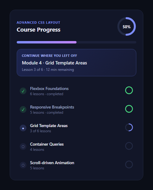
The course progress tracker is the panel every online-learning product shows a learner as soon as they log in: how far through the course am I, and what's next? This snippet builds that panel with a header completion ring, a slim overall progress bar, a "continue where you left off" resume card, and a scrollable module list where each row carries its own mini progress ring and a done/current/upcoming status icon.
One data source, two visualizations
Rather than hard-coding the header percentage, the JS reads every module's data-progress attribute, averages them, and drives both the big SVG ring and the slim top bar off that single computed number. This mirrors how a real LMS would compute completion — from the actual state of each module — instead of a value someone forgot to update by hand.
SVG rings for the completion visuals
Both the header ring and each row's mini ring are plain <circle> elements with stroke-dasharray set to their circumference and stroke-dashoffset animated to reveal the filled arc. The mini rings use a CSS custom property, --pct, so the same stroke-dashoffset formula works for every row without repeating the circumference math per element — set --pct on the row's HTML and the ring fills itself.
The resume card as a focal point
The "continue where you left off" card sits between the top progress summary and the module list, styled with a gradient border-glow treatment so it reads as the primary next action rather than another list row. Clicking it scrolls the matching in-progress module into view and briefly highlights it — a pattern useful for deep-linking a learner straight back into an in-progress module.
Status-driven module rows
Each .cpt-mod carries a modifier class — .is-done, .is-current, or neither for upcoming — that swaps the icon glyph and colors via CSS alone, no per-row JS branching needed. Add a module by copying a row, setting its data-progress and the modifier class, and the ring and header math pick it up automatically since the average is computed from live DOM state.
Customizing it
Swap in real module counts, add a locked-state icon for modules gated behind prerequisites, or read progress from an API and set data-progress before this script runs. Pair it with a lesson sidebar nav for full-course navigation, a progress wizard for a linear multi-step flow, or circular progress for the ring pattern on its own.
Build with AI
Build, Understand, Optimize, and Extend It With AI
You don't have to work out the ring math or the averaging logic by hand. Paste this snippet's HTML, CSS, and JS into an AI coding assistant like Claude and ask it to explain exactly how a single --pct CSS custom property lets one stroke-dashoffset formula drive every module's mini progress ring, or why the header ring's percentage is computed by averaging each module's data-progress attribute rather than being hard-coded. The same assistant can help optimize it — ask whether the reduce over data-progress values should instead weight modules by lesson count, or whether the ring's animation should use CSS @property for a smoother transition. It's also useful for extending the tracker: ask it to add a locked-module state that disables navigation until prerequisites complete, wire data-progress from a real API response, or add a confetti burst when the course hits 100%. Treat the code less like a finished artifact and more like a starting point for a conversation.
Prompt to recreate it
Copy this into your AI assistant of choice to build the effect from scratch, or as a jumping-off point for your own variant:
Build a "course progress tracker" dashboard panel in plain HTML, CSS, and JavaScript — no framework, no library.

Requirements:
- A header section with an SVG ring showing the overall course completion percentage as a filled arc (using stroke-dasharray/stroke-dashoffset on a circle), plus a slim horizontal progress bar below it showing the same percentage.
- Compute that overall percentage in JavaScript, not by hard-coding it: read a data-progress attribute (0-100) off every module list item in the DOM, average them, and use that single computed value to set both the ring's stroke-dashoffset and the bar's width.
- A highlighted "continue where you left off" card, visually distinct (e.g. a gradient border or background glow) from the rest of the list, showing the next lesson's title and remaining time, that on click scrolls the current in-progress module into view in the list below and briefly flashes its background.
- A scrollable list of course modules below the resume card, each row showing: a status icon that differs for completed (checkmark), current (filled dot), and upcoming (empty circle) states via a CSS modifier class rather than per-row JavaScript branching, a title and lesson-count subtitle, and its own small SVG progress ring sized independently from the header ring.
- Make every mini ring share one CSS formula for stroke-dashoffset driven by a single CSS custom property (e.g. --pct) set inline per row, so adding a new module only requires setting that one property and a status class, not writing new CSS.
- Animate both the header ring and the top progress bar filling in on page load using requestAnimationFrame so the fill transition is visible rather than snapping instantly to its final state.
Want to tighten it up first? Run this prompt through the AI Prompt Studio to score it across 8 quality dimensions, catch anti-patterns, and tune the wording for Claude, ChatGPT, or Gemini before you paste it in.
Step by step
How to Use
- 1Paste the HTML, CSS, and JSThe panel renders with sample module data already filled in.
- 2Check the header ringIt animates in showing the averaged completion percentage.
- 3Review the module listDone, current, and upcoming rows each carry their own mini ring.
- 4Click "Continue where you left off"The current module row scrolls into view and briefly highlights.
- 5Edit data-progress valuesChange a module's data-progress attribute in the HTML panel.
- 6Reload to see the recomputeThe header ring and bar update to match the new average.
Real-world uses
Common Use Cases
Got questions?
Frequently Asked Questions
The script collects every element with class .cpt-mod, reads its data-progress attribute, sums them, and divides by the module count. That single averaged number then drives both the header SVG ring's stroke-dashoffset and the slim top progress bar's width, so there's one source of truth instead of two numbers that could drift apart.
Each row's mini ring circle has a CSS custom property --pct set inline (e.g. style="--pct:50"), and the CSS computes stroke-dashoffset as the circumference minus circumference times --pct over 100. Because the formula lives once in the CSS and only --pct changes per row, adding a new module row just means copying markup and setting one property.
Add a .is-locked modifier alongside the existing .is-done/.is-current pattern, dim the row with reduced opacity and pointer-events: none in CSS, and swap the icon glyph to a lock symbol. Check the previous module's data-progress before allowing navigation into a locked one if you wire this to real routing.
Yes — replace the href="#" and the preventDefault-based scroll behavior with a real lesson URL once you have routing. The current demo intercepts the click to keep the example self-contained inside the sandbox, but in a real app you'd just navigate normally.
Model modules as an array of objects with title, subtitle, progress, and status fields, map them to rows, and compute the averaged percentage with a reduce in a memoized value or computed property. Drive the ring's stroke-dashoffset from that computed percentage instead of a DOM query, and the CSS ports over unchanged.