You Might Also Like
Learn Coding Visually
Learn to code with interactive, live-preview playgrounds — HTML, CSS, JavaScript, React & more.
 HTML Playground42 lessons · Click-based · Live preview
 CSS PlaygroundLearn CSS with a live editor
 JavaScript Playground60 lessons · DOM · Async · Canvas
 React PlaygroundLearn React with a live code editor
 GSAP PlaygroundLearn GSAP animation interactively
 SVG Playground44 lessons · shapes · paths · animation
 SCSS Playground45 lessons · Sass modules · tokens
 Tailwind PlaygroundLearn Tailwind CSS with a live editor
 Bootstrap 5 Playground50 lessons · live preview
Lesson Sidebar Navigation — Free Collapsible Course Sidebar UI
Lesson Sidebar Navigation · Navigation · Plain HTML, CSS & JS · Live preview
What's included
Features
About this UI Snippet
Lesson Sidebar Navigation — Collapsible Sections With Lesson Status
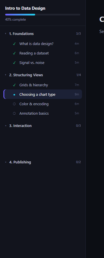
The lesson sidebar navigation is the primary way learners move through a course: sections that expand and collapse, lessons marked done, current, or locked, and one lesson always highlighted as active. This snippet builds it in plain HTML, CSS, and JavaScript — no dependencies.
Collapsible sections
Each .lsn-section carries a data-open attribute. Clicking its .lsn-section-head button flips the attribute, and CSS animates .lsn-lessons between grid-template-rows: 0fr and 1fr — a technique that transitions height without knowing the content's pixel height in advance, so lists of any length collapse and expand smoothly.
Status icons that mean something
Every lesson row carries data-status: done shows a green checkmark, current a cyan dot with a highlighted background and a left accent bar, todo a dim empty circle, and locked a lock glyph. The icon and row styling are driven entirely by that attribute, so changing a lesson's state is a one-line data change.
Locked lessons are truly disabled
Locked rows get opacity: .45, cursor: not-allowed, and their click handler returns immediately — they're visually and functionally inert, not just grayed out with an active click target underneath.
One active lesson at a time
Clicking an unlocked lesson clears current/active state from every other row, demotes the previous current lesson to done, and promotes the clicked lesson to current — mirroring how a real course marks your progress as you move forward.
Course-level progress
A slim progress bar and percentage in the header summarize completion across the whole sidebar, separate from the per-section counts shown next to each section title.
Customizing it
Swap the section and lesson data for your own course, add per-lesson duration or difficulty badges, or persist the active lesson to localStorage so a reload resumes where the learner left off. Pair it with a progress wizard for multi-step enrollment, or a checkbox tree for nested curriculum outlines.
Build with AI
Build, Understand, Optimize, and Extend It With AI
Rather than guessing at the collapse mechanics, paste this snippet's HTML, CSS, and JS into an AI coding assistant like Claude and ask it to walk through why grid-template-rows: 0fr/1fr on a nested overflow:hidden wrapper produces a smooth height animation without JavaScript ever measuring the lessons list's pixel height — and why that approach handles lists of any length better than a fixed max-height. The same assistant is useful for extending the state machine: ask it to add a "locked until prerequisite" rule that automatically flips a section's lessons from locked to todo once the prior section completes, or to persist the active lesson and completed lessons to localStorage so a page reload resumes exactly where the learner left off. It can also help you audit the disabled-state accessibility — for example whether locked lessons should carry aria-disabled and how keyboard users should be prevented from focusing them.
Prompt to recreate it
Copy this into your AI assistant of choice to build the effect from scratch, or as a jumping-off point for your own variant:
Build a "lesson sidebar navigation" component in plain HTML, CSS, and JavaScript — no frameworks, no dependencies.

Requirements:
- A sidebar containing multiple collapsible sections; each section has a clickable header (with a chevron icon) and a list of lesson rows.
- Clicking a section header toggles that section's open/closed state, animating the lesson list's height open and closed using a CSS technique that does not require JavaScript to measure content height (e.g. grid-template-rows transitioning between 0fr and 1fr on a wrapper with overflow hidden), so it works correctly for lists of any length.
- Each lesson row carries one of four statuses via a data attribute: "done" (checkmark icon), "current" (dot icon, highlighted row with a left accent bar), "todo" (empty circle icon), or "locked" (lock icon).
- Locked lesson rows must be visually dimmed (reduced opacity, not-allowed cursor) AND functionally inert — their click handler must check the status and return early, doing nothing, rather than just being styled to look disabled while still being clickable.
- Clicking any unlocked lesson row: removes active/current styling from whichever lesson was previously current (demoting it to "done" with an updated icon), and sets the clicked lesson to "current" with updated icon and highlight styling.
- Include a course-level progress bar and percentage in the sidebar header, plus a small "completed/total" count next to each section's title.
- Keep all styling in a dark theme with a purple/cyan accent gradient, and make sure the JavaScript only ever references classnames and ids that actually exist in the HTML you write.
Want to tighten it up first? Run this prompt through the AI Prompt Studio to score it across 8 quality dimensions, catch anti-patterns, and tune the wording for Claude, ChatGPT, or Gemini before you paste it in.
Step by step
How to Use
- 1Paste the HTML, CSS, and JSA sidebar with four collapsible sections and a stage panel render.
- 2Click a section headerThe chevron rotates and its lessons expand or collapse.
- 3Click an unlocked lessonIt becomes the active lesson and the stage title updates.
- 4Try a locked lessonIt's dimmed and does nothing when clicked.
- 5Replace the section dataEdit the HTML list items for your own course.
- 6Tune the accent colorChange the gradient and highlight variables in CSS.
Real-world uses
Common Use Cases
Got questions?
Frequently Asked Questions
Each .lsn-lessons list uses CSS grid with grid-template-rows toggled between 0fr and 1fr via the parent's data-open attribute, and a nested wrapper with overflow:hidden clips the content. Grid track sizes animate like any other property, so the browser interpolates from 0fr to 1fr smoothly regardless of how many lessons are inside, with no JavaScript height calculation required.
They stay in the DOM so the course structure remains visible — learners can see what's coming and how much is left, which is a UX expectation for courses. The click handler checks data-status === 'locked' and returns immediately, so the row is present and readable but functionally inert; combined with reduced opacity and cursor: not-allowed, it reads as disabled without hiding content.
From your video/quiz completion callback, find the corresponding .lsn-lesson element (by an id or data attribute you add), set its data-status to 'done', swap the icon glyph, and update the section's count label and the course-level progress bar's width and percentage text. The same function that click-selects a lesson can be extended to also mark the previous lesson done automatically.
Yes. When the last lesson in a section is marked done, loop the next section's lesson elements, set their data-status from 'locked' to 'todo', and remove the disabled click guard for that status. You can also auto-open the newly unlocked section by setting its data-open attribute to true so learners immediately see what's next.
Model the course as an array of sections, each with an array of lessons carrying a status field ('done' | 'current' | 'todo' | 'locked'). Render sections and lessons from that state, toggle an "open" boolean per section in component state instead of a DOM attribute, and update lesson status via your framework's state setter on selection. The CSS grid-template-rows collapse technique ports unchanged since it only depends on a data attribute selector.