You Might Also Like
Learn Coding Visually
Learn to code with interactive, live-preview playgrounds — HTML, CSS, JavaScript, React & more.
 HTML Playground42 lessons · Click-based · Live preview
 CSS PlaygroundLearn CSS with a live editor
 JavaScript Playground60 lessons · DOM · Async · Canvas
 React PlaygroundLearn React with a live code editor
 GSAP PlaygroundLearn GSAP animation interactively
 SVG Playground44 lessons · shapes · paths · animation
 SCSS Playground45 lessons · Sass modules · tokens
 Tailwind PlaygroundLearn Tailwind CSS with a live editor
 Bootstrap 5 Playground50 lessons · live preview
Insurance Claim Status Tracker — Free HTML CSS JS Snippet
Insurance Claim Status Tracker · Dashboards · Plain HTML, CSS & JS · Live preview
What's included
Features
About this UI Snippet
Insurance Claim Status Tracker — A Stepper That Shows Where a Claim Really Stands
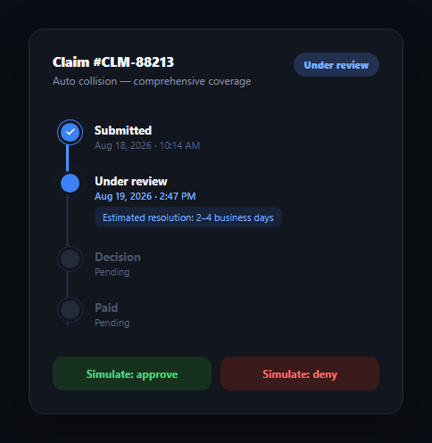
Nothing erodes trust in an insurer faster than silence after a claim is filed. A claim status tracker answers "where is my claim?" without a phone call — showing every stage from submission to payout, timestamping what has already happened, and giving an honest estimate for what's still pending. This snippet builds that pattern in plain HTML, CSS, and vanilla JavaScript: a vertical stepper with an animated fill rail, a status pill, and a two-outcome decision branch for approved or denied claims.
One state, one render function
Two variables drive the whole UI: current, the index of the furthest-reached stage, and outcome, which is null until a decision is made and then 'approved' or 'denied'. The render function reads both and derives every visual: which dots are filled, which pulses, the rail-fill height, the pill text and color. Nothing is set imperatively outside of render, so wiring the tracker to a real claims API is a matter of updating those two variables and calling one function.
A rail that can change color
The .cs-rail-fill element grows its height as a percentage of steps completed, exactly like a shipment or order tracker — but here the fill's gradient itself changes: blue while the claim is in progress, green once approved, red once denied. That single color shift communicates the claim's fate at a glance, reinforcing the status pill without adding new UI.
An honest estimate, not a fake countdown
The "Under review" step carries an .cs-est note — "Estimated resolution: 2–4 business days" — sitting directly under the timestamp for that stage. It's static text, not a manufactured countdown timer, because claims processing genuinely doesn't resolve to the second and pretending otherwise erodes the same trust the tracker is meant to build. The estimate note is removed once a decision lands, since it's no longer relevant.
Two outcomes from one decision step
Rather than hard-coding a linear "Approved → Paid" path, the decision step branches: resolveClaim(true) colors it green and, after a short delay, advances a fourth "Paid" step; resolveClaint(false) colors it red and the tracker stops there — a denied claim never gets a "Paid" state. This mirrors how claims actually behave and is a pattern worth copying into any workflow with a branching outcome.
Extending it
Add a "Documents needed" interstitial step for claims sent back for more information, wire an adjuster's name and photo into the review stage, or replace the simulate buttons with a live poll against a claims API. Pair it with an order tracking timeline for shipment-style flows, a stepper for multi-step forms, or a status dashboard for an overview of many claims at once.
Build with AI
Build, Understand, Optimize, and Extend It With AI
You don't need to trace every branch by hand to understand this tracker. Paste its HTML, CSS, and JS into an AI coding assistant like Claude and ask it to walk through exactly how the current index and outcome variable together determine each step's class, the rail-fill height and color, and the status pill text through a single render call — and why the decision step branches into two different continuations (a Paid step for approvals, a dead end for denials) instead of always advancing linearly. The same assistant can help harden it for production: ask whether the estimate text should be computed from a real SLA value passed into the component, whether the simulate buttons' disabled state correctly prevents a double-resolution, or how to add a "needs more information" branch that loops the claim back to review. It's also useful for extending the effect: ask it to add an adjuster name and avatar to the review stage, wire resolveClaim up to a real API response, or make the estimate note update dynamically as time passes. Treat the code less like a finished artifact and more like a starting point for a conversation.
Prompt to recreate it
Copy this into your AI assistant of choice to build the effect from scratch, or as a jumping-off point for your own variant:
Build an "insurance claim status tracker" in plain HTML, CSS, and JavaScript with no framework — a vertical stepper with a branching outcome.

Requirements:
- Four stages: Submitted, Under review, Decision, Paid — each with a dot, a title, and a timestamp area, plus a background rail behind the dots and a colored fill element on top that grows as a percentage of stages completed.
- Track progress with two state variables: a numeric index for the furthest-reached stage, and an outcome variable that starts null and becomes either an "approved" or "denied" string once a decision is simulated. A single render function must derive every visual (dot color/state, rail-fill height and color, header status pill text and color) from just these two variables.
- The "Under review" stage must show a small estimated-resolution note (e.g. "Estimated resolution: 2–4 business days") as static text near its timestamp — not a live countdown — and that note must be removed once a decision is reached.
- Two buttons simulate resolving the claim: one sets the outcome to approved (turning the decision step and rail green, filling in a real timestamp, and after a short delay advancing a final "Paid" step to complete), the other sets it to denied (turning the decision step and rail red) and the tracker must NOT show a Paid step completing in that case.
- The active/in-progress stage's dot must have a continuously looping pulse implemented as a CSS box-shadow keyframe animation, and completed stages must show a checkmark icon that animates in from a smaller scale and zero opacity.
- Both simulate buttons must disable themselves once a decision has been made, so a claim cannot be resolved twice.
Want to tighten it up first? Run this prompt through the AI Prompt Studio to score it across 8 quality dimensions, catch anti-patterns, and tune the wording for Claude, ChatGPT, or Gemini before you paste it in.
Step by step
How to Use
- 1Paste HTML, CSS, and JSA claim card renders with "Submitted" and "Under review" complete, the review stage pulsing, and an estimated-resolution note beneath it.
- 2Read the current stateThe blue rail fills to the active stage and the header pill reads "Under review".
- 3Simulate an approvalClick "Simulate: approve" — the decision step turns green, a timestamp fills in, and after a beat the "Paid" step completes too.
- 4Or simulate a denialReload and click "Simulate: deny" instead — the decision step turns red and the tracker stops there; no "Paid" step follows.
- 5Notice the estimate disappearOnce a decision lands, the "2–4 business days" estimate note is removed since it's no longer relevant.
- 6Wire it to real dataReplace the two buttons with a poll or websocket handler that sets current and outcome from your claims API.
Real-world uses
Common Use Cases
Got questions?
Frequently Asked Questions
Replace the two simulate buttons with a fetch/poll or websocket handler that receives the claim's current stage and outcome from your backend, sets the current and outcome variables accordingly, fills in real timestamps, and calls render(). No other code changes — render already derives every visual from those two variables.
A precise countdown implies a certainty claims processing rarely has — reviews can finish early or run long. A stated range ("2–4 business days") sets an honest expectation without manufacturing false precision, and it's removed once a real decision timestamp is available.
Insert an extra step between review and decision, or add a .needs-info modifier class on the review step that swaps its color to amber and updates its text. Branch resolveClaim (or add a requestInfo function) to set that state instead of moving current forward, and give the customer an action to resubmit documents.
Wrap the stepper in an aria-live="polite" region so stage changes are announced, add visually-hidden "completed" or "in progress" text to each step, and make sure the status pill's text (not just its color) conveys the outcome. The checkmark icons should carry aria-hidden since the title text already states completion.
Hold current and outcome in component state, derive each step's class from comparing its index to current and outcome in a computed/render expression, and bind the rail's height style to the same percentage calculation. The CSS, including the pulse keyframe and color transitions, ports unchanged.