You Might Also Like
Learn Coding Visually
Learn to code with interactive, live-preview playgrounds — HTML, CSS, JavaScript, React & more.
 HTML Playground42 lessons · Click-based · Live preview
 CSS PlaygroundLearn CSS with a live editor
 JavaScript Playground60 lessons · DOM · Async · Canvas
 React PlaygroundLearn React with a live code editor
 GSAP PlaygroundLearn GSAP animation interactively
 SVG Playground44 lessons · shapes · paths · animation
 SCSS Playground45 lessons · Sass modules · tokens
 Tailwind PlaygroundLearn Tailwind CSS with a live editor
 Bootstrap 5 Playground50 lessons · live preview
New Hire Day-One Checklist — Free Onboarding Progress UI
New Hire Day-One Checklist · Dashboards · Plain HTML, CSS & JS · Live preview
What's included
Features
About this UI Snippet
New Hire Day-One Checklist — Grouped Tasks With a Progress Bar
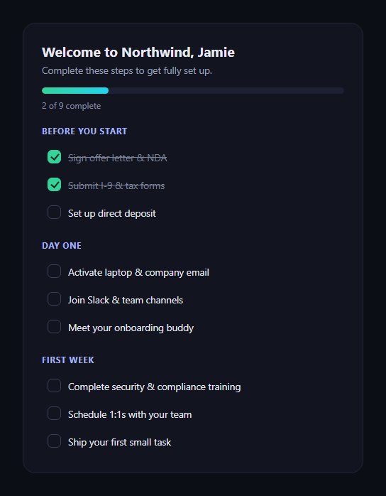
The new hire day-one checklist is the first thing a new employee sees: onboarding tasks grouped by timing, checked off as they're completed, with a progress bar tracking the whole thing and a celebratory screen once every task is done. This snippet builds it in plain HTML, CSS, and JavaScript.
Grouped, not one flat list
Tasks are split into three <section> groups — Before you start, Day one, First week — each with its own heading. Grouping by timing rather than showing one undifferentiated list matches how a new hire actually thinks about the first days: what's needed before arriving versus what happens once they're in the building.
Real checkbox semantics, custom look
Each item is a native <input type="checkbox"> visually hidden but still focusable, paired with a sibling <span class="odc-box"> styled as the visible check via a CSS :checked + .odc-box selector, plus :focus-visible + .odc-box for a visible keyboard-focus ring. The checkbox stays a real, accessible form control — screen readers and keyboard navigation work exactly as expected — while the visual design is fully custom.
Progress computed live, from the DOM
Every change event recounts :checked boxes against the total and updates both the bar's width and a "N of 9 complete" label — nothing is tracked separately in a counter variable that could drift out of sync with what's actually checked.
A completed state that feels earned
Reaching 100% hides the checklist groups entirely and reveals a celebratory panel with an emoji, a personalized headline, and a confirmation message — faded in via a class toggled on the next animation frame so the transition actually animates rather than snapping in. Unchecking any item afterward reverses both: the celebration hides and the checklist groups reappear.
Strikethrough on completed items
Checked items get their label text struck through and dimmed via :checked ~ .odc-text, giving immediate visual feedback on each item beyond just the aggregate progress bar.
Customizing it
Swap the task list and grouping for your own onboarding flow, persist checked state to localStorage or a backend per employee, or add due dates per task. Pair it with an onboarding checklist widget for a simpler flat version, or an onboarding tour for a guided product walkthrough alongside it.
Build with AI
Build, Understand, Optimize, and Extend It With AI
Checklist components look simple but have a few details worth double-checking, so paste this snippet's HTML, CSS, and JS into an AI coding assistant like Claude and ask it to confirm the hidden-native-checkbox-plus-styled-sibling-span pattern keeps the control genuinely accessible (correct focus order, screen-reader announcement, :focus-visible handling) rather than just visually convincing. The same assistant can help you extend the data model — for example asking it to add persistence to localStorage so progress survives a reload, to make certain tasks required before others unlock (a "Day one" task stays disabled until every "Before you start" task is checked), or to add due dates per task with overdue styling. It's also useful for reviewing the completion celebration: ask whether the reversible uncheck behavior (celebration hides again if an item is unchecked) is the right UX or whether a completed checklist should stay "completed" once reached.
Prompt to recreate it
Copy this into your AI assistant of choice to build the effect from scratch, or as a jumping-off point for your own variant:
Build a "new hire day-one checklist" in plain HTML, CSS, and JavaScript — no frameworks, no dependencies.

Requirements:
- Onboarding tasks grouped into three labeled sections in this order: "Before you start", "Day one", and "First week", each containing several checklist items.
- Each item uses a real native <input type="checkbox"> that is visually hidden (not display:none — keep it in the accessibility tree and tab order) paired with a sibling element styled to look like a custom checkbox via a CSS :checked + sibling selector, plus a visible focus ring via :focus-visible + sibling for keyboard users.
- A progress bar and a "N of TOTAL complete" text label above the checklist, recomputed on every checkbox's change event by counting how many checkboxes are currently :checked against the total — do not track completion with a separately incremented counter variable that could drift from the actual checkbox states.
- Checked items show their label text with a strikethrough and dimmed color, driven by CSS from the checkbox's checked state.
- When every checkbox becomes checked, hide the checklist groups and reveal a celebratory panel (icon, heading, message) that fades in — deferring the class that triggers the fade to the next animation frame so the transition actually animates rather than snapping in instantly. If any item is unchecked afterward, reverse this: hide the celebration and show the checklist groups again.
- Keep it in a dark theme with a green/teal accent for progress and completion, and make sure the JavaScript only references classnames/ids that exist in the HTML you write.
Want to tighten it up first? Run this prompt through the AI Prompt Studio to score it across 8 quality dimensions, catch anti-patterns, and tune the wording for Claude, ChatGPT, or Gemini before you paste it in.
Step by step
How to Use
- 1Paste the HTML, CSS, and JSA grouped checklist with a progress bar renders.
- 2Check off an itemThe bar fills and the count label updates immediately.
- 3Watch the item textChecked items get struck through and dimmed.
- 4Check every remaining itemThe checklist hides and a celebration panel fades in.
- 5Uncheck an item afterwardThe celebration reverses and the checklist reappears.
- 6Edit the groups and itemsAdd, remove, or rename tasks; the total recalculates.
Real-world uses
Common Use Cases
Got questions?
Frequently Asked Questions
Every checkbox's change event calls updateProgress, which re-queries the DOM for how many checkboxes currently have :checked true out of the total, and recomputes the percentage from that fresh count. There's no separate counter variable being incremented or decremented — the bar always reflects exactly what's checked in the DOM at that moment, so it can't drift out of sync.
Yes. Each is a real native input type="checkbox", just visually hidden with position:absolute and a 1px size rather than display:none, so it stays in the accessibility tree and keyboard tab order. The visible box is a sibling span styled via the :checked + .odc-box CSS selector, and :focus-visible + .odc-box adds an outline when the hidden input receives keyboard focus — so screen readers and keyboard users get the same semantics as a default checkbox.
The panel starts with hidden removed and its odc-show class (which triggers the CSS opacity/display transition) added one frame later. Adding both in the same synchronous step can cause the browser to skip the transition since it never registers the "before" state — deferring the class addition to the next frame guarantees the starting state is painted first, so the fade actually animates.
On each change event, also write the checked state of every checkbox (keyed by a stable id or index) to localStorage or a backend call. On page load, before calling updateProgress for the first time, read that saved state back and set each checkbox's checked property accordingly, then call updateProgress once to sync the bar and celebration state to what was restored.
Model each task as an object with a completed boolean, grouped by section, held in component state. Render checkboxes bound to that state via your framework's two-way or event binding, derive the progress count and percentage from the same array in render, and conditionally render the celebration panel when every task's completed is true. The custom checkbox CSS (:checked + sibling) needs no changes since it's pure CSS.