You Might Also Like
Learn Coding Visually
Learn to code with interactive, live-preview playgrounds — HTML, CSS, JavaScript, React & more.
 HTML Playground42 lessons · Click-based · Live preview
 CSS PlaygroundLearn CSS with a live editor
 JavaScript Playground60 lessons · DOM · Async · Canvas
 React PlaygroundLearn React with a live code editor
 GSAP PlaygroundLearn GSAP animation interactively
 SVG Playground44 lessons · shapes · paths · animation
 SCSS Playground45 lessons · Sass modules · tokens
 Tailwind PlaygroundLearn Tailwind CSS with a live editor
 Bootstrap 5 Playground50 lessons · live preview
Avatar Stack — Overlapping Avatars with Overflow Count
Overlapping Avatar Stack with Overflow Count · Cards · Plain HTML, CSS & JS · Live preview
What's included
Features
About this UI Snippet
Avatar Stack — Overlapping Circles with a "+N" Overflow Badge
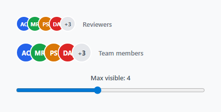
An avatar stack shows a small preview of a longer list of people — reviewers on a pull request, members of a team, attendees of an event — using overlapping circles so a handful of faces fit in the space of one. This snippet covers the overlap layout, the hover interaction, and the overflow count that appears once the list is longer than the space allows.
Overlap via negative margin, not absolute positioning
Each .avatar-item is a flex child with margin-left: -10px, pulling every avatar after the first partially behind its predecessor. This is simpler than absolutely positioning each avatar with calculated left offsets, and it means adding or removing people from the list requires no coordinate recalculation — flexbox handles the layout automatically regardless of how many avatars are present.
Stacking order and the white border
Because each avatar sits later in the DOM and overlaps the one before it, later avatars naturally render on top in normal stacking order. A 2.5px solid #fff border around every avatar is what visually separates overlapping circles from each other — without it, adjacent avatars of similar colors would blend into an indistinct blob at the overlap edge.
The hover lift
.avatar-item:hover { transform: translateY(-4px); z-index: 10 } lifts a hovered avatar up and above its neighbors. The z-index: 10 matters as much as the transform: without it, a raised avatar could still render underneath a later sibling in the stack, since normal DOM order would otherwise win. This small interaction is what makes a static stack feel like individual, distinguishable people rather than a flat decorative graphic.
The overflow badge
renderStack() slices the full people array to max visible avatars and, if any remain, appends one more circle styled as .avatar-more showing +N. This is the detail that lets a stack represent a list of any length in constant visual space — five avatars or five hundred people render in the same footprint, with the overflow badge doing the work of "and N others."
Native tooltips via the title attribute
Each avatar carries a title attribute with the person's full name (or, for the overflow badge, "N more"), which gives every avatar a free native browser tooltip on hover with zero extra markup or JavaScript. For richer tooltips — an avatar image, a role, an online-status dot — swap the title attribute for the tooltip snippet's positioned hover panel instead.
Color-coded initials as a fallback
Each person carries a fixed color alongside their initials, used as the avatar's background when no profile photo is available. Assigning a stable, deterministic color per person (rather than a random one on every render) matters for recognizability — the same person should always render in the same color across the app, which typically means deriving the color from a hash of the user's id rather than array position.
Sizing variants
The .stack-lg modifier scales up both the avatar size and the overlap amount (margin-left: -12px instead of -10px) together — the overlap should scale roughly proportionally with avatar size, or a larger stack either looks too spread out (overlap too small) or too cramped (overlap unchanged while avatars grew).
Real profile photos
Swap the colored initials div for an <img> with the same sizing and border rules, and add object-fit: cover so photos of varying aspect ratios crop consistently to the circle rather than stretching.
See also the avatar stack with tooltip for a variant using positioned custom tooltips instead of the native title attribute, and the avatar status list for a vertical list layout with online/away indicators.
Build with AI
Build, Understand, Optimize, and Extend It With AI
Paste this avatar stack's HTML, CSS, and JS into an AI coding assistant like Claude and ask it to explain why negative margins are used for the overlap instead of absolute positioning, and why the hover-lift interaction needs both a transform and a z-index change to work correctly. It's a good snippet to extend — ask the assistant to add a real profile-photo fallback chain (photo URL first, colored initials if the photo fails to load or is missing), or to add a small online-status dot to each avatar positioned at its bottom-right corner. Beyond that, ask it to replace the native title-attribute tooltips with the richer positioned tooltip pattern from this library's tooltip snippet, so hovering shows more than just a name.
Prompt to recreate it
Copy this into your AI assistant of choice to build the effect from scratch, or as a jumping-off point for your own variant:
Build an overlapping avatar stack with an overflow count badge in plain HTML, CSS, and JavaScript, no framework, no libraries.

Requirements:
- Render a horizontal row of circular avatars from a JavaScript array of at least five people (each with a display name, initials, and an assigned background color), where each avatar after the first overlaps the previous one using a negative left margin rather than manual absolute positioning, so the layout works correctly regardless of how many people are in the array.
- Every avatar circle must have a solid white border so overlapping avatars of similar colors remain visually distinct from each other at the overlap edge.
- Hovering an individual avatar must lift it slightly upward and bring it visually above all of its neighboring avatars, requiring both a transform and an explicit stacking-order change to work correctly regardless of the avatar's position in the row.
- Accept a maximum-visible-count parameter. Any people beyond that count must not render as individual avatars; instead, a final circle styled distinctly from the regular avatars must display a "+N" badge showing exactly how many additional people are hidden.
- Every avatar, including the overflow badge, must expose the full name (or hidden count) as a native browser tooltip with no extra JavaScript required beyond a standard HTML attribute.
- Demonstrate the component working at two different sizes on the page, where the size variant scales both the avatar diameter and the overlap amount together so the visual density stays proportional. Include a live control (such as a slider) that changes the maximum-visible-count in real time and re-renders both stacks to demonstrate the overflow badge updating dynamically.
Want to tighten it up first? Run this prompt through the AI Prompt Studio to score it across 8 quality dimensions, catch anti-patterns, and tune the wording for Claude, ChatGPT, or Gemini before you paste it in.
Step by step
How to Use
- 1Copy the stack containerA .stack div holds one .avatar-item per person, rendered by JavaScript from a people array — copy the container and the renderStack function together.
- 2Replace the PEOPLE arraySwap PEOPLE for your real user list — each entry needs a display name, initials (or a photo URL), and a stable color for the initials fallback.
- 3Set the max visible countCall renderStack(containerId, people, max) with however many avatars should show before the rest collapse into a "+N" badge — 3 to 5 is typical for compact UI.
- 4Add the CSSPaste the CSS once. The negative margin-left value controls overlap tightness — reduce it for less overlap, increase it (more negative) for tighter stacking.
- 5Swap initials for real photosReplace the colored-background div with an <img src="..."> using the same width/height/border-radius/border rules, plus object-fit: cover.
Real-world uses
Common Use Cases
Got questions?
Frequently Asked Questions
Replace the colored .avatar-item div's background/text with an <img src="photo.jpg"> keeping the same width, height, border-radius, and white border, and add object-fit: cover so photos of different aspect ratios crop consistently.
Change the max argument passed to renderStack() — everything beyond that count collapses into a single "+N" badge showing how many are hidden.
The hover rule combines a small translateY with z-index: 10, both required together — the transform alone would visually raise the avatar but a later sibling could still render on top of it without the z-index change, since normal stacking order follows DOM order by default.
Add a small absolutely-positioned dot inside each .avatar-item, colored per that person's status (green for online, gray for offline), positioned at the bottom-right corner with its own white border — the same technique used in the avatar status list snippet.
Open the Export menu on the snippet page for a React component that maps over a people array as a prop with a max prop for the overflow threshold, a React + Tailwind version, a Vue 3 SFC, or an Angular standalone component with @Input() bindings — all preserve the overlap and overflow-badge logic.