


Learn Coding Visually
Learn to code with interactive, live-preview playgrounds — HTML, CSS, JavaScript, React & more.
 HTML Playground42 lessons · Click-based · Live preview
 CSS PlaygroundLearn CSS with a live editor
 JavaScript Playground60 lessons · DOM · Async · Canvas
 React PlaygroundLearn React with a live code editor
 GSAP PlaygroundLearn GSAP animation interactively
 SVG Playground44 lessons · shapes · paths · animation
 SCSS Playground45 lessons · Sass modules · tokens
 Tailwind PlaygroundLearn Tailwind CSS with a live editor
 Bootstrap 5 Playground50 lessons · live preview
Story Progress Bars — Instagram Stories HTML CSS JS
Story Progress Bars · Animations · Plain HTML, CSS & JS · Live preview
What's included
Features
transform: scaleX with a left origin, so progress animates on the compositor and stays smooth, not via layout-bound width.show resets the fill with the animation:none + reflow + restore trick, so re-entering a slide always replays its progress from zero.prev/next, matching the native story gesture without extra buttons.animation-play-state: paused on the active fill, freezing both the bar and the countdown until release.--dur custom property controls each slide's length, so changing pacing is one value, not code edits.opacity, a compositor-friendly crossfade rather than an abrupt swap.About this UI Snippet
Story Progress Bars — Auto-Advancing Segments, Tap Navigation & Hold-to-Pause
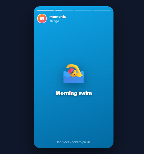
Stories — the tap-through, auto-advancing slideshow popularised by Snapchat and Instagram — are now everywhere: social apps, product tours, onboarding, and marketing. The defining UI element is the row of segmented progress bars across the top: one segment per slide, the current one filling in real time, completed ones full, upcoming ones empty. This snippet implements a complete story viewer in plain HTML, CSS, and vanilla JavaScript: auto-advancing segmented bars, tap-left/right navigation, hold-to-pause, and crossfading slides.
Segmented bars driven by one CSS animation
Each segment is a track containing a .st-fill that is scaled horizontally. The fill uses transform: scaleX (not width) with transform-origin: left, so the bar appears to fill left-to-right — and because it is a transform, the animation runs on the compositor and stays perfectly smooth. Completed bars get .done (scaleX(1)); the active bar gets .st-active, which runs the st-grow keyframe over a --dur duration (default 5s, linear). Upcoming bars stay at scaleX(0).
Auto-advance via animationend
Rather than juggling setTimeout timers (which drift and are hard to pause), the viewer advances when the active fill's animation finishes. A single animationend listener on the bars container checks for the st-grow animation and calls next(). This ties progression directly to the visible progress bar, so the slide always changes exactly when its bar completes — no desync between the timer and the indicator.
Restarting the fill cleanly
When show(i) activates a bar, it must restart the fill animation from zero even if that bar was animated before. It does this with the classic reset trick: set animation: none, force a reflow by reading offsetWidth, then clear the inline animation so the class-based one runs fresh. Without this, re-entering a slide would not replay its progress.
Tap navigation and hold-to-pause
Two transparent .st-nav buttons cover the left and right ~40% of the viewer — tapping them calls prev() and next(), exactly like the native gesture. Holding anywhere (mousedown/touchstart) adds a .paused class that sets animation-play-state: paused on the active fill, freezing both the bar and the countdown; releasing resumes it. This is the behaviour users expect when they press and hold to read a slide longer.
Crossfading slides
Slides stack absolutely and crossfade with an opacity transition (compositor-friendly), so switching feels smooth rather than abrupt. The slides here use gradient backgrounds with emoji, but each is a normal element you can swap for an image or video.
Pair this with a carousel for swipeable galleries, an onboarding tour for guided flows, or an image accordion for expandable media.
Build with AI
Build, Understand, Optimize, and Extend It With AI
You don't have to reconstruct the animation-restart trick by hand. Paste this snippet's HTML, CSS, and JS into an AI coding assistant like Claude and ask it to explain exactly why show sets a bar's fill animation to none, reads fill.offsetWidth, then clears the inline style before adding the active class again, and why advancing on the animationend event is more robust than a setTimeout of the same duration. The same assistant can help optimize it — for instance whether toggling classes on every bar on every show call is wasteful compared to only touching the bars that actually changed state, or whether the crossfade opacity transition should be replaced with a will-change hint for smoother performance on lower-end phones. It's also useful for extending the viewer: ask it to sync a slide's bar duration to a video's real length via the ended event instead of a fixed --dur, add swipe-down-to-close, or support looping through multiple authors' story sets. Treat the code less like a finished artifact and more like a starting point for a conversation.
Prompt to recreate it
Copy this into your AI assistant of choice to build the effect from scratch, or as a jumping-off point for your own variant:
Build an Instagram/Snapchat-style "story viewer" with segmented auto-advancing progress bars in plain HTML, CSS, and JavaScript using only CSS keyframe animations and the animationend event — no setTimeout-based timers, no animation library.

Requirements:
- A row of one progress-bar segment per slide, each segment containing a fill element that starts at zero width using a CSS transform: scaleX(0) with transform-origin set to the left edge, not the width property, so the fill animates on the compositor.
- Three visual states for segments, controlled by classes: a completed state where the fill is fully scaled to 1, an active state where the fill runs a linear keyframe animation from scaleX(0) to scaleX(1) over a configurable CSS custom property duration, and an upcoming state where the fill stays at scaleX(0).
- A show(index) function that, when activating a new slide, must restart that slide's fill animation from zero even if it had previously run — do this by setting the fill's inline animation style to none, forcing a synchronous reflow by reading its offsetWidth, then clearing the inline style so the class-driven animation restarts cleanly.
- Advance to the next slide automatically by listening for the animationend event on the bars container and checking that the completed animation's name matches the fill's keyframe name (not any other animation on the page), rather than using a separate timer.
- Two transparent full-height tap zones covering roughly the left 40% and right 40% of the viewer that call previous-slide and next-slide functions respectively when tapped.
- A press-and-hold interaction (mousedown/touchstart to pause, mouseup/touchend to resume) that sets the active fill's animation-play-state to paused while held, freezing progress exactly in place, and resumes it on release.
- Slides themselves must be stacked absolutely and crossfade between each other using an opacity transition when the active class changes.
Want to tighten it up first? Run this prompt through the AI Prompt Studio to score it across 8 quality dimensions, catch anti-patterns, and tune the wording for Claude, ChatGPT, or Gemini before you paste it in.
Source Code
<div class="st-viewer" id="stViewer">
  <div class="st-bars" id="stBars">
    <div class="st-bar"><span class="st-fill"></span></div>
    <div class="st-bar"><span class="st-fill"></span></div>
    <div class="st-bar"><span class="st-fill"></span></div>
    <div class="st-bar"><span class="st-fill"></span></div>
  </div>

  <div class="st-top">
    <div class="st-avatar">M</div>
    <div class="st-meta"><div class="st-name">moments</div><div class="st-time">3h ago</div></div>
  </div>

  <div class="st-slides" id="stSlides">
    <div class="st-slide active" style="background:linear-gradient(160deg,#6366f1,#4338ca)"><span class="st-emoji">🌄</span><div class="st-cap">Sunrise hike</div></div>
    <div class="st-slide" style="background:linear-gradient(160deg,#0ea5e9,#0369a1)"><span class="st-emoji">🏊</span><div class="st-cap">Morning swim</div></div>
    <div class="st-slide" style="background:linear-gradient(160deg,#f59e0b,#b45309)"><span class="st-emoji">☕</span><div class="st-cap">Coffee break</div></div>
    <div class="st-slide" style="background:linear-gradient(160deg,#ec4899,#9d174d)"><span class="st-emoji">🌃</span><div class="st-cap">City lights</div></div>
  </div>

  <button class="st-nav st-prev" id="stPrev" aria-label="Previous"></button>
  <button class="st-nav st-next" id="stNext" aria-label="Next"></button>
  <div class="st-hint">Tap sides · hold to pause</div>
</div>*{box-sizing:border-box;margin:0;padding:0}
body{font-family:system-ui,-apple-system,sans-serif;background:#0f172a;min-height:100vh;display:flex;align-items:center;justify-content:center;padding:24px}
.st-viewer{position:relative;width:280px;height:498px;border-radius:22px;overflow:hidden;box-shadow:0 25px 60px rgba(0,0,0,.5);background:#000;user-select:none}
.st-bars{position:absolute;top:12px;left:10px;right:10px;display:flex;gap:5px;z-index:4}
.st-bar{flex:1;height:3px;background:rgba(255,255,255,.35);border-radius:3px;overflow:hidden}
.st-fill{display:block;height:100%;width:100%;background:#fff;border-radius:3px;transform:scaleX(0);transform-origin:left}
.st-bar.done .st-fill{transform:scaleX(1)}
.st-bar.active .st-fill{animation:st-grow var(--dur,5s) linear forwards}
.st-viewer.paused .st-bar.active .st-fill{animation-play-state:paused}
@keyframes st-grow{from{transform:scaleX(0)}to{transform:scaleX(1)}}
.st-top{position:absolute;top:26px;left:12px;right:12px;display:flex;align-items:center;gap:9px;z-index:4}
.st-avatar{width:34px;height:34px;border-radius:50%;background:linear-gradient(135deg,#f59e0b,#ec4899);color:#fff;font-weight:800;display:flex;align-items:center;justify-content:center;font-size:15px;border:2px solid rgba(255,255,255,.8)}
.st-name{font-size:13px;font-weight:700;color:#fff;text-shadow:0 1px 3px rgba(0,0,0,.4)}
.st-time{font-size:11px;color:rgba(255,255,255,.75)}
.st-slides{position:absolute;inset:0}
.st-slide{position:absolute;inset:0;display:flex;flex-direction:column;align-items:center;justify-content:center;gap:14px;opacity:0;transition:opacity .35s ease;pointer-events:none}
.st-slide.active{opacity:1}
.st-emoji{font-size:72px;filter:drop-shadow(0 10px 20px rgba(0,0,0,.4))}
.st-cap{font-size:18px;font-weight:800;color:#fff;text-shadow:0 2px 8px rgba(0,0,0,.5)}
.st-nav{position:absolute;top:60px;bottom:0;width:40%;background:none;border:none;cursor:pointer;z-index:3}
.st-prev{left:0}
.st-next{right:0}
.st-hint{position:absolute;bottom:14px;left:0;right:0;text-align:center;font-size:11px;color:rgba(255,255,255,.6);z-index:2;pointer-events:none}var slides = document.querySelectorAll('.st-slide');
var bars = document.querySelectorAll('.st-bar');
var viewer = document.getElementById('stViewer');
var current = 0;
function show(i) {
if (i < 0) i = 0;
if (i >= slides.length) i = slides.length - 1;
current = i;
slides.forEach(function (s, n) { s.classList.toggle('active', n === i); });
bars.forEach(function (b, n) {
b.classList.remove('active', 'done');
if (n < i) b.classList.add('done');
else if (n === i) {
// restart the fill animation from zero
var fill = b.querySelector('.st-fill');
fill.style.animation = 'none';
void fill.offsetWidth;
fill.style.animation = '';
b.classList.add('active');
}
});
}
function next() { if (current < slides.length - 1) show(current + 1); else show(0); }
function prev() { show(current - 1); }
// Advance when the active bar's fill animation completes.
document.getElementById('stBars').addEventListener('animationend', function (e) {
if (e.animationName === 'st-grow') next();
});
document.getElementById('stNext').addEventListener('click', next);
document.getElementById('stPrev').addEventListener('click', prev);
// Hold anywhere to pause the timer.
function pause() { viewer.classList.add('paused'); }
function resume() { viewer.classList.remove('paused'); }
viewer.addEventListener('mousedown', pause);
viewer.addEventListener('touchstart', pause, { passive: true });
window.addEventListener('mouseup', resume);
window.addEventListener('touchend', resume);
show(0);Step by step
How to Use
- 1Paste HTML, CSS, and JSA phone-style story viewer appears with four segmented bars on top; the first fills automatically over five seconds.
- 2Watch it auto-advanceWhen the first bar completes, the viewer crossfades to the next slide and that bar starts filling — looping back to the start after the last.
- 3Tap to navigateTap the right side to skip ahead and the left side to go back, just like Instagram stories.
- 4Hold to pausePress and hold anywhere — the active bar freezes mid-fill and resumes the moment you release.
- 5Change the durationSet the
--durcustom property (e.g. to 3s or 8s) to control how long each slide stays before advancing. - 6Swap in real mediaReplace each
.st-slide's gradient background with an image or a muted autoplay video for real stories.
Real-world uses
Common Use Cases
Got questions?
Frequently Asked Questions
Replace each .st-slide's gradient with background-image: url(...) or put an <img>/<video muted autoplay> inside it. For video, sync the bar duration to the clip length by setting that slide's --dur to the video duration, and call next() on the video's ended event instead of (or in addition to) the bar animation.
Track touch start/move on the viewer: a downward swipe past a threshold closes the story; horizontal swipes past the edges move to the previous/next author's story set. Keep the tap zones for within-set navigation and reserve swipes for set-level and dismiss gestures, as the native apps do.
Tying progression to the bar's animationend guarantees the slide changes exactly when its progress bar completes, even after pausing — animation-play-state pauses both together. A separate setTimeout can drift from the visual bar and is awkward to pause/resume in sync, leading to a timer that finishes before or after the bar visibly fills.
Provide visible, focusable Previous/Next controls (the snippet uses real <button>s with aria-labels) so keyboard users can navigate, and support Left/Right arrow keys mapped to prev/next. Offer a pause control and respect prefers-reduced-motion by disabling auto-advance for users who set it, since auto-moving content can be an accessibility barrier.
In React, hold current in useState, render bars from the slide array, key the active fill so it remounts (auto-restarting the animation), and advance in an onAnimationEnd handler. In Vue, use a ref and :key on the active fill with @animationend. In Angular, track current and bind [class.active]/(animationend). The scaleX keyframe and pause CSS port unchanged.