Source Code
<div class="ia-accordion" id="iaAccordion">
<div class="ia-panel active" style="background:linear-gradient(160deg,#6366f1,#4338ca);transition:flex-grow .45s cubic-bezier(.22,.61,.36,1)" onclick="setActive(this)">
<span class="ia-emoji">🏔️</span>
<span class="ia-vlabel">Mountains</span>
<div class="ia-info"><div class="ia-title">Mountains</div><div class="ia-desc">Alpine trails & summit views</div></div>
</div>
<div class="ia-panel" style="background:linear-gradient(160deg,#0ea5e9,#0369a1);transition:flex-grow .45s cubic-bezier(.22,.61,.36,1)" onclick="setActive(this)">
<span class="ia-emoji">🌊</span>
<span class="ia-vlabel">Ocean</span>
<div class="ia-info"><div class="ia-title">Ocean</div><div class="ia-desc">Reefs, surf & open water</div></div>
</div>
<div class="ia-panel" style="background:linear-gradient(160deg,#10b981,#047857);transition:flex-grow .45s cubic-bezier(.22,.61,.36,1)" onclick="setActive(this)">
<span class="ia-emoji">🌲</span>
<span class="ia-vlabel">Forest</span>
<div class="ia-info"><div class="ia-title">Forest</div><div class="ia-desc">Old-growth woods & trails</div></div>
</div>
<div class="ia-panel" style="background:linear-gradient(160deg,#f59e0b,#b45309);transition:flex-grow .45s cubic-bezier(.22,.61,.36,1)" onclick="setActive(this)">
<span class="ia-emoji">🏜️</span>
<span class="ia-vlabel">Desert</span>
<div class="ia-info"><div class="ia-title">Desert</div><div class="ia-desc">Dunes & canyon country</div></div>
</div>
<div class="ia-panel" style="background:linear-gradient(160deg,#ec4899,#9d174d);transition:flex-grow .45s cubic-bezier(.22,.61,.36,1)" onclick="setActive(this)">
<span class="ia-emoji">🌃</span>
<span class="ia-vlabel">City</span>
<div class="ia-info"><div class="ia-title">City</div><div class="ia-desc">Skylines & night markets</div></div>
</div>
</div>*{box-sizing:border-box;margin:0;padding:0}
body{font-family:system-ui,-apple-system,sans-serif;background:#0f172a;min-height:100vh;display:flex;align-items:center;justify-content:center;padding:24px}
.ia-accordion{display:flex;gap:8px;width:100%;max-width:680px;height:340px}
.ia-panel{position:relative;flex:1 1 0;min-width:0;border-radius:16px;overflow:hidden;cursor:pointer;background-size:cover;background-position:center;flex-grow:1;box-shadow:0 10px 30px rgba(0,0,0,.3);will-change:flex-grow}
.ia-panel.active{flex-grow:6}
.ia-panel::after{content:'';position:absolute;inset:0;background:linear-gradient(to top,rgba(0,0,0,.55),transparent 55%);transition:opacity .4s}
.ia-emoji{position:absolute;top:18px;left:50%;transform:translateX(-50%);font-size:30px;filter:drop-shadow(0 4px 8px rgba(0,0,0,.4));z-index:1;transition:transform .4s}
.ia-panel.active .ia-emoji{transform:translateX(0);left:20px}
.ia-vlabel{position:absolute;bottom:20px;left:50%;transform:translateX(-50%) rotate(180deg);writing-mode:vertical-rl;font-size:15px;font-weight:800;color:#fff;letter-spacing:.04em;white-space:nowrap;text-shadow:0 2px 6px rgba(0,0,0,.5);transition:opacity .25s;z-index:1}
.ia-panel.active .ia-vlabel{opacity:0}
.ia-info{position:absolute;left:20px;bottom:20px;z-index:1;opacity:0;transform:translateY(10px);transition:opacity .4s .15s,transform .4s .15s;white-space:nowrap}
.ia-panel.active .ia-info{opacity:1;transform:translateY(0)}
.ia-title{font-size:22px;font-weight:800;color:#fff;text-shadow:0 2px 8px rgba(0,0,0,.5)}
.ia-desc{font-size:13px;color:rgba(255,255,255,.85);margin-top:2px;text-shadow:0 1px 4px rgba(0,0,0,.5)}
@media(max-width:560px){.ia-accordion{height:300px}.ia-vlabel{font-size:13px}.ia-title{font-size:18px}}function setActive(panel) {
var panels = panel.parentElement.querySelectorAll('.ia-panel');
panels.forEach(function (p) { p.classList.remove('active'); });
panel.classList.add('active');
}
// Optional: expand on hover for pointer devices, keeping click for touch.
var acc = document.getElementById('iaAccordion');
if (window.matchMedia('(hover: hover)').matches) {
acc.querySelectorAll('.ia-panel').forEach(function (p) {
p.addEventListener('mouseenter', function () { setActive(p); });
});
}Learn Coding Visually
Learn to code with interactive, live-preview playgrounds — HTML, CSS, JavaScript, React & more.
 HTML Playground42 lessons · Click-based · Live preview
 CSS PlaygroundLearn CSS with a live editor
 JavaScript Playground60 lessons · DOM · Async · Canvas
 React PlaygroundLearn React with a live code editor
 GSAP PlaygroundLearn GSAP animation interactively
 SVG Playground44 lessons · shapes · paths · animation
 SCSS Playground45 lessons · Sass modules · tokens
 Tailwind PlaygroundLearn Tailwind CSS with a live editor
 Bootstrap 5 Playground50 lessons · live preview
Image Accordion — Expanding Panels HTML CSS JS Snippet
Image Accordion · Layouts · Plain HTML, CSS & JS · Live preview
What's included
Features
flex-grow: 6 vs 1; a single transition: flex-grow animates the expand/collapse with no width calculations.writing-mode: vertical-rl keeps labels readable in narrow slivers and prevents text overflow when collapsed.setActive clears .active everywhere and sets it on one panel — both click and hover route through it, so states never conflict.matchMedia('(hover: hover)') adds mouseenter expansion only on pointer devices, leaving phones with reliable tap-to-expand.--g variable, so swapping gradients for real url() images is a one-line change per panel.::after keeps white titles and descriptions readable over any image or colour.About this UI Snippet
Image Accordion — Flex-Grow Expansion, Vertical Labels & Reveal-on-Expand Captions
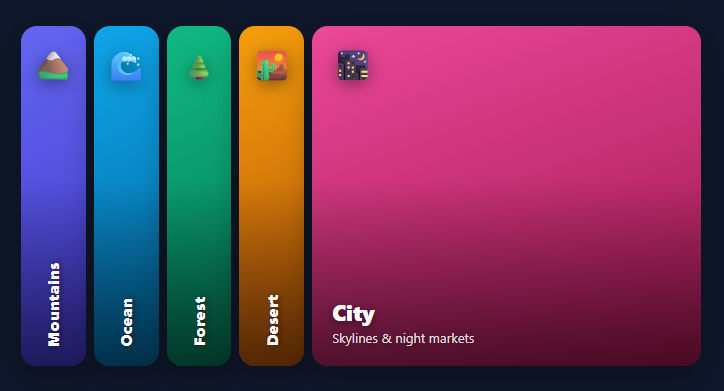
The horizontal image accordion is a striking way to present a small set of categories or destinations in a compact, interactive strip: a row of panels where hovering or clicking one makes it expand to fill most of the width while the others shrink to slivers, revealing a caption on the active panel. It is a staple of travel sites, portfolios, and category landing pages. This snippet implements it in plain HTML, CSS, and vanilla JavaScript using nothing but flexbox and transitions — no fixed widths, no JavaScript animation loop.
Flex-grow is the whole trick
Each panel is a flex child with flex-grow: 1, so by default they share the row equally. The active panel gets .active which sets flex-grow: 6, claiming six times the space of its siblings. Because flex-grow is animatable, a single transition: flex-grow .5s produces the smooth expand-and-collapse — the browser distributes the remaining space and every panel eases to its new size simultaneously. Using flex-grow rather than width means the layout stays fluid: it adapts to any container width and any number of panels without recalculating pixels.
Collapsed vertical label, expanded horizontal caption
A collapsed panel is narrow, so its label is rendered vertically with writing-mode: vertical-rl — readable in the sliver without overflowing. When a panel becomes active, that vertical label fades out and a separate .ia-info block (a large title plus a one-line description) fades and slides up from the bottom-left with a slight delay, so the caption appears after the panel has begun widening. The emoji marker also slides from centred to left-aligned as the panel expands. These small staggered transitions are what make the interaction feel designed rather than abrupt.
Click and hover, without conflict
setActive is the single source of truth: it clears .active from every panel and sets it on the chosen one. The inline onclick makes it work on touch devices and as a stable demo. To add the classic hover-to-expand behaviour without breaking touch, the JS checks window.matchMedia('(hover: hover)') and only attaches mouseenter handlers on devices that actually have a hovering pointer — so phones get tap-to-expand and desktops get hover-to-expand, each using the same setActive function.
Image-ready
The panels use gradient backgrounds with emoji placeholders so the snippet is self-contained, but each panel's background is a single --g custom property — swap it for background-image: url(...) (or set --g to an image) to drop in real photos, and a built-in bottom gradient overlay keeps the white caption legible over any image.
Pair this accordion with a scroll-snap gallery for swipeable galleries, a photo gallery grid, or a bento grid layout.
Build with AI
Build, Understand, Optimize, and Extend It With AI
You don't have to work out the flexbox math by hand. Paste this snippet's HTML, CSS, and JS into an AI coding assistant like Claude and ask it to explain exactly why flex-grow rather than width is what makes the accordion fluid at any panel count, or how the matchMedia hover-hover check keeps touch devices on tap-only interaction while still giving desktop users hover-to-expand through the same setActive function. The same assistant is useful for optimizing it — ask whether using an inline onclick attribute on every panel is a maintenance concern compared to a single delegated listener, and how you'd refactor it that way without changing the visual behavior. It's just as handy for extending the accordion: ask it to add keyboard support so panels can be expanded with Enter or Space when focused, auto-cycle through panels on a timer when idle, or support vertical orientation for a mobile layout. Treat the code less like a finished artifact and more like a starting point for a conversation.
Prompt to recreate it
Copy this into your AI assistant of choice to build the effect from scratch, or as a jumping-off point for your own variant:
Build a horizontal expanding image accordion in plain HTML, CSS, and JavaScript using flexbox flex-grow — no fixed pixel widths, no library.

Requirements:
- A row of panels, each a flex child with an equal flex-grow value at rest, each showing a small icon, a vertically-oriented label (using the CSS writing-mode property so it reads correctly in a narrow collapsed panel), and a hidden info block containing a title and description.
- Exactly one panel should carry an "active" class at a time, which increases its flex-grow to several times the resting value (so it visually dominates the row) via a single shared CSS transition on the flex-grow property, with no JavaScript-driven width calculations.
- When a panel becomes active, its vertical label must fade out, its icon must slide from centered to left-aligned, and its info block (title and description) must fade in and slide up from below with a slight transition delay so it appears just after the panel has started expanding, not simultaneously.
- Write a single reusable activation function that clears the active class from every sibling panel and applies it to just the clicked or hovered one, so click and hover interactions share one code path with no state conflicts.
- Detect whether the current device actually supports hover (using a matchMedia hover-capability check) and only attach mouseenter-based expansion in that case, leaving touch devices with reliable tap-to-expand via a click handler that always remains attached regardless of hover support.
- Each panel's background should be driven by a single custom property so that swapping a gradient placeholder for a real background image is a one-line change per panel, and include a bottom-to-top dark gradient overlay so light-colored caption text stays legible over any background.
Want to tighten it up first? Run this prompt through the AI Prompt Studio to score it across 8 quality dimensions, catch anti-patterns, and tune the wording for Claude, ChatGPT, or Gemini before you paste it in.
Step by step
How to Use
- 1Paste HTML, CSS, and JSA row of five gradient panels (Mountains, Ocean, Forest, Desert, City) appears with the first one expanded and captioned.
- 2Click a panelClick Ocean — it expands to fill most of the row, the others collapse to slivers, and its caption fades up while its vertical label disappears.
- 3Hover on desktopOn a device with a mouse, simply move across the panels — each expands on hover via the same
setActivelogic. - 4Read the captionsThe expanded panel shows a large title and a one-line description; collapsed panels show only a compact vertical label.
- 5Swap in real photosSet each panel's
--gcustom property to aurl(...)image; the built-in dark gradient overlay keeps the caption readable. - 6Add or remove panelsCopy or delete a
.ia-panel— flex-grow redistributes the space automatically, no width math required.
Real-world uses
Common Use Cases
Got questions?
Frequently Asked Questions
Each panel's background comes from its --g custom property. Set it to an image, e.g. style="--g:url('/img/ocean.jpg') center/cover", or change the .ia-panel rule to use background-image. The built-in ::after gradient overlay already darkens the bottom so the white caption stays readable over any photo.
Width animations require knowing or computing exact pixel values and break when the container resizes or the panel count changes. flex-grow is share-based: the active panel claims a larger share and the browser redistributes the rest, so the accordion is fully fluid and responsive with one transition and zero layout math.
Remove the matchMedia block at the bottom of the JS — that is the only thing adding hover behaviour. The inline onclick="setActive(this)" remains, giving you pure click-to-expand on every device. Conversely, to make it hover-only on desktop, keep the block and remove the inline onclick.
Add tabindex="0" and role="button" to each panel and a keydown handler that calls setActive on Enter/Space, so keyboard users can expand panels. Give each panel an aria-label with its title, and if the panels link somewhere, use real <a> elements as the panel so they are focusable and announced natively.
In React, store the active index in useState and set each panel's class from index === active; handle click (and optional hover) to update it. In Vue, use a ref for the active index with :class bindings in a v-for. In Angular, track the active index and bind [class.active]. The flex-grow transition and caption CSS port unchanged.