You Might Also Like
Learn Coding Visually
Learn to code with interactive, live-preview playgrounds — HTML, CSS, JavaScript, React & more.
 HTML Playground42 lessons · Click-based · Live preview
 CSS PlaygroundLearn CSS with a live editor
 JavaScript Playground60 lessons · DOM · Async · Canvas
 React PlaygroundLearn React with a live code editor
 GSAP PlaygroundLearn GSAP animation interactively
 SVG Playground44 lessons · shapes · paths · animation
 SCSS Playground45 lessons · Sass modules · tokens
 Tailwind PlaygroundLearn Tailwind CSS with a live editor
 Bootstrap 5 Playground50 lessons · live preview
SEO Score Meter — Free Composable Score Gauge Widget (HTML/CSS/JS)
SEO Score Meter · Dashboards · Plain HTML, CSS & JS · Live preview
What's included
Features
About this UI Snippet
SEO Score Meter — A Gauge That Shows How the Number Is Built
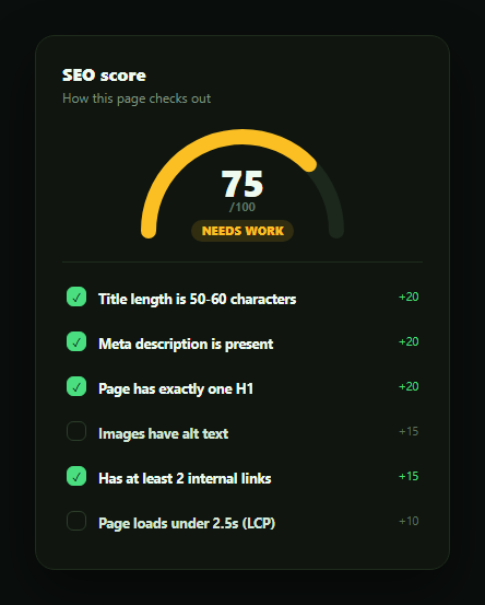
Most SEO score widgets show a single number with no explanation of how it was calculated, which makes the score feel arbitrary and the advice hard to act on. This snippet builds a semicircular gauge paired with a live checklist, in plain HTML, CSS, and vanilla JavaScript, where toggling any individual check immediately moves the gauge — making it obvious that the score is just a sum of point values, not a black box.
The score is a sum, not a mystery
Every check in the CHECKS array carries its own point value — title length worth 20, meta description worth 20, a single H1 worth 20, image alt text worth 15, internal linking worth 15, and page speed worth 10, totalling exactly 100 possible points. render() sums the points of every check currently marked on to get the score. There's no separate "compute score" formula to keep in sync with the checklist — the checklist *is* the formula.
An SVG arc gauge driven by one dash-offset
The gauge is a single SVG arc path drawn twice — a dim track and a colored fill — using stroke-dasharray/stroke-dashoffset to reveal a percentage of the arc's length. render() computes pct = score / 100 and sets the fill's dash-offset to ARC_LENGTH - ARC_LENGTH * pct, so a higher score reveals more of the arc. This is a common, dependency-free technique for progress rings and semicircle gauges that works in any browser without an animation library.
Three tiers, one function
A tierFor(score) function classifies the score as "Great shape" (80+, green), "Needs work" (50-79, amber), or "Poor" (under 50, red), and that same classification drives both the gauge's stroke color and the status label beneath it — so the color and the words can never tell a conflicting story.
Toggle a check, watch the score move
Clicking any checklist row flips its on boolean and calls render() again, instantly recomputing the score, the gauge fill, and the tier. This interactive honesty is the whole point of the widget — a user can see exactly which unchecked item is costing them points, rather than being told "72/100, improve your SEO" with no further detail.
Where it fits
Pair it with a quota usage meter or pricing feature table style checklist for other composed-score dashboards, or an onboarding checklist widget for the same toggle-and-track interaction applied to setup progress instead of a content audit.
Customizing it
Swap in your real SEO checks and point weights, wire each check's on state to an actual page analysis instead of a manual toggle, or add a "why this matters" tooltip per check so the checklist doubles as an educational tool.
Build with AI
Build, Understand, Optimize, and Extend It With AI
You don't have to work out the arc-gauge math by hand. Paste this snippet's HTML, CSS, and JS into an AI coding assistant like Claude and ask it to explain exactly how the SVG path's stroke-dasharray and stroke-dashoffset combine to reveal a percentage of a semicircle arc, and why the score is calculated as a simple sum over the CHECKS array rather than a separate formula that could drift out of sync with the checklist. The same assistant can help you extend it: ask it to add a 7th check with its own point weight (updating the total to remain out of 100), replace the manual toggle with checks that reflect a real automated page analysis via an API, or add a small "why this matters" tooltip to each check item. It's also useful for adapting the pattern entirely: ask how the same composed-score gauge structure would work for an accessibility score, a readability score, or a security checklist. Treat the code less like a finished artifact and more like a starting point for a conversation.
Prompt to recreate it
Copy this into your AI assistant of choice to build the effect from scratch, or as a jumping-off point for your own variant:
Build an "SEO score meter" widget in plain HTML, CSS, and JavaScript with no framework or library.

Requirements:
- Define 5-6 SEO checks as a data array, each with a title, a point value, and a boolean on/off state — the point values across all checks must sum to exactly 100.
- Render a semicircular (or full ring) SVG gauge showing the current score out of 100, using an SVG arc path with stroke-dasharray/stroke-dashoffset (not canvas, not an external charting library) to visually fill a percentage of the arc equal to score / 100.
- Compute the score as the sum of the point values of every check currently marked "on" — there must be no separate hardcoded score value; the checklist itself is the source of truth for the number.
- Below the gauge, render each check as a clickable row showing its title, its point value, and a checkbox-style indicator reflecting its on/off state.
- Clicking any check row must toggle that check's on/off state and immediately recompute and redraw the gauge (score number, arc fill, and a status tier) to reflect the new sum.
- Classify the score into at least 3 tiers (e.g. "Great shape" 80+, "Needs work" 50-79, "Poor" under 50) with distinct colors, and use the same tier classification to color both the gauge arc and a status label so they're always consistent with each other.
- Make sure the initial default state has a realistic mix of passing and failing checks so both a partial gauge fill and an actionable checklist are visible on first load.
Want to tighten it up first? Run this prompt through the AI Prompt Studio to score it across 8 quality dimensions, catch anti-patterns, and tune the wording for Claude, ChatGPT, or Gemini before you paste it in.
Step by step
How to Use
- 1Paste HTML, CSS, and JSA gauge and 6-item checklist render with 4 checks already passing.
- 2Read the initial score20+20+20+15=75 points from the passing checks show on the gauge.
- 3Toggle "Images have alt text"The score jumps by 15 points and the gauge fill grows.
- 4Toggle a passing check offThe gauge shrinks and the tier label may downgrade from green to amber.
- 5Watch the tier change colorBelow 80 shows amber "Needs work"; below 50 shows red "Poor."
- 6Wire up real checksReplace each check's manual toggle with a real automated page analysis.
Real-world uses
Common Use Cases
Got questions?
Frequently Asked Questions
Each of the 6 checks has a fixed point value — 20, 20, 20, 15, 15, and 10, totalling exactly 100. The score is the sum of the point values of every check currently marked "on." With the default 4 checks passing (title, meta, H1, links: 20+20+20+15), the starting score is 75.
The score is divided by 100 to get a percentage, which is applied to the SVG arc's stroke-dashoffset — a higher score reveals more of the 270-unit arc length. This is a pure CSS/SVG technique, no canvas or animation library required.
tierFor(score) returns "Great shape" (green) at 80 or above, "Needs work" (amber) from 50 to 79, and "Poor" (red) below 50. That same function's result sets both the gauge's stroke color and the status label text, so they always agree.
Toggling is what demonstrates the score is composed rather than opaque — clicking any check immediately shows how many points it's worth by watching the gauge move. In a production tool you'd likely make passing checks reflect real page analysis instead of a manual click, but the interactive toggle is a clear teaching and demo device.
Move the CHECKS array into component state and derive the score, percentage, and tier with useMemo or a computed property whenever a check's "on" value changes. The SVG arc and its dash-offset binding port directly since it's just a style attribute driven by that derived percentage.