You Might Also Like
Learn Coding Visually
Learn to code with interactive, live-preview playgrounds — HTML, CSS, JavaScript, React & more.
 HTML Playground42 lessons · Click-based · Live preview
 CSS PlaygroundLearn CSS with a live editor
 JavaScript Playground60 lessons · DOM · Async · Canvas
 React PlaygroundLearn React with a live code editor
 GSAP PlaygroundLearn GSAP animation interactively
 SVG Playground44 lessons · shapes · paths · animation
 SCSS Playground45 lessons · Sass modules · tokens
 Tailwind PlaygroundLearn Tailwind CSS with a live editor
 Bootstrap 5 Playground50 lessons · live preview
Dense Feature Comparison Matrix — Sticky Rows & Columns, No Library
Dense Feature Comparison Matrix · Pricing · Plain HTML, CSS & JS · Live preview
What's included
Features
About this UI Snippet
Dense Feature Comparison Matrix — Sticky Header Row AND Sticky First Column, Together
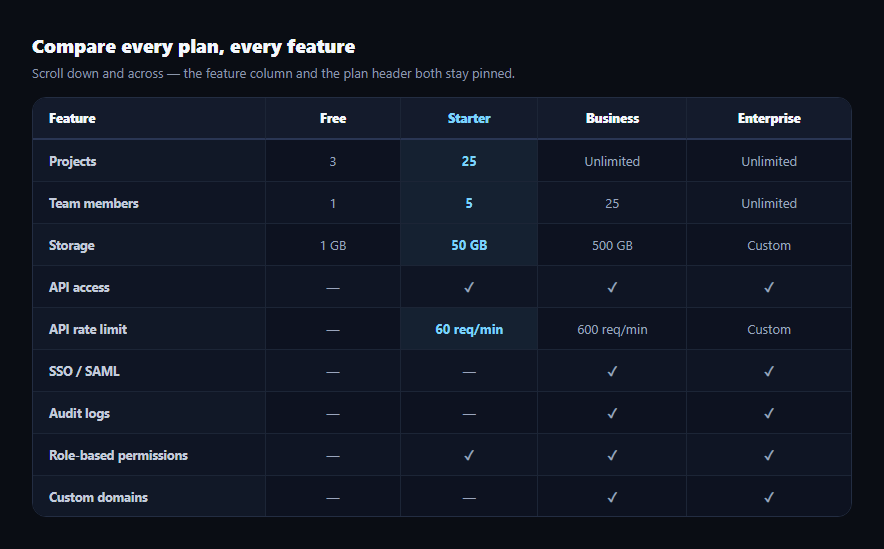
A comparison table with four or more plans and a dozen-plus feature rows is too big to fit on screen at once, which normally forces a visitor to scroll and lose track of which row or which plan column they were even looking at. This snippet solves both problems simultaneously with pure CSS position: sticky — the plan header row stays pinned while scrolling down, the feature-name column stays pinned while scrolling right, and the top-left corner cell stays pinned in both directions at once, genuinely, not just one axis dressed up to look like both.
Why sticky-both-axes is harder than it looks
Making a header row sticky (position: sticky; top: 0) is common and well-documented. Making a *first column* sticky (position: sticky; left: 0) on its own is also common. Doing both at the same time, correctly, requires getting three separate rules right together — miss any one and either the corner cell scrolls away with the header, or the first-column cells overlap the header incorrectly, or z-index fighting makes cells render behind each other during scroll:
1. Every thead th gets position: sticky; top: 0 so the whole header row pins to the top of the scroll container.
2. Every tbody th (the first-column feature-name cells) gets position: sticky; left: 0 so the whole first column pins to the left.
3. The single corner cell — .cmg-corner, the top-left th in thead — gets both top: 0 and left: 0 simultaneously, plus the highest z-index of the three layers, so it stays fixed in both directions and always renders above the header row scrolling underneath it and the first column scrolling underneath it.
The z-index layering that makes it actually work
Without careful z-index ordering, sticky cells render in DOM order as they scroll under each other, producing visible seams or the wrong cell on top. This snippet layers it explicitly: the corner cell at z-index: 3 (highest, since it overlaps both other sticky layers), the header row at z-index: 2, the first column at z-index: 1, and ordinary body cells at the default stacking level. Each sticky cell also needs its own explicit background, since a transparent sticky cell lets the scrolling content behind it show through — an easy, common mistake that makes "sticky" cells look broken even when the positioning itself is correct.
`border-collapse: separate`, not `collapse`
Sticky positioning on table cells is unreliable with border-collapse: collapse in some browser rendering engines, because collapsed borders are shared between adjacent cells in ways that interact awkwardly with sticky's own layout calculations. This table uses border-collapse: separate; border-spacing: 0 and draws borders manually via border-bottom/border-right on individual cells instead, which keeps the sticky behavior consistent and predictable across browsers.
A real 4×14 matrix, not a toy example
Four plans (Free, Starter, Business, Enterprise) across 14 feature rows — from project and team limits through SSO, audit logs, uptime SLA, and monthly price — is dense enough that sticky-both-axes genuinely matters; a small 2×4 table wouldn't demonstrate the problem this pattern solves. The scroll container is capped with max-height and overflow: auto, so both scrolling axes are real, not simulated.
Customizing it
Add rows or columns freely — the sticky rules apply by element type (thead th, tbody th, .cmg-corner), not by index, so the layout keeps working at any size. Pair it with pricing feature table for a simpler, non-scrolling variant, or comparison table for a general-purpose base.
Build with AI
Build, Understand, Optimize, and Extend It With AI
Paste this snippet's HTML and CSS into an AI coding assistant like Claude and ask it to explain exactly why the corner cell needs both top and left sticky positioning plus the highest z-index of the three sticky layers, and why border-collapse: separate is used instead of collapse. It's also a good candidate to extend — ask it to add a "pin this column" feature letting a visitor sticky an arbitrary plan column for direct comparison, make the table keyboard-navigable with arrow keys, or convert it to a responsive card-per-plan layout below a breakpoint where the sticky matrix stops making sense on narrow screens.
Prompt to recreate it
Copy this into your AI assistant of choice to build the effect from scratch, or as a jumping-off point for your own variant:
Build a dense plan comparison table in plain HTML, CSS, and JavaScript with no dependencies, where BOTH the header row (plan names) AND the first column (feature names) stay visibly pinned while scrolling — genuinely on both axes at the same time, not just one axis.

Requirements:
- At least 4 plan columns and at least 10 feature rows (aim for real density: limits, boolean features shown as check/dash, and price rows), inside a scroll container with a fixed max-height and overflow: auto so both vertical and horizontal scrolling are real, not simulated.
- Use position: sticky with top: 0 on every header cell (thead th) so the entire header row pins to the top of the scroll container while scrolling down.
- Use position: sticky with left: 0 on every first-column cell (a tbody th per row, ideally with scope="row" for accessibility) so the entire feature-name column pins to the left while scrolling right.
- The single top-left corner header cell must use position: sticky with BOTH top: 0 and left: 0 set simultaneously, and must have a higher z-index than the rest of the header row and the rest of the first column, so it stays fixed in both directions at once and renders above the other two sticky layers during a diagonal scroll — verify this actually works by reasoning through what happens at each z-index layer during scroll before finalizing the CSS.
- Use border-collapse: separate with border-spacing: 0 instead of border-collapse: collapse, and draw cell borders individually, to avoid known sticky-positioning rendering issues with collapsed table borders.
- Give every sticky cell an explicit, non-transparent background color so scrolling content does not visibly show through it.
- Style one plan column as "featured" or "recommended" to draw attention, and add zebra-striping to body rows for horizontal scannability.
Want to tighten it up first? Run this prompt through the AI Prompt Studio to score it across 8 quality dimensions, catch anti-patterns, and tune the wording for Claude, ChatGPT, or Gemini before you paste it in.
Step by step
How to Use
- 1Scroll down inside the tableThe Feature/plan header row stays pinned to the top.
- 2Scroll right inside the tableThe feature-name column stays pinned to the left.
- 3Scroll diagonallyThe corner cell stays fixed in both directions simultaneously.
- 4Hover a rowA lightweight highlight helps track a feature across many columns.
- 5Add a plan columnAdd a th to the header and a matching td to every row — sticky rules apply automatically.
- 6Add a feature rowAdd a tr with a tbody th first cell — it inherits the sticky first-column rule.
Real-world uses
Common Use Cases
Got questions?
Frequently Asked Questions
Both axes genuinely work at once. thead th cells use position: sticky with top: 0 (sticky vertically), tbody th cells use position: sticky with left: 0 (sticky horizontally), and the single corner cell — the top-left th — uses both top: 0 and left: 0 together with the highest z-index of the three layers, so it stays fixed in both directions simultaneously as you scroll diagonally.
As you scroll, the corner cell sits at the intersection where the sticky header row and the sticky first column would otherwise overlap each other. Without the corner having the highest z-index, whichever layer comes later in the DOM would render on top during scroll, causing the corner cell to visually disappear under the header or the first column instead of staying correctly on top of both.
position: sticky on table cells behaves unreliably in some browsers when combined with border-collapse: collapse, because collapsed borders are shared between adjacent cells in a way that can interfere with sticky's positioning calculations. Using border-collapse: separate with border-spacing: 0, and drawing borders manually on individual cells, avoids that class of bug entirely.
A sticky cell without its own background is transparent, so as the rest of the table scrolls underneath it, that scrolling content shows through the "pinned" cell — which looks broken even though the positioning itself is technically correct. Every sticky cell in this table sets an explicit background so it visually occludes whatever scrolls beneath it.
No — the sticky rules are written against element types (thead th, tbody th, and the .cmg-corner class) rather than specific row or column indices, so adding a new plan column (a th plus a matching td in every row) or a new feature row (a tr with a tbody th first cell) automatically inherits the correct sticky behavior with no other changes needed.