You Might Also Like
Learn Coding Visually
Learn to code with interactive, live-preview playgrounds — HTML, CSS, JavaScript, React & more.
 HTML Playground42 lessons · Click-based · Live preview
 CSS PlaygroundLearn CSS with a live editor
 JavaScript Playground60 lessons · DOM · Async · Canvas
 React PlaygroundLearn React with a live code editor
 GSAP PlaygroundLearn GSAP animation interactively
 SVG Playground44 lessons · shapes · paths · animation
 SCSS Playground45 lessons · Sass modules · tokens
 Tailwind PlaygroundLearn Tailwind CSS with a live editor
 Bootstrap 5 Playground50 lessons · live preview
Liquid Glass Navbar — Free FLIP-Animated Pill Nav Snippet
Liquid Glass Navbar · Navigation · Plain HTML, CSS & JS · Live preview
What's included
Features
About this UI Snippet
Liquid Glass Navbar — Frosted Pill Navigation With a FLIP-Animated Morphing Indicator
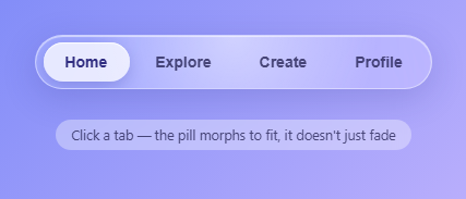
Apple's "Liquid Glass" material, introduced across iOS and macOS 26, is built from two visual ingredients layered together: heavy translucency via backdrop blur, and a soft specular sheen that makes the surface look like it is catching light rather than just sitting flat. This snippet recreates both with plain CSS — backdrop-filter: blur(20px) saturate(160%) on the navbar itself for the glass body, and a separate radial-gradient .lg-sheen layer for the highlight — then adds the piece that actually makes a pill nav feel alive: an active-tab indicator that morphs between tabs instead of just fading in and out.
Why morphing instead of fading
A fading indicator (opacity 0 to 1 on a new pill, opacity 1 to 0 on the old one) reads as two separate objects taking turns. A morphing indicator — one that visibly slides and resizes from the old tab's exact position and width to the new tab's position and width — reads as one continuous object, which is the actual "liquid" quality the aesthetic is named for. Getting that right means animating from real, measured layout values, not guessed ones.
The FLIP technique, step by step
FLIP stands for First, Last, Invert, Play, and it is the standard trick for animating layout changes smoothly. First: before doing anything, pill.getBoundingClientRect() records the pill's current on-screen box. Last: the pill is then instantly (with transition: none) repositioned to match the new target tab's real left and width, and its box is measured again — this is where the element ends up, with no animation yet. Invert: the delta between the first and last positions is computed (deltaX, plus a scaleX ratio for the width change), and applied as a transform. Because a transform is applied that exactly cancels out the jump, the pill visually appears to still be in its old spot even though its real left/width have already changed underneath. Play: a transition is set on transform only, and the transform is reset to identity (translateX(0) scaleX(1)) — the browser now animates from the inverted position back to the true position, which the eye reads as a smooth morph from old tab to new tab.
Why animate transform instead of left/width directly
You could skip FLIP entirely and just transition left and width with CSS. That works, but those are layout-triggering properties — the browser has to recompute geometry on every frame, which gets janky under load and cannot be handed off to the compositor thread. transform (translate and scale) can be composited independently of layout, so the FLIP version stays smooth even on a busy page. This matters far more in real apps than in this small demo: the same FLIP pattern is what keeps drag-and-drop reordering, filtered grid reflows, and shared-element page transitions smooth in production UIs.
The forced reflow gotcha
Between writing the inverted transform and writing the identity transform, the code calls pill.getBoundingClientRect() again purely to force a synchronous layout flush. Without it, the browser may batch both style writes together before ever painting the inverted state, and the transition has nothing to animate from — the pill would just snap to its final position with no visible motion. This is one of the most common FLIP bugs and worth knowing by name.
Backdrop blur, saturation, and the inset highlight
The glass body pairs blur(20px) with saturate(160%), which is what gives translucent Apple-style surfaces their slightly punchier, more vivid color underneath the blur rather than looking washed out. A subtle inset 0 1px 1px rgba(255,255,255,0.6) box-shadow adds a hairline top highlight that reads as a curved glass edge catching light, and the same trick is repeated on the pill itself so it looks like a distinct glass layer floating above the bar, not just a flat color fill.
Pointer-tracked sheen for extra polish
On mousemove, the sheen's radial-gradient position is recalculated from the cursor's percentage position within the navbar and written directly to background. This is deliberately simple — no requestAnimationFrame loop is needed since mousemove already fires at a usable rate — and it makes the glass feel like a physical reflective surface responding to where you are looking, rather than a static texture.
Build with AI
Build, Understand, Optimize, and Extend It With AI
Hand this snippet's JS to an AI assistant like Claude and ask it to trace through movePillTo() step by step, matching each block of code to First, Last, Invert, and Play — it is a great way to actually internalize FLIP rather than just recognizing the acronym. Good extensions to ask for: adapt the pill to work in a vertical sidebar nav instead of a horizontal bar, add keyboard arrow-key navigation between tabs with the same morph animation, or make the sheen respond to device orientation on mobile instead of mousemove using the DeviceOrientation API.
Prompt to recreate it
Copy this into your AI assistant of choice to build the effect from scratch, or as a jumping-off point for your own variant:
Build a frosted "liquid glass" pill navigation bar in plain HTML, CSS, and JavaScript with a morphing active-tab indicator, no libraries.

Requirements:
- A horizontal row of button "tabs" inside a rounded pill-shaped container styled with backdrop-filter: blur() and saturate() for heavy translucency, plus a subtle inset highlight so it reads as a glass surface over a colorful gradient background.
- A single reusable absolutely-positioned "pill" element that represents the active tab indicator, sitting behind the tab buttons in stacking order.
- When a different tab is clicked, animate the pill from its old position/width to the new tab's position/width using the FLIP technique: measure the pill's current bounding box (First), instantly move it to the new tab's real position with no transition (Last), compute the delta between the two and apply it as an inverted CSS transform so it appears unmoved (Invert), force a synchronous reflow, then transition the transform back to identity (Play) — do not animate left/width/top directly.
- Use a spring-like easing curve (a cubic-bezier with overshoot) on the Play phase so the morph has a light bounce rather than a linear or purely-eased slide.
- Add a separate radial-gradient "sheen" layer over the glass bar whose position updates on mousemove to track the cursor, simulating light reflecting off glass.
- Make the indicator logic fully generic so it works correctly for tabs of different widths and for any number of tabs, always deriving position and size from live getBoundingClientRect() measurements rather than hardcoded pixel values.
- Include comments in the JS explicitly labeling the First, Last, Invert, and Play steps so the technique is easy to study.
Want to tighten it up first? Run this prompt through the AI Prompt Studio to score it across 8 quality dimensions, catch anti-patterns, and tune the wording for Claude, ChatGPT, or Gemini before you paste it in.
Step by step
How to Use
- 1See the frosted pill bar render over the gradient backgroundThe navbar shows heavy blur with the gradient softly visible through it, a bright highlight near the top, and a solid white pill sitting under the active "Home" tab.
- 2Move your mouse over the navbarA soft radial highlight follows your cursor across the glass surface, reinforcing the sense that it is a reflective material rather than a flat translucent rectangle.
- 3Click a different tab, e.g. "Explore"The white pill visibly slides and resizes from underneath "Home" to underneath "Explore" in one continuous motion with a light spring overshoot — it does not fade out and back in.
- 4Click rapidly between distant tabsBecause each click re-measures the pill's real current position with getBoundingClientRect before animating, rapid clicks stay smooth and never jump-cut, even mid-animation.
- 5Inspect the JS for the movePillTo functionRead through the First/Last/Invert/Play comments in sequence — each labeled block corresponds directly to one step of the FLIP technique described in the about section.
- 6Resize the tabs or add a new oneAdd another <button class="lg-item"> in the HTML and it just works — the pill's position and width are always derived from the clicked element's live getBoundingClientRect, never hardcoded pixel values.
Real-world uses
Common Use Cases
Got questions?
Frequently Asked Questions
transform (translate and scale) can be handled by the compositor thread without triggering a browser layout recalculation on every animation frame, so it stays smooth even under load. Animating left and width directly forces a synchronous layout pass each frame, which is more expensive and can visibly stutter. FLIP achieves the identical visual result — an element that appears to slide and resize between two real layout positions — while only ever animating a transform.
Browsers batch style writes and only recalculate layout when something actually reads a layout-dependent value. Without that extra getBoundingClientRect() call between setting the inverted transform and resetting it to identity, both writes could be flushed together and the browser would never paint the "inverted" frame — the pill would just snap to its destination with no visible animation. Calling getBoundingClientRect() forces the browser to compute and paint the current state first, guaranteeing the transition has a starting point to animate from.
It is supported in all current versions of Chrome, Edge, Safari, and Firefox (Firefox added support in 2022 without a vendor prefix), but the snippet still includes -webkit-backdrop-filter for older WebKit-based browsers. If backdrop-filter is unsupported, the navbar gracefully falls back to its semi-transparent background color without blur, which still looks acceptable, just less "glassy."
Yes. Keep the pill-morph logic inside a ref-based effect: in React, run movePillTo inside a useLayoutEffect that fires when the active-tab index state changes, using a ref to the pill element and refs (or querySelectorAll scoped to a container ref) for the tab buttons — no cleanup is required since it is not a persistent loop, just a one-shot animation per click. In Vue, call the equivalent inside a watcher on the active index using nextTick to ensure the DOM has updated first; in Angular, trigger it from the click handler directly since there is no continuous timer or animation frame loop to dispose of.
Just add more <button class="lg-item"> elements to the HTML — no JS changes are needed. Because movePillTo() always reads the clicked element's live getBoundingClientRect().width and left, it automatically fits a "Home" tab and a much wider "Notifications and Settings" tab correctly, since the FLIP calculation is based on real measured geometry rather than a fixed pill width.