You Might Also Like
Learn Coding Visually
Learn to code with interactive, live-preview playgrounds — HTML, CSS, JavaScript, React & more.
 HTML Playground42 lessons · Click-based · Live preview
 CSS PlaygroundLearn CSS with a live editor
 JavaScript Playground60 lessons · DOM · Async · Canvas
 React PlaygroundLearn React with a live code editor
 GSAP PlaygroundLearn GSAP animation interactively
 SVG Playground44 lessons · shapes · paths · animation
 SCSS Playground45 lessons · Sass modules · tokens
 Tailwind PlaygroundLearn Tailwind CSS with a live editor
 Bootstrap 5 Playground50 lessons · live preview
CSS Anchor Positioning Menu — HTML CSS JS Snippet
Anchor Positioning Menu · Navigation · Plain HTML, CSS & JS · Live preview
What's included
Features
About this UI Snippet
Anchor Positioning Menu — Native Popover API, anchor-name/position-area, position-try Fallbacks & @starting-style Animation
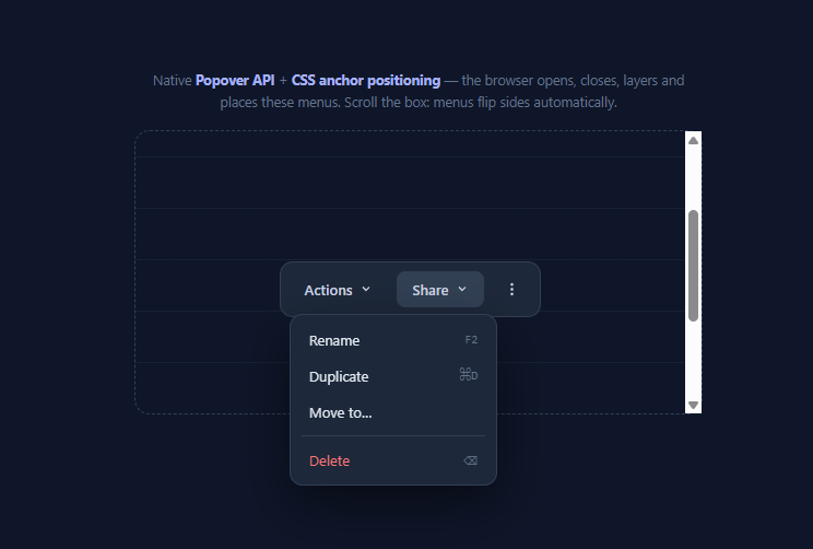
For fifteen years, dropdown menus meant JavaScript positioning libraries — Popper, Floating UI, or hand-rolled getBoundingClientRect math — plus manual outside-click handlers, Escape listeners, z-index wars, and clipping fights with overflow: hidden ancestors. Two platform features ended that era: the Popover API (open/close, light dismiss, Escape, and top-layer rendering, all native) and CSS anchor positioning (declarative tethering with automatic flip fallbacks). This snippet builds a toolbar with three dropdown menus using both — inside a scrollable stage that proves the flagship trick: scroll until a menu runs out of room below its button, and the browser flips it above, with zero JavaScript involved.
The Popover API: behaviour without listeners
Each menu is a plain <div popover id="menu-actions">, and each trigger is <button popovertarget="menu-actions">. That attribute pair alone gives you: toggle on click, light dismiss (clicking anywhere else closes it), Escape to close, only-one-auto-popover-open-at-a-time (open Share and Actions closes itself), focus handling, and rendering in the top layer — the same stacking context as native <dialog>, which sits above every z-index and cannot be clipped by any overflow: hidden ancestor. The demo's JS does exactly two real things, both app logic rather than plumbing: closing a menu after an item is chosen (menu.hidePopover() on item click, since popovers rightly don't assume inner clicks mean "done"), and feature-detecting anchor support for the notice. The API also fires toggle events with newState for analytics or lazy content.
Anchor positioning: tethering as a style
Positioning takes four declarations. The trigger declares anchor-name: --actions — an identifier, like a named target. The menu declares position-anchor: --actions to tether to it, and position-area: bottom span-right to sit below the anchor, spanning rightward from its left edge (the 9-cell position-area grid replaces all the old top: calc(...) math). Finally — the part that used to require a library — position-try-fallbacks: top span-right, bottom span-left, top span-left lists alternate placements the browser tries *automatically* whenever the preferred one would overflow the viewport: scroll the stage and watch menus flip above their buttons in real time, re-evaluated on every scroll and resize by the engine, off the main thread. Because popovers live in the top layer, the tether even works across the scroll container boundary that would clip an absolutely-positioned menu.
Animating from display: none
Popovers are display: none when closed, which historically made entry animation impossible — transitions need a starting style, and a hidden element has none. Two new primitives fix it, both used here: @starting-style supplies the "from" values (opacity: 0; translateY(-4px) scale(0.98)) applied for the first frame after the popover opens, and transition: display 0.16s allow-discrete, overlay 0.16s allow-discrete keeps the element rendered (and in the top layer — that's the overlay property) until the exit transition finishes. The result is the standard dropdown fade-and-drop, implemented entirely in the stylesheet against :popover-open.
Progressive enhancement posture
The Popover API is supported everywhere (Chrome 114+, Safari 17+, Firefox 125+). Anchor positioning shipped in Chromium (125+) and is rolling through Safari and Firefox; the snippet guards it with @supports not (anchor-name: --a), falling back to a centred fixed-position drop so menus remain fully functional — open/close/dismiss all still native — just not tethered. CSS.supports('anchor-name: --a') drives the user-facing notice. This is the correct adoption posture in 2026: popover everywhere, anchors as enhancement, and a polyfill (@oddbird/css-anchor-positioning) if you need tethering universally today.
Build with AI
Build, Understand, Optimize, and Extend It With AI
This snippet compresses five new platform features into one small file, and an AI assistant is the fastest way to pull them apart: paste it into Claude and ask it to enumerate exactly which behaviours come from the popover attribute versus the anchor CSS versus the three animation primitives — then have it break each one deliberately (remove allow-discrete, remove @starting-style, remove the fallback list) and describe what you'd observe, which is the quickest route to a durable mental model. For real work, hand it one of your existing Popper or Floating UI dropdowns and ask for a migration to this pattern, including the CSS.supports branch your browser matrix requires and the roving arrow-key focus the Popover API leaves to you for menu-role accessibility. Two extensions worth requesting: a single shared popover retargeted across a table's row-action kebabs by rewriting position-anchor before showPopover(), and a hint-popover tooltip variant reusing the same anchor plumbing with position-area: top center. Each teaches a corner of the API the basic demo can't.
Prompt to recreate it
Copy this into your AI assistant of choice to build the effect from scratch, or as a jumping-off point for your own variant:
Build a toolbar with three dropdown menus using ONLY the native Popover API and CSS anchor positioning in plain HTML and CSS — JavaScript may appear solely for closing a menu after an item is chosen and for feature detection.

Requirements:
- A toolbar with two labelled buttons (Actions, Share) and an icon-only kebab button; each button opens its own menu using the popovertarget attribute pointing at a div with the popover attribute — no click listeners for opening, closing, outside-click, or Escape, since the Popover API provides toggle, light dismiss, Escape handling, sibling auto-closing, and top-layer rendering natively.
- Tether each menu with CSS anchor positioning: anchor-name on its trigger, position-anchor plus position-area (below the anchor, left-aligned growing rightward) on the menu, a small block-axis margin as the gap, and a position-try-fallbacks list that flips the menu above the anchor and realigns it when viewport space runs out.
- Place the toolbar inside a taller-than-viewport scrollable stage with a dashed border so scrolling visibly demonstrates the automatic flip — menus must reposition live as their anchors approach the container edges, with zero scroll listeners.
- Animate entry and exit from display:none correctly: base closed styles with opacity and a small translate/scale, revealed under :popover-open, an @starting-style block supplying the entry first-frame, and a transition list that includes display and overlay with allow-discrete so the exit fade completes before the element leaves the top layer.
- Menus contain hover-highlighted items with monospace keyboard-shortcut hints, a separator, and a red danger action; a small delegated click handler calls hidePopover() when an item is chosen.
- Guard anchor positioning with @supports not (anchor-name: --a) providing a functional fixed-position fallback, surface a notice via CSS.supports() detection, and comment which behaviours are native versus app logic — making clear the popover part ships unguarded because its support is universal.
Want to tighten it up first? Run this prompt through the AI Prompt Studio to score it across 8 quality dimensions, catch anti-patterns, and tune the wording for Claude, ChatGPT, or Gemini before you paste it in.
Step by step
How to Use
- 1Open the menus and test the native behaviourClick Actions, Share, or the kebab — menus fade in below their buttons. Press Escape, click outside, or open another menu: each closes correctly with no JS listeners involved. Now scroll the dashed stage so a button nears the bottom edge and reopen its menu — it flips above the button automatically via position-try-fallbacks, re-evaluating as you continue scrolling.
- 2Wire a menu to your own triggerThree steps: give the trigger anchor-name: --mymenu and popovertarget="my-menu"; give the panel popover, id="my-menu", and position-anchor: --mymenu; choose a position-area (bottom span-right for left-aligned dropdowns, bottom span-left for right-aligned ones like user menus in a top-right corner) plus a position-try-fallbacks list of the placements you would accept when space runs out.
- 3Choose placement with the position-area gridposition-area addresses a 3×3 grid around the anchor: block keywords (top/bottom/center) × inline keywords (left/right/span-left/span-right/center). span-right means "start at the anchor's left edge and grow rightward". For a centred tooltip use top center; for a submenu flying out sideways use right span-bottom. The margin-block: 6px on the menu is the gap from the anchor.
- 4Keep the exit animation workingThe transition list must include display and overlay with allow-discrete, or closing will snap instead of fading (the element becomes display:none immediately). @starting-style must repeat the closed-state values for :popover-open — it defines the first frame of entry. If you add new animated properties, add them in three places: base .menu, :popover-open, and @starting-style.
- 5Handle browsers without anchor supportThe @supports not (anchor-name: --a) block gives non-supporting browsers a fixed centred drop — functional but untethered. For production-parity everywhere, add the @oddbird/css-anchor-positioning polyfill (a script tag; it parses and emulates the CSS), or branch to a Floating UI implementation when CSS.supports("anchor-name: --a") is false. Never gate the popover behaviour itself — that part is universal.
- 6Export and composeClick JSX for React — popover and popovertarget are plain attributes (React 19 passes them through), so the pattern needs no refs or portals; the top layer replaces createPortal entirely. Compare with the JS-positioned Dropdown Menu and Nested Dropdown to see what the platform now absorbs, and pair with the Context Menu or Command Palette for adjacent patterns.
Real-world uses
Common Use Cases
Got questions?
Frequently Asked Questions
Six behaviours, all free with popover + popovertarget: (1) toggle on trigger click, including correct aria-expanded semantics on the invoker; (2) light dismiss — clicking outside closes the popover, implemented natively so it cannot desync the way document-level click listeners do; (3) Escape-key dismissal; (4) auto-popover exclusivity — opening one closes others, which previously required a shared store or event bus; (5) top-layer rendering above all stacking contexts, replacing portal/append-to-body strategies and killing z-index and clipping bugs structurally; and (6) toggle/beforetoggle lifecycle events for hooks like lazy-loading menu content. What it deliberately does not do: close when something inside is clicked (that is app semantics — a menu closes on item choice, a filter panel does not, so this snippet adds the three-line item-click handler), and arrow-key roving focus between items, which remains your responsibility for full menu-role accessibility.
position-area places the positioned element into a cell of an implicit 3×3 grid drawn around the anchor: one block-axis keyword (top/center/bottom) and one inline-axis keyword (left/center/right, or the span- variants which align to an anchor edge and grow across it — span-right means "left edges aligned, extend rightward", the normal dropdown alignment). If the chosen placement would overflow the element's containing block (effectively the viewport for top-layer popovers), the browser walks position-try-fallbacks in order and uses the first candidate that fits, re-running this test on every scroll, resize, and anchor movement — the engine-level equivalent of Floating UI's flip middleware, but off the main thread and with no listeners. Order your fallbacks by preference: this snippet tries the vertical flip first (top span-right) before horizontal realignment, because a menu jumping sides is more disorienting than one flipping up.
A closed popover is display: none, and display is a discrete property — normally it switches instantly at transition start, so the element vanishes before your opacity transition can play. transition: display 0.16s allow-discrete changes the timing for discrete properties: display flips at the END of the transition when animating to none, keeping the element rendered while it fades out. overlay is the companion property that only exists for top-layer elements: it controls whether the element is still promoted to the top layer, and it also needs allow-discrete so the browser keeps the popover in the top layer for the duration of the exit — without it, the closing menu instantly drops out of the top layer and can get clipped or reordered mid-fade. Entry needs the third piece, @starting-style, because an element coming from display:none has no prior computed styles to transition from; the @starting-style block supplies that first-frame state. All three appear in this snippet's .menu rules — remove any one and a direction of the animation breaks.
Tailwind v4 speaks these features via arbitrary properties and variants: the trigger gets [anchor-name:--menu], the panel gets [position-anchor:--menu] [position-area:bottom_span-right] [position-try-fallbacks:top_span-right] open:opacity-100 (the :popover-open state maps to Tailwind's open: variant), with @starting-style via the starting: variant in v4. React 19 forwards popover, popovertarget, and popovertargetaction as regular props — no refs, no portals (the top layer makes createPortal obsolete for this), and toggle events attach with onToggle. Angular binds them as attributes and the CSS ships in component styles unchanged. Support: the Popover API is universal in evergreen browsers (Chrome 114+, Safari 17+, Firefox 125+); anchor positioning is Chromium 125+ with Safari/Firefox rolling out — so ship popovers unguarded, wrap tethering in @supports as this snippet does, and where the fallback drop position is not acceptable, add the @oddbird/css-anchor-positioning polyfill or branch to Floating UI when CSS.supports("anchor-name: --a") returns false.