You Might Also Like
Learn Coding Visually
Learn to code with interactive, live-preview playgrounds — HTML, CSS, JavaScript, React & more.
 HTML Playground42 lessons · Click-based · Live preview
 CSS PlaygroundLearn CSS with a live editor
 JavaScript Playground60 lessons · DOM · Async · Canvas
 React PlaygroundLearn React with a live code editor
 GSAP PlaygroundLearn GSAP animation interactively
 SVG Playground44 lessons · shapes · paths · animation
 SCSS Playground45 lessons · Sass modules · tokens
 Tailwind PlaygroundLearn Tailwind CSS with a live editor
 Bootstrap 5 Playground50 lessons · live preview
Interest Selector — Free HTML CSS JS Snippet
Interest Selector · Forms · Plain HTML, CSS & JS · Live preview
What's included
Features
About this UI Snippet
Interest Selector — Pill Chip Multi-Select for Onboarding and Personalisation
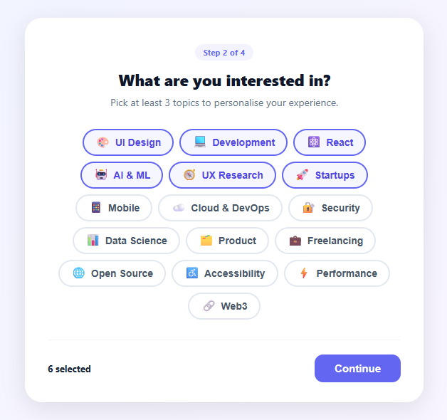
An interest selector is a multi-select chip grid — related to the chip filter and tag input — used in onboarding flows, newsletter preference centres, and content personalisation screens to learn what a user cares about. This snippet provides 16 topic chips in a flex-wrap grid, a minimum selection validation (3 required), a live count display, a disabled Continue button that enables on reaching the minimum, and a "Select at least 3" hint that hides once the minimum is met.
The pill chip toggle pattern
Each .chip is a button element styled as a rounded pill. toggle(chip) adds or removes the .selected class, which switches the border from grey (#e2e8f0) to indigo (#6366f1) and applies a light indigo background tint. Using button elements (not divs or inputs) gives keyboard focus, Enter/Space activation, and correct ARIA semantics for free.
Minimum selection validation
update() counts .chip.selected elements and compares against MIN = 3. If below minimum, the Continue button is disabled via disabled attribute (which CSS styles as grey with not-allowed cursor). The "Select at least 3" note appears below the count text. Once the minimum is met, both the button enables and the note hides. This pattern is cleaner than showing a validation error on submit — it gives real-time visual guidance.
The live count display
#countText shows "0 selected", "1 selected", "3 selected" etc. A zero state shows "None selected". This gives immediate feedback on each chip click, making the requirement clear and progress visible — particularly important on mobile where users may not see the minimum count hint.
Emoji icons in chip buttons
The emoji inside each chip uses a span with font-size: 16px. Emoji render as colored icons across all platforms without any icon library. The chip layout is flex with a 6px gap between the emoji and the label text, keeping them tightly coupled as a single visual unit.
Collecting the selected values
To read which topics are selected, query all .chip.selected elements and extract their data-id attributes: const selected = [...document.querySelectorAll(".chip.selected")].map(el => el.dataset.id). This gives an array like ["design", "react", "devtools"]. On Continue, POST this array to your API: fetch("/api/onboarding/interests", { method: "POST", body: JSON.stringify({ interests: selected }), headers: { "Content-Type": "application/json" } }). On the server, store the array in the user's profile and use it to seed the personalised content feed.
Search and filtering for large topic lists
When the topic list grows beyond 20–30 chips, add a search box above the grid. On each keystroke, filter visible chips by checking if the chip's label text includes the search query (case-insensitive): chips.forEach(chip => { chip.style.display = chip.querySelector(".chip-label").textContent.toLowerCase().includes(q) ? "" : "none"; }). This keeps the underlying selection state intact while narrowing the visible choices. For very large lists (100+ topics), consider grouping chips into collapsible category sections with a "Show more" toggle per group.
Build with AI
Build, Understand, Optimize, and Extend It With AI
You do not have to trace the toggle and validation logic by hand to know exactly what it is doing. Paste this snippet's HTML, CSS, and JS into an AI coding assistant like Claude and ask it to explain why update() re-queries document.querySelectorAll(".chip.selected") on every single click instead of maintaining a running counter, and whether that matters at 16 chips versus 200. The same assistant is useful for optimizing it, for example suggesting a Set-based selection model that avoids a full DOM query on every toggle, or profiling whether a large topic grid should be virtualized. It is just as good for extending the pattern, such as adding a configurable MAX alongside the existing MIN, grouping chips into collapsible categories for a much longer topic list, or persisting selections to localStorage so a returning user's chips are pre-selected. Treat the code less like a finished artifact and more like a starting point for a conversation.
Prompt to recreate it
Copy this into your AI assistant of choice to build the effect from scratch, or as a jumping-off point for your own variant:
Build an "interest selector" onboarding step in plain HTML, CSS, and JavaScript using only DOM APIs and CSS class toggles — no state library, no framework.

Requirements:
- A grid of pill-shaped chip buttons (flex-wrap, not CSS grid) that reflows naturally at any container width, each button carrying a machine-readable identifier in a data attribute separate from its visible emoji-plus-label content.
- Clicking a chip toggles a "selected" class on that chip via classList.toggle, which restyles its border and background — no other chip's state is affected.
- A MIN constant (e.g. 3) defines the minimum number of chips that must be selected. After every toggle, recompute the count of selected chips, update a live "N selected" text element, enable or disable a Continue button's disabled attribute based on whether the count meets MIN, and show or hide a "select at least N" hint element to match.
- The Continue button must use the native disabled attribute (styled distinctly via CSS, e.g. grey background and not-allowed cursor) rather than just a visual-only disabled look, so it is genuinely non-interactive below the minimum.
- On Continue, collect the data attribute values of every currently selected chip into a plain array (not the display text) so the result is stable even if labels are renamed or translated later.
- Use real button elements for the chips so they are keyboard-focusable and activate on Enter and Space without extra JavaScript.
Want to tighten it up first? Run this prompt through the AI Prompt Studio to score it across 8 quality dimensions, catch anti-patterns, and tune the wording for Claude, ChatGPT, or Gemini before you paste it in.
Step by step
How to Use
- 1Click chips to select or deselect topicsClick any topic chip to toggle it selected (indigo border and tint). Click again to deselect. The count updates immediately and the Continue button enables when 3 or more are selected.
- 2Change the minimum requirementEdit var MIN = 3 in the JS to any number. The count display and validation update accordingly.
- 3Add or remove topicsDuplicate a .chip button in the HTML. Update the emoji in .chip-icon and the label in .chip-label. Set a unique data-id for the selected values array.
- 4Pre-select topics for returning usersOn page load, read the user's saved interests and add the .selected class to matching chips: savedInterests.forEach(id => document.querySelector('.chip[data-id="' + id + '"]').classList.add("selected")). Then call update().
- 5Handle the Continue actionReplace the alert() in onContinue() with your navigation logic: save the selected array to an API endpoint (POST /api/onboarding/interests) and advance to the next step.
- 6Export for your frameworkClick "JSX" for a React component with useState for selected set and useMemo for count. Click "Vue" for a Vue 3 SFC with reactive Set.
Real-world uses
Common Use Cases
Got questions?
Frequently Asked Questions
In toggle(chip), check the count before adding .selected: if (!chip.classList.contains("selected") && document.querySelectorAll(".chip.selected").length >= MAX) return; This prevents selection above the cap. Show a "Max N selected" note below the count when the limit is hit.
After loading the page, fetch the user's saved interests and apply: savedInterests.forEach(id => { const chip = document.querySelector('.chip[data-id="' + id + '"]'); if (chip) chip.classList.add("selected"); }); call update() after to refresh the count and button state.
Use const [selected, setSelected] = useState(new Set(["dev", "react", "ux"])). Toggle: setSelected(prev => { const next = new Set(prev); next.has(id) ? next.delete(id) : next.add(id); return next; }). Derive count: selected.size. Disable continue: selected.size < 3. Render each chip as a button with an onClick that calls the toggle function, and apply a conditional className that adds the active/selected styles when selected.has(chip.id) is true. Pass the selected set to the Continue handler as Array.from(selected) to convert it to a plain array for API serialisation. For animation, add a short CSS scale transform on the .selected class toggle so chips visually "pop" when selected — a 100ms scale(1.05) then back to scale(1) via a CSS transition creates a satisfying tactile feel that encourages engagement in onboarding flows.
A single MIN variable drives the whole gate. update() counts document.querySelectorAll(".chip.selected").length, writes the live "N selected" counter, disables #continueBtn while count < MIN, and shows the #minNote hint. Change MIN to 1 for an optional-feeling picker or 5 for a stronger personalisation signal, and update the subtitle copy ("Pick at least 3 topics…") to match — the enforcement and the promise should always agree.
Every chip carries its machine value in data-id, so onContinue() collects them with Array.from(document.querySelectorAll(".chip.selected")).map(c => c.dataset.id) — giving you a clean array like ["design", "dev", "ai"] regardless of the visible labels or emoji. Replace the demo alert with a fetch POST to your onboarding endpoint or stash the array in localStorage for the next step. Keeping display labels separate from data-id values means you can rename or translate chips without breaking stored preferences.