You Might Also Like
Learn Coding Visually
Learn to code with interactive, live-preview playgrounds — HTML, CSS, JavaScript, React & more.
 HTML Playground42 lessons · Click-based · Live preview
 CSS PlaygroundLearn CSS with a live editor
 JavaScript Playground60 lessons · DOM · Async · Canvas
 React PlaygroundLearn React with a live code editor
 GSAP PlaygroundLearn GSAP animation interactively
 SVG Playground44 lessons · shapes · paths · animation
 SCSS Playground45 lessons · Sass modules · tokens
 Tailwind PlaygroundLearn Tailwind CSS with a live editor
 Bootstrap 5 Playground50 lessons · live preview
Custom File Input — Styled Upload Field Snippet
Custom File Input · Forms · Plain HTML, CSS & JS · Live preview
What's included
Features
About this UI Snippet
Custom File Input — Styled Button, File Name + Size & Clear Control
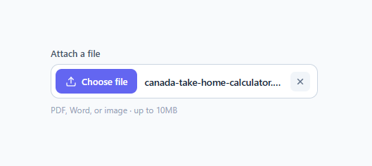
A custom file input is one of the most-searched form snippets because the default <input type="file"> is notoriously ugly and unstylable — its button text and appearance are controlled by the browser and OS, and look different everywhere. For a drag-and-drop area instead, see the file dropzone; for upload feedback, the upload progress card. This snippet replaces it with a clean, branded control that shows a "Choose file" button, the selected file's name and size, and a clear button to remove it — while keeping a real, accessible <input type="file"> underneath so uploads and keyboard support keep working.
The accessible hide-and-replace pattern
The trick to styling a file input without breaking it is to keep the native input and hide it visually rather than replace it. The <input type="file"> is wrapped in a <label> and hidden with position: absolute; width: 1px; height: 1px; opacity: 0 — not display: none, which would remove it from the tab order and from assistive tech. Because the whole control is a <label>, clicking anywhere on it (the styled button, the filename area) opens the OS file picker natively. This is the same reliable pattern used for the accessible custom checkbox, applied to file inputs: the browser handles the file dialog, validation, and form submission; CSS only handles appearance.
Showing the file name and size
When the user picks a file, a single change listener reads input.files[0] and writes the file's name and a human-readable size into the .file-name element ("report.pdf · 248 KB"). The fmtSize helper converts the raw byte count into B, KB, or MB so the size is readable. The filename area uses text-overflow: ellipsis with overflow: hidden so a very long filename truncates gracefully instead of breaking the layout. A .has-file class on the wrapper darkens the text and bolds it so a chosen file looks visibly different from the "No file selected" placeholder.
The clear button
Once a file is selected, a clear (×) button appears. Clicking it resets the input value (input.value = ''), restores the placeholder text, removes the .has-file class, and hides itself again. One important detail: the clear button calls e.preventDefault() because it lives inside the <label> — without it, clicking the × would also trigger the label and re-open the file picker. This is exactly the kind of subtlety that breaks naive custom file inputs, and handling it is what makes this control feel solid. Resetting input.value is the correct way to clear a file input; you cannot set its value to a filename for security reasons, but you can clear it.
Restricting accepted file types
The native accept attribute (.pdf,.png,.jpg,.jpeg,.doc,.docx) tells the OS file picker to highlight matching file types, which guides users toward valid selections. Note that accept is a hint, not enforcement — users can still override it — so always validate the file type and size on the client (in the change handler) and again on the server. The hint line under the control ("PDF, Word, or image · up to 10MB") sets expectations before the user opens the dialog.
The focus and hover states
Because the native input is preserved, keyboard focus lands on it, and .file:focus-within styles the whole control with the brand border and a focus ring — using :focus-within so the ring appears when the hidden input is focused via keyboard. The control also has a hover state. These make the custom input feel like a first-class form field rather than a static button, and keep it operable for keyboard users who Tab to it and press Enter/Space to open the picker.
Customizing the control
Re-theme by changing the "Choose file" button color, the focus ring, and the clear-button hover (red here). Swap the upload and × SVGs for your own icons. Change the accept attribute to your allowed types and update the hint text to match. To show a thumbnail preview for images, read the file with URL.createObjectURL(file) in the change handler and set it as an <img> src (remember to revokeObjectURL when clearing). To accept multiple files, add the multiple attribute and render a small list of names instead of one. The structure — label, hidden input, button, name, clear — stays the same.
Why keep the native input
A common but broken approach builds a "file input" from a styled <button> plus JavaScript, which cannot actually open the OS file dialog without a hidden real input anyway, and risks losing keyboard support and form submission. Keeping the genuine <input type="file"> means the file is included in a normal form submit under its name, the OS file picker (including drag-from-desktop and recent files) works, screen readers announce it as a file upload, and it is keyboard-operable — all for free. The custom look is purely cosmetic CSS layered on top of a fully functional field.
Build with AI
Build, Understand, Optimize, and Extend It With AI
You don't need to reverse-engineer the accessibility trick here on your own. Paste the HTML, CSS, and JS into an AI coding assistant like Claude and ask it to explain precisely why the native input is hidden with position absolute plus opacity 0 instead of display none, and why the clear button's click handler needs e.preventDefault() when it lives inside the label. The same assistant can help optimize it — for instance checking whether fmtSize should memoize or whether the DOMContentLoaded versus requestAnimationFrame init fallback is actually needed for your framework export. It's also a fast way to extend the control: ask it to add an image thumbnail preview via URL.createObjectURL, support the multiple attribute with a scrollable file list, or add drag-and-drop onto the same label. Treat the code less like a finished artifact and more like a starting point for a conversation.
Prompt to recreate it
Copy this into your AI assistant of choice to build the effect from scratch, or as a jumping-off point for your own variant:
Build a custom-styled file input in plain HTML, CSS, and JavaScript that keeps the real native file input fully functional — no fake button-only implementations, no libraries.

Requirements:
- Wrap a real input type="file" inside a label element, so clicking anywhere in the styled control (button, filename text) opens the OS file picker natively without any JS click-forwarding.
- Hide the native input visually using position absolute, width and height of 1px, and opacity 0 — explicitly not display none — so it stays in the tab order and reachable by screen readers and keyboard.
- On the input's change event, read input.files[0] and, if present, write the file name plus a human-readable size (formatted as B, KB, or MB depending on magnitude) into a text element, and add a has-file class to the wrapper to restyle the filename text; if no file, reset to a placeholder state.
- Show a clear button only when a file is selected. Its click handler must call e.preventDefault() before resetting input.value to an empty string and restoring the placeholder state, specifically to stop the click from also bubbling to the label and reopening the file picker.
- Add a :focus-within style on the wrapper so keyboard focus on the hidden input still produces a visible focus ring around the whole control.
- Set the accept attribute to a realistic list of file types (e.g. .pdf,.png,.jpg,.jpeg,.doc,.docx) and display a hint line describing accepted types and a max size, understanding that accept is only a hint and real validation must also happen in the change handler.
Want to tighten it up first? Run this prompt through the AI Prompt Studio to score it across 8 quality dimensions, catch anti-patterns, and tune the wording for Claude, ChatGPT, or Gemini before you paste it in.
Step by step
How to Use
- 1Copy the controlCopy the <label class="file"> with its hidden <input type="file">, the .file-btn, .file-name, and .file-clear button, plus the small script.
- 2Keep the native inputThe real <input type="file"> stays (hidden via opacity, not display:none) so uploads, keyboard, and form submission work. The whole label opens the picker.
- 3Set accepted typesChange the accept attribute to your allowed file types and update the hint text. Validate type and size in the change handler and on the server too.
- 4Add an image preview (optional)In the change handler, use URL.createObjectURL(file) as an <img> src to show a thumbnail; revoke it when clearing.
- 5Re-theme itChange the Choose-file button color, the focus ring, and the clear-button hover to match your form.
- 6Export in your formatClick "HTML" for a standalone file, "JSX" for a React component, or "Tailwind" for a React + Tailwind version.
Real-world uses
Common Use Cases
Got questions?
Frequently Asked Questions
Keep the real <input type="file"> and hide it with position: absolute; width/height: 1px; opacity: 0 (never display: none, which removes it from the tab order). Wrap everything in a <label> so clicking the styled button opens the OS picker, and use a change listener to show the file name. The native input still handles uploads, keyboard, and submission.
In a change event listener, read input.files[0] and write its name and a formatted size into your label element. A small helper converts the byte count into KB or MB. A class on the wrapper styles the chosen-file state differently from the placeholder.
The clear button is inside the <label>, so a normal click would also activate the label and re-open the file picker. Calling e.preventDefault() stops that, so clicking × only clears the field. Clearing is done by setting input.value = "".
Set the accept attribute (e.g. accept=".pdf,.png,.jpg") to guide the OS picker toward matching types. It is a hint, not enforcement, so also validate the type and size in the change handler and again on the server.
In the change handler, call URL.createObjectURL(file) and set it as the src of an <img>. Revoke the object URL with URL.revokeObjectURL when the file is cleared or replaced to free memory.
Yes. Click "JSX" for a React component or "Tailwind" for a React + Tailwind version. In React, keep a ref or controlled state for the chosen file, render the name/size from it, and clear by resetting the input via a ref; the label/hidden-input structure is unchanged.