You Might Also Like
Learn Coding Visually
Learn to code with interactive, live-preview playgrounds — HTML, CSS, JavaScript, React & more.
 HTML Playground42 lessons · Click-based · Live preview
 CSS PlaygroundLearn CSS with a live editor
 JavaScript Playground60 lessons · DOM · Async · Canvas
 React PlaygroundLearn React with a live code editor
 GSAP PlaygroundLearn GSAP animation interactively
 SVG Playground44 lessons · shapes · paths · animation
 SCSS Playground45 lessons · Sass modules · tokens
 Tailwind PlaygroundLearn Tailwind CSS with a live editor
 Bootstrap 5 Playground50 lessons · live preview
Contact Picker Button — Free navigator.contacts with Manual Fallback
Contact Picker Button · Buttons · Plain HTML, CSS & JS · Live preview
What's included
Features
About this UI Snippet
Contact Picker Button — Native Device Picker With a Manual Path That Feels Just as Real
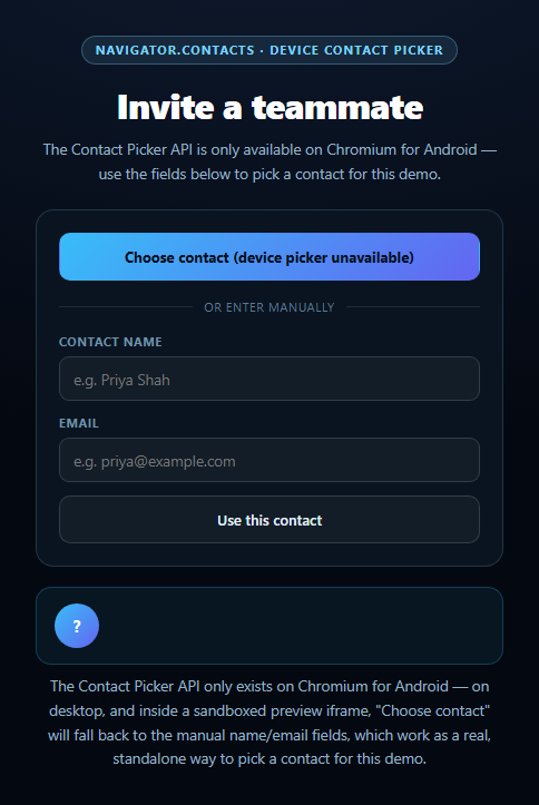
The Contact Picker API's navigator.contacts.select() lets a web page ask the operating system's own address book for a contact — no server, no OAuth, just a native picker UI the browser owns. It's also one of the narrowest browser APIs in existence: it shipped only in Chromium on Android, has no desktop implementation anywhere, and needs a real top-level user gesture in a secure context, so it essentially never fires inside a sandboxed preview iframe. This snippet treats that reality directly by building a manual entry path that stands on its own as a real feature, not a "sorry, this doesn't work" message.
The real device picker
pickDeviceContact() gates the whole attempt behind checking both 'contacts' in navigator and 'ContactsManager' in window, then calls navigator.contacts.select(['name', 'email'], { multiple: false }) inside a try/catch. On success, the resolved array's first entry's name and email fields populate the selected-contact card exactly the way a real invite flow would use them.
A manual path built to feel complete, not apologetic
Below the picker button sit two ordinary, always-present inputs for name and email, styled and labeled as a first-class alternative rather than a hidden fallback — "or enter manually" reads as an equal option, not an error state. useManualContact() validates that a name was entered, then renders the exact same selected-contact card the native picker would produce. Because almost every visitor to this demo — anyone not on Chromium for Android — will use this path by default, it had to be built as if it were the primary feature, which is exactly what makes this snippet worth studying alongside the more permission-flaky APIs in this batch.
One rendering path for both sources
showSelected(name, email) is the single function both the native picker and the manual form call to display a result, the same "shape-matched" discipline used in this library's canvas audio frequency bars snippet, where simulated and real audio data feed the identical drawing function. Whichever source provided the contact, the resulting UI — an avatar initial, name, and email — is indistinguishable.
Handling the empty and denied cases
An empty picker result (the user backed out without choosing anyone) gets its own clear status message rather than being treated as an error, and any thrown exception — commonly a SecurityError from a missing user gesture or a blocked iframe permissions policy — routes straight to the manual fields with focus already placed in the name input, so recovering from a failed native attempt takes zero extra clicks. Pair this with a share modal for an invite flow, or a team presence list to show who's already been added.
Customizing it
Request additional properties like tel or icon, allow multiple: true for a bulk invite flow, or validate the manual email field's format before accepting it.
Build with AI
Build, Understand, Optimize, and Extend It With AI
Paste this snippet's HTML, CSS, and JS into an AI coding assistant like Claude and ask it to explain why the manual name/email entry path is written as a fully-featured, equally-weighted alternative to the native picker rather than a disabled-looking fallback message — and why that design choice matters given the Contact Picker API's extremely narrow support (Chromium on Android only, no desktop browser at all). It's a good prompt for reasoning about API scoping generally: ask what the requested properties array (['name', 'email']) controls, and how the multiple option would change both the returned data shape and the UI needed to display several contacts at once. For extensions, ask it to add multiple-contact selection with a checklist-style result display, validate the manual email field's format before accepting it, or persist recently-used manual contacts in localStorage for quick reselection. Treat the code less like a finished artifact and more like a starting point for a conversation.
Prompt to recreate it
Copy this into your AI assistant of choice to build the effect from scratch, or as a jumping-off point for your own variant:
Build a "Contact Picker Button" in plain HTML, CSS, and JavaScript — no libraries.

Requirements:
- A "Choose contact" button, and below it, a clearly-labeled manual entry section with name and email input fields plus a "Use this contact" button, presented as an equally valid option rather than a hidden or apologetic fallback.
- A single shared display function that renders a selected contact (an avatar with the first letter of the name, the full name, and the email) so both the native picker and the manual form produce visually identical results.
- The Choose Contact button should check both 'contacts' in navigator and 'ContactsManager' in window before attempting anything, then call navigator.contacts.select(['name', 'email'], { multiple: false }) inside a try/catch. On a successful non-empty result, extract the first contact's name and email arrays and pass them to the shared display function. On an empty result (user backed out of the picker), show a distinct "No contact selected" status rather than treating it as an error.
- CRITICAL: since the Contact Picker API is supported only on Chromium for Android and has zero desktop browser support (meaning most visitors, and definitely anyone viewing this inside a sandboxed preview iframe where the underlying permission is virtually always unavailable, will never see the native picker work), make sure that on any unsupported-browser or thrown-error case, the status text explains what happened and focuses the manual name input so recovering takes no extra clicks — never leave the button in a dead-end state.
- The manual form should validate that a name was entered before accepting the contact, support submitting via the Enter key in either field, and use the exact same shared display function as the native path.
Want to tighten it up first? Run this prompt through the AI Prompt Studio to score it across 8 quality dimensions, catch anti-patterns, and tune the wording for Claude, ChatGPT, or Gemini before you paste it in.
Step by step
How to Use
- 1Paste HTML, CSS, and JSA "Choose contact" button and manual name/email fields render.
- 2Click "Choose contact" on Chromium AndroidThe device's real contact picker opens.
- 3Click it anywhere elseIt explains the API isn't available and focuses the manual fields.
- 4Type a name and emailClick "Use this contact" to select it the same way.
- 5See the selected-contact cardBoth paths render to the identical avatar/name/email display.
- 6Press Enter in either fieldSubmits the manual contact without needing the mouse.
Real-world uses
Common Use Cases
Got questions?
Frequently Asked Questions
The Contact Picker API's navigator.contacts.select() is implemented only in Chromium-based browsers on Android — there is no desktop implementation in any browser, and it's routinely disallowed inside sandboxed preview iframes like the one likely rendering this demo, since it requires a genuine top-level user gesture in a secure context. On any of those unsupported platforms, the button automatically explains that and directs you to the manual name/email fields instead.
No — it's built as a fully functional, standalone way to select a contact for this demo, since it's what the overwhelming majority of visitors will actually use (anyone not on Chromium for Android). Typing a name and email and clicking "Use this contact" produces the exact same selected-contact card the native picker would, through the same rendering function.
This snippet requests just name and email via navigator.contacts.select(['name', 'email'], { multiple: false }), but the API can also request tel (phone numbers), address, icon, and others, depending on what the browser supports and what the user's contact entry contains. Each requested property comes back as an array on the selected contact object, since a single contact can have multiple emails or phone numbers.
navigator.contacts.select() resolves with an empty array rather than rejecting when the user dismisses the picker without selecting a contact. This snippet checks for that case explicitly and shows a plain "No contact selected" status, distinct from an actual failure like a permission or security error, which shows a different message and falls back to the manual fields.
Keep the selected contact (name and email) as component state, and call the same pickDeviceContact and useManualContact logic from your button click handlers, setting state instead of touching the DOM directly. The capability checks and the try/catch around navigator.contacts.select() work identically regardless of framework, since they're plain browser API calls.