You Might Also Like
Learn Coding Visually
Learn to code with interactive, live-preview playgrounds — HTML, CSS, JavaScript, React & more.
 HTML Playground42 lessons · Click-based · Live preview
 CSS PlaygroundLearn CSS with a live editor
 JavaScript Playground60 lessons · DOM · Async · Canvas
 React PlaygroundLearn React with a live code editor
 GSAP PlaygroundLearn GSAP animation interactively
 SVG Playground44 lessons · shapes · paths · animation
 SCSS Playground45 lessons · Sass modules · tokens
 Tailwind PlaygroundLearn Tailwind CSS with a live editor
 Bootstrap 5 Playground50 lessons · live preview
Competitive Rank Tier Badge — Free Gaming Rank UI
Competitive Rank Tier Badge · Cards · Plain HTML, CSS & JS · Live preview
What's included
Features
About this UI Snippet
Competitive Rank Tier Badge — One Points Value Drives Everything
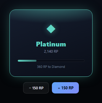
This is the rank badge pattern from competitive games and gamified apps — a Bronze-through-Diamond tier name, a tier-colored glow and emblem, and a progress bar toward the next tier with a "points needed" readout. Every part of the badge is derived from a single ranked-points (RP) number, not set independently.
A table of tier thresholds, not a chain of if/else
TIERS is an ordered array of { name, min, color, glow, emblem } objects, where min is the RP value at which that tier begins. tierForRp(points) walks the list and keeps the *last* tier whose min the current points meet or exceed — a small, readable loop that scales cleanly to any number of tiers without a growing if/else chain, and makes adding a new tier (say, an "Ascendant" tier above Diamond) a one-line array addition.
Colors driven by CSS custom properties
Rather than toggle classes per tier, the current tier's color and glow are written onto the card as CSS custom properties (--tier-color, --tier-glow) via style.setProperty(). Every visual element that needs the tier color — the border, the box-shadow glow, the emblem, the tier name text, and the progress bar's gradient — reads from those same two properties, so the whole badge re-themes instantly and consistently with a single JS write.
A progress bar computed from real thresholds
The bar's fill percentage is (currentRP - currentTierMin) / (nextTierMin - currentTierMin) * 100 — the share of the *current tier's own point range* that's been completed, not a share of some arbitrary max. The label reads nextTierMin - currentRP, the exact number of points still needed, recalculated fresh every time RP changes.
The top-tier edge case, handled explicitly
At the highest tier (Diamond here), there's no "next tier" to progress toward. Rather than let the math produce NaN or a stale bar, the code explicitly detects the missing next tier, fills the bar to 100%, and swaps the label to "Highest tier reached" — an honest terminal state instead of a broken-looking one. Pair this with an activity rings or gradient stat ring card for a fuller player-profile dashboard.
Build with AI
Build, Understand, Optimize, and Extend It With AI
Paste this snippet's HTML, CSS, and JS into an AI coding assistant like Claude and ask it to explain why tierForRp() walks the TIERS array keeping the last matching threshold instead of using a chain of if/else statements, and what happens to that logic's correctness if the TIERS array isn't kept sorted by ascending min value. It's also useful for reasoning about the progress bar math — ask why the percentage is computed relative to the current tier's own point range rather than as a percentage of the maximum possible RP. For extensions, ask it to add a promotion celebration animation that fires specifically when rp growth crosses a tier's min threshold (not on every point gain), or to add tier icons as SVGs instead of Unicode glyph characters. Treat the code less like a finished artifact and more like a starting point for a conversation.
Prompt to recreate it
Copy this into your AI assistant of choice to build the effect from scratch, or as a jumping-off point for your own variant:
Build a "competitive rank tier badge" in plain HTML, CSS, and JavaScript — no libraries.

Requirements:
- A TIERS array of objects (at least Bronze, Silver, Gold, Platinum, Diamond) each with a name, a min ranked-points (RP) threshold where that tier begins, a color, a glow color, and an emblem character, ordered from lowest to highest threshold.
- A single rp number driving the entire badge. Write a tierForRp(points) function that determines the current tier by finding the highest-threshold tier whose min the points meet or exceed (do not use a manually maintained if/else chain per tier).
- Apply the current tier's color and glow as CSS custom properties (e.g. --tier-color, --tier-glow) on the badge's root element via style.setProperty(), and reference those same two custom properties from CSS for the border color, a box-shadow/glow effect, the emblem color, the tier name text color, and the progress bar's gradient — so a single JS update re-themes the whole badge.
- CRITICAL progress bar logic: compute the fill percentage as (rp - currentTierMin) / (nextTierMin - currentTierMin) * 100 — the share of the CURRENT tier's own RP range completed — and a label showing exactly how many points remain to the next tier, both computed live from rp and the TIERS thresholds, not hardcoded.
- CRITICAL edge case: when rp is in the highest tier (no next tier exists in the array), do not attempt the normal percentage math — instead show the bar at 100% and a clear "Highest tier reached" (or similar) label instead of a broken/NaN result.
- Two buttons that add or subtract RP (e.g. ±150) and re-render the whole badge, demonstrating both promotion (tier increases, color/glow/emblem swap) and demotion (tier decreases) working correctly through the same render function.
Want to tighten it up first? Run this prompt through the AI Prompt Studio to score it across 8 quality dimensions, catch anti-patterns, and tune the wording for Claude, ChatGPT, or Gemini before you paste it in.
Step by step
How to Use
- 1Paste HTML, CSS, and JSA Platinum-tier badge renders with sample RP.
- 2Click "+ 150 RP"Watch the progress bar and points-needed label update.
- 3Cross a tier thresholdThe badge's color, glow, and emblem swap automatically.
- 4Reach DiamondThe bar fills to 100% and shows "Highest tier reached".
- 5Click "− 150 RP"Confirm the badge can also demote correctly.
- 6Edit TIERSAdd, remove, or re-threshold tiers freely.
Real-world uses
Common Use Cases
Got questions?
Frequently Asked Questions
TIERS is an ordered array of objects each with a min RP threshold where that tier begins. tierForRp() walks the array and keeps updating its answer to the last tier whose min the current RP meets or exceeds, so the result is always the highest tier the player has actually reached — no separate if/else chain to keep in sync as tiers are added.
It's (currentRP - currentTierMin) / (nextTierMin - currentTierMin) * 100 — the share of the CURRENT tier's own point range that has been completed, not a percentage of some fixed global maximum. That's why the bar always starts near 0% right after a promotion and fills toward 100% as the next tier approaches.
The code explicitly checks whether a next tier exists in the TIERS array. If not (i.e. the player is at the top tier), it skips the normal percentage math entirely, sets the bar to a full 100%, and swaps the label to "Highest tier reached" — avoiding a NaN or divide-by-zero result from trying to compute progress toward a tier that doesn't exist.
The current tier's color and glow values are written onto the card element as CSS custom properties (--tier-color and --tier-glow) via style.setProperty(). Every element that needs tier coloring — border, glow, emblem, tier name, and progress bar gradient — references those same two custom properties in its CSS, so updating them once updates every dependent style simultaneously.
Keep rp and the TIERS array as-is (or move TIERS to a constants file), compute the current tier index and next-tier progress with the same tierForRp() logic inside a derived/computed value, and set the CSS custom properties either via an inline style object or a ref's style.setProperty() call in an effect that runs when rp changes.