Learn Coding Visually
Learn to code with interactive, live-preview playgrounds — HTML, CSS, JavaScript, React & more.
 HTML Playground42 lessons · Click-based · Live preview
 CSS PlaygroundLearn CSS with a live editor
 JavaScript Playground60 lessons · DOM · Async · Canvas
 React PlaygroundLearn React with a live code editor
 GSAP PlaygroundLearn GSAP animation interactively
 SVG Playground44 lessons · shapes · paths · animation
 SCSS Playground45 lessons · Sass modules · tokens
 Tailwind PlaygroundLearn Tailwind CSS with a live editor
 Bootstrap 5 Playground50 lessons · live preview
Fullscreen Menu — Animated Nav Overlay HTML CSS JS
Fullscreen Menu · Modals · Plain HTML, CSS & JS · Live preview
What's included
Features
About this UI Snippet
Fullscreen Menu — Clip-Path Circle Reveal with Staggered Nav Links
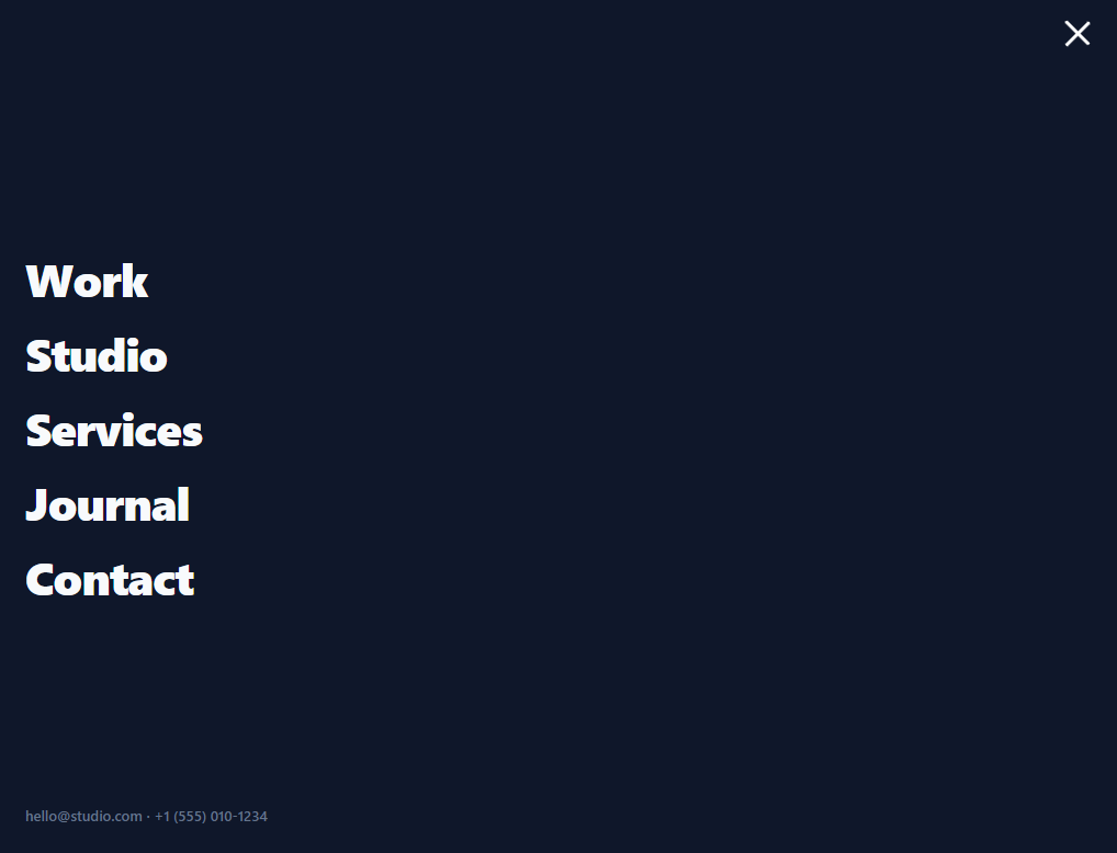
A fullscreen menu is the bold navigation pattern where tapping the hamburger expands a full-viewport overlay of large links — common on agency, portfolio, and editorial sites. This snippet builds it in plain HTML, CSS, and vanilla JavaScript: a clip-path circle reveal from the menu button, links that stagger in, an animated hamburger-to-X, scroll lock, and the expected close behaviours — no library.
A circular clip-path reveal
Instead of a plain fade, the overlay reveals with an expanding circle: clip-path: circle(0% at …) anchored at the menu button's position grows to circle(150% …) on open, so the menu appears to spread out from the button the user tapped. Animating clip-path is GPU-friendly and far more distinctive than opacity alone — it's the signature "wipe open from the corner" effect, and anchoring the circle at the button ties the overlay's origin to the trigger.
Staggered link entrance
The nav links don't all appear at once. Each <li> carries a custom property --i (its index), and the open state translates each link up into place with a transition-delay of base + i × step — so they cascade in one after another. Driving the stagger with a CSS custom property and calc() means the delay is data-free CSS (no per-link JavaScript), and adding a link is just another <li> with the next index. The links start translated down and clipped by their overflow: hidden parent, so they rise into view like a reveal.
Hamburger that becomes an X
The toggle's three bars animate into a close X: the top and bottom bars translate to the centre and rotate ±45°, the middle fades out. This morph is pure CSS driven by an fm-on class, and the bars switch colour to stay visible against the dark overlay. A single toggle handler opens or closes based on the current state.
Scroll lock and accessible close
Opening sets body { overflow: hidden } so the page behind can't scroll — essential for a full-viewport overlay, or the background scrolls under the menu. The overlay closes on Escape, on choosing any link, and on the toggle, all routed through one close() that also restores scroll, resets the hamburger, and updates aria-expanded/aria-hidden so the state is announced to assistive tech.
Drop-in and adaptable
It's a complete navigation overlay — wire the links to your routes, restyle the type and colours, and adjust the clip-path origin to your button's position. It's a clear reference for clip-path reveals, CSS custom-property staggering, and the scroll-lock-and-close lifecycle every fullscreen menu needs.
Build with AI
Build, Understand, Optimize, and Extend It With AI
You don't have to work out the clip-path geometry by hand. Paste this snippet's HTML, CSS, and JS into an AI coding assistant like Claude and ask it to explain exactly why circle(0%) and circle(150%) are anchored at the same fixed point rather than a percentage-based one, and how the --i custom property combined with a calc() transition-delay produces the letter-by-letter... actually link-by-link cascade without any per-link JavaScript timing. The same assistant can help optimize it — ask whether animating clip-path at this scale has any jank risk on lower-end mobile devices compared to a transform-based alternative, or whether the scroll-lock approach using body overflow hidden causes a layout shift from the disappearing scrollbar that should be compensated for. It's also useful for extending the menu: have it add a focus trap so Tab cycles only within the open overlay, a nested submenu that reveals with its own stagger, or a second clip-path shape (from center instead of a corner) for a different open origin. Treat the code less like a finished artifact and more like a starting point for a conversation.
Prompt to recreate it
Copy this into your AI assistant of choice to build the effect from scratch, or as a jumping-off point for your own variant:
Build a fullscreen navigation menu overlay that reveals with a circular clip-path wipe, in plain HTML, CSS, and JavaScript — no libraries.

Requirements:
- A header with a logo and a hamburger toggle button built from three stacked bar elements (not an icon font or SVG), plus a full-viewport overlay containing a vertical list of large navigation links and a footer line, both hidden by default.
- The overlay's closed state must use CSS clip-path set to a circle with a 0% radius anchored at a fixed point matching the toggle button's approximate position; its open state (driven by a single class toggle) must expand that same circle to a radius large enough to cover the entire viewport regardless of screen size, transitioning between the two with an eased CSS transition on clip-path only.
- Each navigation link's list item must carry its own index as a CSS custom property. In the closed state, links must be translated downward and fully transparent; in the open state, every link must translate to its resting position and fade in, with each link's transition-delay computed from its index via calc() so the links visibly cascade into view one after another — no JavaScript may set individual per-link timing.
- The hamburger toggle must morph into an X purely via CSS driven by one class: the top and bottom bars rotate roughly 45 degrees in opposite directions and translate to meet in the middle, the middle bar fades out, and all bars switch to a color visible against the overlay's dark background once open.
- Toggling open must lock the page's own scrolling (so the background can never scroll behind the overlay) and toggle appropriate aria-expanded/aria-hidden attributes; toggling closed must restore scrolling. The overlay must close via the toggle button, via the Escape key, and via clicking any navigation link — all three paths must route through one shared close function so scroll-lock and attribute state can never drift out of sync between them.
Want to tighten it up first? Run this prompt through the AI Prompt Studio to score it across 8 quality dimensions, catch anti-patterns, and tune the wording for Claude, ChatGPT, or Gemini before you paste it in.
Step by step
How to Use
- 1Paste HTML, CSS, and JSA header with a hamburger renders; the page sits behind a hidden fullscreen overlay.
- 2Open the menuClick the hamburger — the overlay wipes open in a circle from the button and links stagger in.
- 3Close itPress Escape, click the X, or choose a link; the overlay wipes closed and scroll unlocks.
- 4Wire your linksReplace the nav items with your routes; add an <li> with the next --i to extend.
- 5Adjust the originMatch the clip-path circle's "at" position to your menu button's location.
- 6Restyle itChange the overlay colour, link type size, and stagger timing to fit your brand.
Real-world uses
Common Use Cases
Got questions?
Frequently Asked Questions
The overlay has clip-path: circle(0% at <button position>) when closed, which clips it to nothing, and circle(150% at <same position>) when open, which expands the visible circle beyond the viewport. A CSS transition animates clip-path between the two, so the menu appears to wipe open from the button. Anchoring the circle's centre at the menu button ties the reveal's origin to the trigger.
Each <li> sets a CSS custom property --i to its index. The open state applies transition-delay: calc(base + var(--i) * step) to each link, so link 1 animates slightly before link 2, and so on — a cascade. Because the delay is computed in CSS from the index, there's no JavaScript timing per link; adding a link is just another <li> with the next --i value.
A fullscreen overlay covers the viewport, but without locking scroll the page behind it still scrolls when the user swipes or scrolls over the menu — which feels broken and can move the background out from under the links. Setting body { overflow: hidden } on open (and restoring it on close) freezes the page behind the overlay. close() always restores it so scroll never gets stuck off.
The toggle is a real button with aria-label and aria-expanded that flips on open/close, and the overlay's aria-hidden updates so assistive tech knows whether it's active. Escape closes it, matching keyboard convention. For full robustness you'd also trap focus within the open overlay and return focus to the toggle on close — a small addition on top of this foundation.
Hold an open boolean in state and toggle classes/aria from it; lock body scroll in an effect when open. In React use useState plus a useEffect for the Escape listener and scroll lock; in Vue, a ref with onMounted/onUnmounted; in Angular, a property with HostListener. The clip-path and stagger CSS are framework-agnostic — only the open state and listeners move into the framework.