You Might Also Like
Learn Coding Visually
Learn to code with interactive, live-preview playgrounds — HTML, CSS, JavaScript, React & more.
 HTML Playground42 lessons · Click-based · Live preview
 CSS PlaygroundLearn CSS with a live editor
 JavaScript Playground60 lessons · DOM · Async · Canvas
 React PlaygroundLearn React with a live code editor
 GSAP PlaygroundLearn GSAP animation interactively
 SVG Playground44 lessons · shapes · paths · animation
 SCSS Playground45 lessons · Sass modules · tokens
 Tailwind PlaygroundLearn Tailwind CSS with a live editor
 Bootstrap 5 Playground50 lessons · live preview
Cohort Retention Heatmap — Free Weekly Retention Grid Snippet
Cohort Retention Heatmap · Charts · Plain HTML, CSS & JS · Live preview
What's included
Features
About this UI Snippet
Cohort Retention Heatmap — Weekly Retention by Signup Cohort
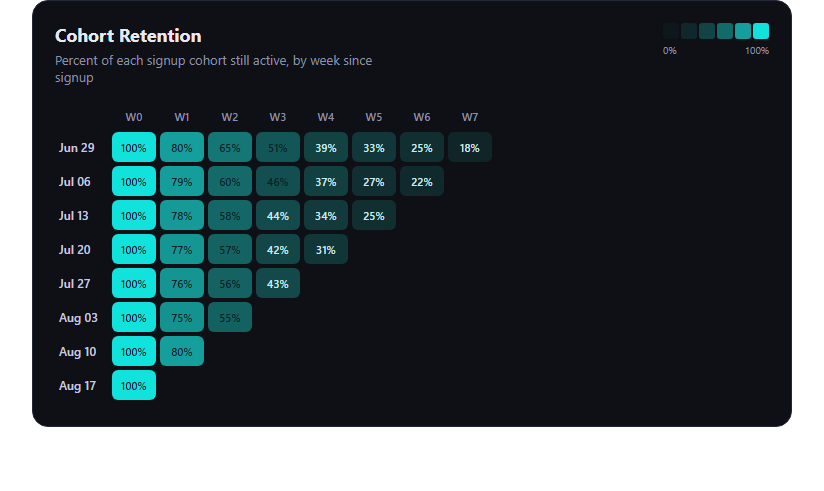
The cohort retention heatmap is the analytics-dashboard staple for tracking how well a product holds onto users: rows are signup cohorts (one per week), columns are weeks-since-signup, and each cell's color intensity shows what percentage of that cohort is still active. This snippet builds one in plain HTML, CSS, and JavaScript with a genuinely computed color function.
A real percentage-to-color function
The core of the demo is retentionColor(pct), which takes any retention percentage from 0 to 100 and computes an HSLA color from it — hue stays fixed (teal), while saturation, lightness, and alpha are all derived mathematically from the normalized percentage. Nothing is a hardcoded per-cell color or a lookup table; feed the function 37% or 91% and it produces a proportionally different shade every time, which is what makes the grid an honest visualization rather than a set of pre-picked swatches.
Simulated but structured data
Each cohort row is generated with a seeded pseudo-random decay model: retention starts at 100% and multiplies by a per-cohort decay factor each week, with small jitter layered in so the curve looks organic rather than a perfect exponential. Cells for weeks that haven't happened yet for a newer cohort are rendered empty (crh-empty), which is how real retention tables look — the staircase of missing future weeks.
Legend generated from the same function
The legend swatches are built by calling retentionColor() at six sample points (0, 20, 40, 60, 80, 100), so the legend can never drift out of sync with what the cells actually show — change the color function once and both update together.
Hover tooltips
Hovering any populated cell shows a small tooltip positioned relative to the card with the cohort label and the exact retention percentage, so users get precision on demand without cluttering every cell with a wall of text (though the cells do show a compact inline percentage too).
Customizing it
Swap the simulated data for your real cohort table, change the color ramp's hue or curve, add a click handler to drill into a cohort's users, or extend the grid to more weeks. Pair it with a funnel chart for conversion context, an activity heatmap for daily engagement, or a stat comparison card for headline retention KPIs.
Build with AI
Build, Understand, Optimize, and Extend It With AI
Rather than guessing at a color ramp by eye, paste this snippet's HTML, CSS, and JS into an AI coding assistant like Claude and ask it to walk through exactly how retentionColor(pct) turns a raw percentage into an HSLA string — why saturation, lightness, and alpha are all functions of the normalized value instead of a fixed palette, and how that keeps the legend and cells mathematically in sync. It's also a good way to sanity-check the simulated decay model: ask whether the seeded pseudo-random generator produces a fair spread of cohort curves, or whether the empty-cell handling for not-yet-elapsed weeks correctly distinguishes "no data yet" from "churned to zero." From there you can have it extend the demo: wiring the table to a real API response, adding a click-to-drill-into-cohort handler, or building a colorblind-safe alternate palette using perceptually uniform lightness steps.
Prompt to recreate it
Copy this into your AI assistant of choice to build the effect from scratch, or as a jumping-off point for your own variant:
Build a "cohort retention heatmap" in plain HTML, CSS, and JavaScript — no chart library, no CDN.

Requirements:
- Rows represent signup cohorts (one per week); columns represent weeks-since-signup. Render as an HTML table.
- Write a genuine function, e.g. retentionColor(percentage), that computes a CSS color (HSLA or similar) FROM the numeric percentage using math (interpolating saturation/lightness/alpha or similar) — do not hardcode a per-percentage or per-cell color lookup table. The function must produce visibly different colors for different input percentages across the 0-100 range.
- Generate a legend by calling the same retentionColor() function at several sample percentages (e.g. 0, 20, 40, 60, 80, 100) so the legend is guaranteed to stay visually consistent with the cells.
- Simulate realistic cohort data: each cohort should follow a decay curve (retention starts at 100% and decreases over subsequent weeks) with some organic-looking variation, and weeks that haven't elapsed yet for a newer cohort should render as empty cells, not as 0%.
- Add hover tooltips on each populated cell that show the exact cohort label and percentage, positioned near the hovered cell.
- Keep it dependency-free, responsive (horizontal scroll on narrow viewports), and dark-theme friendly.
Want to tighten it up first? Run this prompt through the AI Prompt Studio to score it across 8 quality dimensions, catch anti-patterns, and tune the wording for Claude, ChatGPT, or Gemini before you paste it in.
Step by step
How to Use
- 1Paste HTML, CSS, and JSThe heatmap card renders with legend, grid, and tooltip.
- 2Hover any populated cellA tooltip shows the cohort and exact percentage.
- 3Check the legendIt's generated from the same color function as the cells.
- 4Swap in real dataReplace the simulated cohorts array with your API response.
- 5Adjust the color rampTune hue, saturation, or alpha in retentionColor().
Real-world uses
Common Use Cases
Got questions?
Frequently Asked Questions
It's computed. Every cell calls retentionColor(pct), which maps the 0-100 percentage to an HSLA string by scaling saturation, lightness, and alpha from the normalized value — there is no lookup table or per-cell hardcoded color. Any percentage you pass in produces a proportionally distinct shade.
A cohort that signed up recently hasn't reached later weeks yet, so those cells are rendered as empty (crh-empty) rather than 0% — showing 0% would incorrectly imply the cohort churned completely when in reality that week simply hasn't happened.
Replace the seeded cohorts/data generation with your own array of { label, values } objects, where values is an array of percentages (or null for not-yet-elapsed weeks) per week-since-signup. The rendering and color logic work unchanged.
Yes — edit the hue, sat, and light formulas inside retentionColor(). Keeping the mapping a function (rather than hardcoding colors) means changing one formula updates every cell and the legend consistently.
Move the cohort data into component state, compute retentionColor(pct) the same way in a helper, and map over cohorts/weeks in your template to render cells instead of building the table with DOM APIs. The tooltip can become local hover state instead of manual event listeners.