You Might Also Like
Learn Coding Visually
Learn to code with interactive, live-preview playgrounds — HTML, CSS, JavaScript, React & more.
 HTML Playground42 lessons · Click-based · Live preview
 CSS PlaygroundLearn CSS with a live editor
 JavaScript Playground60 lessons · DOM · Async · Canvas
 React PlaygroundLearn React with a live code editor
 GSAP PlaygroundLearn GSAP animation interactively
 SVG Playground44 lessons · shapes · paths · animation
 SCSS Playground45 lessons · Sass modules · tokens
 Tailwind PlaygroundLearn Tailwind CSS with a live editor
 Bootstrap 5 Playground50 lessons · live preview
Funnel Conversion Steps — Free Drop-Off Funnel HTML CSS JS
Funnel Conversion Steps · Charts · Plain HTML, CSS & JS · Live preview
What's included
Features
About this UI Snippet
Funnel Conversion Steps — A Stage-by-Stage Drop-Off Visualization
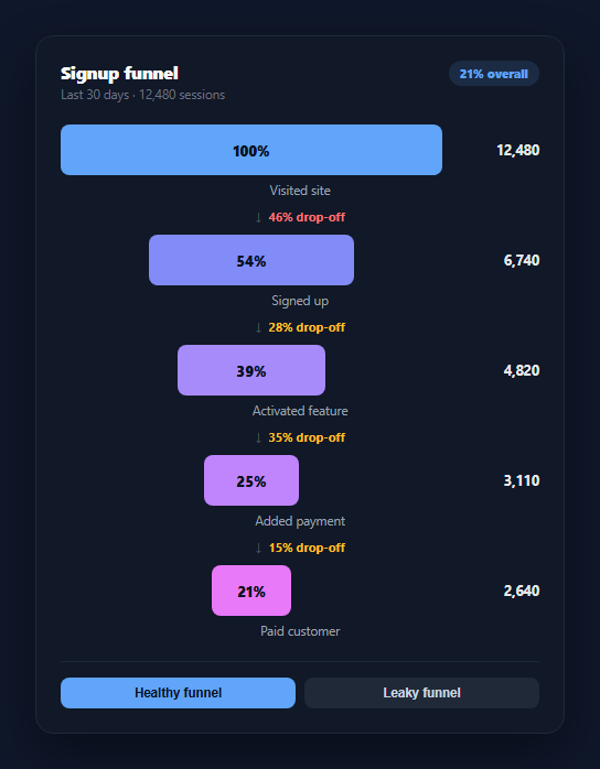
Every product with a signup flow, checkout, or onboarding sequence eventually needs to answer one question: where do people actually leave? A funnel chart answers it visually, showing each stage as a bar sized to its share of the starting cohort, with the percentage lost between consecutive stages called out explicitly. This snippet builds that funnel in plain HTML, CSS, and vanilla JavaScript from a single ordered array of stages, no chart library involved.
Bars sized by count, not by an external scale
Each stage's bar width is computed as a percentage of the *first* stage's count (stage.count / maxCount), clamped to a 6% minimum so even a heavily-dropped-off final stage stays visible and readable. Because every bar is measured against the same reference point, the shrinking width tells an honest visual story — the funnel narrows exactly as fast as users actually leave, and you can see the “gap” between an initial burst of traffic and the trickle that converts.
Drop-off, calculated between neighbors, not against the top
Between every pair of consecutive stages, render() inserts a callout showing what fraction of the *previous* stage's count was lost before the next stage (1 - next.count / stage.count) * 100. This is the number product and growth teams actually act on — a 78% drop between "Activated feature" and "Added payment" points at a specific step to fix, which a single overall conversion number would hide entirely. Drops under 40% render in amber rather than red, so the callouts read as a heat scale rather than uniform alarm.
An overall conversion rate for context
The header badge shows the ratio of the last stage's count to the first — the number a stakeholder skimming a dashboard wants first. It's derived the same way as everything else: computed from the stage data on every render, so switching datasets (via the demo toggle) updates the badge, every bar, and every drop-off label together, with nothing left stale.
Pure SVG-free, CSS-driven bars
The bars are plain divs with an inline width percentage and a CSS transition, so swapping datasets animates the funnel smoothly rather than snapping. No canvas, no SVG paths — just flexbox layout and computed widths, which keeps the markup easy to restyle and trivial to port to a chart library later if the data volume grows.
Two example states, one render function
The demo buttons swap between a healthy funnel (gradual, even drop-off) and a leaky one (a single stage loses most of the cohort) to show how the same render(stages) function reacts to different data. In production, replace the datasets with a real query result — anything shaped as an ordered array of { label, count } renders correctly. Pair it with a stat comparison card for stage-over-stage deltas, or an activity heatmap for when in the funnel users tend to drop.
Build with AI
Build, Understand, Optimize, and Extend It With AI
You don't have to work out the funnel math by hand. Paste this snippet's HTML, CSS, and JS into an AI coding assistant like Claude and ask it to walk through exactly why each bar's width is computed against the first stage's count rather than the previous stage's count, and why the drop-off percentage between two stages uses the opposite reference point — the previous stage, not the first. The same assistant can help you optimize it — ask whether the 6% minimum bar width should scale with the number of stages, or whether the drop-off severity threshold should be configurable per dataset. It's also useful for extending the chart: ask it to add a second color track showing an "expected" benchmark drop-off alongside the actual one, animate the drop-off labels counting up on data swap, or make bars clickable to drill into a stage's underlying user list. Treat the code less like a finished artifact and more like a starting point for a conversation.
Prompt to recreate it
Copy this into your AI assistant of choice to build the effect from scratch, or as a jumping-off point for your own variant:
Build a "funnel conversion steps" chart in plain HTML, CSS, and JavaScript with no framework, library, or CDN dependency.

Requirements:
- Accept an ordered array of stage objects, each with a label and a count, and render one horizontal bar per stage stacked vertically.
- Compute each bar's width as a percentage of the FIRST stage's count (not the previous stage), clamped to a minimum visible width (e.g. 6%), so the funnel's narrowing visually reflects true proportions relative to the top of the funnel.
- Between every pair of consecutive stage bars, render a drop-off callout showing the percentage of the PREVIOUS stage's count that was lost before reaching the next stage: 1 minus (next count divided by previous count), as a percentage — this is a different reference point than the bar width calculation and must not be confused with it.
- Style drop-off callouts under roughly 40% in a milder warning color (e.g. amber) and callouts at or above that threshold in a more alarming color (e.g. red), so the callouts read as a rough severity scale.
- Add a header badge showing the overall conversion rate: the last stage's count divided by the first stage's count, as a percentage — recomputed whenever the stage data changes.
- Provide a small demo control that swaps between at least two different stage datasets (e.g. a gradual healthy funnel and a leaky funnel with one severe drop) and re-renders the bars, drop-off labels, and overall badge from a single render(stages) function so nothing goes stale between the two states.
- Use CSS transitions on the bar width so switching datasets animates rather than snaps.
Want to tighten it up first? Run this prompt through the AI Prompt Studio to score it across 8 quality dimensions, catch anti-patterns, and tune the wording for Claude, ChatGPT, or Gemini before you paste it in.
Step by step
How to Use
- 1Paste HTML, CSS, and JSA five-stage signup funnel renders with shrinking bars and drop-off callouts.
- 2Read the bars top to bottomEach bar's width is proportional to its share of the first stage's count.
- 3Read the drop-off labelsThe percentage between two bars shows how much of the previous stage was lost.
- 4Switch datasetsClick "Healthy funnel" or "Leaky funnel" to see gradual vs. concentrated drop-off.
- 5Check the overall badgeThe header shows the final stage's conversion rate against the first.
- 6Swap in real dataReplace DATASETS with an array of { label, count } objects from your analytics.
Real-world uses
Common Use Cases
Got questions?
Frequently Asked Questions
Every stage's width is a percentage of the first stage's count — stage.count / maxCount — clamped to a 6% minimum so the last stage never disappears visually even after heavy drop-off. Because all bars share the same reference point, the visual narrowing accurately reflects the real proportions rather than each bar being scaled independently.
It's calculated against the immediately preceding stage, not the top of the funnel: 1 - (next stage's count / current stage's count), turned into a percentage. This is the number that matters for diagnosis — it tells you what fraction of people who reached this stage failed to reach the next one, independent of how many people started the funnel overall.
Drop-offs under 40% render in amber and steeper ones in red, so the callouts function as a rough heat scale rather than treating every loss as equally urgent. Adjust the threshold in the mild check inside render() to match what counts as "expected" attrition for your specific funnel.
Yes — the stages array can be any length. render() loops over it and inserts a drop-off callout between every consecutive pair automatically, so adding or removing a stage is a data change with no markup or JS logic edits required.
Pass the stages array as a prop and derive the max count, each bar's percentage, and each drop-off value with a memoized computation (useMemo in React, a computed property in Vue). The percentage math and the drop-off formula are pure functions of the array and port unchanged.