You Might Also Like
Learn Coding Visually
Learn to code with interactive, live-preview playgrounds — HTML, CSS, JavaScript, React & more.
 HTML Playground42 lessons · Click-based · Live preview
 CSS PlaygroundLearn CSS with a live editor
 JavaScript Playground60 lessons · DOM · Async · Canvas
 React PlaygroundLearn React with a live code editor
 GSAP PlaygroundLearn GSAP animation interactively
 SVG Playground44 lessons · shapes · paths · animation
 SCSS Playground45 lessons · Sass modules · tokens
 Tailwind PlaygroundLearn Tailwind CSS with a live editor
 Bootstrap 5 Playground50 lessons · live preview
Callout Box — Note, Tip & Warning Admonition Snippet
Callout / Admonition Box · Cards · Plain HTML, CSS & JS · Live preview
What's included
Features
About this UI Snippet
Callout / Admonition Box — Note, Tip, Warning & Danger Variants in Pure CSS
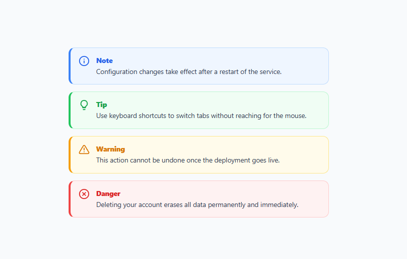
A callout box — also called an admonition, alert, or note box — is one of the most-searched content components because every documentation site, README, blog post, and help center needs a way to make important asides stand out from the body text (often right beside a code block). This snippet ships four ready-made variants — note, tip, warning, and danger — each with an icon, a colored accent bar, a tinted background, and a title, built entirely with pure CSS. The variant is set by a single class, so adding a callout to any content is one line of markup.
The anatomy of a callout
Each callout is a flex row with two parts: an icon on the left that signals the type at a glance, and a body with a bold title and the message. The whole box has a tinted background, a subtle full border, and — the signature detail — a thicker colored left border (border-left-width: 4px) that acts as an accent bar. This left-accent-bar pattern is the visual convention readers immediately recognize as "this is a callout," used by GitHub, MDN, Docusaurus, and virtually every docs framework. The combination of color, icon, and accent makes the callout's importance and category obvious without reading a word.
Color-coding by severity
The four variants follow a universal severity scale that readers already understand: note is blue (neutral information), tip is green (a helpful suggestion), warning is amber (proceed with caution), and danger is red (destructive or irreversible). Each variant coordinates four things — the background tint, the full border color, the left-accent-bar color, and the icon plus title color — so the callout reads as a single coherent color. Changing the variant class (note/tip/warning/danger) re-skins the entire box. Using conventional colors means the meaning is instant: a red box says "stop and read this" before the reader processes the text.
Matching icons to meaning
Color alone is not enough — color-blind readers and quick scanners benefit from distinct icons per type: an info circle for note, a lightbulb for tip, a warning triangle for warning, and an X-circle for danger. The icons are inline SVGs that inherit the variant's color via stroke, so they always match the box. Pairing a recognizable icon with the color means the callout type is identifiable two ways, which is both clearer and more accessible than relying on hue alone — the same reason good alert components never use color as their only signal.
Why a single class drives everything
The power of this component is that all the styling cascades from one class on the wrapper. Markup-wise, a callout is just <div class="callout warning"> with an icon and body inside — no per-element color classes, no inline styles. The CSS targets .callout.warning .ct-title, .callout.warning .ic svg, etc., so the title, icon, background, and borders all derive from that one word. This is exactly how documentation tooling works (you write :::warning and the renderer adds the class), and it makes callouts trivial to author and consistent across a whole site.
Built for content, not chrome
Callouts live inside flowing content — paragraphs, lists, code blocks — so they are designed to sit naturally in a column of text. They have comfortable padding, readable line height, and a max-width that matches a content column. The body text uses a neutral slate color so it stays legible regardless of the variant's accent. Because the box is just a styled div, you can put anything inside it: multiple paragraphs, a list, a link, even a code snippet — the icon stays pinned to the top-left while the body flows.
Customizing the callouts
Re-theme any variant by changing its four coordinated colors (background, border, left-accent, icon/title) — keep them as shades of one hue so the box reads as a single color. Add new variants (for example, "success" or "info") by copying a block and swapping the hue. Swap the icons for your icon set; they inherit color automatically via stroke: currentColor if you set the title color on a shared parent. To make the title optional, just omit the .ct-title paragraph. For a more minimal look, drop the full border and keep only the left accent bar and background tint. Because everything is class-driven CSS, these are all small edits.
Accessibility considerations
For purely visual emphasis, a callout is a styled container and needs no special ARIA. If a callout conveys something a screen-reader user must not miss (like a danger warning), you can add role="note" for general asides, or for time-sensitive alerts use role="alert" (which announces immediately) — but reserve alert for genuinely urgent, dynamically-inserted messages, not static page content. The icon is decorative and the title text provides the category in words, so the meaning is available without seeing the color or icon. Keep sufficient contrast between the body text and the tinted background (the slate-on-light-tint here passes AA) so the message stays readable in every variant.
Build with AI
Build, Understand, Optimize, and Extend It With AI
You don't have to compare every variant's four coordinated colors by hand to see the pattern here. Paste this snippet's HTML and CSS into an AI coding assistant like Claude and ask it to explain exactly why the border-left-width is set independently from the full border color, and how a single class like callout.warning cascades down to restyle the background, both border colors, the icon stroke, and the title text all at once through descendant selectors. The same assistant can help optimize it — asking whether the four variants' color values should become CSS custom properties scoped per variant so a rebrand only touches root-level tokens, or whether the decorative icons need any ARIA treatment given the title text already names the category in words. It's also useful for extending the set: ask it to add a fifth "success" variant, a dismissible close button, or a compact inline version for use mid-sentence rather than as a block. Treat the code less like a finished artifact and more like a starting point for a conversation.
Prompt to recreate it
Copy this into your AI assistant of choice to build the effect from scratch, or as a jumping-off point for your own variant:
Build a set of documentation-style "callout/admonition boxes" in plain HTML and CSS only, no JavaScript, with four semantic variants driven entirely by a single class name each.

Requirements:
- Exactly four variants — note, tip, warning, and danger — each a flex row containing a small icon on the left and a body containing a bold title and message text on the right.
- Every variant must coordinate exactly four visual properties from one shared hue: a tinted background color, a full border color, a distinctly thicker left border color (functioning as a colored accent bar), and a matching icon-and-title text color — changing only the single variant class name on the wrapper element must be sufficient to re-skin all four properties at once, with no other classes needed anywhere else in the markup.
- Give each variant a visually distinct icon (not just a different color of the same icon) so the category remains identifiable even without color vision — an info circle for note, a lightbulb for tip, a warning triangle for warning, and an X-circle for danger — with the icon's stroke color inheriting from the variant automatically rather than being hardcoded per icon.
- Style the body so it can contain more than a single paragraph (multiple paragraphs, a list, or inline code) without breaking the layout, with the icon staying pinned to the top-left regardless of how much content follows in the body.
- Keep the box comfortable for reading inline within flowing article content: appropriate padding, line-height, and a content-column-appropriate max-width, with body text using one neutral color across all four variants so message readability never depends on which variant is active.
Want to tighten it up first? Run this prompt through the AI Prompt Studio to score it across 8 quality dimensions, catch anti-patterns, and tune the wording for Claude, ChatGPT, or Gemini before you paste it in.
Step by step
How to Use
- 1Copy a calloutEach callout is a <div class="callout VARIANT"> with an .ic icon and a .body (title + message). Pick the variant: note, tip, warning, or danger.
- 2Set the type with one classChange the variant word on the wrapper to re-skin the whole box — background, border, accent bar, icon, and title all follow.
- 3Edit the title and messageChange the .ct-title text and the message paragraph. You can put multiple paragraphs, lists, or code inside the .body.
- 4Add your own variantCopy a CSS variant block and swap the hue for a new type like "success" or "info", coordinating all four colors.
- 5Swap the iconsReplace the inline SVGs with your icon set; they inherit the variant color via stroke automatically.
- 6Export in your formatClick "HTML" for a standalone file, "JSX" for a React component, or "Tailwind" for a React + Tailwind version.
Real-world uses
Common Use Cases
Got questions?
Frequently Asked Questions
It is a styled container that lifts an important aside — a note, tip, warning, or danger message — out of the surrounding text. It typically has a colored left accent bar, a tinted background, an icon, and a title, so readers immediately see its importance and category. Docs frameworks like Docusaurus and MkDocs call these admonitions.
Change the single variant class on the wrapper — note, tip, warning, or danger. The CSS derives the background tint, border, left accent bar, icon color, and title color from that one class, so the whole box re-skins at once.
Color alone fails for color-blind readers and quick scanners. Each variant has a distinct icon (info, lightbulb, triangle, X-circle) that inherits the variant color, so the type is identifiable two ways — by icon and by color — which is clearer and more accessible.
Copy one of the variant CSS blocks and change the four coordinated colors — background tint, full border, left-accent border, and icon/title color — to a new hue. Then use that variant word as the wrapper class.
For visual emphasis on static content, no — it is just a styled container. You can add role="note" for general asides. Reserve role="alert" for genuinely urgent, dynamically-inserted messages, since it announces immediately; do not use it for static page content.
Yes. Click "JSX" for a React component or "Tailwind" for a React + Tailwind version. In React, make a <Callout type="warning"> component that maps the type prop to the variant class and renders the matching icon, so authors just pass a type and content.