You Might Also Like
Learn Coding Visually
Learn to code with interactive, live-preview playgrounds — HTML, CSS, JavaScript, React & more.
 HTML Playground42 lessons · Click-based · Live preview
 CSS PlaygroundLearn CSS with a live editor
 JavaScript Playground60 lessons · DOM · Async · Canvas
 React PlaygroundLearn React with a live code editor
 GSAP PlaygroundLearn GSAP animation interactively
 SVG Playground44 lessons · shapes · paths · animation
 SCSS Playground45 lessons · Sass modules · tokens
 Tailwind PlaygroundLearn Tailwind CSS with a live editor
 Bootstrap 5 Playground50 lessons · live preview
Wave Text — Free HTML CSS JS Animation Snippet
Wave Text Animation · Animations · Plain HTML, CSS & JS · Live preview
What's included
Features
About this UI Snippet
Wave Text — buildWave() Character Wrapping, animation-delay Stagger
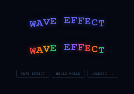
Wave text animates each character in a heading individually — characters rise and fall in a sequential wave pattern. Used on interactive headings, loading messages, and any text that benefits from playful motion — see also split text reveals, a typewriter effect, and gradient text.
The character-splitting technique
buildWave(id, text) splits the text string into individual characters via .split(''). Each character is wrapped in a <span> with a unique animation-delay: i * 0.05s — the delay increases by 50ms per character, creating the left-to-right wave timing. Spaces are replaced with non-breaking spaces ( ) to preserve spacing.
The CSS wave animation
Each span has a CSS @keyframes wave animation that runs translateY(-12px) at 50% and returns to translateY(0) at 100%. With staggered delays, the upward peak travels from character 0 to the last character, creating the wave.
Hover re-trigger
Hovering the wave element triggers the animation again by briefly removing and re-adding the animation class — creating an on-demand wave that plays each time the user hovers.
The staggered animation-delay technique
Wave text works by applying the same keyframe animation to every character span, but with a progressively increasing animation-delay. Character 0 starts immediately; character 1 waits 0.05s; character N waits N×0.05s. The keyframe itself is identical — translateY(-12px) at 50% and translateY(0) at 0%/100%. The delay offset is all that creates the wave appearance.
Character splitting with JavaScript
The text content is split into individual characters, each wrapped in a span: [...text].forEach((char, i) => { const span = document.createElement('span'); span.textContent = char === ' ' ? ' ' : char; span.style.animationDelay = i * 0.05 + 's'; el.appendChild(span); }). The non-breaking space ( ) replaces regular spaces so they preserve their width in the inline span layout.
Controlling the wave properties
Change the delay multiplier (0.05s) to control wave speed — smaller values create a faster wave, larger values create a slower, more dramatic roll. Change the translateY value in the keyframe to control wave height. Add translateX for a sideways sway. Use a sine-based delay function for a smoother wave curve: Math.sin(i * 0.4) * 0.1 + 'delay'.
Accessibility and prefers-reduced-motion
The animation can be distracting for users sensitive to motion. Add @media (prefers-reduced-motion: reduce) { .wave-char { animation: none; } } to freeze all characters for users who have enabled the reduce motion accessibility setting. The text remains fully readable — only the decorative motion is removed.
The staggered animation-delay technique
Wave text works by applying the same keyframe animation to every character span, but with a progressively increasing animation-delay. Character 0 starts immediately; character 1 waits 0.05s; character N waits N×0.05s. The keyframe itself is identical — translateY(-12px) at 50% and translateY(0) at 0%/100%. The delay offset is all that creates the wave appearance.
Character splitting with JavaScript
The text content is split into individual characters, each wrapped in a span: [...text].forEach((char, i) => { const span = document.createElement('span'); span.textContent = char === ' ' ? ' ' : char; span.style.animationDelay = i * 0.05 + 's'; el.appendChild(span); }). The non-breaking space ( ) replaces regular spaces so they preserve their width in the inline span layout.
Controlling the wave properties
Change the delay multiplier (0.05s) to control wave speed — smaller values create a faster wave, larger values create a slower, more dramatic roll. Change the translateY value in the keyframe to control wave height. Add translateX for a sideways sway. Use a sine-based delay function for a smoother wave curve: Math.sin(i * 0.4) * 0.1 + 'delay'.
Accessibility and prefers-reduced-motion
The animation can be distracting for users sensitive to motion. Add @media (prefers-reduced-motion: reduce) { .wave-char { animation: none; } } to freeze all characters for users who have enabled the reduce motion accessibility setting. The text remains fully readable — only the decorative motion is removed.
Build with AI
Build, Understand, Optimize, and Extend It With AI
Ask an AI coding assistant like Claude to explain exactly why every letter span shares the identical wave keyframe yet still produces a rolling wave — walking through how the i * 0.08s animation-delay offset is the only thing that differs per character is a quick way to really internalize the stagger pattern. It's worth a scaling question too: ask whether rebuilding all the letter spans from scratch on every setWord() call (rather than reusing existing ones and just updating text) matters for a long phrase, and where the line would be. For extending it, ask for a sine-based delay curve instead of a linear one for a smoother roll, a version that reacts to mouse proximity instead of running on a fixed loop, or letters that also rotate slightly as they rise for a more playful bounce. Treat the code less like a finished artifact and more like a starting point for a conversation.
Prompt to recreate it
Copy this into your AI assistant of choice to build the effect from scratch, or as a jumping-off point for your own variant:
Build a "wave text" animation in plain HTML, CSS, and JavaScript where each character of a phrase bounces in sequence, using a single shared CSS keyframe and per-character animation-delay — no per-character custom keyframes, no JS animation loop.

Requirements:
- A function that takes a target element and a text string, splits the string into individual characters, and wraps each one in its own span appended to the element — replacing literal space characters with a non-breaking space so word gaps don't collapse to zero width in the inline layout.
- Apply one shared CSS keyframe animation to every character span that moves it upward (via transform: translateY) at the midpoint of the animation and back to its resting position at the end, running infinitely.
- Assign each character span an animation-delay computed purely from its index times a fixed constant (such as 0.08 seconds), so character 0 starts immediately and each subsequent character starts slightly later — this delay offset alone must be what produces the visible left-to-right wave motion.
- Provide at least two independent instances of the wave running simultaneously with different text content, confirming that each instance's characters are built and animated independently.
- Make the per-character delay constant and the keyframe's translateY distance easy to tune as top-level values, and demonstrate that changing the phrase via a button click tears down and rebuilds the character spans (restarting delays from zero) rather than trying to reuse the old ones.
- Note in a code comment how to add prefers-reduced-motion support that disables the animation for users who have that OS-level preference set, without removing any text content.
Want to tighten it up first? Run this prompt through the AI Prompt Studio to score it across 8 quality dimensions, catch anti-patterns, and tune the wording for Claude, ChatGPT, or Gemini before you paste it in.
Step by step
How to Use
- 1Watch the wave animateThe wave cycles through the text continuously. Characters rise in sequence from left to right.
- 2Hover to replayMove the cursor over the wave text to trigger the animation on demand.
- 3Update the textIn the JS panel, update the text arguments in the buildWave() calls to your own phrases.
- 4Change animation delayUpdate i * 0.05 in the JS animation-delay calculation. Smaller values (0.03) create faster waves; larger (0.08) create slower ones.
- 5Change wave heightUpdate the translateY(-12px) value in the CSS wave keyframe.
- 6Export in your formatClick "HTML" for a standalone file, "JSX" for a React component, or "Tailwind" for a React + Tailwind version.
Real-world uses
Common Use Cases
Got questions?
Frequently Asked Questions
buildWave() assigns animation-delay: i * 0.05s to each span, where i is the character index. Character 0 starts at 0s, character 1 at 0.05s, character 2 at 0.1s. The translateY peak travels left to right as each character reaches its 50% keyframe at a slightly later time.
When text is split into individual characters, regular spaces between words are rendered as empty spans with zero width. Non-breaking space (\u00A0) has a visible width, preserving the gap between words.
Replace translateY(-12px) with translateX(12px) for a horizontal wave, or use a combination: transform: translateY(-12px) rotate(10deg) for a rotation wave.
Wrap the wave trigger in an IntersectionObserver. When the element enters the viewport, call buildWave() (which re-creates all spans and restarts animations from delay 0).
Yes. Click "JSX" for a React component. Split the text string into characters, map each to a span with style={{ animationDelay: i * 0.05 + "s" }}. Increment a key on hover to re-trigger by remounting the spans.
Add a colour array and assign span.style.color = colors[i % colors.length] in buildWave(). Combine with the delay stagger for a rainbow wave effect.