More Mobile Snippets
Front-End Coding Playgrounds
Learn to code with interactive, live-preview playgrounds — HTML, CSS, JavaScript, React & more.
 HTML Playground42 lessons · Click-based · Live preview
 CSS PlaygroundLearn CSS with a live editor
 JavaScript Playground60 lessons · DOM · Async · Canvas
 React PlaygroundLearn React with a live code editor
 GSAP PlaygroundLearn GSAP animation interactively
 SVG Playground44 lessons · shapes · paths · animation
 SCSS Playground45 lessons · Sass modules · tokens
 Tailwind PlaygroundLearn Tailwind CSS with a live editor
 Bootstrap 5 Playground50 lessons · live preview
Mobile Paywall Screen — Free Subscription UI Snippet
Mobile Paywall Screen · Mobile · Plain HTML, CSS & JS · Live preview
What's included
Features
About this UI Snippet
Mobile Paywall Screen — Subscription Upsell UI
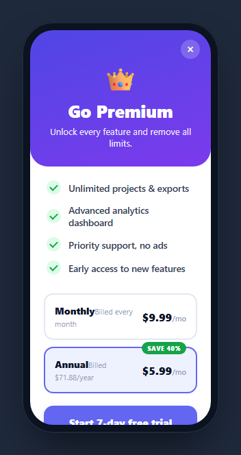
A paywall screen is the subscription upsell an app shows to convert free users to paid — a benefit-led hero, a checklist of premium features, selectable plans with savings highlighted, and a trial call-to-action. This snippet builds a conversion-optimized one inside a CSS phone frame, where selecting a plan updates the CTA and fine print, in HTML, CSS, and vanilla JavaScript with no dependency.
Plan selection drives the CTA
The two plan cards are real <button>s; clicking one moves the .active class (a colored border and tint) and, crucially, rewrites the CTA label and the fine print from a COPY map. Choosing Annual shows "Start 7-day free trial" with "Then $71.88/year"; choosing Monthly switches to "Continue — $9.99/mo" with monthly billing terms. Keeping the button and legal copy in sync with the selected plan is exactly what a compliant, high-converting paywall must do, and here it's one lookup.
Conversion patterns baked in
The design uses the standard upsell tactics: the annual plan is pre-selected (the choice you want) and carries a "SAVE 40%" badge, prices are shown as a per-month equivalent so annual looks cheaper, benefits are framed as outcomes ("Unlimited projects", "no ads"), and a free-trial CTA lowers the commitment. These aren't incidental — they're the elements that make a paywall work, assembled in one reference.
A CSS checklist
Each feature row has a checkmark drawn purely in CSS: a green circle with an ::after pseudo-element rotated into a tick (two borders at 45°). No icon font or SVG, so the list stays self-contained and recolors easily.
The hero and layout
A gradient hero with a rounded bottom, a close button, a crown glyph, and benefit copy sits atop a scrollable screen; the restore/terms/privacy links at the bottom are the legally-expected footer for app subscriptions. The whole screen scrolls within the phone frame.
Reusing it
Replace the plans, prices, and feature copy, and wire the CTA to your billing SDK (StoreKit, Play Billing, Stripe). The plan-to-copy map makes adding plans or A/B-testing wording trivial. Lift it out of the frame for a web pricing modal, or keep it framed inside a phone mockup for store screenshots.
Build with AI
Build, Understand, Optimize, and Extend It With AI
You don't have to reconstruct the conversion logic from scratch. Paste this snippet's HTML, CSS, and JS into an AI coding assistant like Claude and ask it to explain exactly how the COPY object keyed by plan drives both the CTA button text and the fine print in one lookup, and why the annual plan is pre-selected with the "SAVE 40%" badge rather than left neutral. The same assistant can help optimize it, for example checking whether the plan-switching logic scales cleanly to a third or fourth pricing tier, or whether the pure-CSS checkmark technique (an ::after pseudo-element rotated into an L-shape) is the cheapest way to render the feature list icons. It's also useful for extending the effect: ask it to add a live countdown for a limited-time discount, wire the CTA into a real billing SDK like StoreKit or Play Billing, or add a comparison table between plans. Treat the code less like a finished artifact and more like a starting point for a conversation.
Prompt to recreate it
Copy this into your AI assistant of choice to build the effect from scratch, or as a jumping-off point for your own variant:
Build a mobile subscription paywall screen in plain HTML, CSS, and vanilla JavaScript, styled inside a phone-shaped frame, with no external libraries.

Requirements:
- A gradient hero section with a close button, an icon or emoji, a headline, and a short benefit sentence, sitting above a scrollable feature checklist.
- Render the feature checklist items with checkmarks drawn purely in CSS (a colored circle with an ::after pseudo-element rotated 45 degrees to form a checkmark) — no icon font, no SVG, no image for the checkmarks.
- Render at least two plan option buttons (for example Monthly and Annual), each showing a plan name, a short billing description, and a price framed as a per-month equivalent even for the annual plan. Pre-select the plan you want users to choose by default and mark it with a savings badge.
- Store a mapping from plan key to its call-to-action label and fine-print legal text in a single JavaScript object, and when the user taps a different plan button, move the active-state styling to the tapped button and update both the CTA button text and the fine print from that one object — they must never fall out of sync.
- Tapping the primary call-to-action button should show a brief "Processing" state before confirming, standing in for a real billing SDK call.
- Include a footer row with Restore, Terms, and Privacy links, matching the legally expected footer pattern for app subscription screens.
Step by step
How to Use
- 1Paste HTML, CSS, and JSA subscription paywall renders inside a phone frame.
- 2Read the benefitsA CSS checklist lists the premium features.
- 3Switch plansTapping Monthly or Annual moves the selection highlight.
- 4Watch the CTA updateThe button and fine print change with the chosen plan.
- 5Tap the CTAIt shows a processing state then confirms.
- 6Wire your billingConnect the CTA to your subscription SDK.
Real-world uses
Common Use Cases
Got questions?
Frequently Asked Questions
The plan cards are buttons, and clicking one moves an active class and looks up that plan's copy in a COPY map. The map holds the CTA label and the fine print for each plan, so selecting Annual versus Monthly rewrites both the button text and the billing terms in one step — keeping the call-to-action and the legal copy in sync with the choice.
It's a deliberate conversion pattern: defaulting to the plan you want users to pick (annual, which has higher lifetime value) increases its take rate. The screen reinforces it with a SAVE badge and a per-month price so annual appears cheaper than monthly at a glance — standard, effective paywall tactics.
No. Each is a green circle with an ::after pseudo-element styled into a tick using two borders rotated 45 degrees — the classic CSS checkmark. There's no icon font or SVG, so the feature list is self-contained and you can recolor the checks by changing two CSS values.
Wire the CTA's click handler to your subscription SDK — StoreKit on iOS, Play Billing on Android, or Stripe on the web — passing the selected plan's product id. The plan-to-copy map also makes it easy to add plans or A/B-test wording without touching the markup. The restore link should call your SDK's restore-purchases flow.
Hold the selected plan in state and derive the CTA label and fine print from a copy map keyed by plan. Render the plan cards from data with a conditional active class. Trigger your purchase flow in the CTA handler and show a processing state. In Tailwind, style the cards, badge, and checklist with utilities and the checkmarks with a small style block.