More Mobile Snippets
Front-End Coding Playgrounds
Learn to code with interactive, live-preview playgrounds — HTML, CSS, JavaScript, React & more.
 HTML Playground42 lessons · Click-based · Live preview
 CSS PlaygroundLearn CSS with a live editor
 JavaScript Playground60 lessons · DOM · Async · Canvas
 React PlaygroundLearn React with a live code editor
 GSAP PlaygroundLearn GSAP animation interactively
 SVG Playground44 lessons · shapes · paths · animation
 SCSS Playground45 lessons · Sass modules · tokens
 Tailwind PlaygroundLearn Tailwind CSS with a live editor
 Bootstrap 5 Playground50 lessons · live preview
Mobile Status Bar — Free iOS Status Bar UI Snippet
Mobile Status Bar · Mobile · Plain HTML, CSS & JS · Live preview
What's included
Features
About this UI Snippet
Mobile Status Bar — Reusable iOS-Style Top Bar
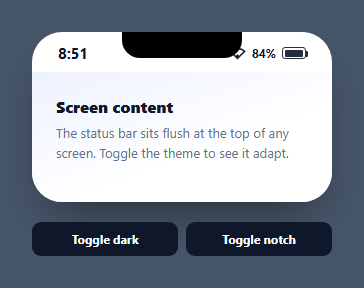
A mobile status bar is the thin strip at the top of every phone screen — time on the left; signal, wifi, and battery on the right — that app mockups and design systems need to look authentic. This snippet is a reusable, themeable status bar drawn entirely in HTML and CSS, with a live clock, real battery reading, an optional notch, and light/dark modes, in vanilla JavaScript with no dependency.
Icons drawn in CSS and SVG, not a font
The signal is four <rect>s of rising height in a tiny inline SVG; the wifi is a stroked arc with a dot; the battery is a bordered box with a nub ::after and an inner fill bar. Every glyph uses currentColor, so the whole bar inverts automatically when the theme flips — no separate dark-mode icon set. Building them inline keeps the component self-contained with no icon dependency.
A live clock and real battery
A tick() interval keeps the time current in 12-hour format. Where the browser supports it, navigator.getBattery() reads the actual device charge and updates the percentage and fill on levelchange, so the mockup reflects reality; it degrades gracefully to the default value where the API is unavailable.
The notch as a toggle
The notch is a single black pill anchored to the top center with bottom-rounded corners. A .no-notch class slides it up and fades it out via transitions, letting you switch between notched and flat-top devices — useful when one design system targets multiple phones. Because it's absolutely positioned, it overlays the bar without affecting layout.
Theming with one class
Light and dark are a single .dark class on the container; since text and icons are currentColor and backgrounds use the theme, flipping the class restyles the entire bar and the demo page beneath it. This mirrors how you'd drive a real app's status-bar style from the active theme.
Reusing it as a header
The status bar is built to sit flush atop any screen. Drop it above your content (or inside a phone mockup) and it provides the device chrome for free. Keep it as a component and pass a theme prop, and every screen in your design — login, onboarding, dashboard — gets a consistent, live top bar.
Build with AI
Build, Understand, Optimize, and Extend It With AI
Rather than puzzling out the icon markup by eye, paste this snippet's HTML, CSS, and JS into an AI coding assistant like Claude and ask it to explain exactly why every glyph is drawn with currentColor instead of a fixed hex value, and what would break in dark mode if even one icon lost that property, or to walk through the navigator.getBattery() promise chain and its levelchange listener. The same assistant can help you optimize it, for example asking whether a ten-second clock interval is the right tradeoff between battery use and displayed accuracy, or whether the notch's opacity-and-transform toggle could be replaced with a single CSS custom property. It is also useful for extending the bar: ask it to add carrier signal-strength tiers driven by a real Network Information API reading, support a Dynamic-Island-style pill instead of a notch, or expose the whole thing as a themeable web component. Treat the code less like a finished artifact and more like a starting point for a conversation.
Prompt to recreate it
Copy this into your AI assistant of choice to build the effect from scratch, or as a jumping-off point for your own variant:
Build a reusable "mobile status bar" component in plain HTML, CSS, and JavaScript using only inline SVG and CSS shapes for icons — no icon font, no image assets.

Requirements:
- A thin bar with a live clock on the left showing 12-hour time updated at a low-cost interval (a few seconds is fine, not every second), and on the right a signal-strength icon (a small set of ascending bars), a wifi icon (a stroked arc plus a dot), a battery percentage number, and a battery glyph (a bordered rectangle with a small nub and an inner fill bar).
- Every icon and the battery fill must use currentColor (or a CSS variable derived from it) rather than a hardcoded color, so that toggling a single theme class on the container recolors every icon and the text together with no per-icon overrides.
- If the Battery Status API (navigator.getBattery) is available in the browser, the battery percentage and fill width must reflect the real device battery level and update live on the API's levelchange event; if the API is unavailable, it must fall back gracefully to a fixed placeholder value with no errors thrown.
- An optional notch element, absolutely positioned at the top center as a rounded-bottom pill, that can be toggled off with a class that both fades its opacity to zero and slides it upward via a transform, rather than just toggling display so the change animates.
- A single boolean class on the outer container must be all that's needed to switch the whole bar and an example content area beneath it between a light and a dark theme.
- The bar must be built so it can sit flush at the very top of an arbitrary screen of content below it, with no dependency on that content's structure.
Step by step
How to Use
- 1Paste HTML, CSS, and JSA status bar renders flush above a demo screen.
- 2Watch the clockThe time updates live in 12-hour format.
- 3See the batteryWhere supported, it reads the real device charge.
- 4Toggle dark modeOne class flips the bar and page to a dark theme.
- 5Toggle the notchSwitch between notched and flat-top devices.
- 6Reuse itPlace it atop any screen as device chrome.
Real-world uses
Common Use Cases
Got questions?
Frequently Asked Questions
No — they're inline SVG and CSS. The signal is four rising rects, the wifi is a stroked arc with a dot, and the battery is a bordered box with a nub pseudo-element and a fill bar. All use currentColor, so they recolor with the text and invert in dark mode without a separate icon set.
Where the browser supports navigator.getBattery(), yes — it reads the actual charge, sets the percentage and fill width, and listens for levelchange to stay current. In contexts without the API it simply keeps the default value, so it never breaks; it just falls back to a static level.
The notch is one black pill positioned at the top center with bottom-rounded corners and a high stacking order, so it overlays the bar without affecting layout. A no-notch class translates it up and fades it via CSS transitions, letting you switch between notched and flat-top device styles instantly.
A single dark class on the container. Because the icons and text use currentColor and the backgrounds reference the theme, toggling that one class restyles the entire bar and the demo page beneath it — the same way you'd switch a real app's status-bar appearance based on the active theme.
Make it a component with a theme prop that sets the dark class and a notch boolean. Put the clock interval and the getBattery subscription in a mount effect with cleanup. Render it at the top of each screen as shared chrome. In Tailwind, lay out the bar with flex justify-between and build the icons as small inline SVGs using currentColor.