Learn Coding Visually
Learn to code with interactive, live-preview playgrounds — HTML, CSS, JavaScript, React & more.
 HTML Playground42 lessons · Click-based · Live preview
 CSS PlaygroundLearn CSS with a live editor
 JavaScript Playground60 lessons · DOM · Async · Canvas
 React PlaygroundLearn React with a live code editor
 GSAP PlaygroundLearn GSAP animation interactively
 SVG Playground44 lessons · shapes · paths · animation
 SCSS Playground45 lessons · Sass modules · tokens
 Tailwind PlaygroundLearn Tailwind CSS with a live editor
 Bootstrap 5 Playground50 lessons · live preview
Loyalty Points Widget — Rewards HTML CSS JS Snippet
Loyalty Points Widget · Cards · Plain HTML, CSS & JS · Live preview
What's included
Features
points variable and updateUI drive the balance, progress bar, tier copy, and every reward button — trivial to wire to a real account.updateUI sets the gradient bar's width to points / NEXT_TIER with a cubic-bezier transition and a glow, capping at 100%.animateBalance tweens the number with a cubic ease-out requestAnimationFrame loop, making each spend feel tangible.updateUI re-evaluates every reward against the new balance, flipping now-unaffordable buttons to "Need N".data-cost, so adding or repricing rewards is a markup edit with no JavaScript changes.About this UI Snippet
Loyalty Points Widget — Tier Progress Bar, Redeemable Rewards & Affordability-Gated Buttons
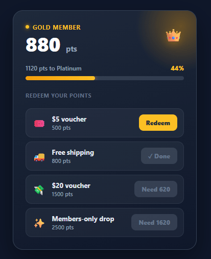
Loyalty programmes work because they give customers a reason to come back and a visible sense of progress toward a reward. The widget that surfaces a member's points has to do three jobs at once: show the current balance with status, show how close they are to the next tier, and let them spend points on rewards they can actually afford. This snippet implements all three in plain HTML, CSS, and vanilla JavaScript: a points balance with tier badge, an animated progress bar toward the next tier, a list of redeemable rewards, affordability-gated redeem buttons, an animated count-down on spend, and a confirmation toast.
Balance, tier, and progress
The card leads with a large points balance and a "Gold member" tier badge on a dark gradient with a warm glow — the premium treatment that loyalty programmes use to make membership feel valuable. Below it, updateUI computes progress toward NEXT_TIER as a percentage, animates the gradient bar's width with a cubic-bezier transition, and writes the remaining points ("320 pts to Platinum"). When the balance reaches the threshold, the copy switches to "Platinum unlocked!".
Affordability-gated redemption
Each reward carries its cost on a data-cost attribute. updateUI walks every reward and decides its button state: if the member can afford it, the button reads "Redeem"; if not, it disables and reads "Need N" — telling the user exactly how many more points they require rather than just greying out silently. This turns a dead-end into a goal, which is the whole point of a loyalty programme.
Animated balance count-down
When a reward is redeemed, redeem checks affordability, subtracts the cost, and calls animateBalance, which tweens the displayed number from the old value to the new one over 500ms using an eased requestAnimationFrame loop (cubic ease-out). Watching the points tick down makes the spend feel tangible — and then updateUI re-runs to re-gate every other reward against the new, lower balance, so buttons that are now unaffordable immediately switch to "Need N".
Confirmation toast
A pill toast slides up from the bottom of the card confirming the redeemed reward by name, auto-dismissing after a moment via a cleared-and-reset timer so rapid redemptions never stack stale toasts. The redeemed reward's own button locks to "✓ Done".
Everything is driven by a single points variable and the updateUI function, so wiring it to a real account is a matter of seeding points from your API and POSTing redemptions. Pair this widget with a stats card for account metrics, a progress bar for other goals, a gradient progress ring, or an order summary where vouchers apply.
Build with AI
Build, Understand, Optimize, and Extend It With AI
You do not need to trace the affordability-gating logic in your head. Paste this snippet's HTML, CSS, and JS into an AI coding assistant like Claude and ask it to explain exactly how updateUI() re-evaluates every reward's data-cost attribute against the live points variable to decide between a "Redeem" and a "Need N" label, and why animateBalance() uses a cubic ease-out inside requestAnimationFrame rather than just snapping the number to its new value. The same assistant can help optimize it, for instance asking whether rebuilding every reward button's disabled state and text on every single redemption is necessary or whether only the affected rewards need re-checking. It is also useful for extending the widget: ask it to add multiple tiers with different perks, persist redemptions to a real backend with optimistic rollback on failure, or add a reduced-motion fallback for the balance count-down animation. Treat the code less like a finished artifact and more like a starting point for a conversation.
Prompt to recreate it
Copy this into your AI assistant of choice to build the effect from scratch, or as a jumping-off point for your own variant:
Build a "loyalty points widget" in plain HTML, CSS, and JavaScript with no libraries.

Requirements:
- A card showing a large points balance, a membership tier label, and a progress bar toward the next tier threshold, where the bar's fill width and the "N points to next tier" copy are both derived from one shared points variable and a next-tier constant.
- A list of redeemable rewards, each carrying its point cost as a data attribute on its row, with a redeem button per reward.
- A single update function that walks every reward row and sets its button's disabled state and label purely from comparing the live points balance to that reward's cost: enabled and labeled "Redeem" when affordable, disabled and labeled with exactly how many more points are needed (e.g. "Need 340") when not.
- Redeeming a reward must: verify affordability again at click time (not just trust the disabled state), subtract its cost from the points variable, animate the displayed balance number from its old value to its new value over a fixed short duration using an eased requestAnimationFrame tween (not an instant text swap), lock that specific reward's button to a permanent "done" state so it cannot be redeemed twice, and re-run the shared update function afterward so every other reward's affordability label refreshes against the new lower balance.
- Show a temporary confirmation toast naming the redeemed reward, auto-dismissing after a couple of seconds, with any pending dismiss timer cleared and restarted on each new redemption so rapid redemptions never leave stale toasts stacked or flickering.
- The tier progress bar's fill percentage must be capped at 100 even if the points balance exceeds the next-tier threshold, and the copy must switch to an "unlocked" message once the threshold is reached.
Want to tighten it up first? Run this prompt through the AI Prompt Studio to score it across 8 quality dimensions, catch anti-patterns, and tune the wording for Claude, ChatGPT, or Gemini before you paste it in.
Step by step
How to Use
- 1Paste HTML, CSS, and JSA dark loyalty card appears showing 1680 points, a "Gold member" badge, a progress bar at 84% toward Platinum, and four rewards.
- 2Check affordability gatingRewards you can afford show "Redeem"; the 2500-point members-only drop is disabled and reads "Need 820", telling you exactly how short you are.
- 3Redeem a rewardClick "Redeem" on the $5 voucher — the balance counts down from 1680 to 1180, a toast confirms "Redeemed $5 voucher!", and the button locks to "✓ Done".
- 4Watch the bar updateThe progress bar shrinks toward the next tier and the "pts to Platinum" figure recalculates from the new balance.
- 5See re-gating in actionAfter spending, rewards you can no longer afford flip to "Need N" automatically — the whole list re-evaluates against the new balance.
- 6Seed real dataSet the
pointsvariable from your account API and adjustNEXT_TIERand rewarddata-costvalues; the rest of the UI follows.
Real-world uses
Common Use Cases
Got questions?
Frequently Asked Questions
Seed the points variable from your loyalty API on load and render the reward rows from your catalogue, setting each data-cost. Call updateUI() once and the progress bar, tier copy, and button gating all reflect the live balance. Set NEXT_TIER from the member's current tier threshold.
In redeem, after the affordability check, POST the reward id to your endpoint and only commit the local deduction on success; on failure, revert the balance and re-enable the button. To avoid double-spends from rapid clicks, disable the button immediately (this snippet does) and treat the server's returned balance as authoritative.
Keep an array of tiers with thresholds and names, and in updateUI find the current and next tier from points to drive the badge and the "pts to next" copy. You can also list the perks unlocked at each tier below the bar so members see what the next level grants.
Give the progress bar role="progressbar" with aria-valuenow/aria-valuemax, put the redeem confirmation toast in an aria-live="polite" region, and make sure the "Need N" button text conveys the gating without relying on colour. The redeem controls are real <button> elements, so they are keyboard-operable by default.
In React, hold points in useState, derive the percentage and each button's disabled/label state in render, and animate the balance with a small effect or a tween library. In Vue, use a ref for points and computed values for progress and gating. In Angular, track points on the component and bind [style.width] and [disabled]. The card styling and bar CSS port unchanged.