You Might Also Like
Learn Coding Visually
Learn to code with interactive, live-preview playgrounds — HTML, CSS, JavaScript, React & more.
 HTML Playground42 lessons · Click-based · Live preview
 CSS PlaygroundLearn CSS with a live editor
 JavaScript Playground60 lessons · DOM · Async · Canvas
 React PlaygroundLearn React with a live code editor
 GSAP PlaygroundLearn GSAP animation interactively
 SVG Playground44 lessons · shapes · paths · animation
 SCSS Playground45 lessons · Sass modules · tokens
 Tailwind PlaygroundLearn Tailwind CSS with a live editor
 Bootstrap 5 Playground50 lessons · live preview
Feature Spotlight Tabs — Free HTML CSS JS Snippet
Feature Spotlight Tabs · Layouts · Plain HTML, CSS & JS · Live preview
What's included
Features
About this UI Snippet
Feature Spotlight Tabs — Vertical Feature Selector with Paired Cross-Fading Visual
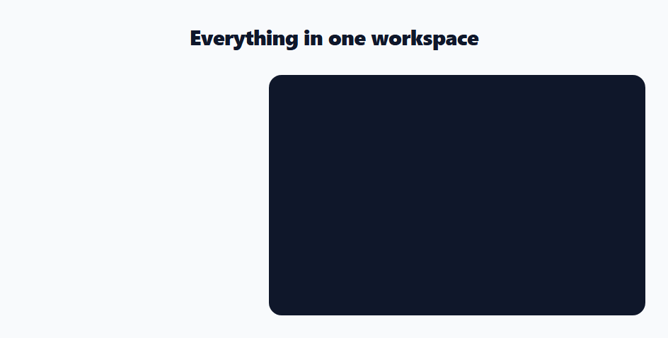
Marketing pages need to explain several features without turning into an endless scroll. The feature-spotlight-tabs pattern solves this elegantly: a vertical list of feature tabs on one side, a large visual stage on the other, and selecting a tab swaps the visual to match. The visitor controls the pace, sees one feature at a time in detail, and the whole section stays compact. This is the layout Stripe, Notion, and most modern SaaS sites use for their "here's what it does" block. This component implements it in HTML, CSS, and vanilla JavaScript, driven by a single features array.
The two-column layout that stacks
The section is a CSS grid with a fixed 320px tab column and a flexible visual stage (grid-template-columns: 320px 1fr). align-items: start keeps the tab list from stretching to the stage's height. At 720px a media query collapses it to a single column and reorders the stage above the tabs with order: -1, so on mobile the visual leads and the tappable feature list follows — the natural reading order for a small screen.
Tabs with an animated accent rail
Each tab is a card with an icon tile, a title, and a one-line description. The active tab is marked three ways: a lifted shadow and tinted border, an icon tile that inverts to a filled accent colour, and an accent rail that grows down the left edge. That rail is a ::before pseudo-element scaled with transform: scaleY(0) to scaleY(1) and transform-origin: top, so it wipes in from the top when the tab activates rather than just appearing — a small motion detail that signals which feature is selected. Hovering any tab nudges it a couple of pixels right for tactile feedback.
Cross-fading the paired visual
Selecting a tab does not snap the visual — it cross-fades. The paint() function adds a .swap class that fades the stage to opacity: 0 and nudges it down 12px, then in a setTimeout it swaps the content and background and removes the class, easing the new visual back in. The timeout is matched to the CSS transition so the swap happens while the stage is invisible. Here the visuals are coloured gradient panels with a label, standing in for what would be product screenshots, animations, or videos in production.
Data-driven from one array
Everything is generated from a FEATURES array of { icon, title, desc, label, bg } objects. The script builds each tab — including its inline SVG icon — attaches the click handler, and renders the matching visual. Adding a feature is one array entry; there is no markup to duplicate and no risk of the tabs and visuals drifting out of sync because they share the same index. A guard in select() ignores clicks on the already-active tab so there is no needless re-fade.
Accessible tablist with keyboard support
The tabs use role="tab" inside a role="tablist" container, and the active tab carries aria-selected="true". The tab list listens for ArrowDown and ArrowUp and moves the selection (with wrap-around via modulo) plus focus to the next tab — the keyboard interaction screen-reader and keyboard users expect from a vertical tablist. Because every tab is a real <button>, it is focusable and clickable without any extra wiring.
Customisation
Replace the FEATURES array with your real features — give each an inline SVG icon path, a title, a description, and a visual. To use real media instead of gradient panels, set the visual to an <img> or <video> and swap the paint() function to change its src. Adjust the cross-fade timing (CSS transition plus the matching JS timeout), swap the #6366f1 accent used by the rail, active icon, and active border, and change the stage min-height to fit your visuals. To auto-advance like a carousel, add a setInterval that calls select((active + 1) % FEATURES.length) and pause it on hover.
Build with AI
Build, Understand, Optimize, and Extend It With AI
You don't have to guess why the visual swap needs a setTimeout instead of just changing instantly. Paste this snippet's HTML, CSS, and JS into an AI coding assistant like Claude and ask it to explain exactly how the paint function's timeout is matched to the CSS opacity transition duration so the content only changes while the stage is invisible, and what would visually break if that timing drifted out of sync. The same assistant can help optimize it — ask whether the accent rail's scaleY wipe-in animation and the icon tile's background/color transition are both necessary or somewhat redundant as selection signals, and whether the keyboard arrow handler correctly wraps at both ends of the list. It's also useful for extending the component: ask it to swap the gradient placeholder panels for real lazy-loaded product screenshots with a preload step during the fade-out window, add auto-advancing like a carousel that pauses on hover or focus, or support a horizontal tab variant for wider, shorter sections. Treat the code less like a finished artifact and more like a starting point for a conversation.
Prompt to recreate it
Copy this into your AI assistant of choice to build the effect from scratch, or as a jumping-off point for your own variant:
Build a vertical feature-spotlight tabs section in plain HTML, CSS, and JavaScript where selecting a tab cross-fades a paired visual — no library.

Requirements:
- A two-column CSS grid layout: a fixed-width vertical column of feature tab cards on one side, and a flexible visual "stage" area on the other, with the tab column using align-items start so it never stretches to match the stage's height.
- Generate every tab and its paired visual from a single shared data array of objects (containing at minimum an icon, a title, a description, a visual label, and a visual background), so the tabs and visuals can never drift out of sync because they are always read from the same indexed array.
- The active tab must be marked with at least three visual signals: a lifted box-shadow and tinted border, an icon tile that inverts from a tinted background to a solid filled accent color, and a left-edge accent rail built from a pseudo-element that wipes in via a scaleY transform animation from a top transform-origin (not just appearing instantly).
- Clicking a tab must not instantly swap the stage's content. Instead, first add a class that fades the stage to zero opacity and shifts it slightly downward, then after a timeout matched to that transition's duration, swap the visual's background and label content and remove the fade class so it eases back into view — implement a guard so clicking the already-active tab does nothing.
- Wire proper ARIA tablist semantics: a role tablist container, role tab on each button with aria-selected reflecting the active state, and keyboard support where ArrowDown and ArrowUp move both the visual selection and keyboard focus to the next or previous tab, wrapping around at both ends of the list.
- Add a responsive breakpoint that collapses the two-column grid to a single column and reorders the visual stage above the tab list for mobile reading order.
Want to tighten it up first? Run this prompt through the AI Prompt Studio to score it across 8 quality dimensions, catch anti-patterns, and tune the wording for Claude, ChatGPT, or Gemini before you paste it in.
Step by step
How to Use
- 1Paste the HTML, CSS, and JSA two-column section renders with a vertical list of feature tabs and a large visual stage showing the first feature.
- 2Click a feature tabThe accent rail wipes down its left edge, its icon fills with the accent colour, and the stage cross-fades to that feature's visual.
- 3Use arrow keysFocus a tab and press Up/Down to move the selection with wrap-around; focus follows the active tab.
- 4Resize to mobileBelow 720px the layout stacks to one column with the visual on top and the feature list beneath.
- 5Edit the featuresChange the FEATURES array — each entry's icon, title, description, and visual render automatically and stay index-matched.
- 6Use real mediaSwap the gradient panels for an <img> or <video> in the stage and update paint() to change its src, then theme the accent.
Real-world uses
Common Use Cases
Got questions?
Frequently Asked Questions
Put an <img> or <video> inside .fst-visual and add a src/poster field to each FEATURES entry. In paint(), instead of setting textContent and background, set the media element's src during the .swap window (while it is faded out) so the new asset loads before fading in. Preload upcoming images if the swap should feel instant. The cross-fade timing and tab logic stay the same.
Change .fst-tabs to flex-direction: row (or a grid) and move the accent rail from the left edge to the bottom (::before with height: 3px, left/right: 0, bottom: 0, and transform: scaleX instead of scaleY). Switch the keyboard handler to ArrowLeft/ArrowRight. The layout grid and cross-fade are independent of tab orientation.
Yes. Add setInterval(() => select((active + 1) % FEATURES.length), 5000) after setup, and clear it on the tablist's mouseenter/focusin (restarting on mouseleave/focusout) so it pauses while the user is interacting. Any manual click should also reset the timer so the chosen feature gets the full interval before auto-advancing.
That is a ::before pseudo-element rail animated with transform: scaleY from 0 to 1 with transform-origin: top, so it wipes in from the top edge when the tab becomes active rather than just appearing. It is a lightweight motion cue — animating transform (not height or width) keeps it on the GPU compositor — that makes the current selection obvious at a glance.
Hold the active index in state and render FEATURES with .map/v-for/*ngFor. Bind each tab's .active class and aria-selected to index comparisons, and bind the visual's content/src to FEATURES[active]. For the cross-fade, toggle a swap class via state and use a timeout (cleared on unmount) to change the asset at the midpoint, or key the visual off the index and let a CSS transition handle it. The arrow-key handler attaches to the tablist's onKeyDown.