You Might Also Like
Learn Coding Visually
Learn to code with interactive, live-preview playgrounds — HTML, CSS, JavaScript, React & more.
 HTML Playground42 lessons · Click-based · Live preview
 CSS PlaygroundLearn CSS with a live editor
 JavaScript Playground60 lessons · DOM · Async · Canvas
 React PlaygroundLearn React with a live code editor
 GSAP PlaygroundLearn GSAP animation interactively
 SVG Playground44 lessons · shapes · paths · animation
 SCSS Playground45 lessons · Sass modules · tokens
 Tailwind PlaygroundLearn Tailwind CSS with a live editor
 Bootstrap 5 Playground50 lessons · live preview
Air Quality Index Gauge — Free EPA AQI Semicircle Gauge
Air Quality Index Gauge · Charts · Plain HTML, CSS & JS · Live preview
What's included
Features
About this UI Snippet
Air Quality Index Gauge — Real EPA Breakpoints, Colors, and Advisories
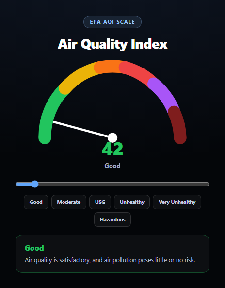
This gauge uses the actual US EPA Air Quality Index scale — the same six categories, breakpoints, and colors published in the EPA's AQI technical documentation — not an invented 0-100 approximation. Drag the slider or click a preset and every part of the UI (needle angle, readout color, band name, health advisory) derives from the same real breakpoint table.
The real EPA breakpoints
The BANDS array encodes the actual six AQI categories: Good (0-50, green #22c55e), Moderate (51-100, yellow #eab308), Unhealthy for Sensitive Groups (101-150, orange #f97316), Unhealthy (151-200, red #ef4444), Very Unhealthy (201-300, purple #a855f7), and Hazardous (301+, maroon #7f1d1d). bandFor(aqi) walks the table and returns the first band whose max the value doesn't exceed — the same lookup logic any real AQI display uses, just applied to a value you control with a slider instead of a live sensor feed.
One SVG arc, six colored segments
The gauge is a single semicircular SVG built from six separate <path> arcs, each stroked in its band's exact color and sized proportionally to that band's real point range — the Good segment is visually narrower than Hazardous's open-ended range gets represented as a fixed final wedge, matching how AQI scales are conventionally drawn. A single needle <line> rotates from -90° (0 AQI) to +90° (500 AQI) via transform: rotate(), animated with a spring-like cubic-bezier transition so moving the slider sweeps the needle smoothly across the full 500-point scale.
A health advisory per band, not just a color
Each band carries the real short-form advisory language associated with that AQI category — from "little or no risk" at Good to "everyone is more likely to be affected" at Hazardous — so the gauge communicates what the number actually means, not just what color it is. Pair this with a weather widget or weather forecast card for a complete environmental conditions dashboard.
Build with AI
Build, Understand, Optimize, and Extend It With AI
Paste this snippet's HTML, CSS, and JS into an AI coding assistant like Claude and ask it to verify the AQI breakpoint values and colors against the EPA's official AQI technical documentation, and to explain how the needle's rotation formula ((aqi / 500) * 180 - 90) maps the 0-500 AQI scale onto a 180-degree semicircle. It's also useful for reasoning about the gauge construction — ask why each band is drawn as a separate SVG arc segment rather than one continuous gradient stroke, and what tradeoffs that makes for getting hard color boundaries exactly at the real breakpoints versus a smoother but less accurate gradient. For extensions, ask it to wire the gauge up to a real air-quality API (like AirNow or OpenWeatherMap's air pollution endpoint) with polling, add a small history sparkline beneath the gauge showing the last 24 hours, or add a second gauge for PM2.5 concentration alongside the overall AQI. Treat the code less like a finished artifact and more like a starting point for a conversation.
Prompt to recreate it
Copy this into your AI assistant of choice to build the effect from scratch, or as a jumping-off point for your own variant:
Build an "air quality index gauge" in plain HTML, CSS, and JavaScript (inline SVG, no charting library) using the real US EPA Air Quality Index scale.

Requirements:
- Use the actual EPA AQI breakpoints and standard category colors: Good 0-50 (green), Moderate 51-100 (yellow), Unhealthy for Sensitive Groups 101-150 (orange), Unhealthy 151-200 (red), Very Unhealthy 201-300 (purple), Hazardous 301+ (maroon). Get these boundaries and colors exactly right — do not invent different thresholds.
- Render a semicircular gauge as inline SVG, built from six separate arc <path> elements (one per band) each stroked in its band's real color, sized proportionally to that band's point range within the 0-500 scale the gauge represents.
- A single needle line element that rotates via a CSS transform: rotate() to point at the current AQI value, mapped linearly across the semicircle (0 AQI at one end, 500 AQI at the other), animated with a smooth easing transition whenever the value changes.
- A range slider (0-500) that updates the AQI value live as it's dragged, plus a row of preset buttons that jump directly to a representative value within each of the six bands.
- A big numeric AQI readout and a text label showing the current band name, both colored to match the active band, plus a short health advisory paragraph beneath the gauge that changes to that band's real short-form EPA guidance text (e.g. "little or no risk" for Good, up through "everyone is more likely to be affected" for Hazardous).
- Structure the code so a single function (e.g. update(aqiValue)) is the one place that looks up the correct band from an AQI value and updates the needle angle, readout color, band label, and advisory text — so the same function could later be driven by a live air-quality API instead of the slider.
Want to tighten it up first? Run this prompt through the AI Prompt Studio to score it across 8 quality dimensions, catch anti-patterns, and tune the wording for Claude, ChatGPT, or Gemini before you paste it in.
Step by step
How to Use
- 1Paste HTML, CSS, and JSThe gauge renders at AQI 42 — Good.
- 2Drag the sliderThe needle sweeps and the readout updates live, 0–500.
- 3Click a presetJump straight to a representative value for each band.
- 4Read the advisoryThe health message below updates per real EPA band.
- 5Cross the 50/100/150/200/300 marksWatch the color and band name change at the real breakpoints.
- 6Wire up live dataReplace the slider with a call to update(aqi) from an air-quality API.
Real-world uses
Common Use Cases
Got questions?
Frequently Asked Questions
Yes. The BANDS table uses the real US EPA Air Quality Index breakpoints: Good 0-50, Moderate 51-100, Unhealthy for Sensitive Groups 101-150, Unhealthy 151-200, Very Unhealthy 201-300, and Hazardous 301 and above, matching the EPA's published AQI technical documentation. The colors (green, yellow, orange, red, purple, maroon) match the official category colors used on EPA and AirNow reporting.
The gauge sweeps a 180-degree semicircle, so the needle's rotation angle is (aqi / 500) * 180 - 90, mapping AQI 0 to -90 degrees (pointing left) and AQI 500 to +90 degrees (pointing right). A CSS transition with a spring-like cubic-bezier easing animates the rotation whenever the underlying value changes, whether from the slider or a preset button.
AQI values technically extend past 500 in extreme cases, but 500 is the top of the standard reporting scale used by the EPA and AirNow, and the slider and gauge are capped there (values are clamped with Math.max/Math.min). The Hazardous arc represents 301-500 on the gauge, consistent with how the scale is conventionally visualized even though real-world Hazardous readings can occasionally exceed 500.
Yes — the slider and preset buttons are just two ways of calling the same update(aqi) function, which handles clamping the value, finding the right band, and updating the needle angle, readout, and advisory text. Call update(currentAqiFromYourApi) on whatever interval your air-quality data source refreshes, and remove or hide the slider if you don't want manual control.
Keep the numeric AQI value in component state, derive the active band by running the same breakpoint lookup against it, and bind the needle's rotate() transform, the readout color, and the advisory text to that derived band — the SVG arcs themselves are static and never need to re-render, only the needle's transform attribute and a few text/color bindings change.