Source Code
<div class="sht-card">
  <div class="sht-head">
    <h2 class="sht-title">Team performance</h2>
    <span class="sht-hint">Scroll the table ↓ →</span>
  </div>
  <div class="sht-scroll">
    <table class="sht-table">
      <thead>
        <tr>
          <th class="sht-corner">Member</th>
          <th>Role</th><th>Deals</th><th>Revenue</th><th>Win rate</th><th>Calls</th><th>Emails</th><th>Status</th>
        </tr>
      </thead>
      <tbody>
        <tr><th class="sht-rowh">Ava Chen</th><td>AE</td><td>42</td><td>$128k</td><td>61%</td><td>310</td><td>1,204</td><td><span class="sht-tag up">On track</span></td></tr>
        <tr><th class="sht-rowh">Marco Diaz</th><td>AE</td><td>38</td><td>$112k</td><td>57%</td><td>288</td><td>980</td><td><span class="sht-tag up">On track</span></td></tr>
        <tr><th class="sht-rowh">Sora Lee</th><td>SDR</td><td>21</td><td>$64k</td><td>48%</td><td>412</td><td>1,560</td><td><span class="sht-tag warn">At risk</span></td></tr>
        <tr><th class="sht-rowh">Riya Patel</th><td>AE</td><td>51</td><td>$156k</td><td>66%</td><td>275</td><td>890</td><td><span class="sht-tag up">Ahead</span></td></tr>
        <tr><th class="sht-rowh">Theo Park</th><td>SDR</td><td>17</td><td>$48k</td><td>41%</td><td>523</td><td>1,840</td><td><span class="sht-tag warn">At risk</span></td></tr>
        <tr><th class="sht-rowh">Nina Rao</th><td>AE</td><td>44</td><td>$134k</td><td>62%</td><td>301</td><td>1,110</td><td><span class="sht-tag up">On track</span></td></tr>
        <tr><th class="sht-rowh">Leo Frost</th><td>SDR</td><td>24</td><td>$71k</td><td>50%</td><td>389</td><td>1,420</td><td><span class="sht-tag up">On track</span></td></tr>
        <tr><th class="sht-rowh">Mia Vance</th><td>AE</td><td>49</td><td>$148k</td><td>64%</td><td>262</td><td>845</td><td><span class="sht-tag up">Ahead</span></td></tr>
        <tr><th class="sht-rowh">Owen Bly</th><td>SDR</td><td>19</td><td>$52k</td><td>44%</td><td>470</td><td>1,690</td><td><span class="sht-tag warn">At risk</span></td></tr>
        <tr><th class="sht-rowh">Zoe Kim</th><td>AE</td><td>46</td><td>$140k</td><td>63%</td><td>284</td><td>1,005</td><td><span class="sht-tag up">On track</span></td></tr>
      </tbody>
    </table>
  </div>
</div>*{box-sizing:border-box;margin:0;padding:0}
body{font-family:system-ui,-apple-system,sans-serif;background:#f1f5f9;min-height:100vh;display:flex;align-items:center;justify-content:center;padding:24px}
.sht-card{background:#fff;border:1px solid #e2e8f0;border-radius:16px;width:100%;max-width:560px;box-shadow:0 14px 44px rgba(15,23,42,.07);overflow:hidden}
.sht-head{display:flex;align-items:baseline;justify-content:space-between;padding:18px 20px 14px}
.sht-title{font-size:16px;font-weight:800;color:#1e293b}
.sht-hint{font-size:11px;color:#94a3b8;font-weight:600}
.sht-scroll{max-height:300px;overflow:auto;border-top:1px solid #f1f5f9}
.sht-table{border-collapse:separate;border-spacing:0;width:max-content;min-width:100%;font-size:13px}
.sht-table th,.sht-table td{padding:11px 16px;text-align:right;white-space:nowrap;border-bottom:1px solid #f1f5f9;color:#475569;font-variant-numeric:tabular-nums}
.sht-table thead th{text-align:right;font-size:11px;font-weight:700;text-transform:uppercase;letter-spacing:.04em;color:#94a3b8;background:#f8fafc;position:sticky;top:0;z-index:2}
/* First column: left-aligned, frozen */
.sht-table th.sht-rowh,.sht-table th.sht-corner{text-align:left;font-weight:700;color:#1e293b;position:sticky;left:0;background:#fff;z-index:1}
.sht-table thead th.sht-corner{z-index:3;background:#f8fafc}
.sht-table tbody tr:hover th.sht-rowh,.sht-table tbody tr:hover td{background:#f5f3ff}
/* subtle divider showing the frozen column edge */
.sht-table th.sht-rowh::after,.sht-table th.sht-corner::after{content:'';position:absolute;top:0;right:0;bottom:0;width:1px;background:#e2e8f0}
.sht-tag{display:inline-block;font-size:11px;font-weight:700;padding:3px 9px;border-radius:999px}
.sht-tag.up{background:#dcfce7;color:#16a34a}
.sht-tag.warn{background:#fef3c7;color:#b45309}
.sht-scroll::-webkit-scrollbar{height:9px;width:9px}
.sht-scroll::-webkit-scrollbar-thumb{background:#e2e8f0;border-radius:8px;border:2px solid #fff}Learn Coding Visually
Learn to code with interactive, live-preview playgrounds — HTML, CSS, JavaScript, React & more.
 HTML Playground42 lessons · Click-based · Live preview
 CSS PlaygroundLearn CSS with a live editor
 JavaScript Playground60 lessons · DOM · Async · Canvas
 React PlaygroundLearn React with a live code editor
 GSAP PlaygroundLearn GSAP animation interactively
 SVG Playground44 lessons · shapes · paths · animation
 SCSS Playground45 lessons · Sass modules · tokens
 Tailwind PlaygroundLearn Tailwind CSS with a live editor
 Bootstrap 5 Playground50 lessons · live preview
Sticky Header Table — Frozen Panes HTML CSS Snippet
Sticky Header Table · Tables · Plain HTML & CSS · Live preview
What's included
Features
position: sticky; top: 0 inside the scroll container, so column labels stay visible while rows scroll.position: sticky; left: 0, keeping the row label visible during horizontal scroll.top: 0 and left: 0 at the highest z-index, anchoring both frozen panes.overflow: auto plus width: max-content; min-width: 100% enables both vertical and horizontal scrolling that fills the card.border-collapse: separate with per-cell borders and a 1px ::after edge avoids the broken sticky behaviour of collapsed borders.position: sticky — no scroll listeners, no layout thrash, fully accessible.About this UI Snippet
Sticky Header Table — Frozen Header Row & Frozen First Column With position:sticky
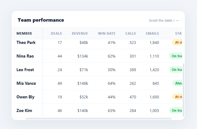
Wide data tables are unreadable the moment you scroll: the column headers disappear off the top and you lose track of which row you are on as the first column scrolls off the left. The fix every dashboard and admin panel needs is frozen panes — a header row pinned to the top and a first column pinned to the left, both staying put while the rest of the table scrolls in two dimensions. This snippet implements that in pure HTML and CSS using position: sticky, with zero JavaScript.
The two-axis sticky setup
The table lives in a .sht-scroll container with overflow: auto and a fixed max-height, which is what creates the scroll context. Three sticky rules do the work: the header cells use position: sticky; top: 0 so they pin to the top of that scroll container; the first-column cells use position: sticky; left: 0 so they pin to the left; and the top-left corner cell uses both top: 0 and left: 0 so it stays locked in place as the anchor of both frozen panes.
Why z-index ordering matters
Sticky cells overlap as you scroll, so stacking order is critical. The header row sits at z-index: 2, the frozen first column at z-index: 1, and the corner cell at z-index: 3 so it stays above both when they cross. Without this ordering the body cells would bleed over the frozen header, or the header would slide under the first column — the classic broken-frozen-pane look. Each sticky cell also needs an opaque background (transparent sticky cells let scrolled content show through), which is why the header is #f8fafc and the first column is white.
Border-collapse caveat
position: sticky does not work reliably with border-collapse: collapse because collapsed borders are owned by the table, not the cells. This snippet uses border-collapse: separate; border-spacing: 0 and draws row dividers with per-cell border-bottom, plus a 1px ::after on the frozen column to render the vertical edge that visually separates it from the scrolling area.
Sizing for horizontal scroll
The table uses width: max-content; min-width: 100% so it grows as wide as its content needs (triggering horizontal scroll) but still fills the container when there are few columns. Numeric columns are right-aligned with tabular-nums for clean figure alignment, while the frozen name column is left-aligned.
The result is a robust, dependency-free data grid that scrolls in both directions with headers and the key column always visible. Pair this with a sortable table for column sorting, a pagination table for paging, or a data table with search and row actions.
Build with AI
Build, Understand, Optimize, and Extend It With AI
You don't have to puzzle out the z-index stacking order by trial and error. Paste this snippet's HTML, CSS, and JS into an AI coding assistant like Claude and ask it to explain exactly why the corner cell needs both top and left stickiness at z-index 3 while the header sits at 2 and the frozen column at 1, and why border-collapse separate is required instead of the usual collapse. The same assistant can help optimize it — for instance whether a table with hundreds of rows should virtualize its body instead of relying on the browser to lay out every row, or whether the frozen-column shadow effect needs a scroll listener at all. It's also useful for extending the table: ask it to freeze a second column, add a scrolled-state box-shadow cue on the frozen edges, or make columns resizable while keeping the sticky behavior intact. Treat the code less like a finished artifact and more like a starting point for a conversation.
Prompt to recreate it
Copy this into your AI assistant of choice to build the effect from scratch, or as a jumping-off point for your own variant:
Build a data table with a frozen header row and a frozen first column in plain HTML and CSS using only position: sticky — no JavaScript, no virtual scrolling library.

Requirements:
- A scroll container with a fixed max-height and overflow auto wrapping a table sized with width: max-content and min-width: 100%, so it can scroll both vertically and horizontally.
- The table must use border-collapse: separate with border-spacing: 0, not border-collapse: collapse, and draw row separators using per-cell border-bottom, because collapsed borders break position: sticky on table cells.
- All header cells must be position: sticky with top: 0 so they remain pinned to the top of the scroll container while the body scrolls vertically underneath them.
- Every row's first cell (the row label) must be position: sticky with left: 0 so it remains pinned to the left edge while the remaining columns scroll horizontally.
- The single top-left corner cell must be position: sticky with both top: 0 and left: 0 simultaneously, so it stays anchored in both directions as the visual anchor of the two frozen panes.
- Assign explicit, correctly ordered z-index values so the corner cell always renders above the header row, and the header row always renders above the frozen column, preventing scrolled body cells from bleeding over either frozen edge.
- Every sticky cell must have an explicit opaque background color, since transparent sticky cells let scrolled content show through underneath them.
- Add a thin vertical divider (e.g. a 1px pseudo-element edge) on the frozen column so its boundary with the scrolling area is visually clear.
Want to tighten it up first? Run this prompt through the AI Prompt Studio to score it across 8 quality dimensions, catch anti-patterns, and tune the wording for Claude, ChatGPT, or Gemini before you paste it in.
Step by step
How to Use
- 1Paste HTML, CSS, and JSA "Team performance" table appears inside a fixed-height, scrollable card with many columns and rows.
- 2Scroll downThe header row (Role, Deals, Revenue…) stays pinned at the top while the rows scroll beneath it.
- 3Scroll rightThe first "Member" column stays pinned to the left while the metric columns scroll horizontally.
- 4Watch the cornerThe top-left "Member" header cell stays locked in both directions as the anchor of the frozen panes.
- 5Hover a rowThe whole row — including the frozen name cell — highlights together, so the pinned column tracks the hovered row.
- 6Adjust the freeze heightChange
max-heighton.sht-scrollto control how many rows show before vertical scrolling kicks in.
Real-world uses
Common Use Cases
Got questions?
Frequently Asked Questions
The two most common causes: (1) border-collapse: collapse breaks sticky on table cells — switch to border-collapse: separate; border-spacing: 0 and draw borders per cell (this snippet does). (2) An ancestor has overflow: hidden/auto other than your intended scroll container, which captures the stickiness. Also ensure the scroll container has a constrained height/width so there is something to scroll within.
Make each additional column sticky with left set to the cumulative width of the columns before it (e.g. second frozen column left: 160px if the first is 160px wide). Give them descending z-indexes and opaque backgrounds. Because left offsets must be exact, fixed widths on the frozen columns make this reliable.
Pure CSS cannot detect scroll position, so add a tiny scroll listener that toggles a class on the container when scrollLeft > 0 (and scrollTop > 0), then apply a box-shadow to the frozen column/header in that state. This "scrolled" shadow is a nice cue that content is hidden behind the frozen panes, used by Google Sheets and Airtable.
Yes — it is a real semantic <table> with <thead>, <th> headers (including row headers via <th scope="row">, which you should add), so screen readers announce the structure correctly. position: sticky is purely visual and does not change the DOM order or semantics, so assistive tech is unaffected by the freezing.
It is mostly CSS, so it ports almost verbatim: render the <table> from your data with the same class names and position: sticky rules. In React, map rows from an array and add the sticky classes; in Vue use v-for; in Angular *ngFor. No lifecycle hooks are needed since there is no JavaScript — only add a hook if you implement the optional scroll-shadow cue.