Learn Coding Visually
Learn to code with interactive, live-preview playgrounds — HTML, CSS, JavaScript, React & more.
 HTML Playground42 lessons · Click-based · Live preview
 CSS PlaygroundLearn CSS with a live editor
 JavaScript Playground60 lessons · DOM · Async · Canvas
 React PlaygroundLearn React with a live code editor
 GSAP PlaygroundLearn GSAP animation interactively
 SVG Playground44 lessons · shapes · paths · animation
 SCSS Playground45 lessons · Sass modules · tokens
 Tailwind PlaygroundLearn Tailwind CSS with a live editor
 Bootstrap 5 Playground50 lessons · live preview
Portfolio Filter Grid — Isotope-Style HTML CSS JS
Portfolio Filter Grid · Layouts · Plain HTML, CSS & JS · Live preview
What's included
Features
data-cat and tabs data-filter; filterItems shows matches and hides the rest with a class — no library.animation-delay and a re-triggered pf-in keyframe, so matches cascade into the grid.offsetWidth / add-class trick replays the entrance on every filter change.transform and opacity, so it stays smooth and survives the Tailwind/React export.aspect-ratio tiles collapses to 2 columns on mobile, with a legibility gradient per tile.About this UI Snippet
Portfolio Filter Grid — Category Tabs, Staggered Reveal & Per-Tab Counts
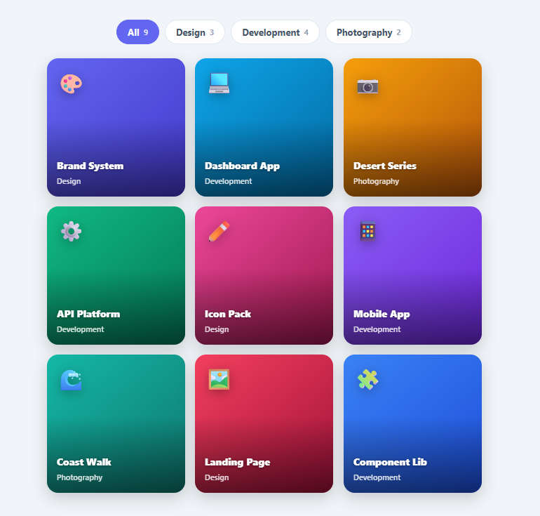
A filterable grid — the "Isotope" pattern — lets visitors narrow a portfolio, gallery, or catalogue by category with a single tap, and the items that match animate into place. It is a staple of portfolio sites, case-study pages, and project galleries. This snippet implements it in plain HTML, CSS, and vanilla JavaScript with a smooth, dependency-free reveal: category tabs with counts, a responsive grid, a staggered scale-in for matching items, and an empty state.
Tag-based filtering
Every grid item carries a data-cat attribute, and every tab a data-filter. filterItems moves the active class to the clicked tab, then loops the items: those whose category matches the filter (or the special all) stay visible, the rest get a .hide class that sets display: none. This is the simplest robust filtering model — no layout library, no DOM reordering, just a class toggle per item driven by data attributes.
Staggered scale-in reveal
Matching items don't just appear — they animate in. For each visible item, filterItems sets an animation-delay based on a running visible-count, then re-triggers a pf-in keyframe (opacity + scale + translate) using the remove-class / force-reflow / add-class trick. The result is a pleasing cascade where the filtered items pour into the grid left-to-right, every time you change tabs. Because the animation uses only transform and opacity, it runs on the compositor and exports cleanly to utility frameworks (which animate transforms but not layout).
Why display:none over a FLIP reorder
True Isotope animates items physically sliding to new positions (the FLIP technique), which is impressive but fragile and heavy. This snippet deliberately uses display: none for non-matching items and an entrance animation for matching ones — the matching items fade and scale in while the grid reflows instantly underneath. It is far simpler, has no edge cases, and reads as polished for the vast majority of portfolio use cases.
Counts and empty state
Each tab shows a count of items in that category, helping users gauge what's there before clicking. After filtering, filterItems reveals a "No projects in this category" message if nothing matched — a graceful end state instead of a blank grid. The grid itself is a responsive three-column layout that collapses to two on mobile, with square aspect-ratio tiles and a legibility gradient over each.
Swap the tiles for real project thumbnails and link them out. Pair this with an image lightbox for full views, a masonry grid for varied heights, or a chip filter for multi-tag filtering.
Build with AI
Build, Understand, Optimize, and Extend It With AI
You don't have to trace the reflow trick or the staggering formula by hand. Paste this snippet's HTML, CSS, and JS into an AI coding assistant like Claude and ask it to explain exactly why filterItems removes and re-adds the "in" class with a forced offsetWidth read in between, and how the shown counter multiplied by a fixed increment produces the animation-delay that makes matching items cascade in left to right. The same assistant can help optimize it, for example checking whether display none is really the best way to hide non-matching items versus a FLIP-based reposition animation, or whether the staggering delay should scale down automatically for filters with many more matching items. It's also useful for extending the effect: ask it to support filtering by multiple simultaneous tags instead of one category at a time, add a search input that filters by item name alongside the category tabs, or animate the tab's active-state pill sliding between tabs instead of an instant class swap. Treat the code less like a finished artifact and more like a starting point for a conversation.
Prompt to recreate it
Copy this into your AI assistant of choice to build the effect from scratch, or as a jumping-off point for your own variant:
Build a filterable portfolio grid (the "Isotope" pattern) in plain HTML, CSS, and vanilla JavaScript, with no masonry or filtering library.

Requirements:
- A row of category tab buttons, each carrying a data-filter value (including a special "all" value), and a grid of item tiles, each carrying a data-cat value naming its category.
- Clicking a tab must move an active-state class to that tab and, for every grid item, decide whether it matches the new filter (either the item's category equals the tab's filter, or the filter is "all"); non-matching items must be hidden via a CSS class that sets display: none, and matching items must remain visible.
- Every time matching items are revealed by a filter change, they must replay a scale-and-fade entrance animation from scratch — even if that same item was already visible before the filter changed — using the standard technique of removing the animation class, forcing a synchronous reflow by reading the element's offsetWidth, then re-adding the animation class so the browser doesn't skip an animation it considers already-played.
- Stagger the entrance animation so matching items cascade in left-to-right rather than popping in simultaneously, by assigning each visible item an increasing CSS animation-delay based on a running count of how many items have been shown so far in that render pass.
- If a filter matches zero items, reveal a distinct "no items" empty-state message in place of the grid; hide that message again as soon as a filter matches at least one item.
- Keep the animation limited to transform and opacity properties only (no animating layout properties like width, height, or top/left) so it stays smooth and compositor-friendly.
Want to tighten it up first? Run this prompt through the AI Prompt Studio to score it across 8 quality dimensions, catch anti-patterns, and tune the wording for Claude, ChatGPT, or Gemini before you paste it in.
Step by step
How to Use
- 1Paste HTML, CSS, and JSA portfolio appears with category tabs (All, Design, Development, Photography) above a 3-column grid of nine project tiles.
- 2Click a categoryClick "Design" — only design projects remain and they scale-in one after another in a staggered cascade.
- 3Switch tabsEach tab change re-runs the entrance animation for the newly matching items, so filtering always feels alive.
- 4Read the countsEach tab shows how many projects it contains, so visitors know what to expect before clicking.
- 5Back to AllClick "All" to bring every project back, again with the staggered reveal.
- 6Swap in real workReplace each tile's gradient and emoji with a project thumbnail and set its
data-cat; the filtering needs no changes.
Real-world uses
Common Use Cases
Got questions?
Frequently Asked Questions
Add a tab with a data-filter value and grid items with the matching data-cat. filterItems works generically off those attributes, so no code changes are needed. Update each tab's count span (or compute counts in JS on load by counting items per data-cat).
Give items a space-separated data-cat (e.g. "design web") and change the match test to check whether the item's tag list includes the active filter. For multi-select filtering (show items matching ANY selected tag), track a set of active filters and show an item if its tags intersect that set — pair it with a chip filter UI.
Position-shuffle animations use the FLIP technique (measure first/last positions, animate the delta), which is impressive but adds significant complexity and edge cases, especially with responsive grids. Using display: none for non-matches plus an entrance animation for matches is far simpler, robust, and looks polished — the right trade-off for most portfolios.
Use real <button> tabs (this snippet does) so they are keyboard-operable, and add aria-pressed to reflect the active filter. Consider grouping the tabs with role="group" and an accessible label, and announcing the result count via an aria-live region so screen-reader users hear "Showing 3 design projects" after filtering.
In React, hold the active filter in useState and derive the visible items by filtering the array in render — no class toggling; use a CSS animation keyed on the filter (or a key change) to replay the entrance. In Vue, use a computed filtered list with <transition-group> for animation. In Angular, an *ngFor over a filtered array with @animations. The keyframe and grid CSS port unchanged.