Source Code
<div class="demo">
  <div class="rings-wrap">
    <svg class="rings-svg" viewBox="0 0 120 120" role="img" aria-label="Loading three stages: assets, config, data">
      <circle class="ring-track" cx="60" cy="60" r="52" />
      <circle class="ring-track" cx="60" cy="60" r="38" />
      <circle class="ring-track" cx="60" cy="60" r="24" />
      <circle class="ring-fill ring-1" cx="60" cy="60" r="52" />
      <circle class="ring-fill ring-2" cx="60" cy="60" r="38" />
      <circle class="ring-fill ring-3" cx="60" cy="60" r="24" />
    </svg>
    <div class="rings-center">
      <span class="rings-pct" id="pct">0%</span>
      <span class="rings-label" id="label">Loading assets…</span>
    </div>
  </div>
  <div class="rings-legend">
    <span><i style="background:#6366f1"></i>Assets</span>
    <span><i style="background:#22d3ee"></i>Config</span>
    <span><i style="background:#34d399"></i>Data</span>
  </div>
</div>
* { box-sizing: border-box; margin: 0; padding: 0; }
body { font-family: system-ui, sans-serif; background: #f8fafc; display: flex; align-items: center; justify-content: center; min-height: 100vh; padding: 24px; }
.demo { display: flex; flex-direction: column; align-items: center; gap: 18px; }
.rings-wrap { position: relative; width: 160px; height: 160px; }
.rings-svg { width: 100%; height: 100%; transform: rotate(-90deg); }
.ring-track { fill: none; stroke: #eef2ff; stroke-width: 7; }
.ring-fill { fill: none; stroke-width: 7; stroke-linecap: round; transition: stroke-dashoffset 0.4s cubic-bezier(.4,0,.2,1); }
.ring-1 { stroke: #6366f1; stroke-dasharray: 326.7; stroke-dashoffset: 326.7; }
.ring-2 { stroke: #22d3ee; stroke-dasharray: 238.8; stroke-dashoffset: 238.8; }
.ring-3 { stroke: #34d399; stroke-dasharray: 150.8; stroke-dashoffset: 150.8; }
.rings-center { position: absolute; inset: 0; display: flex; flex-direction: column; align-items: center; justify-content: center; gap: 3px; }
.rings-pct { font-size: 22px; font-weight: 800; color: #111827; font-variant-numeric: tabular-nums; }
.rings-label { font-size: 10.5px; font-weight: 600; color: #94a3b8; text-align: center; padding: 0 10px; }
.rings-legend { display: flex; gap: 16px; }
.rings-legend span { display: flex; align-items: center; gap: 6px; font-size: 11.5px; font-weight: 600; color: #64748b; }
.rings-legend i { width: 8px; height: 8px; border-radius: 50%; display: inline-block; }const ring1 = document.querySelector('.ring-1');
const ring2 = document.querySelector('.ring-2');
const ring3 = document.querySelector('.ring-3');
const pctEl = document.getElementById('pct');
const labelEl = document.getElementById('label');
const stages = [
{ ring: ring1, dasharray: 326.7, label: 'Loading assets…' },
{ ring: ring2, dasharray: 238.8, label: 'Applying config…' },
{ ring: ring3, dasharray: 150.8, label: 'Fetching data…' },
];
function setRing(ring, dasharray, progress) {
ring.style.strokeDashoffset = dasharray * (1 - progress);
}
let overall = 0;
let stageIndex = 0;
let stageProgress = 0;
function tick() {
if (stageIndex >= stages.length) return;
stageProgress += 0.045;
const current = stages[stageIndex];
setRing(current.ring, current.dasharray, Math.min(stageProgress, 1));
overall = ((stageIndex + Math.min(stageProgress, 1)) / stages.length) * 100;
pctEl.textContent = Math.round(overall) + '%';
labelEl.textContent = current.label;
if (stageProgress >= 1) {
stageIndex += 1;
stageProgress = 0;
if (stageIndex < stages.length) {
labelEl.textContent = stages[stageIndex].label;
} else {
labelEl.textContent = 'Ready';
pctEl.textContent = '100%';
return;
}
}
requestAnimationFrame(tick);
}
requestAnimationFrame(tick);Learn Coding Visually
Learn to code with interactive, live-preview playgrounds — HTML, CSS, JavaScript, React & more.
 HTML Playground42 lessons · Click-based · Live preview
 CSS PlaygroundLearn CSS with a live editor
 JavaScript Playground60 lessons · DOM · Async · Canvas
 React PlaygroundLearn React with a live code editor
 GSAP PlaygroundLearn GSAP animation interactively
 SVG Playground44 lessons · shapes · paths · animation
 SCSS Playground45 lessons · Sass modules · tokens
 Tailwind PlaygroundLearn Tailwind CSS with a live editor
 Bootstrap 5 Playground50 lessons · live preview
Concentric Rings Progress Loader — Multi-Stage SVG Loading Indicator
Concentric Rings Progress Loader · Loaders · Plain HTML, CSS & JS · Live preview
What's included
Features
About this UI Snippet
Concentric Rings Progress Loader — One Ring per Loading Stage
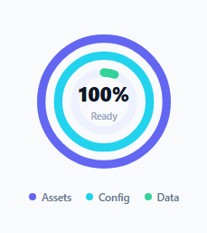
A single spinner or progress bar can only communicate "something is happening" and, at best, one overall percentage. This loader instead uses three nested SVG rings, filled one at a time in sequence, so a genuinely multi-stage loading process — asset loading, then config, then data — has a visual home for each individual stage's progress, not just a single blended number.
The stroke-dasharray / stroke-dashoffset technique
Each ring is an SVG <circle> with no fill, just a stroke, and a stroke-dasharray set to that circle's exact circumference (2 × π × r, precomputed per radius — 326.7 for r=52, 238.8 for r=38, 150.8 for r=24). Because the dash pattern is exactly one segment as long as the whole circle, the circle appears either fully drawn or, when stroke-dashoffset equals the same value, entirely hidden. Animating stroke-dashoffset from that full value down to 0 makes the ring appear to fill in continuously, clockwise from its start point — a standard SVG progress-ring trick, applied here three times independently.
Why the SVG is rotated -90 degrees
SVG circles start their path at the 3 o'clock position by default. Rotating the whole <svg> element -90deg moves that starting point to 12 o'clock, which is the conventional "start" position for a progress indicator — the rotation is applied once to the parent SVG rather than adjusting each circle's path math individually.
Sequencing three independent progress values into one loop
A single requestAnimationFrame loop (tick) advances one shared stageProgress value for whichever ring is currently active (stages[stageIndex]). Once that stage reaches 1 (fully filled), the loop increments stageIndex, resets stageProgress to 0, and continues animating the *next* ring — so only one ring is ever actively filling at a time, while previously completed rings simply stay full. The center percentage (overall) is derived from both values together: ((stageIndex + stageProgress) / stages.length) * 100, so it advances smoothly across the whole sequence rather than jumping in three big steps.
Where a multi-stage loader beats a single progress bar
Multi-step processes — app cold-start sequences, multi-phase file uploads, onboarding data imports — genuinely have distinct phases with their own completion criteria. Showing them as one blended percentage hides *which* phase is currently slow; three separate, individually-labeled rings that fill one after another give a user (or a developer debugging a slow load) a much clearer read on exactly what's happening and roughly how far along it is.
Build with AI
Build, Understand, Optimize, and Extend It With AI
Ask an AI assistant to walk through the stroke-dasharray/stroke-dashoffset math for an SVG progress ring in detail — specifically why the dasharray value must equal the circle's circumference and how that relates to the radius — since getting this wrong is the most common bug when customizing ring sizes. It's also worth asking for a version where all three rings fill concurrently based on independently-reported real progress values instead of one at a time, or for a version that turns red and pauses if a stage's underlying operation reports an error.
Prompt to recreate it
Copy this into your AI assistant of choice to build the effect from scratch, or as a jumping-off point for your own variant:
Build a multi-stage SVG progress loader in HTML, CSS and vanilla JavaScript showing three concentric rings that fill in sequence, one per loading stage — no external libraries.

Requirements:
- An SVG with three nested circles of decreasing radius, each with a light "track" circle behind it and a colored "fill" circle in front using the stroke-dasharray/stroke-dashoffset technique to animate as a progress ring.
- Rotate the SVG so each ring's fill starts from the 12 o'clock position rather than the SVG default of 3 o'clock.
- Animate the rings sequentially using requestAnimationFrame: the outermost ring fills first from 0 to 100% before the next ring begins filling, and so on, with completed rings remaining visually full.
- A center label showing a live overall percentage computed from both which stage is active and how far that stage has progressed, updating smoothly as the animation runs (not in three large jumps).
- A secondary text label in the center that updates to name whichever stage is currently active (e.g. "Loading assets…", "Applying config…", "Fetching data…").
- A small legend beneath the rings mapping each ring's color to its stage name, and appropriate ARIA attributes summarizing the loader's purpose for screen readers.
Want to tighten it up first? Run this prompt through the AI Prompt Studio to score it across 8 quality dimensions, catch anti-patterns, and tune the wording for Claude, ChatGPT, or Gemini before you paste it in.
Step by step
How to Use
- 1Adjust the ring radii and dasharray values togetherIf you change an r attribute on a circle, recompute its stroke-dasharray as 2 × π × r and update both the SVG and matching JS dasharray values.
- 2Edit the stages arrayEach stage needs a ring element reference, its matching dasharray number, and a label string shown while it is active.
- 3Tune the fill speedChange the 0.045 increment added to stageProgress each frame — a smaller number fills more slowly, a larger one more quickly.
- 4Replace the simulated progress with real progressInstead of incrementing stageProgress by a fixed amount per frame, set it directly from real load-event progress (e.g. a fetch's reported bytes loaded).
- 5Swap the ring colorsUpdate the stroke colors on .ring-1/.ring-2/.ring-3 and the matching legend dot colors in the HTML panel to fit your palette.
Real-world uses
Common Use Cases
Got questions?
Frequently Asked Questions
Setting stroke-dasharray to the circle's exact circumference creates one dash segment as long as the whole circle, so the ring renders as fully drawn. Animating stroke-dashoffset toward 0 progressively reveals more of that segment from the start point, visually filling the ring.
SVG circles begin their path at the 3 o'clock position by default. Rotating the whole SVG element -90 degrees moves the visual starting point to 12 o'clock, matching the conventional orientation for a circular progress indicator.
Yes — remove the stageIndex advancement logic and instead update all three rings' stroke-dashoffset independently based on three separate real progress values reported concurrently, rather than gating them one after another.
Replace the fixed 0.045-per-frame increment in tick() with an assignment driven by real progress events — for example a fetch response's reported bytes loaded divided by total bytes for that stage.
The tick() function detects stageIndex has advanced past the last stage, sets the label to "Ready" and the percentage to a fixed 100%, and returns without scheduling another animation frame, stopping the loop cleanly.
The SVG has role="img" with a descriptive aria-label summarizing all three stages up front. For live progress updates specifically, consider adding aria-live="polite" to the percentage or label element so changes are announced as loading proceeds.