You Might Also Like
Learn Coding Visually
Learn to code with interactive, live-preview playgrounds — HTML, CSS, JavaScript, React & more.
 HTML Playground42 lessons · Click-based · Live preview
 CSS PlaygroundLearn CSS with a live editor
 JavaScript Playground60 lessons · DOM · Async · Canvas
 React PlaygroundLearn React with a live code editor
 GSAP PlaygroundLearn GSAP animation interactively
 SVG Playground44 lessons · shapes · paths · animation
 SCSS Playground45 lessons · Sass modules · tokens
 Tailwind PlaygroundLearn Tailwind CSS with a live editor
 Bootstrap 5 Playground50 lessons · live preview
Environment Badge — Free HTML CSS JS DEV/STAGING/PROD Ribbon Snippet
Environment Badge · Misc · Plain HTML, CSS & JS · Live preview
What's included
Features
About this UI Snippet
Environment Badge — HTML & CSS Corner Ribbon for Non-Production Builds
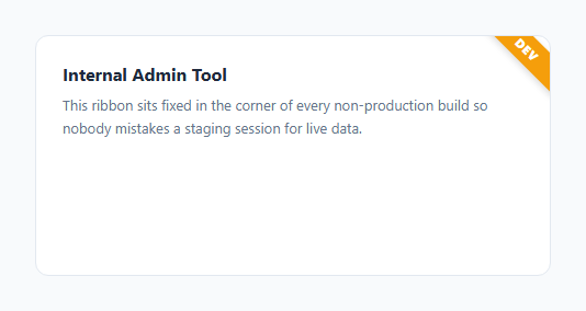
Internal tools that talk to real customer data are dangerous to confuse with a staging or dev copy — one wrong click in the wrong environment can send a real email, refund a real order, or delete real rows. This snippet is a small but high-value safety net: a diagonal corner ribbon, color-coded by environment, that's impossible to miss no matter what page of the admin tool you're on.
How the diagonal ribbon is built
The badge is a single div positioned with position: absolute; top: 0; right: 0 inside a position: relative container (your app shell, in a real integration). Rather than being a straight horizontal bar, it's rotated 45 degrees with transform: rotate(45deg), and nudged into place with translate(29%, -1%) so the rotated rectangle's diagonal spans neatly across the corner rather than floating off it. Generous horizontal padding (padding: 5px 36px) makes the ribbon wide enough that the rotated shape still fully covers the corner even though its unrotated width looks oversized.
How the color coding works
Each environment maps to one modifier class — .env-dev (amber), .env-staging (indigo), .env-prod (red) — each just setting a different background. The demo's setEnv(env) function removes all three classes and re-adds the correct one, and swaps the label text via a small lookup object. In a real app, you'd set this class once at boot time based on an environment variable or hostname check, not via a manual switcher — the buttons here exist purely so you can preview all three states in the live editor.
Why production is red and included at all
It might seem odd to show a badge in production, but many teams intentionally render a (very subtle, or fully hidden) production indicator too, so the *absence* of a dev/staging color is a positive confirmation rather than an assumption. Some teams choose to render nothing at all in prod — that's a one-line change: skip rendering the badge component entirely when env === 'prod'.
Wiring it to a real environment variable
In a real app, replace the manual setEnv calls with a single line at startup, e.g. setEnv(process.env.NEXT_PUBLIC_ENV || 'dev'), so the ribbon always reflects the actual deployed environment without any manual step.
Build with AI
Build, Understand, Optimize, and Extend It With AI
Ask an AI assistant to explain the transform math behind the ribbon — why 45 degrees plus a small translate offset produces a diagonal band that sits flush across a square corner container of a given size, and how you'd need to adjust the translate percentages if the container's corner radius or size changes. It's also a good prompt for making the badge environment-aware automatically: ask the assistant to write the one-line integration that reads an environment variable at build or runtime and calls setEnv accordingly, for your specific framework (Next.js, Vite, plain static site, etc.).
Prompt to recreate it
Copy this into your AI assistant of choice to build the effect from scratch, or as a jumping-off point for your own variant:
Build an "environment badge" corner ribbon in plain HTML, CSS, and JavaScript for flagging non-production builds of an internal tool.

Requirements:
- A single diagonal ribbon element positioned absolutely in the top-right corner of a relatively-positioned container, built using CSS rotate and translate transforms on a plain div — no image assets or SVG.
- Three color-coded environment states — DEV (amber/orange), STAGING (blue/indigo), PRODUCTION (red) — each defined as a separate CSS class that only changes the background color.
- One JavaScript function, setEnv(envName), that removes any existing environment class, adds the correct one, and updates the ribbon's label text from a small lookup object, so the badge can be driven by a single call at app startup.
- The ribbon must not affect the layout or click targets of the underlying page content — pure overlay, absolutely positioned, with a subtle drop shadow for legibility over any background.
- Include a way to preview all three states, such as demo buttons, but make clear in comments that a real integration should call setEnv() once based on a real environment variable rather than manual buttons.
Want to tighten it up first? Run this prompt through the AI Prompt Studio to score it across 8 quality dimensions, catch anti-patterns, and tune the wording for Claude, ChatGPT, or Gemini before you paste it in.
Step by step
How to Use
- 1Load the snippetClick "Environment Badge" in the sidebar Library tab to see the ribbon overlaying the mock app corner.
- 2Switch environmentsClick DEV, STAGING, or PRODUCTION below the demo to see the ribbon change color and label instantly.
- 3Adjust the ribbon angle or sizeTweak the rotate(45deg) and translate values in the CSS panel if your corner container has different proportions.
- 4Add or rename environmentsAdd a new .env-* class with a background color and extend the labels object in the JS panel.
- 5Wire to a real environment variableReplace the manual switcher buttons with a single setEnv() call driven by your build's environment variable at app startup.
- 6Export and saveExport as HTML/JSX/Tailwind or click "Save as" to keep this in your personal snippet library.
Real-world uses
Common Use Cases
Got questions?
Frequently Asked Questions
A diagonal ribbon in the exact corner draws the eye without stealing significant screen real estate or covering important UI, while still being large and bold enough to notice immediately.
A plain div is positioned in the top-right corner and rotated 45 degrees with a CSS transform, then nudged with translate so the rotated rectangle spans the corner cleanly. Padding controls how wide the visible ribbon band is.
Some teams do, using a muted or hidden style, so the badge's state is always explicit rather than assumed. Others render nothing in production — that's a simple conditional: skip rendering the component when env is "prod".
Call setEnv() once at app startup with a value derived from an environment variable, e.g. process.env.NEXT_PUBLIC_ENV, instead of using the manual switcher buttons included in this demo.
Yes — add a new CSS class (e.g. .env-qa) with its own background color, and add a matching entry to the labels lookup object in the JavaScript.
The ribbon only covers a small triangular area in the corner. If that area overlaps an interactive element in your real layout, add pointer-events: none to the badge, or nudge its position so it clears critical controls.
No — it is absolutely positioned and has no impact on the flow of surrounding content. It only requires the parent container to have position: relative (or fixed, for a viewport-anchored version).