You Might Also Like
Learn Coding Visually
Learn to code with interactive, live-preview playgrounds — HTML, CSS, JavaScript, React & more.
 HTML Playground42 lessons · Click-based · Live preview
 CSS PlaygroundLearn CSS with a live editor
 JavaScript Playground60 lessons · DOM · Async · Canvas
 React PlaygroundLearn React with a live code editor
 GSAP PlaygroundLearn GSAP animation interactively
 SVG Playground44 lessons · shapes · paths · animation
 SCSS Playground45 lessons · Sass modules · tokens
 Tailwind PlaygroundLearn Tailwind CSS with a live editor
 Bootstrap 5 Playground50 lessons · live preview
Badge Dot Indicator — Free HTML CSS JS Notification Badge Snippet
Badge Dot Indicator · Misc · Plain HTML, CSS & JS · Live preview
What's included
Features
About this UI Snippet
Badge Dot Indicator — HTML, CSS & JavaScript Notification Badges
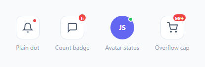
A small colored dot or number in the corner of an icon is one of the most information-dense UI elements on the web — it tells the user "something happened here" without taking any extra space. This snippet demonstrates the three common variants: a plain unread dot on a bell icon, a numeric count badge on a messages icon, and an online-status dot on a circular avatar, plus a count badge that caps its display at "99+" once the real number gets too large to fit comfortably.
How the corner positioning works
Every badge is position: absolute inside a parent that has position: relative (the .icon-btn or .avatar). The dot variant uses top: 4px; right: 4px with a 2px white border, so it visually "cuts into" the icon's corner rather than floating in empty space outside it. The count variant is pulled slightly further outside the button with top: -6px; right: -6px, since it's wider than a plain dot and needs the extra clearance to avoid touching the icon glyph.
How the overflow cap works
Real unread counts can jump well past what fits legibly in an 18px circle. renderCount() compares count against a MAX_DISPLAY constant (99) and renders MAX_DISPLAY + '+' whenever the real count exceeds it, otherwise it renders the exact number. Because the badge uses min-width: 18px rather than a fixed width, both a single digit and "99+" render at a readable size without the circle becoming egg-shaped or the text overflowing its bounds.
How the badge auto-hides
When count reaches zero, renderCount() sets display: none on the badge so the icon reverts to its plain, unbadged state — there's no such thing as a "0" badge cluttering the UI.
Accessibility notes
Icon buttons carry a descriptive aria-label (e.g. "Messages, 5 unread") rather than relying on the badge's visual number alone, since screen readers do not reliably announce absolutely-positioned decorative badge text.
Build with AI
Build, Understand, Optimize, and Extend It With AI
Give this snippet to an AI assistant and ask it to explain why the badge needs a border matching the page background rather than no border at all — the border is what visually separates the badge from the icon glyph underneath it and makes it read as "on top of" the icon rather than merging into it. It's also a good prompt for extending the pattern: ask the assistant to animate the badge with a brief scale-pulse whenever the count increases, or to add a small aria-live region so screen reader users are proactively notified when a new notification arrives rather than only on request.
Prompt to recreate it
Copy this into your AI assistant of choice to build the effect from scratch, or as a jumping-off point for your own variant:
Build a "badge dot indicator" set in plain HTML, CSS, and vanilla JavaScript covering these variants:

Requirements:
- A plain unread dot overlaying the top-right corner of an icon button, using absolute positioning anchored to a relatively-positioned parent, with a border matching the page background so it visually separates from the icon.
- A numeric count badge overlaying a second icon button, using min-width rather than a fixed width so it fits both single digits and multi-character text without clipping or looking oversized.
- A JavaScript overflow rule: once the underlying count exceeds a configurable maximum (default 99), the badge must display "99+" instead of the literal number, driven by a single named constant that is easy to change.
- A rule that hides the badge entirely (not just shows "0") whenever the underlying count is zero.
- A circular avatar with a small colored status dot in its corner to demonstrate the same technique used for presence indicators, not just notification counts.
- Every icon button must carry a descriptive aria-label reflecting both its purpose and its current badge state for screen reader users.
Want to tighten it up first? Run this prompt through the AI Prompt Studio to score it across 8 quality dimensions, catch anti-patterns, and tune the wording for Claude, ChatGPT, or Gemini before you paste it in.
Step by step
How to Use
- 1Load the snippetClick "Badge Dot Indicator" in the sidebar Library tab to see all four badge variants in the preview.
- 2Click "Add notification"Watch the count badge increase and eventually flip to the "99+" overflow state.
- 3Change the badge colorUpdate the background value on .badge-dot and .badge-count in the CSS panel to match your brand's alert color.
- 4Adjust the overflow thresholdChange the MAX_DISPLAY constant in the JS panel to cap the badge at a different number, like 9+ instead of 99+.
- 5Wire to real dataReplace the bumpCount demo function with a call that sets count from your actual unread/notification data and calls renderCount().
- 6Export and saveUse the export buttons or click "Save as" to keep a customized version for reuse.
Real-world uses
Common Use Cases
Got questions?
Frequently Asked Questions
A dot badge is a small solid circle that just signals "there is something new" without a specific number. A count badge shows the actual number of unread items, capping at a value like "99+" once the number gets too large to display cleanly.
The icon button or avatar has position: relative, and the badge has position: absolute with small top/right offsets. A visible border matching the page background creates the illusion the badge is cut into the icon rather than floating separately.
The renderCount function compares the live count against a MAX_DISPLAY constant (99). If count exceeds it, the badge renders "99+" instead of the literal number, keeping the badge width consistent and legible.
A fixed width would either clip "99+" or leave too much empty space around a single digit. min-width plus horizontal padding lets the badge grow just enough to fit its content while staying pill-shaped.
renderCount sets the badge's display to none whenever count is 0, so no empty circle is shown. Call renderCount whenever your underlying count changes.
Yes — the .avatar-dot variant is exactly that: a colored dot (green for online) placed in the corner of a circular avatar. Swap the color and update the aria-label to reflect the status text.
The visual badge alone is not reliably announced, so the icon button carries a full aria-label describing both the icon's purpose and its current count or status, e.g. "Messages, 5 unread".