You Might Also Like
Learn Coding Visually
Learn to code with interactive, live-preview playgrounds — HTML, CSS, JavaScript, React & more.
 HTML Playground42 lessons · Click-based · Live preview
 CSS PlaygroundLearn CSS with a live editor
 JavaScript Playground60 lessons · DOM · Async · Canvas
 React PlaygroundLearn React with a live code editor
 GSAP PlaygroundLearn GSAP animation interactively
 SVG Playground44 lessons · shapes · paths · animation
 SCSS Playground45 lessons · Sass modules · tokens
 Tailwind PlaygroundLearn Tailwind CSS with a live editor
 Bootstrap 5 Playground50 lessons · live preview
Canvas Mesh Gradient Background — Free Animated Blurred Blob Effect
Canvas Mesh Gradient Background · Animations · Plain HTML, CSS & JS · Live preview
What's included
Features
About this UI Snippet
Canvas Mesh Gradient Background — Orbiting Blobs Softened by CSS
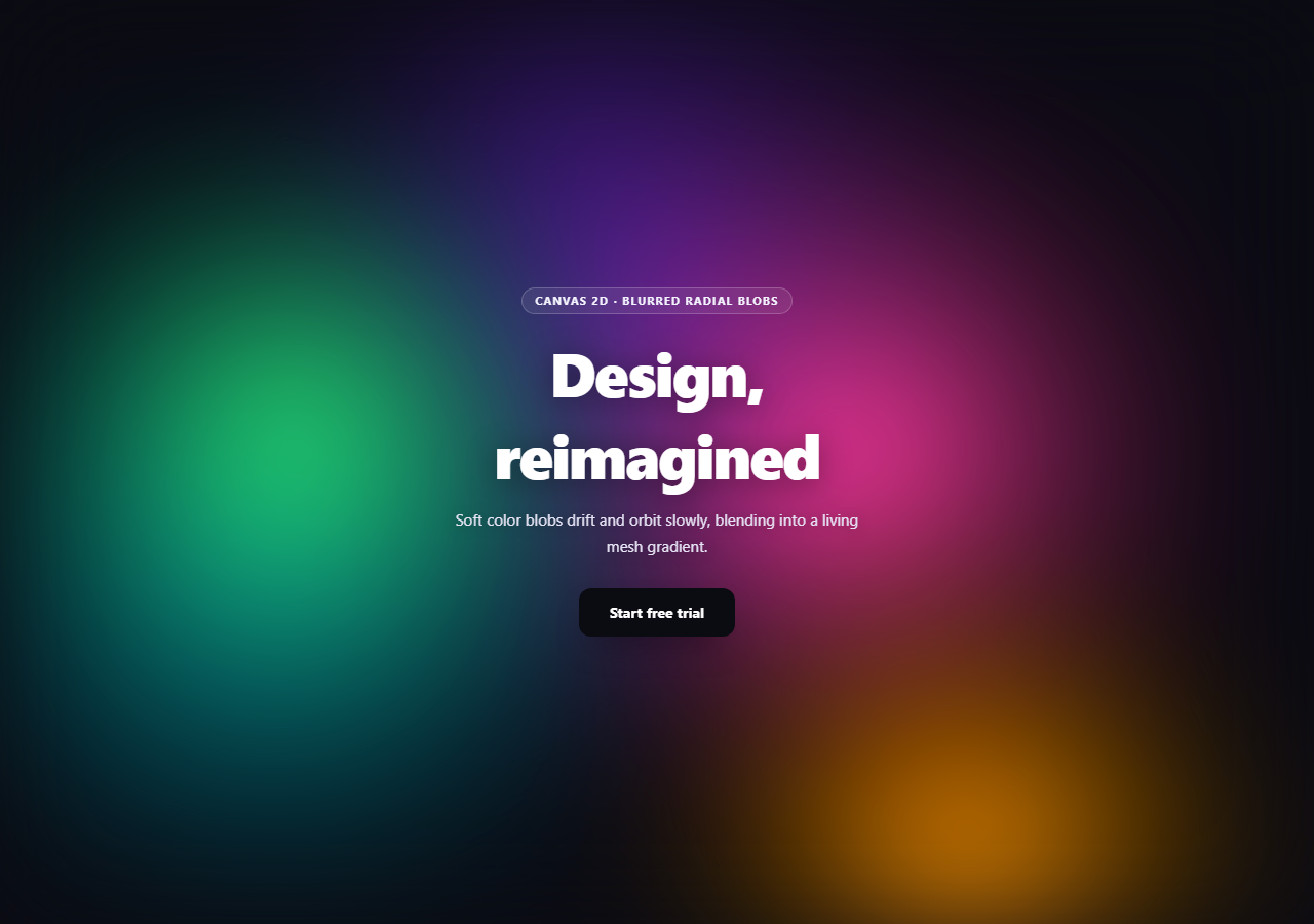
The animated mesh gradient look — soft, saturated color fields blending into each other — is everywhere in modern SaaS and product marketing pages. This snippet builds it with a small trick: draw sharp, high-contrast radial gradient circles on a low-resolution canvas, then let a single CSS filter: blur() on the canvas element do the actual softening. The blur is free, GPU-accelerated, and completely decoupled from the animation logic.
Draw sharp, let CSS blur it
Every blob is a plain createRadialGradient circle — full color at the center fading to transparent at the edge — drawn with hard mathematical precision. None of that softness is visible directly: .cmg-canvas { filter: blur(60px) saturate(1.3) } in the CSS is what turns those crisp circles into the smooth, melting color fields the effect is known for. Because the blur is a compositor-level CSS filter rather than a canvas shadow or manual convolution, it costs almost nothing extra to animate — the JavaScript never has to know it's happening.
Drawing small on purpose
resize() deliberately sizes the canvas's backing store to only 60% of the wrapper's dimensions. Since a 60px blur is going to erase most fine detail anyway, there is no benefit to drawing at full resolution — doing so would just spend more pixel-fill time per frame for a visually identical result once blurred. This is the inverse of the usual high-DPI advice, and it's a useful pattern any time a canvas feeds into a heavy CSS filter.
Orbits instead of random walks
Each blob in BLOBS has a hx, hy home position and orbits it on an ellipse defined by orbitX, orbitY, its own speed, and a phase offset — cx = (hx + cos(t * speed + phase) * orbitX) * W. Because every blob's period, radius, and starting phase are different, the five orbits drift in and out of alignment with each other indefinitely without ever repeating in a way a viewer would notice, and — unlike a random-walk approach — the motion is perfectly smooth and perfectly loops mathematically rather than needing manual bounds-checking.
Layering and readability
The wrapper's actual content sits in a separate stacking layer above the canvas with its own text-shadow for legibility against a busy background, and the canvas itself paints an opaque base color before drawing blobs so partially-transparent gradient edges never reveal a transparent hole. Pair this background with a gradient mesh hero layout, or swap the palette for a calmer duotone version behind a glowing stars card.
Build with AI
Build, Understand, Optimize, and Extend It With AI
Paste this snippet's HTML, CSS, and JS into an AI coding assistant like Claude and ask it to explain why the actual softening comes from a CSS filter: blur() on the canvas element rather than any blur logic in the JavaScript, and why drawing the canvas at a reduced resolution before a heavy blur is applied is a reasonable performance optimization rather than a quality compromise. It's also a good example for reasoning about combined periodic motion — ask why giving each blob its own independent speed and phase offset in its orbit calculation prevents the mesh from ever visibly repeating, compared to what would happen if every blob shared the same speed. For extensions, ask it to add a subtle hue rotation over time using a CSS filter, tie the blur amount to scroll position for a focus/unfocus effect, or add a sixth blob that only becomes visible on hover over a specific section. It can also help you reason about the blur-and-downscale technique's tradeoffs versus a WebGL shader approach for the same visual result. Treat the code less like a finished artifact and more like a starting point for a conversation.
Prompt to recreate it
Copy this into your AI assistant of choice to build the effect from scratch, or as a jumping-off point for your own variant:
Build a "canvas mesh gradient background" effect in plain HTML, CSS, and JavaScript using the Canvas 2D API plus a CSS blur filter — soft, orbiting color blobs blending into a smooth animated mesh, no libraries.

Requirements:
- A full-bleed canvas positioned absolutely behind centered hero content, styled in CSS with filter: blur(60px) saturate(1.3) (or similar) — the blur must come entirely from this CSS filter, not from any manual blur logic in JavaScript.
- Size the canvas's actual drawing backing store to a reduced fraction (e.g. 60%) of its displayed CSS size rather than 1:1 with the viewport, and explain in a comment why doing so is a valid optimization once a heavy blur filter is going to erase fine detail regardless of source resolution.
- Define an array of at least five "blob" objects, each with a home position (as a fraction of canvas width/height), an elliptical orbit radius (separate x and y amplitude), an independent animation speed, and a random phase offset, plus its own solid color. Every blob's speed and phase must differ from the others so their combined motion never visibly repeats.
- Each frame, first fill the canvas with an opaque solid background color (not transparent), then for every blob compute its current orbit position using cosine for x and sine for y (offset by its own speed and phase), and draw a createRadialGradient circle centered there that fades from the blob's full color at the center to fully transparent at its edge — drawn as sharp, unblurred circles, since the CSS filter handles the softening.
- Drive all blob positions from one requestAnimationFrame loop and a single shared time variable, and make sure the layout keeps real hero content (heading, paragraph, button) in front of the canvas in a separate non-blurred stacking layer with readable contrast (e.g. via text-shadow) against the busy moving background.
Want to tighten it up first? Run this prompt through the AI Prompt Studio to score it across 8 quality dimensions, catch anti-patterns, and tune the wording for Claude, ChatGPT, or Gemini before you paste it in.
Step by step
How to Use
- 1Paste HTML, CSS, and JSFive color blobs orbit and blend behind the hero content.
- 2Note the CSS blur.cmg-canvas uses filter: blur(60px) — that's the actual softening.
- 3Resize the windowThe canvas rescales at 60% resolution and keeps animating.
- 4Add a blobPush a new object into BLOBS with its own home, orbit, and color.
- 5Change the paceLower every speed value for a slower, more ambient drift.
- 6Adjust the blur amountIncrease blur() for a softer, more diffuse mesh.
Real-world uses
Common Use Cases
Got questions?
Frequently Asked Questions
The JavaScript never blurs anything — it draws plain, sharp radial gradient circles. The softening comes entirely from a single CSS filter, filter: blur(60px) saturate(1.3), applied to the canvas element itself in the stylesheet. That means the blur is handled by the browser's compositor, not by any per-pixel canvas code, which is both simpler and considerably cheaper than a manual convolution.
A 60px CSS blur erases almost all fine detail regardless of how sharp the source pixels are, so drawing at full resolution would spend extra fill-rate cost every frame for a result that looks identical once blurred. Sizing the canvas backing store smaller than its displayed size and letting CSS scale it up (along with the blur) keeps the animation loop cheaper without any visible quality loss.
Each blob orbits its own home position on an ellipse with its own independent speed and starting phase offset. Because no two blobs share a period, radius, or phase, their positions relative to each other drift continuously and take an extremely long time to realign into any previous configuration — long enough that a viewer never perceives a loop, even though the underlying motion is just combined sine and cosine waves.
Each blob's gradient fades from full color at its center to fully transparent (rgba(0,0,0,0)) at its edge. If the canvas were left transparent underneath, the areas between and around blobs would show through to whatever is behind the canvas rather than blending into a continuous color field. Painting an opaque base fill first guarantees every pixel has a solid color to blend against.
Move the canvas ref, resize() call, and requestAnimationFrame loop into a mount effect, and cancelAnimationFrame the stored frame id on unmount. Keep the CSS blur filter on the canvas element's class, since that part of the effect lives entirely in CSS and needs no JavaScript wiring at all — only the drawing loop needs a lifecycle hook.