Source Code
<div class="container py-5">
  <div class="row bstabs-shell">
    <div class="col-md-3 border-end">
      <div class="nav flex-column nav-pills bstabs-nav" id="bstabsNav" role="tablist" aria-orientation="vertical">
        <button class="nav-link active" data-bs-toggle="pill" data-bs-target="#bstabs-profile" type="button" role="tab">
          <svg width="15" height="15" viewBox="0 0 24 24" fill="none" stroke="currentColor" stroke-width="2" stroke-linecap="round" stroke-linejoin="round"><path d="M20 21v-2a4 4 0 0 0-4-4H8a4 4 0 0 0-4 4v2"/><circle cx="12" cy="7" r="4"/></svg>
          Profile
        </button>
        <button class="nav-link" data-bs-toggle="pill" data-bs-target="#bstabs-notifications" type="button" role="tab">
          <svg width="15" height="15" viewBox="0 0 24 24" fill="none" stroke="currentColor" stroke-width="2" stroke-linecap="round" stroke-linejoin="round"><path d="M18 8A6 6 0 0 0 6 8c0 7-3 9-3 9h18s-3-2-3-9"/><path d="M13.73 21a2 2 0 0 1-3.46 0"/></svg>
          Notifications <span class="badge bg-danger rounded-pill ms-auto" id="bstabsUnread">3</span>
        </button>
        <button class="nav-link" data-bs-toggle="pill" data-bs-target="#bstabs-security" type="button" role="tab">
          <svg width="15" height="15" viewBox="0 0 24 24" fill="none" stroke="currentColor" stroke-width="2" stroke-linecap="round" stroke-linejoin="round"><rect x="3" y="11" width="18" height="11" rx="2"/><path d="M7 11V7a5 5 0 0 1 10 0v4"/></svg>
          Security
        </button>
        <button class="nav-link" data-bs-toggle="pill" data-bs-target="#bstabs-billing" type="button" role="tab">
          <svg width="15" height="15" viewBox="0 0 24 24" fill="none" stroke="currentColor" stroke-width="2" stroke-linecap="round" stroke-linejoin="round"><rect x="1" y="4" width="22" height="16" rx="2"/><line x1="1" y1="10" x2="23" y2="10"/></svg>
          Billing
        </button>
      </div>
    </div>

    <div class="col-md-9">
      <div class="tab-content bstabs-content" id="bstabsContent">
        <div class="tab-pane fade show active" id="bstabs-profile" role="tabpanel">
          <h5 class="fw-bold mb-3">Profile</h5>
          <div class="mb-3"><label class="form-label small fw-semibold">Display name</label><input type="text" class="form-control" value="Jordan Lee"></div>
          <div class="mb-3"><label class="form-label small fw-semibold">Bio</label><textarea class="form-control" rows="3">Product designer, coffee enthusiast.</textarea></div>
          <button class="btn btn-primary btn-sm">Save changes</button>
        </div>
        <div class="tab-pane fade" id="bstabs-notifications" role="tabpanel">
          <h5 class="fw-bold mb-3">Notifications</h5>
          <div class="form-check form-switch mb-2"><input class="form-check-input" type="checkbox" checked><label class="form-check-label small">Email me about comments</label></div>
          <div class="form-check form-switch mb-2"><input class="form-check-input" type="checkbox" checked><label class="form-check-label small">Weekly digest</label></div>
          <div class="form-check form-switch mb-2"><input class="form-check-input" type="checkbox"><label class="form-check-label small">Product announcements</label></div>
        </div>
        <div class="tab-pane fade" id="bstabs-security" role="tabpanel">
          <h5 class="fw-bold mb-3">Security</h5>
          <div class="mb-3"><label class="form-label small fw-semibold">Current password</label><input type="password" class="form-control" placeholder="••••••••"></div>
          <div class="form-check form-switch"><input class="form-check-input" type="checkbox"><label class="form-check-label small">Two-factor authentication</label></div>
        </div>
        <div class="tab-pane fade" id="bstabs-billing" role="tabpanel">
          <h5 class="fw-bold mb-3">Billing</h5>
          <p class="text-muted small mb-3">You're on the <strong>Pro</strong> plan — $24/mo, renews Oct 9.</p>
          <button class="btn btn-outline-dark btn-sm">Manage subscription</button>
        </div>
      </div>
    </div>
  </div>
</div>
body { background: #fafafa; }
.bstabs-shell {
background: #fff;
border: 1px solid #eceef1;
border-radius: 14px;
overflow: hidden;
min-height: 340px;
}
.bstabs-nav { padding: 16px 10px; gap: 3px; }
.bstabs-nav .nav-link {
display: flex;
align-items: center;
gap: 9px;
color: #4b5563;
font-size: 13.5px;
font-weight: 600;
border-radius: 8px;
padding: 9px 12px;
text-align: left;
}
.bstabs-nav .nav-link:hover { background: #f3f4f6; }
.bstabs-nav .nav-link.active { background: #eef0ff; color: #4338ca; }
.bstabs-content { padding: 28px 32px; }
@media (max-width: 767px) {
.bstabs-nav { flex-direction: row !important; overflow-x: auto; flex-wrap: nowrap; }
.bstabs-content { padding: 20px; }
}const nav = document.getElementById('bstabsNav');
const unreadBadge = document.getElementById('bstabsUnread');
// Bootstrap's own Tab component (via data-bs-toggle="pill") handles switching
// panes — this listener only reacts to the switch, clearing the unread badge
// the first time the Notifications tab is actually opened.
nav.addEventListener('shown.bs.tab', e => {
if (e.target.getAttribute('data-bs-target') === '#bstabs-notifications') {
unreadBadge.style.display = 'none';
}
});Learn Coding Visually
Learn to code with interactive, live-preview playgrounds — HTML, CSS, JavaScript, React & more.
 HTML Playground42 lessons · Click-based · Live preview
 CSS PlaygroundLearn CSS with a live editor
 JavaScript Playground60 lessons · DOM · Async · Canvas
 React PlaygroundLearn React with a live code editor
 GSAP PlaygroundLearn GSAP animation interactively
 SVG Playground44 lessons · shapes · paths · animation
 SCSS Playground45 lessons · Sass modules · tokens
 Tailwind PlaygroundLearn Tailwind CSS with a live editor
 Bootstrap 5 Playground50 lessons · live preview
Bootstrap Vertical Tabs Settings Panel — Free Snippet
Bootstrap Vertical Tabs Settings Panel · Navigation · Plain HTML, CSS & JS · Live preview
What's included
Features
About this UI Snippet
Bootstrap Vertical Tabs Settings Panel — HTML, CSS & JavaScript
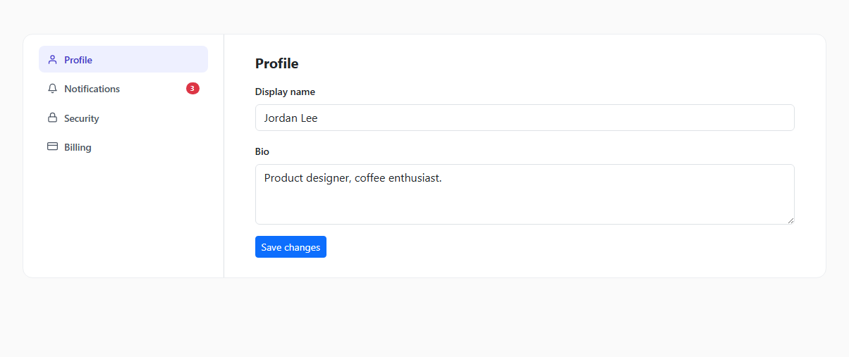
Account settings pages almost always follow the same shape: a vertical list of sections on the left, the selected section's content on the right. This snippet builds that layout on real Bootstrap 5.3 — the actual nav-pills component with aria-orientation="vertical", switched by Bootstrap's own Tab JavaScript component via data-bs-toggle="pill", rather than a custom-built tab switcher reimplementing what Bootstrap already ships.
Four genuinely different panels, not one template repeated
Profile, Notifications, Security, and Billing each contain real, distinct form controls — text inputs, a textarea, toggle switches, a password field — rather than four copies of the same placeholder content. That matters for actually evaluating whether this pattern fits a real settings page, versus a demo that only proves tab-switching works in the abstract.
Listening to Bootstrap's own tab event, not writing a click handler
Rather than attaching a custom click listener to the nav buttons, this snippet listens for Bootstrap's own shown.bs.tab event — fired by Bootstrap's Tab component itself once a pane has finished becoming visible. That event carries e.target, the button that triggered the switch, whose data-bs-target attribute is checked to detect specifically when the Notifications tab was opened, at which point the unread-count badge is hidden. This is the pattern to reach for whenever you need to react to a Bootstrap component's state change: listen for its own lifecycle event rather than re-detecting the change yourself.
Responsive behavior
Below Bootstrap's md breakpoint, the vertical nav-pills list switches to a horizontal, scrollable row via a small media query overriding flex-direction — a vertical settings sidebar doesn't fit a phone-width screen, so it collapses into a swipeable tab bar instead, while still using the exact same underlying Bootstrap Tab component and markup.
Build with AI
Build, Understand, Optimize, and Extend It With AI
Hand this snippet's HTML, CSS, and JS to an AI coding assistant like Claude and ask it to persist the active tab in the URL (e.g. a #security hash) so a direct link or a page refresh opens the correct settings section, or to wire each tab's Save button to a real API call with a success/error toast. It's also a good exercise to ask the assistant to add a fifth "Danger Zone" tab with a delete-account confirmation flow, reusing the multi-step confirmation pattern from the Bootstrap Multi-Step Signup Modal snippet in this same category.
Prompt to recreate it
Copy this into your AI assistant of choice to build the effect from scratch, or as a jumping-off point for your own variant:
Build a Bootstrap 5.3 vertical tabs settings panel, using the real Bootstrap CDN framework (bootstrap.min.css and bootstrap.bundle.min.js), not custom CSS made to resemble Bootstrap.

Requirements:
- A two-column layout using Bootstrap's grid: a vertical nav-pills list on the left (with aria-orientation="vertical") with icons and labels for at least four sections (e.g. Profile, Notifications, Security, Billing), and the matching tab-content pane on the right, switched using Bootstrap's own Tab component via data-bs-toggle="pill" and data-bs-target — no custom JavaScript should implement the pane-switching itself.
- Each of the four panes must contain genuinely different, real Bootstrap form controls appropriate to that section (e.g. text inputs and a textarea for Profile, toggle switches for Notifications, a password field for Security) rather than repeated placeholder content.
- One nav item (Notifications) should display a small unread-count badge. Add a listener for Bootstrap's own shown.bs.tab event (not a custom click handler) that clears/hides this badge the first time that specific tab is opened.
- The layout must be responsive: below Bootstrap's md breakpoint, the vertical nav should become a horizontal, scrollable row of tabs instead of a sidebar.
Want to tighten it up first? Run this prompt through the AI Prompt Studio to score it across 8 quality dimensions, catch anti-patterns, and tune the wording for Claude, ChatGPT, or Gemini before you paste it in.
Step by step
How to Use
- 1Load the snippetClick "Bootstrap Vertical Tabs Settings Panel" in the sidebar Library tab. The preview loads on the Profile tab, with a red "3" badge on Notifications.
- 2Click through the tabsClick Security or Billing in the left nav — Bootstrap's real pill-tab component switches the content pane on the right, with each tab showing genuinely different form controls.
- 3Open NotificationsClick the Notifications tab — the unread badge disappears the first time this tab is opened, since it's been "seen."
- 4Try the form controlsToggle a switch on Notifications or Security, or edit the text fields on Profile — they're real, functional Bootstrap form controls.
- 5Shrink the preview widthNarrow the preview below roughly 768px — the vertical nav collapses into a horizontal, scrollable tab row.
- 6Export in your formatClick "HTML" for a standalone file, "JSX" for React, or "Tailwind" for React + Tailwind CSS.
Real-world uses
Common Use Cases
Got questions?
Frequently Asked Questions
Yes — each nav button uses data-bs-toggle="pill" with a data-bs-target, which is Bootstrap's own Tab component. No custom JavaScript switches the panes; the only custom logic is a listener on Bootstrap's shown.bs.tab event that clears the notification badge.
A listener on Bootstrap's shown.bs.tab event checks e.target.getAttribute('data-bs-target') to see which tab was just shown, and hides the badge specifically when it matches the Notifications pane's target.
Yes — add a new nav-link button with its own data-bs-target, and a matching tab-pane div with that same id in the tab-content container. Bootstrap's Tab component picks it up automatically with no other changes needed.
Below Bootstrap's md breakpoint (768px), a small CSS override switches the nav-pills from a vertical column to a horizontal, scrollable row, so the settings sections stay reachable without the sidebar consuming most of a narrow screen.
They're real Bootstrap form controls (inputs, a textarea, toggle switches) that respond normally to typing and clicking, though nothing is wired to a save/submit endpoint yet — that's the natural next integration step for a real settings page.
Yes — Bootstrap's nav-pills/tab-pane markup includes the correct role="tablist"/role="tab"/role="tabpanel" attributes and keyboard navigation (arrow keys move between tabs) out of the box, since this is Bootstrap's own accessible Tab component.