Learn Coding Visually
Learn to code with interactive, live-preview playgrounds — HTML, CSS, JavaScript, React & more.
 HTML Playground42 lessons · Click-based · Live preview
 CSS PlaygroundLearn CSS with a live editor
 JavaScript Playground60 lessons · DOM · Async · Canvas
 React PlaygroundLearn React with a live code editor
 GSAP PlaygroundLearn GSAP animation interactively
 SVG Playground44 lessons · shapes · paths · animation
 SCSS Playground45 lessons · Sass modules · tokens
 Tailwind PlaygroundLearn Tailwind CSS with a live editor
 Bootstrap 5 Playground50 lessons · live preview
Free Trial Signup Card — Free HTML CSS JS Snippet, No Credit Card
Free Trial Signup Card · Pricing · Plain HTML, CSS & JS · Live preview
What's included
Features
About this UI Snippet
Free Trial Signup Card — Inline Validation, "No Card Required," and a Clear End-of-Trial State
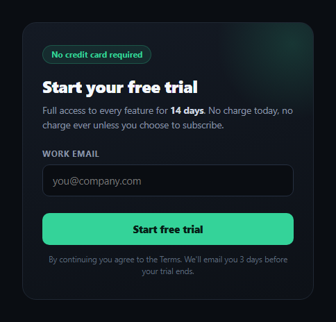
The single biggest source of friction on a SaaS signup form isn't the email field — it's the anxiety that filling it out will lead to an unexpected charge. This snippet builds a free-trial signup card that removes that anxiety in three concrete ways: an explicit "No credit card required" badge above the fold, real inline validation on the email field so mistakes surface before submission rather than after, and a submitted state that states the exact trial length and precisely what happens on the day it ends.
Inline validation that reacts as you type
The email input listens on both input and blur, running a real regex check (isValidEmail) rather than relying solely on the browser's built-in type="email" validation, which varies in strictness across browsers and gives no visual feedback of its own. A valid email toggles .is-valid, which fades in a small checkmark inside the field and turns the border green; an invalid one toggles .is-invalid and reveals an inline error message with a smooth height transition rather than a jarring layout jump. Critically, the field stays neutral (`no state class`) while empty, so a new visitor isn't greeted with a red error before they've typed anything.
Submitting is gated, not just decorative
The submit handler re-validates on submit regardless of what the live validation already showed, refusing to proceed and re-focusing the field on an invalid value. This matters because a user can paste an invalid address or the live listener can be bypassed in edge cases (autofill, browser extensions) — validating again at the point of submission is the only way to guarantee the "success" state is only ever reached with a plausible email.
A submitted state that answers the two questions users actually have
Once submitted, the card swaps to a confirmation view built around a three-step timeline: what happened today (full access unlocked, no card on file), what happens on day 11 (a reminder email, stated explicitly rather than left as a surprise), and what happens on day 14 (the trial ends automatically with no charge, and upgrading is something the user chooses rather than something that happens to them). This answers the two questions every trial signup implicitly raises — "will I be charged?" and "will I be warned before anything changes?" — directly in the UI instead of burying the answer in a terms-of-service link.
Why "no credit card required" belongs in the layout, not just the copy
Plenty of trial forms bury the no-card promise in fine print while still visually implying a payment step is coming (a padlock icon, a "secure checkout" phrase). This card puts the badge in the first thing a visitor reads, styled distinctly from the rest of the copy, so the reassurance lands before any friction does — the same principle behind money-back guarantee badges on checkout pages.
Customizing it
Swap the 14-day window and reminder timing for your own trial length, wire the submit handler to your real signup endpoint instead of the local demo state, and pair it with a trial countdown once the account exists to keep reinforcing the same "no surprise charge" promise throughout the trial.
Build with AI
Build, Understand, Optimize, and Extend It With AI
Paste this snippet's HTML, CSS, and JS into an AI coding assistant like Claude and ask it to explain why the email field validates on both input and blur but still re-validates again inside the submit handler, and what class of bugs that submit-time re-validation prevents that live validation alone would miss. It can also help you extend the flow — ask it to wire the submit handler to a real API endpoint with a loading state on the button, add a honeypot or rate limit to deter bot signups, or make the day-11 reminder timing configurable via a single JS constant instead of hardcoded HTML text. Treat it as a starting point for a conversation about trust-driven onboarding UX, not a finished form.
Prompt to recreate it
Copy this into your AI assistant of choice to build the effect from scratch, or as a jumping-off point for your own variant:
Build a "free trial signup card" in plain HTML, CSS, and JavaScript with no dependencies or libraries.

Requirements:
- A card prominently displaying a "No credit card required" badge above the headline, not buried in fine print, plus copy stating the exact trial length (e.g. 14 days).
- A single email input with real inline validation: validate with a genuine regex check (not just relying on the browser's built-in type="email" behavior) on both the input and blur events, toggling a valid state (green border plus a fading-in checkmark icon) or an invalid state (red border plus an inline error message that animates in via a height transition, not an instant jump) — and show neither state while the field is empty.
- A submit handler that re-validates the email again regardless of the live validation state, refusing to proceed and refocusing the field if the value is invalid, so the success state can only ever be reached with a plausible email address.
- On successful submission, replace the form with a confirmation view that clearly states: what happens today (full access unlocked, no card on file, no charge), a reminder that will be sent a few days before the trial ends, and what happens automatically when the trial ends (it simply ends, nothing is billed, and upgrading is something the user actively chooses).
- A "use a different email" control that resets the card back to the signup form without a page reload, clearing any validation state.
- Keep all copy specific and concrete (real day numbers, explicit "no charge" language) rather than vague trial-signup boilerplate.
Want to tighten it up first? Run this prompt through the AI Prompt Studio to score it across 8 quality dimensions, catch anti-patterns, and tune the wording for Claude, ChatGPT, or Gemini before you paste it in.
Step by step
How to Use
- 1Type an email addressThe field validates live on every keystroke and on blur, showing a green check or a red inline error.
- 2Submit with a valid emailThe form re-validates on submit and swaps to the confirmation state only if the address is valid.
- 3Read the timelineThe confirmation view states today, the day-11 reminder, and the day-14 automatic trial end with no charge.
- 4Use a different emailThe reset button clears the form and returns to the signup state.
- 5Wire it to your backendReplace the local success state in the submit handler with your real signup API call.
- 6Adjust the trial windowChange the 14-day and day-11 references in the HTML timeline to match your product.
Real-world uses
Common Use Cases
Got questions?
Frequently Asked Questions
Validating on input gives immediate feedback as the visitor types, so a typo is caught while it is still fresh in their mind rather than after they have moved on and clicked submit. Blur validation catches the case of pasting a value and tabbing away without triggering further keystrokes. Submit-time validation is still kept as a final gate, since live validation alone could theoretically be bypassed by autofill or browser extensions.
The two biggest trust gaps in a trial signup are not knowing whether a card will be charged and not knowing when or how the trial ends. Putting "No credit card required" above the fold and then spelling out today, the reminder day, and the automatic end date in a visible timeline answers both questions directly in the UI, rather than requiring the visitor to trust a terms-of-service link they likely will not read.
No — it is a self-contained front-end demo. The submit handler validates the email and swaps to a local confirmation state to demonstrate the interaction. In production, replace that local state transition with a real fetch or form POST to your signup endpoint, and only show the confirmation state once that request succeeds.
The 14-day trial and day-11 reminder are plain text in the HTML timeline (and referenced in the intro copy), not computed values — update those strings directly to match your product's actual trial window and reminder schedule.
Move emailInput.value and the valid/invalid booleans into component state, call your validation regex on each input change, and conditionally render either the form or the success timeline based on a submitted flag. The CSS classes and transitions port over unchanged.