You Might Also Like
Learn Coding Visually
Learn to code with interactive, live-preview playgrounds — HTML, CSS, JavaScript, React & more.
 HTML Playground42 lessons · Click-based · Live preview
 CSS PlaygroundLearn CSS with a live editor
 JavaScript Playground60 lessons · DOM · Async · Canvas
 React PlaygroundLearn React with a live code editor
 GSAP PlaygroundLearn GSAP animation interactively
 SVG Playground44 lessons · shapes · paths · animation
 SCSS Playground45 lessons · Sass modules · tokens
 Tailwind PlaygroundLearn Tailwind CSS with a live editor
 Bootstrap 5 Playground50 lessons · live preview
Half-Star Rating Input — Free HTML CSS JS Precision Star Widget
Half-Star Rating Input · Forms · Plain HTML, CSS & JS · Live preview
What's included
Features
About this UI Snippet
Half-Star Rating Input — Pointer-Position Detection with a CSS Overlay Fill
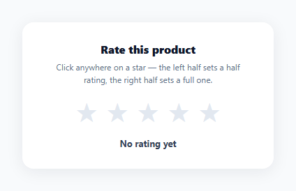
Most star rating widgets only support whole-number values, but many review systems — app stores, product marketplaces, hotel booking sites — need half-star precision (3.5 out of 5, not just 3 or 4). This snippet implements that with a simple two-layer star technique and pointer-position math, no icon font or SVG masking library required.
Two stacked stars, not five discrete icons
Each .hsr-star renders a gray background star via ::before { content: '★' }, with a second, absolutely-positioned .hsr-fill element stacked exactly on top rendering the same character in gold. .hsr-fill starts at width: 0% with overflow: hidden, so only the portion of the gold star within that width is visible — clipping a full star glyph down to a partial fill is just a matter of animating that width between 0% and 100%.
Detecting which half was clicked
ratingFromEvent() reads e.clientX - rect.left to get the cursor's x-position relative to the star's own bounding box, then compares it against rect.width / 2: var half = x < rect.width / 2. Combined with the star's zero-based index, this produces a rating of index + 0.5 for a left-half click or index + 1 for a right-half click — the same math whether the event comes from a live click or a hover preview.
One render function drives both hover and committed state
render(rating) loops every star and computes diff = rating - i, clamping it to the 0–1 range with Math.max(0, Math.min(1, diff)) before converting to a percentage. A rating of 3.5 against star index 3 gives a diff of 0.5 (half-filled), against index 2 gives 1 (fully filled), and against index 4 gives a negative diff clamped to 0 (empty) — one formula naturally produces full, half, and empty stars for any rating value.
Keyboard access via ARIA slider semantics
The wrapper carries role="slider", aria-valuemin, aria-valuemax, and a live-updated aria-valuenow, with arrow-key handlers stepping the rating by 0.5 in either direction — matching the interaction model screen reader users expect from a slider, not just a decorative row of icons.
Customizing it
Change the star glyph to an SVG or icon font by swapping the content: '★' rule, adjust the step size for quarter-star precision, or wire updateValue() to submit the rating to your backend on commit.
Build with AI
Build, Understand, Optimize, and Extend It With AI
You don't have to work out the fill-clamping math by hand. Paste this snippet's HTML, CSS, and JS into an AI coding assistant like Claude and ask it to explain how diff = rating - starIndex combined with Math.max/Math.min produces full, half, and empty stars from a single formula, and why the fill uses a width-clipped overlay star instead of an SVG clip-path. The same assistant can help optimize it too — ask whether recalculating every star's fill on every mousemove event is worth throttling for very large star counts. It's also useful for extending the widget: ask it to add a submit button that only becomes enabled once a rating is committed, support touch drag for mobile, or generalize it to a configurable number of stars. Treat the code less like a finished artifact and more like a starting point for a conversation.
Prompt to recreate it
Copy this into your AI assistant of choice to build the effect from scratch, or as a jumping-off point for your own variant:
Build a "half-star rating input" in plain HTML, CSS, and JavaScript with no icon library or SVG masking.

Requirements:
- Five star elements, each rendering two stacked star glyphs via CSS: a gray background star, and a gold foreground star inside an absolutely-positioned, overflow-hidden overlay whose width can be set to any percentage to reveal a partial fill.
- On mousemove over the star row, detect which star is being hovered and whether the cursor is in the left or right half of that star's bounding box, using the event's clientX relative to the star's own getBoundingClientRect(); compute a candidate rating of the star's zero-based index plus 0.5 for the left half or plus 1 for the right half.
- A single render function that, given any rating value (including fractional), loops every star and computes how much of it should be filled by subtracting the star's index from the rating and clamping the result between 0 and 1, so the same function naturally produces fully filled, half filled, and empty stars.
- Live preview the rating on hover using that render function, and restore the last committed rating when the pointer leaves the star row without clicking.
- Clicking commits the hovered rating as the new value and updates a text label showing the exact decimal rating (e.g. "3.5 out of 5 stars"), or "No rating yet" when nothing has been chosen.
- Make the star row keyboard accessible with role="slider", aria-valuemin, aria-valuemax, and a live aria-valuenow, and let Arrow Left/Right (or Up/Down) adjust the committed rating by 0.5 per key press when the row is focused.
Want to tighten it up first? Run this prompt through the AI Prompt Studio to score it across 8 quality dimensions, catch anti-patterns, and tune the wording for Claude, ChatGPT, or Gemini before you paste it in.
Step by step
How to Use
- 1Paste HTML, CSS, and JSA 5-star input renders with no rating selected and a "No rating yet" label.
- 2Hover across a starThe fill preview updates live, showing a half-fill on the left half and a full fill on the right half of each star.
- 3Click to commitThe clicked position sets the rating, and the label updates to show the exact value like "3.5 out of 5 stars".
- 4Use the keyboardTab to focus the widget, then use the arrow keys to adjust the rating in 0.5-point steps.
- 5Change the step sizeIn the JS, edit the step variable in the keydown handler and the half/1 branch in ratingFromEvent() for quarter-star precision.
- 6Wire up submissionIn updateValue(), add a fetch() call to persist the rating once the user commits a value.
Real-world uses
Common Use Cases
Got questions?
Frequently Asked Questions
ratingFromEvent() reads the click's x-coordinate relative to the star's own bounding box with e.clientX - rect.left, then checks whether that position is less than half the star's width. A left-half click adds 0.5 to the star's index; a right-half click adds 1, producing the half or full rating.
Each star is two stacked ★ characters — a gray one behind, and a gold one in an absolutely positioned .hsr-fill element with overflow: hidden and a width set as a percentage. Setting that width to 50% clips the gold star glyph to reveal only its left half, giving a visually correct half-fill using plain CSS.
For each star, it computes diff = rating - starIndex, then clamps that to the 0–1 range with Math.max(0, Math.min(1, diff)) before converting to a percentage width. A rating of 3.5 gives full stars 0–2 a diff ≥ 1 (clamped to 100%), star 3 a diff of 0.5 (50% fill), and star 4 a negative diff (clamped to 0%).
Yes. The wrapper has tabindex="0" and role="slider" with aria-valuemin/max/now, and a keydown listener lets Arrow Right/Up increase and Arrow Left/Down decrease the rating in 0.5-point steps, updating both the visual fill and the announced ARIA value.
In ratingFromEvent(), replace the single width/2 comparison with a check against width/4 and width/2 and 3*width/4 to produce four possible fractional increments per star, and change the step constant in the keydown handler from 0.5 to 0.25 to match.