You Might Also Like
Learn Coding Visually
Learn to code with interactive, live-preview playgrounds — HTML, CSS, JavaScript, React & more.
 HTML Playground42 lessons · Click-based · Live preview
 CSS PlaygroundLearn CSS with a live editor
 JavaScript Playground60 lessons · DOM · Async · Canvas
 React PlaygroundLearn React with a live code editor
 GSAP PlaygroundLearn GSAP animation interactively
 SVG Playground44 lessons · shapes · paths · animation
 SCSS Playground45 lessons · Sass modules · tokens
 Tailwind PlaygroundLearn Tailwind CSS with a live editor
 Bootstrap 5 Playground50 lessons · live preview
Dot Pagination Carousel — Free HTML CSS JS Slide Carousel Snippet
Dot Pagination Carousel · Navigation · Plain HTML, CSS & JS · Live preview
What's included
Features
About this UI Snippet
Dot Pagination Carousel — HTML, CSS & JavaScript Slide Carousel
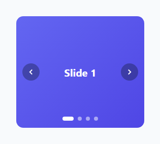
Carousels are everywhere — hero banners, testimonial rotators, onboarding screens — and the dot-indicator-plus-arrows combination is the most recognizable navigation pattern for them. This snippet builds a complete carousel using a single sliding track and a row of clickable dots, with the currently active dot rendered as a wider pill rather than just a differently colored circle.
How the sliding mechanism works
All slides sit side by side inside .carousel-track with display: flex, each slide set to min-width: 100% so exactly one slide fills the visible .carousel viewport at a time (overflow: hidden on the parent hides the rest). Moving between slides is a single CSS transform: track.style.transform = 'translateX(-' + (currentIndex * 100) + '%)'. To show slide index 2, the track shifts left by exactly 200% of its own width — since each slide is 100% of the viewport, sliding by a multiple of 100% always lines up a slide exactly with the viewport. The transition: transform 0.4s ease on the track is what makes that jump animate smoothly instead of snapping.
How the dots and arrows share one state
There is exactly one source of truth: the currentIndex variable. Both goToSlide(index) (called by clicking a dot) and moveSlide(delta) (called by clicking an arrow, passing +1 or -1) do nothing but update currentIndex and then call the single renderSlide() function, which both moves the track and updates which dot has the .active class. This means dots and arrows can never disagree about which slide is showing — they're just two different ways of changing the same variable.
How the arrows wrap around
moveSlide computes (currentIndex + delta + totalSlides) % totalSlides. Adding totalSlides before the modulo is what correctly handles the "previous" click from slide 0 — without it, (0 - 1) % 4 would evaluate to -1 in JavaScript (a negative number, not a valid array-style wraparound), rather than the desired 3.
How the active dot pill effect works
The .dot.active class doesn't just change background — it also grows width from 8px to 22px and rounds the corners slightly less (border-radius: 4px instead of 50%), turning a circle into a short pill. This is a purely cosmetic CSS transition layered on top of the same class toggle used for the color change.
Build with AI
Build, Understand, Optimize, and Extend It With AI
Ask an AI assistant to walk through the translateX percentage math in detail — specifically why multiplying currentIndex by 100% works regardless of how many slides exist, as long as every slide is exactly the width of the viewport. It's also a good prompt for adding touch/swipe support via pointer events so mobile users can drag between slides, or for adding autoplay with a pause-on-hover behavior, both common real-world carousel requirements not covered by the base click-only version.
Prompt to recreate it
Copy this into your AI assistant of choice to build the effect from scratch, or as a jumping-off point for your own variant:
Build a "dot pagination carousel" in plain HTML, CSS, and vanilla JavaScript with clickable dots and prev/next arrows — no carousel library.

Requirements:
- A flex track containing several full-viewport-width slides, moved between using a single CSS transform (translateX by a percentage of the track width based on the current slide index), animated with a CSS transition rather than manual JavaScript animation.
- A row of small dot buttons below the carousel, one per slide, where clicking a dot jumps directly to that slide, and the currently active dot is visually distinguished (e.g. widened into a pill shape) rather than only changed in color.
- Previous/next arrow buttons that move one slide at a time and correctly wrap around from the last slide back to the first (and vice versa) using modulo arithmetic that handles negative intermediate values correctly.
- Exactly one shared piece of state (a current slide index) must drive both the track position and the active dot — no separate, potentially-desynced state for the two.
- The whole component must support adding or removing slides by only editing the markup, with zero required changes to the JavaScript logic.
- All interactive controls must be real <button> elements with descriptive aria-labels for accessibility.
Want to tighten it up first? Run this prompt through the AI Prompt Studio to score it across 8 quality dimensions, catch anti-patterns, and tune the wording for Claude, ChatGPT, or Gemini before you paste it in.
Step by step
How to Use
- 1Load the snippetClick "Dot Pagination Carousel" in the sidebar Library tab to load the four-slide demo.
- 2Click dots and arrowsClick any dot to jump directly to that slide, or use the prev/next arrows in the preview.
- 3Add real contentReplace each .slide div's background gradient with a real image via background-image or an <img> tag.
- 4Add more slidesAdd a new .slide div in the track and a matching dot button — totalSlides and the wraparound math update automatically.
- 5Add autoplayWrap moveSlide(1) in a setInterval to auto-advance, and clear it on user interaction if you want to pause on hover.
- 6Export and saveExport as HTML/JSX/Tailwind, or click "Save as" to reuse this carousel in a real hero or testimonial section.
Real-world uses
Common Use Cases
Got questions?
Frequently Asked Questions
Each slide is exactly 100% of the visible viewport width. Sliding to index N means shifting the track left by N times 100%, which the transform property does directly: translateX(-N00%). Because every slide is the same width, this math works for any number of slides without per-slide coordinates.
Both interactions only ever change one shared variable, currentIndex, and then call the same renderSlide function, which updates both the track position and the active dot. There is no separate state for "which dot is active" versus "which slide is showing" — they are driven by the same source of truth.
moveSlide computes (currentIndex + delta + totalSlides) % totalSlides. Adding totalSlides before the modulo operation ensures a negative intermediate value (like -1 when going back from slide 0) wraps around to the correct last-slide index instead of producing a negative number.
Wrap a call to moveSlide(1) in a setInterval with your desired delay (e.g. 4000ms). Consider clearing and restarting that interval on manual dot/arrow interaction, and pausing it on mouse hover or keyboard focus for better usability.
Yes — replace each .slide div's background gradient with a background-image, or replace the div's content with an <img> element sized to fill the slide with object-fit: cover.
Add a new .slide div inside the track and a matching dot button in the .dots container calling goToSlide with the next index. totalSlides is calculated automatically from the DOM, so no manual count needs updating.
The dots and arrows are native buttons with descriptive aria-labels ("Go to slide 2", "Previous slide"), and the dots container uses role="tablist" to signal a navigable group. All controls are reachable and operable via keyboard by default since they are real button elements.