You Might Also Like
Learn Coding Visually
Learn to code with interactive, live-preview playgrounds — HTML, CSS, JavaScript, React & more.
 HTML Playground42 lessons · Click-based · Live preview
 CSS PlaygroundLearn CSS with a live editor
 JavaScript Playground60 lessons · DOM · Async · Canvas
 React PlaygroundLearn React with a live code editor
 GSAP PlaygroundLearn GSAP animation interactively
 SVG Playground44 lessons · shapes · paths · animation
 SCSS Playground45 lessons · Sass modules · tokens
 Tailwind PlaygroundLearn Tailwind CSS with a live editor
 Bootstrap 5 Playground50 lessons · live preview
Off-Canvas Push Menu — Free HTML CSS JS Sliding Navigation Snippet
Off-Canvas Push Menu · Navigation · Plain HTML, CSS & JS · Live preview
What's included
Features
About this UI Snippet
Off-Canvas Push Menu — HTML, CSS & JavaScript Sliding Page Navigation
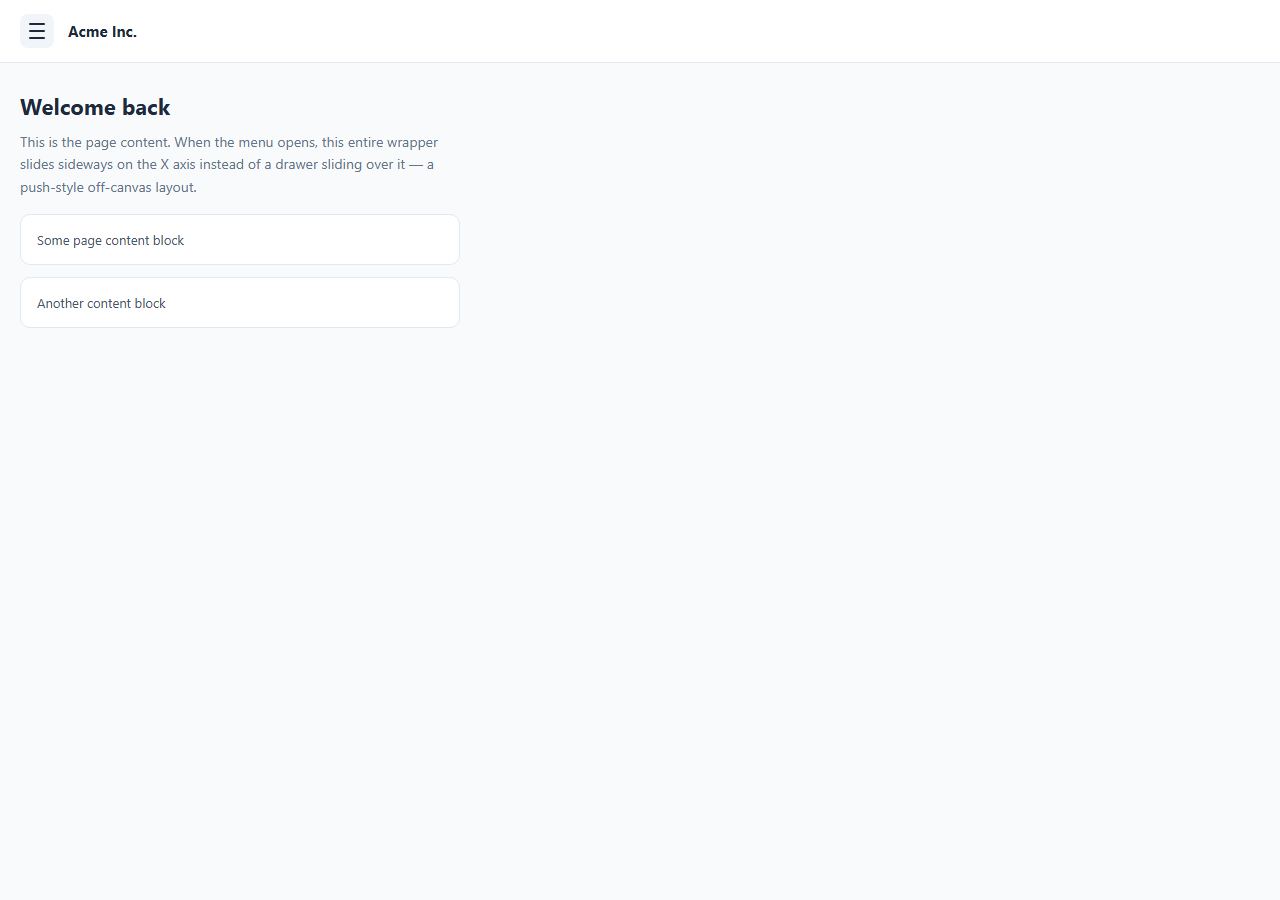
Most mobile navigation drawers are overlays: a panel slides in on top of the page while the page itself stays put. A push-style off-canvas menu is different — the entire visible page shifts sideways on the X axis to reveal a hidden sidebar underneath it. It's the pattern used by older Facebook and many native-feeling mobile web apps because it makes the menu feel like a physical layer beneath the content rather than a modal floating above it.
This snippet builds that effect with plain HTML, CSS, and vanilla JavaScript. There are three sibling elements inside .app: the .off-canvas sidebar positioned absolutely at the left edge, the .page-wrap that contains the topbar and all page content, and a .scrim overlay used only to catch outside clicks. No layout library, no drawer component, no npm package.
How the push effect works
The trick is that .off-canvas starts at transform: translateX(-100%) — fully hidden off the left edge of the viewport — while .page-wrap sits on top of it at transform: translateX(0). When the menu opens, two things happen at once: the off-canvas panel animates to translateX(0) to slide into view, and .page-wrap gets a .shifted class that animates it to transform: translateX(240px) — the exact width of the sidebar. Because both elements share the same 0.3s ease transition, the page appears to be *pushed* to the right by the menu sliding in underneath it, rather than the menu sliding on top of the page. The parent .app has overflow-x: hidden so the page-wrap's rightward shift never creates a horizontal scrollbar.
How the hamburger-to-X animation works
The hamburger icon is three <span> bars inside a button. When aria-expanded="true" is set on the button, three sibling selectors kick in: the top bar translates down 7px and rotates 45deg, the middle bar fades to opacity: 0, and the bottom bar translates up 7px and rotates -45deg. Together the two remaining bars form an X. Driving this off the aria-expanded attribute rather than a separate class means the visual state and the accessibility state can never drift out of sync.
Closing the menu
Three things close the menu: clicking the close button inside the panel, clicking the semi-transparent scrim that covers the page while the menu is open, or clicking the hamburger again. All three call the same closeMenu() function, which resets the transforms, removes the .shifted and .visible classes, and flips aria-expanded and aria-hidden back.
Changing the sidebar width
The sidebar width is set in exactly two places that must match: .off-canvas { width: 240px } and .page-wrap.shifted { transform: translateX(240px) }. Change both values together — if they diverge, the page will either overshoot the sidebar's edge or leave a gap.
Build with AI
Build, Understand, Optimize, and Extend It With AI
Paste this snippet's HTML, CSS, and JS into an AI coding assistant like Claude and ask it to walk through exactly why the sidebar's translateX(-100%) and the page-wrap's translateX(240px) have to be driven by the same transition duration for the push illusion to hold together — and what visibly breaks if only one of the two elements animates. It's also a good snippet to hand over when you want to extend the pattern safely: ask it to add a right-edge variant, wire in swipe-to-open touch gestures, or convert the toggle/close functions into a single boolean state so the component ports cleanly to React or Vue. Because the accessibility wiring (aria-expanded, aria-hidden) is intentionally minimal here, it's also worth asking the assistant to check whether focus is being trapped correctly inside the open menu and to suggest the missing keyboard handling (Escape to close, focus returning to the hamburger) before shipping it to production.
Prompt to recreate it
Copy this into your AI assistant of choice to build the effect from scratch, or as a jumping-off point for your own variant:
Build a "push-style" off-canvas navigation menu in plain HTML, CSS, and JavaScript — no framework, no drawer library.

Requirements:
- Three sibling elements inside one relatively positioned, overflow-x:hidden wrapper: a fixed-width sidebar panel positioned absolutely off-screen to the left via transform: translateX(-100%), a page-wrap div containing a topbar and page content sitting on top of it, and a full-screen scrim overlay for outside clicks.
- Opening the menu must animate the sidebar to translateX(0) AND the page-wrap to translateX(<sidebar-width>) at the same time, using the same transition duration on both elements, so the page visibly gets pushed aside by the sidebar sliding in underneath it — this must NOT look like an overlay drawer sliding on top of a static page.
- A hamburger button with three span bars that morphs into an X purely via CSS, driven off the button's own aria-expanded attribute (not a separate class) — top and bottom bars rotate and converge, the middle bar fades out.
- Three independent ways to close the menu that all call the same close function: a close button inside the sidebar, clicking the scrim, and clicking the hamburger again.
- Keep aria-hidden on the sidebar and aria-expanded on the hamburger in sync with the open/closed state at all times.
- The sidebar width must be controlled by exactly two coordinated values (the sidebar's own width and the page-wrap's shifted translateX distance) so resizing the menu only requires updating both to match.
Want to tighten it up first? Run this prompt through the AI Prompt Studio to score it across 8 quality dimensions, catch anti-patterns, and tune the wording for Claude, ChatGPT, or Gemini before you paste it in.
Step by step
How to Use
- 1Load the snippetClick "Off-Canvas Push Menu" in the sidebar Library tab to load the HTML, CSS, and JS panels and see the closed state in the preview.
- 2Open the menuClick the hamburger icon in the preview. Watch the page content shift right as the dark sidebar slides in from underneath it, and the hamburger morph into an X.
- 3Close it three waysClick the X inside the sidebar, click the dimmed scrim area, or click the hamburger again — all three should close the menu identically.
- 4Resize the sidebarIn the CSS panel, change both the width on .off-canvas and the translateX value on .page-wrap.shifted to the same new value, then reopen the menu to confirm the page shifts exactly that far.
- 5Add or edit linksIn the HTML panel, add more .oc-link anchors inside the nav — the flex layout and hover states apply automatically to any number of links.
- 6Export in your formatClick "HTML" for a standalone file, "JSX" for React, or "Tailwind" for a React + Tailwind version. "Copy all" copies everything to the clipboard.
Real-world uses
Common Use Cases
Got questions?
Frequently Asked Questions
It is a navigation pattern where opening the menu shifts the entire visible page sideways to reveal a hidden sidebar underneath it, instead of sliding a drawer on top of the page. Both the sidebar and the page move using CSS transforms so they appear physically connected.
A normal drawer is an overlay: it slides in above the page using a higher z-index while the page stays fixed in place and is often dimmed with a scrim. Here, the page itself moves via transform: translateX, so the menu feels like it lives beneath the content and pushes it aside rather than covering it.
Update the width value on .off-canvas and the translateX distance on .page-wrap.shifted to the same new number — for example 280px in both places. They must match exactly or the page will either overshoot the sidebar edge or leave a visible gap.
The outer .app container has overflow-x: hidden, which clips anything that extends past the viewport width during the transform animation, including the momentary overhang while the page-wrap is sliding.
The three bars are span elements targeted with nth-child selectors that key off the button's aria-expanded attribute. When it is true, the top and bottom bars rotate 45 and -45 degrees and translate toward the center, and the middle bar fades out, forming an X shape purely with CSS transitions.
Yes. Move .off-canvas to right: 0 instead of left: 0, change its initial transform to translateX(100%), and change .page-wrap.shifted to translateX(-240px) so the page shifts left instead of right.
It works at any viewport width, but the push effect is most natural on narrower screens where a permanent sidebar would not fit. On wide desktop layouts you may prefer a permanently visible sidebar instead of a toggled one.
Yes. Add a details/summary element or a small accordion pattern in place of an .oc-link anchor. The sidebar's fixed width and vertical layout accommodate nested content as long as you manage its own expand/collapse state separately from the outer menu.