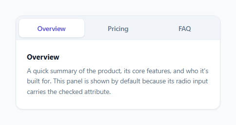
Tab Switcher — CSS Only Radio Hack (No JavaScript)
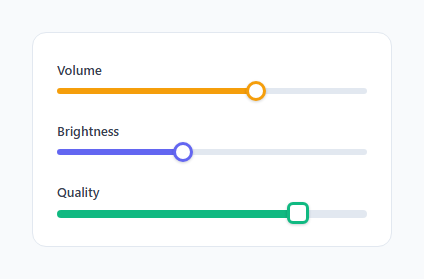
Styled Range Slider — CSS Only Vendor Pseudo-Elements (No JavaScript)
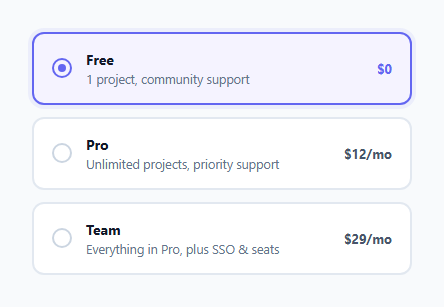
Styled Radio Buttons — CSS Only Plan Selector (No JavaScript)

Star Rating — CSS Only Radio Hack (No JavaScript)
Simple Hover Tooltip — CSS Only, Truly Zero JavaScript
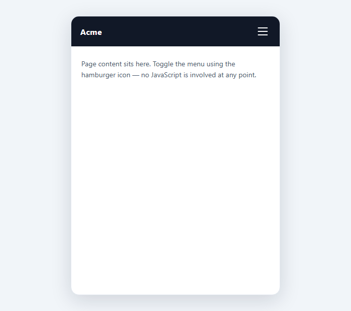
Hamburger Menu — CSS Only Checkbox Hack (No JavaScript)
Learn Coding Visually
Learn to code with interactive, live-preview playgrounds — HTML, CSS, JavaScript, React & more.
 HTML Playground42 lessons · Click-based · Live preview
 CSS PlaygroundLearn CSS with a live editor
 JavaScript Playground60 lessons · DOM · Async · Canvas
 React PlaygroundLearn React with a live code editor
 GSAP PlaygroundLearn GSAP animation interactively
 SVG Playground44 lessons · shapes · paths · animation
 SCSS Playground45 lessons · Sass modules · tokens
 Tailwind PlaygroundLearn Tailwind CSS with a live editor
 Bootstrap 5 Playground50 lessons · live preview
Native HTML Accordion — <details>/<summary>, No JavaScript
Accordion — Native <details>/<summary> (No JavaScript) · Misc · Plain HTML & CSS · Live preview
What's included
Features
About this UI Snippet
Accordion Built on Native <details>/<summary> — The Browser Already Does This
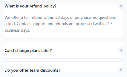
Every other pattern in this batch reaches for a hidden checkbox or radio input to fake open/closed state in CSS. <details>/<summary> doesn't need that workaround at all — disclosure state is a first-class native HTML feature. The browser tracks open/closed, handles the click-to-toggle behavior on <summary>, exposes it to the accessibility tree with the correct aria-expanded semantics automatically, and even supports Enter/Space toggling out of the box, all without a single hidden form control anywhere in the markup.
The open attribute is the entire state model
<details> carries a boolean open attribute the browser manages itself: absent means closed, present means open, and clicking the child <summary> element toggles it natively. .acc-item[open] .acc-header::after styles the disclosure icon based on that real DOM attribute using a plain CSS attribute selector — no :checked proxy, no sibling combinator gymnastics, because the state being styled is the actual semantic state of the element, not a stand-in input elsewhere in the tree.
Removing and replacing the default marker
Browsers render <summary> with a built-in disclosure triangle by default (a ::marker in most browsers, or a proprietary ::-webkit-details-marker in WebKit browsers specifically). This snippet suppresses both — list-style: none handles the standards-track ::marker triangle, and summary::-webkit-details-marker { display: none } is the extra rule needed specifically for older WebKit-based rendering, since it historically ignored list-style on summary. In its place, a custom chevron icon is drawn as a ::after pseudo-element background image, rotated 180 degrees when [open] is present — the same rotate-on-state-change idea used throughout this batch, just keyed to a native attribute instead of :checked.
Being honest about the animation limitation
Historically, <details> content snaps open and closed instantly — there is no standard way to transition height from 0 to the content's real height, because until recently browsers couldn't animate the content-visibility/display change involved in revealing <details> content at all. This snippet does not pretend that limitation doesn't exist: the smooth height reveal is wrapped in @supports (interpolate-size: allow-keywords), a genuinely new CSS property that lets height: auto participate in a transition (similar in spirit to the grid-template-rows trick used in this batch's checkbox-hack accordion, but applied directly to <details>'s native reveal). Browsers that don't yet support interpolate-size simply get the native instant open/close — which is not a broken experience, just a less animated one. This is the honest, transparent tradeoff: reach for this native element when instant (or progressively-enhanced) toggling is acceptable, and reach for the checkbox-hack + grid-template-rows accordion elsewhere in this batch when a guaranteed smooth animation matters more than using the simplest possible markup.
Why this is the simplest correct choice when animation isn't required
No hidden input, no for/id pairing to keep in sync, no sibling-combinator chain to get right — the entire interactive behavior is two native elements. That absence of moving parts is itself a reliability advantage: there's no way to misconfigure the open/close logic, because there is no logic to configure; the browser's user-agent implementation is doing exactly what a checkbox hack simulates, natively.
Where this fits alongside the rest of this batch
Anywhere <script> tags are stripped — CMS content blocks, sanitized user HTML, email, AMP, script-stripped Markdown renders — <details>/<summary> works exactly as well as it does anywhere else, because it was never dependent on JavaScript in the first place; it predates and is entirely orthogonal to the checkbox-hack technique used elsewhere in this library.
Build with AI
Build, Understand, Optimize, and Extend It With AI
Ask an AI assistant to explain the tradeoff between this native <details>-based accordion and the checkbox-hack + grid-template-rows accordion elsewhere in this batch — specifically why the checkbox-hack version can guarantee a smooth animation across all current browsers while this one can only offer it as a progressive enhancement. It's also worth asking for the newer shared name="..." exclusive-<details> grouping feature and what browser support it currently has, since that could replace the radio-based tab-switcher pattern in future work.
Prompt to recreate it
Copy this into your AI assistant of choice to build the effect from scratch, or as a jumping-off point for your own variant:
Build a styled FAQ accordion using only native HTML <details> and <summary> elements plus CSS — no JavaScript, no onclick attributes, no <script> tags, and no hidden checkbox or radio inputs of any kind; rely entirely on the browser's built-in disclosure state.

Requirements:
- At least three <details> elements, each with a <summary> as its header and a content div as the remaining child, with one <details> given the open attribute so it starts expanded.
- Suppress the browser's default disclosure marker (covering both the standards-track ::marker and the WebKit-specific ::-webkit-details-marker) and replace it with a custom chevron icon built as a CSS pseudo-element.
- Rotate the custom chevron 180 degrees when the details element carries the open attribute, styled purely via the [open] attribute selector — no class toggling.
- As a progressive enhancement only, wrapped in an @supports feature query for the interpolate-size CSS property, add a smooth height transition for the content reveal; browsers without that support must still fully function with the native instant open/close, and this must be described honestly as a fallback rather than hidden as a bug.
- Ensure the summary shows a visible focus outline for keyboard users tabbing to it.
Want to tighten it up first? Run this prompt through the AI Prompt Studio to score it across 8 quality dimensions, catch anti-patterns, and tune the wording for Claude, ChatGPT, or Gemini before you paste it in.
Source Code
<div class="demo">
  <div class="accordion">
    <details class="acc-item" open>
      <summary class="acc-header">What is your refund policy?</summary>
      <div class="acc-content">
        <p>We offer a full refund within 30 days of purchase, no questions asked. Contact support and refunds are processed within 2-3 business days.</p>
      </div>
    </details>
    <details class="acc-item">
      <summary class="acc-header">Can I change plans later?</summary>
      <div class="acc-content">
        <p>Yes, you can upgrade or downgrade at any time from account settings. Upgrades apply immediately; downgrades apply at the next billing cycle.</p>
      </div>
    </details>
    <details class="acc-item">
      <summary class="acc-header">Do you offer team discounts?</summary>
      <div class="acc-content">
        <p>Teams of 10 or more get a 20% discount automatically applied at checkout when using a shared team billing account.</p>
      </div>
    </details>
  </div>
</div>
* { box-sizing: border-box; margin: 0; padding: 0; }
body { font-family: system-ui, sans-serif; background: #f8fafc; display: flex; align-items: center; justify-content: center; min-height: 100vh; padding: 24px; }
.accordion { width: 440px; max-width: 100%; display: flex; flex-direction: column; gap: 10px; }
.acc-item { background: #fff; border: 1px solid #e2e8f0; border-radius: 12px; overflow: hidden; }
/* Remove the browser's default disclosure triangle so we can draw our own */
.acc-item summary { list-style: none; }
.acc-item summary::-webkit-details-marker { display: none; }
.acc-header { display: flex; align-items: center; justify-content: space-between; gap: 12px; padding: 16px 18px; cursor: pointer; font-size: 14px; font-weight: 600; color: #111827; }
.acc-header:focus-visible { outline: 2px solid #6366f1; outline-offset: -2px; }
.acc-header::after { content: ''; flex-shrink: 0; width: 22px; height: 22px; border-radius: 50%; background: #f1f5f9 url("data:image/svg+xml,%3Csvg xmlns='http://www.w3.org/2000/svg' width='12' height='12' viewBox='0 0 24 24' fill='none' stroke='%234f46e5' stroke-width='2.5'%3E%3Cpolyline points='6 9 12 15 18 9'/%3E%3C/svg%3E") no-repeat center; transition: transform 0.25s ease; }
/* The open attribute is native browser state — no JS or checkbox needed */
.acc-item[open] .acc-header::after { transform: rotate(180deg); }
.acc-content { padding: 0 18px 18px; }
.acc-content p { font-size: 13.5px; color: #64748b; line-height: 1.6; }
/* Honest fallback note: a smooth height-reveal animation on <details> requires
the newer interpolate-size CSS property, which not every browser supports yet.
Where supported, this makes the native open/close transition animate instead
of snapping instantly; unsupported browsers simply get the instant native
open/close, which is still fully functional. */
@supports (interpolate-size: allow-keywords) {
html { interpolate-size: allow-keywords; }
.acc-item .acc-content { overflow: hidden; height: 0; transition: height 0.25s ease, content-visibility 0.25s ease allow-discrete; }
.acc-item[open] .acc-content { height: auto; }
}Step by step
How to Use
- 1Use <details> as the item, <summary> as the headerThe first child of <details> must be <summary> — the browser automatically makes it the clickable toggle for the rest of the element's content.
- 2Add the open attribute for a default-expanded itemPut open directly on any <details> element to have it rendered expanded on first page load.
- 3Suppress the default marker before adding your own iconApply list-style:none plus the ::-webkit-details-marker rule so your custom ::after chevron is the only visible toggle indicator.
- 4Style state with the [open] attribute selectorAny visual change tied to expanded/collapsed state should key off .acc-item[open] — this is the real DOM state, not a proxy input.
- 5Add smooth animation only if interpolate-size support matters to youThe @supports block is optional — omit it entirely if you are fine with the native instant snap-open behavior across all browsers.
Real-world uses
Common Use Cases
Got questions?
Frequently Asked Questions
Only if you need a guaranteed smooth height animation across all browsers today. This native version is simpler and more robust, but its animated reveal is a progressive enhancement gated behind interpolate-size support; the checkbox-hack + grid-template-rows accordion elsewhere in this batch animates smoothly everywhere at the cost of extra hidden-input markup.
Yes — <details>/<summary> is fully functional with zero CSS, including the disclosure triangle, click-to-toggle, and keyboard support. Every rule in this snippet is purely cosmetic on top of already-working native behavior.
By default, no — each <details> is independent. Some browsers support a shared name attribute on <details> elements (similar to radio grouping) to make only one open at a time; support for this is newer, so verify it in your target browsers before relying on it.
Yes — browsers expose <summary> with the correct implicit ARIA role and toggle its aria-expanded state automatically as part of the HTML specification, which is more reliable than a hand-rolled ARIA implementation on a custom checkbox-driven accordion.
The default triangle marker's size, position, and exact rendering vary across browsers and are hard to restyle directly. Hiding it and drawing a custom ::after icon keyed to the [open] attribute gives full, consistent control over the disclosure indicator's appearance.
The @supports block simply never applies, so .acc-content falls back to the browser's native instant show/hide — functionally complete, just without the smooth height transition. Nothing breaks or becomes inaccessible.